AI Lecture Redesign — Case Study
From Inconsistent Type to Typographic Precision
A real ETH Zurich conference presentation with 21 slides — redesigned by Arty with a focus on typography optimization. Font hierarchy, weight contrast, and spatial rhythm transformed while preserving every technical detail.
📄 21 slides transformed
🎓 ETH Zurich / EXCLAIM Project
🤖 Style: Academic Lecture
Why This Deck Needs a Redesign
This presentation from ETH Zurich's EXCLAIM project (Extreme Scale Computing and Data Platform for Cloud-Resolving Weather and Climate Modeling, Anurag Dipankar, 2022) covers cutting-edge climate simulation infrastructure. The technical content is strong, but the typography and layout undermine its impact:
- 🔤 Inconsistent font families — monospace metadata text, mixed serif/sans-serif headings, and code blocks using different typefaces create a fragmented reading experience
- ⚖️ No typographic hierarchy — headings, body text, labels, and callouts all share similar weight and size, making it impossible to scan slides quickly
- 📐 Poor spatial rhythm — some slides are 80% empty space with tiny text, while others cram diagrams and code into every corner with no breathing room
- 💻 Code and technical content treated as afterthoughts — code snippets sit in red-bordered boxes that clash with the slide palette, and architecture diagrams use uniform box styles with no visual differentiation
Arty's redesign applies consistent typographic principles throughout: bold display headings establish clear slide topics, medium-weight subheadings provide context, and body text uses proper line height and spacing. Code blocks receive syntax-appropriate styling, architecture diagrams gain icon-enhanced nodes with depth, and every slide achieves balanced spatial composition — all while preserving the exact technical content.
Original presentation from ETH Zurich Research Collection — EXCLAIM project, Anurag Dipankar, Scientific Director, 2022-06-28. Used under In Copyright - Non-Commercial Use Permitted.
Before
Repository metadata page, monospace text, no slide design
After

Structured metadata with icon cards, clear typographic hierarchy
Before
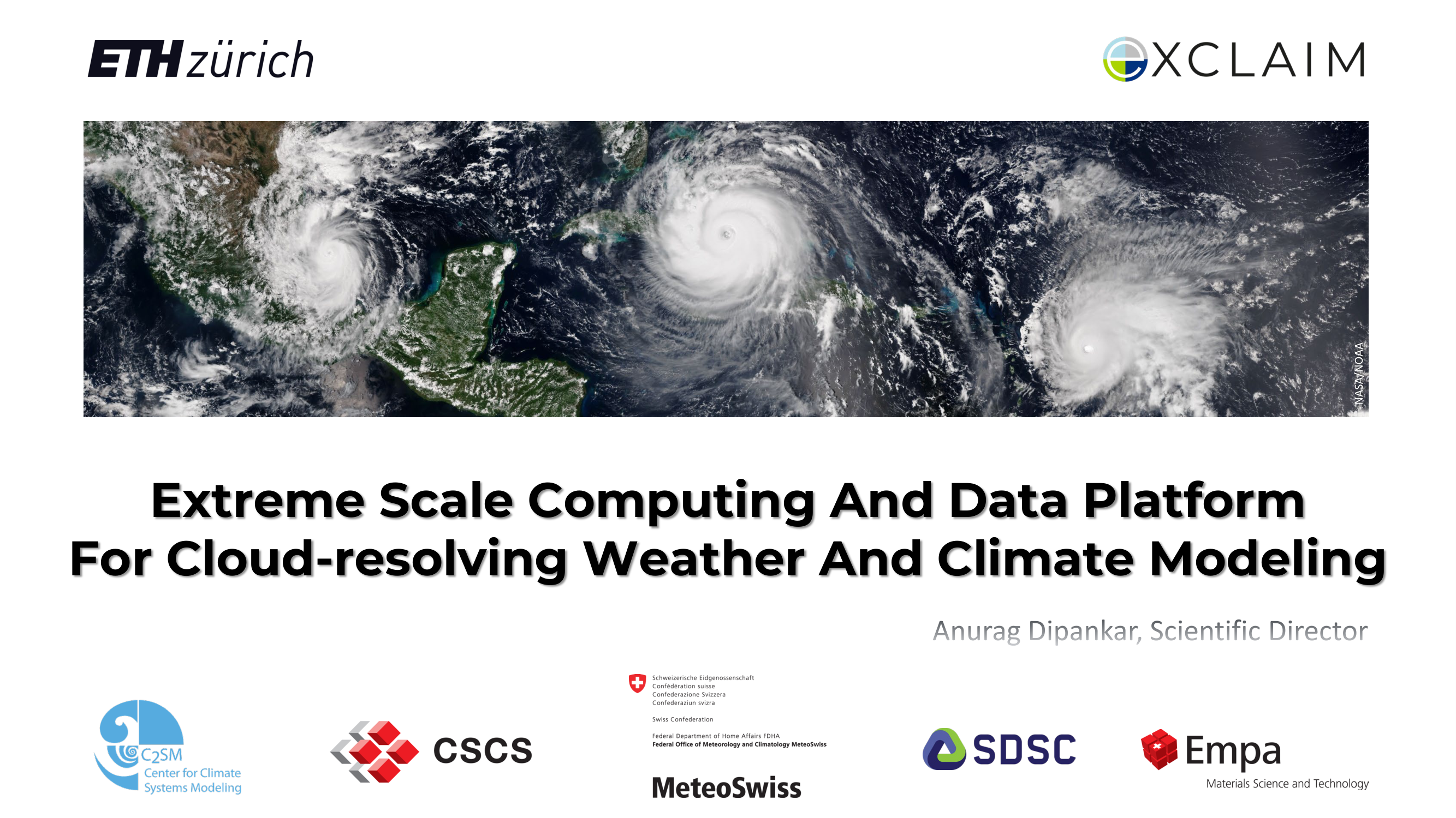
Satellite imagery with overlaid title, logo bar at bottom
After
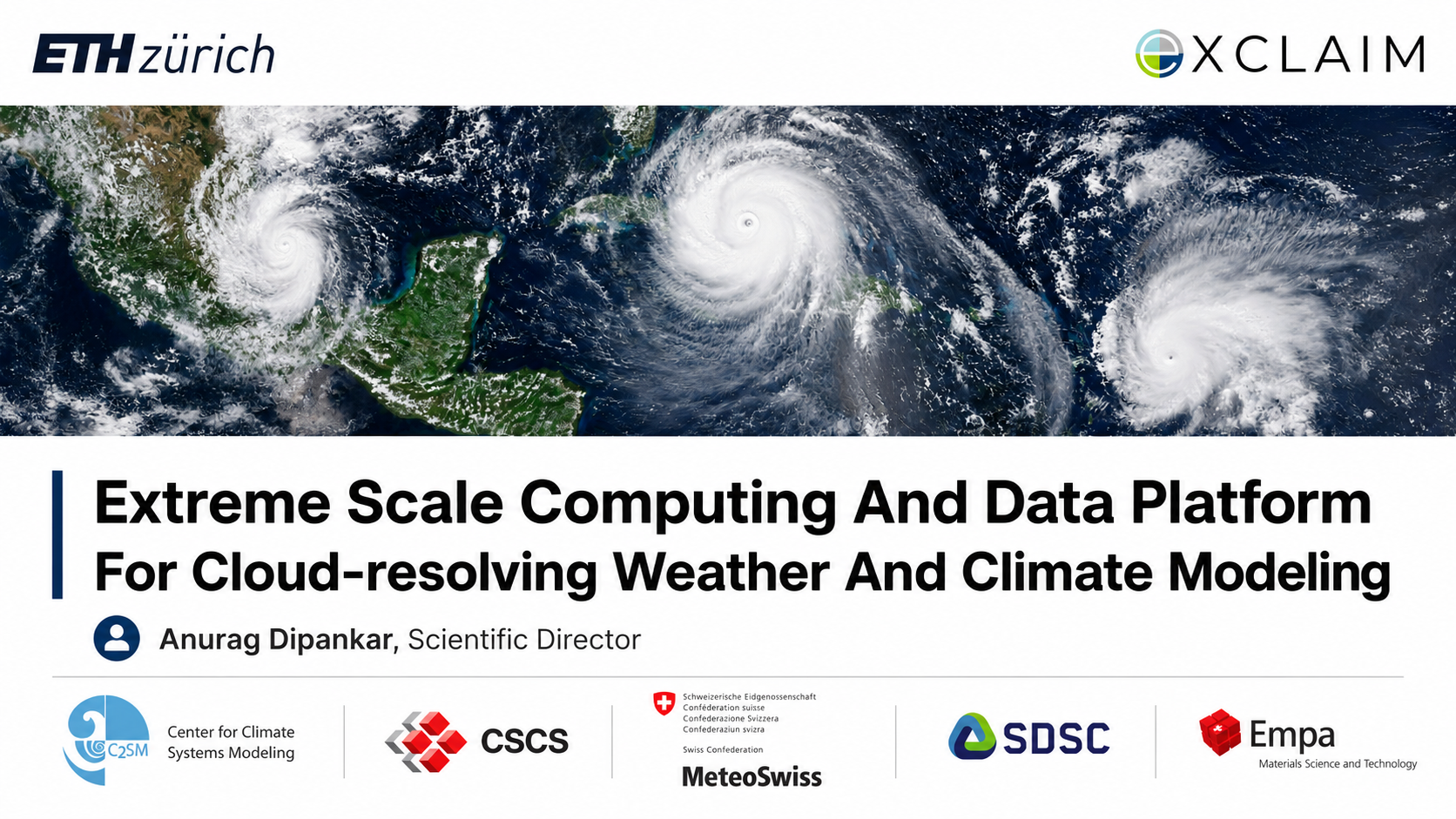
Refined title typography, organized partner branding
Before

Five plain bullets, 75% empty space, undersized text
After
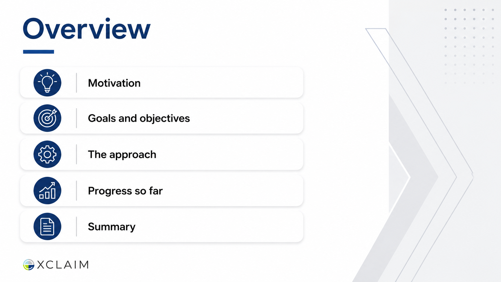
Icon-enhanced agenda cards, balanced spatial composition
Before
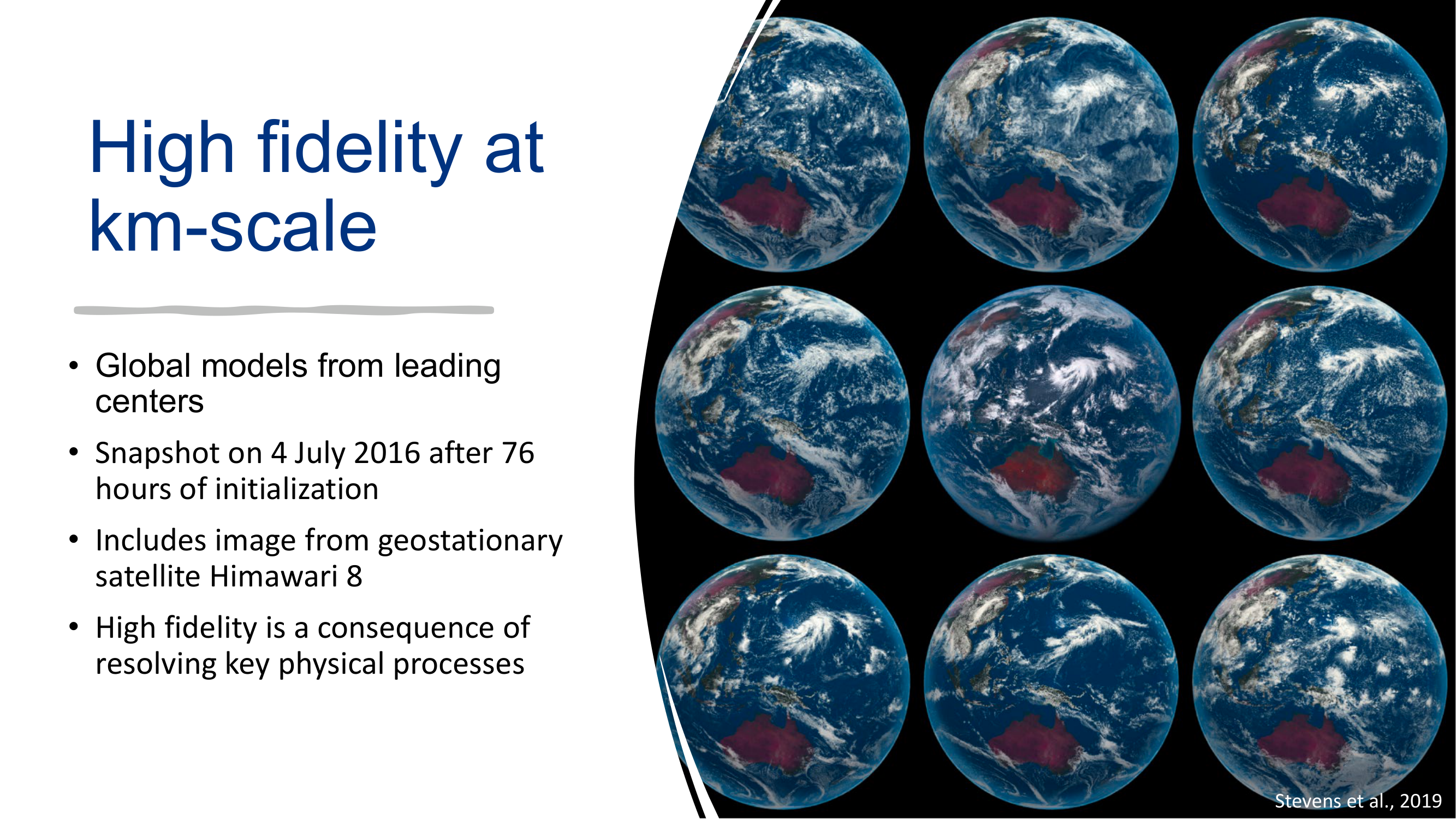
Mixed layout, thin heading weight, small body text
After
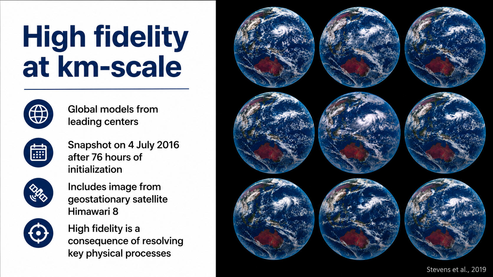
Consistent heading weight, improved text-image balance
Before

Rotated text labels, collage layout, hard to read captions
After
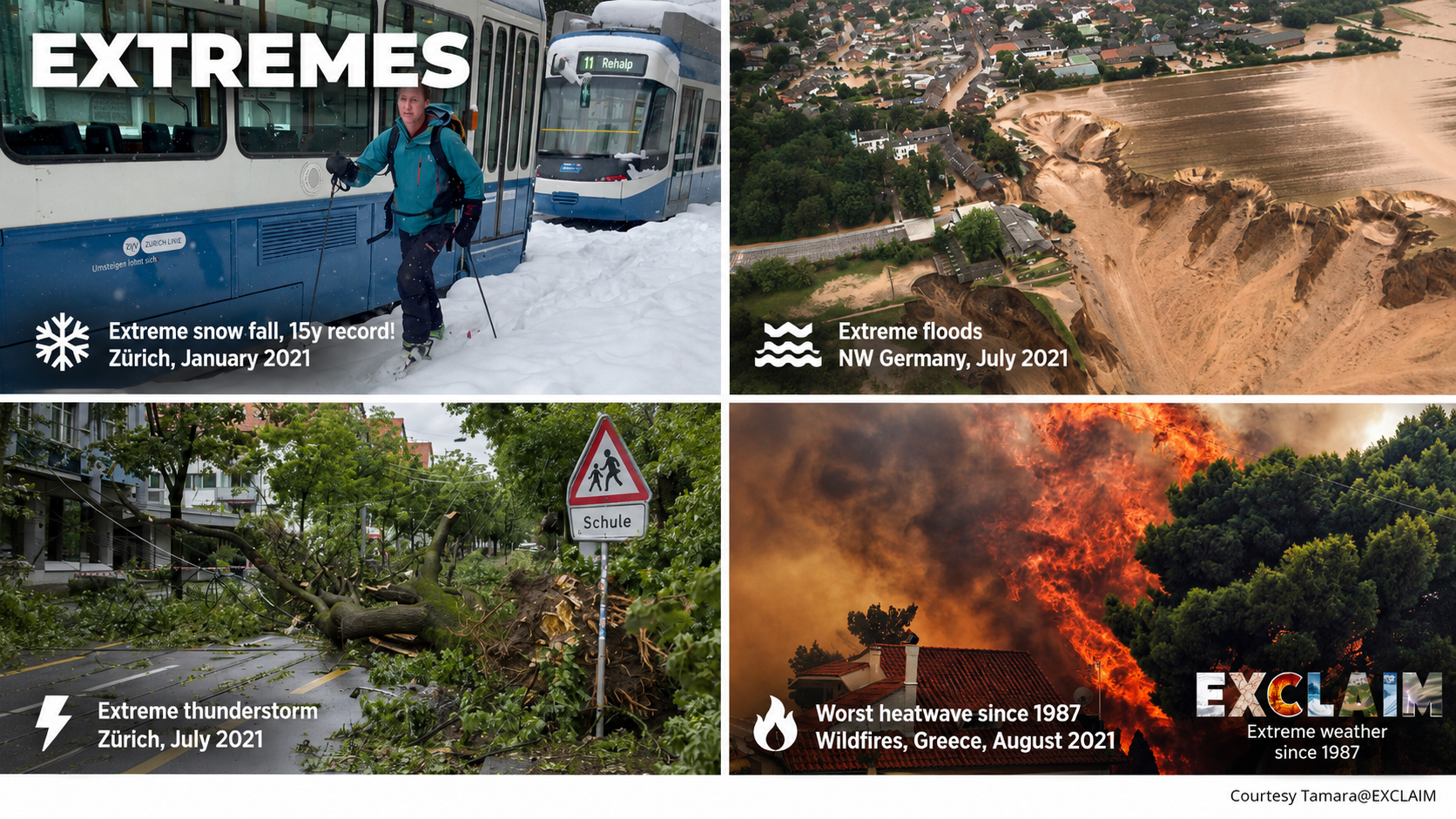
Ordered visual layout, readable typography
Before
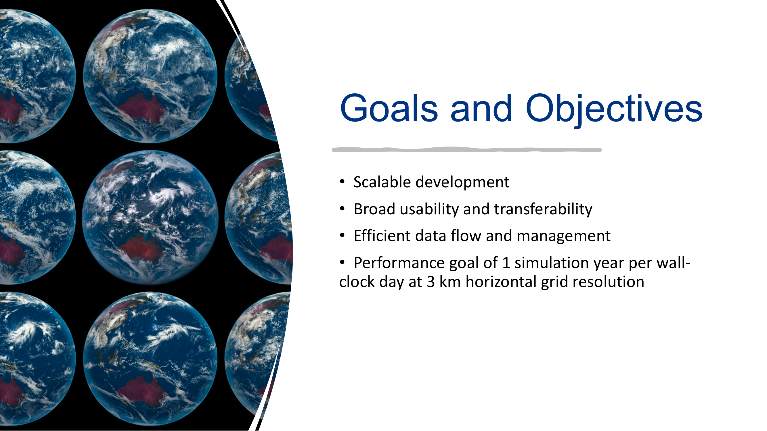
Thin bullets competing with background imagery
After
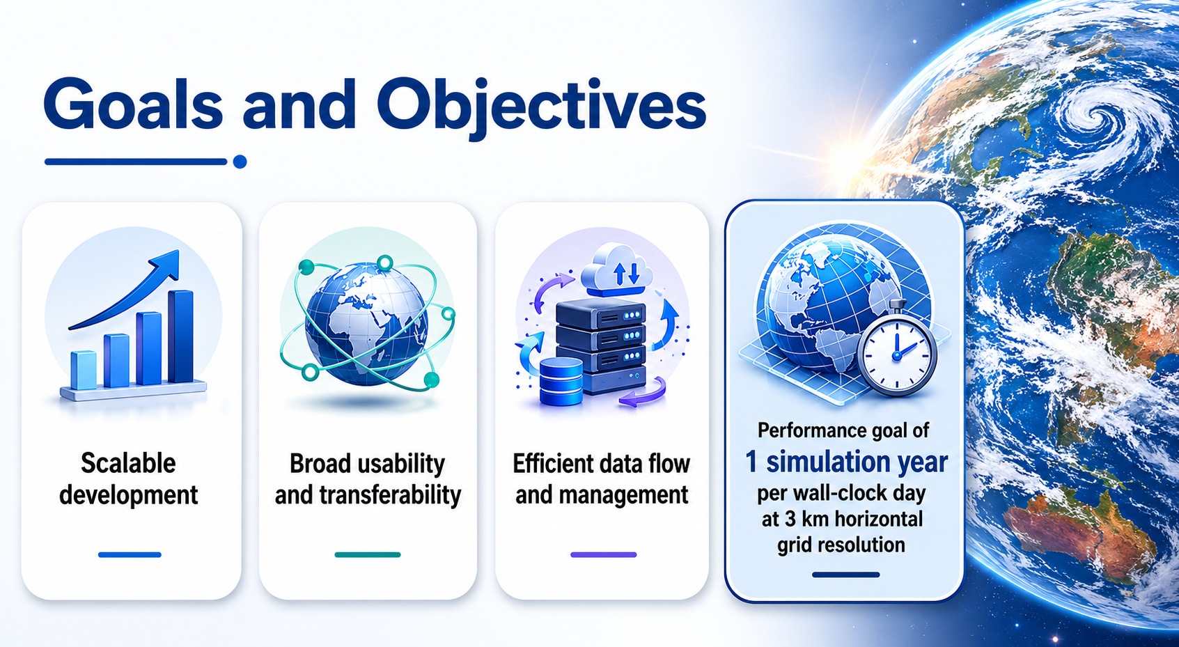
Icon-enhanced objective cards, clear visual separation
Before
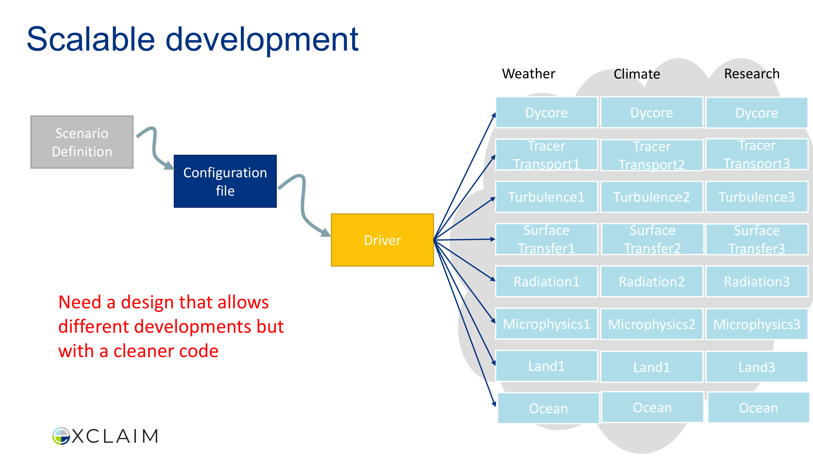
Uniform plain boxes, small labels, no visual differentiation
After
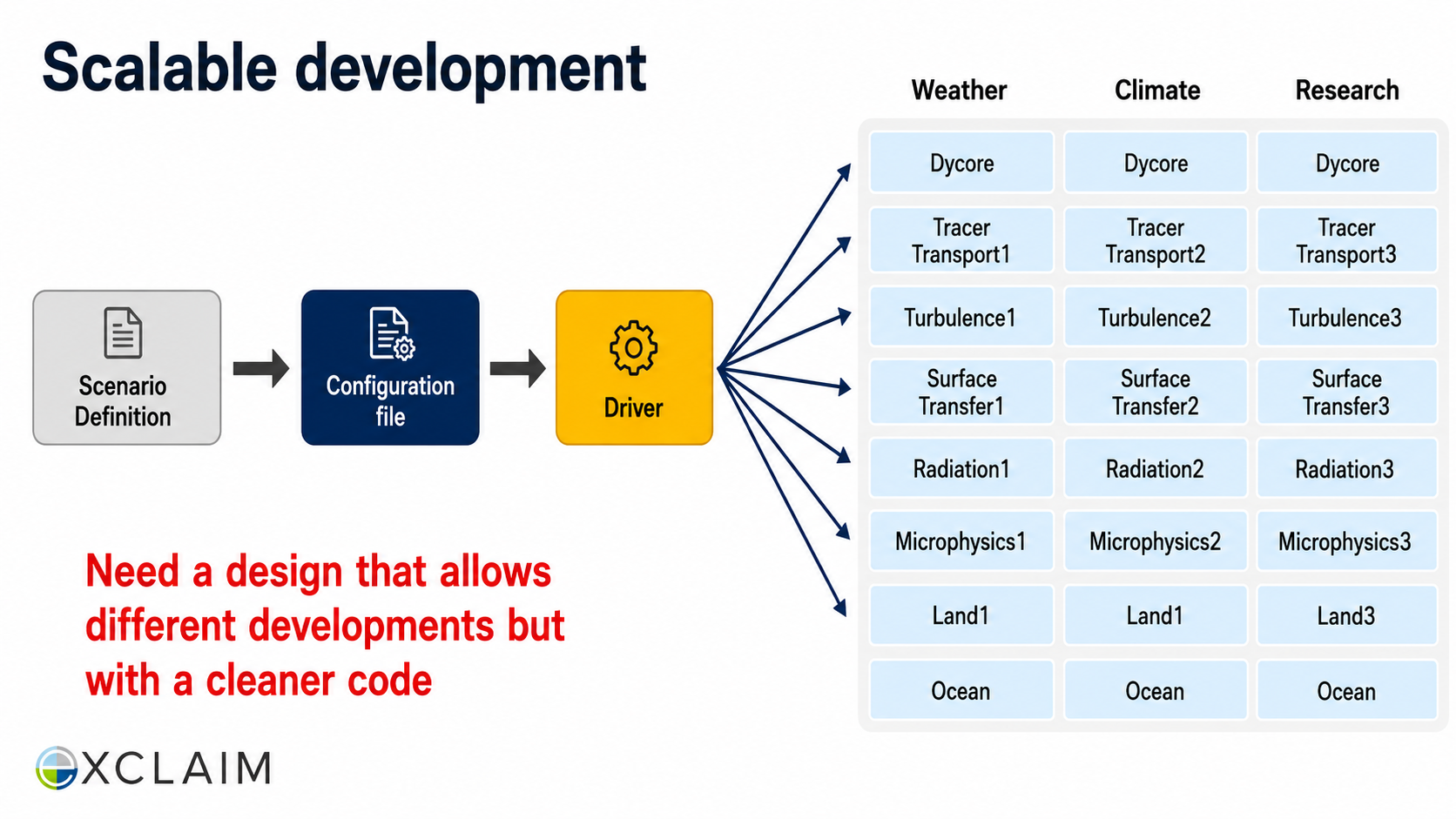
Styled architecture nodes, improved label typography
Before
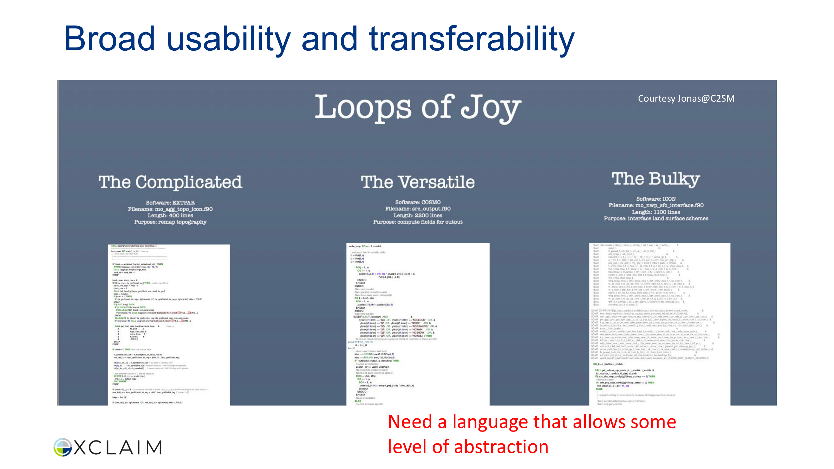
Mixed serif/sans-serif fonts, code screenshots hard to read
After
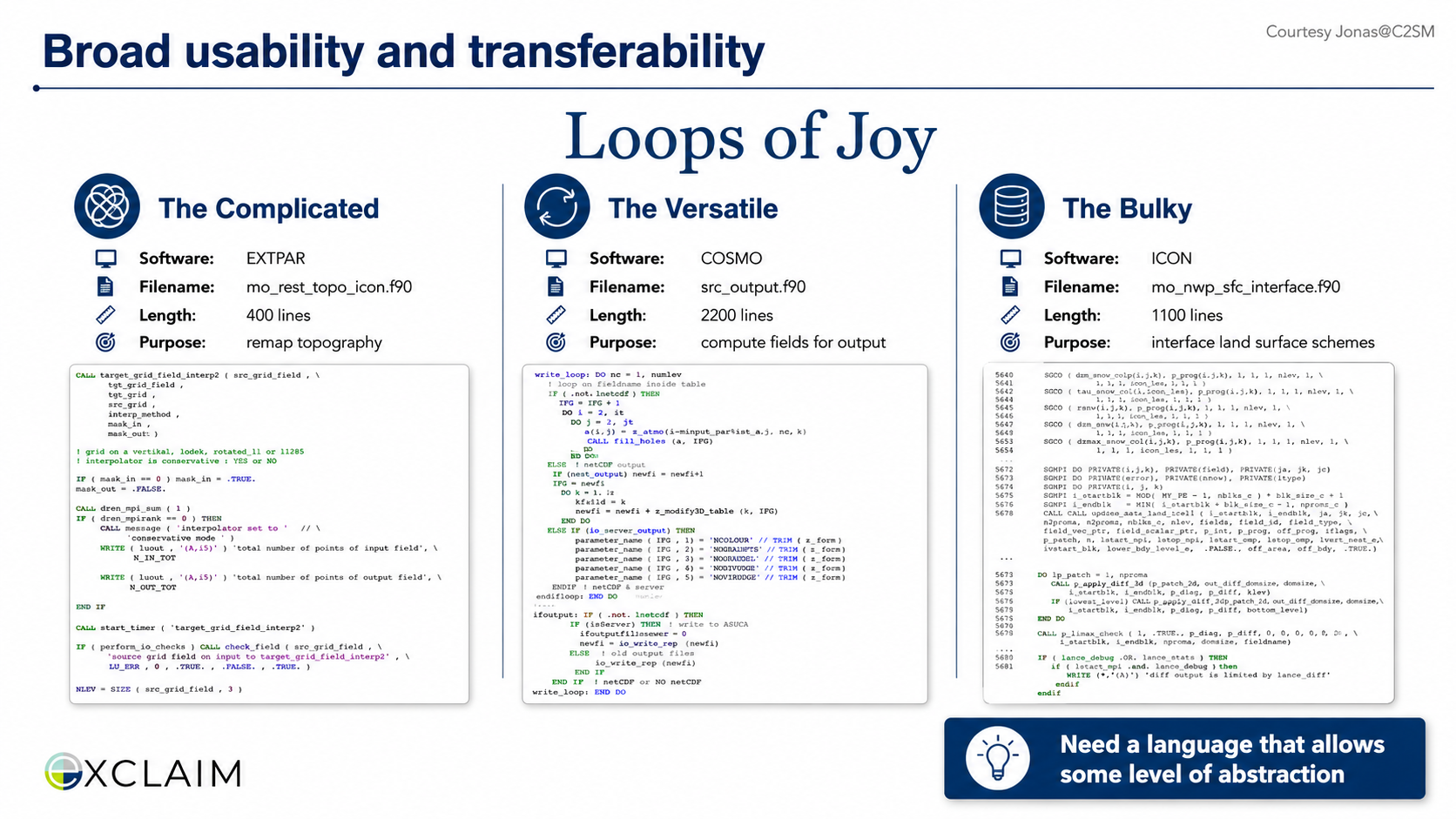
Unified font family, styled code presentation
Before
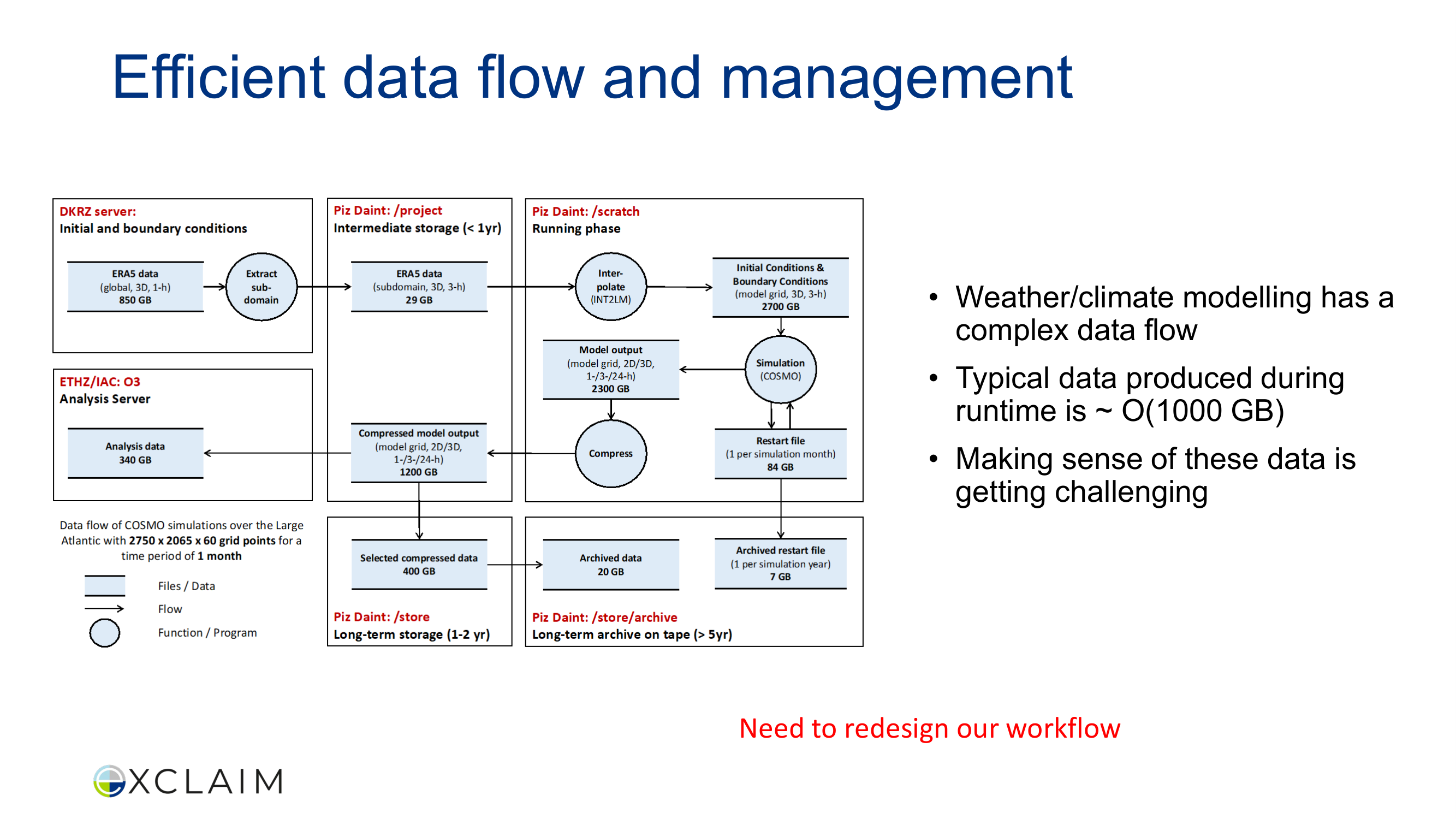
Dense flowchart, tiny labels, cramped annotations
After
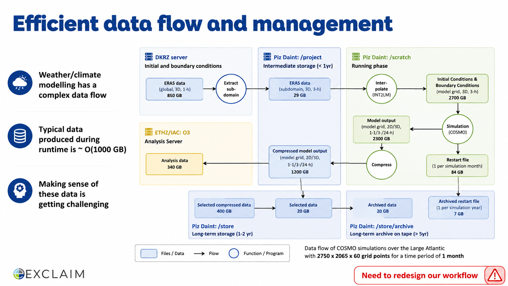
Cleaner flow visualization, readable labels
Before
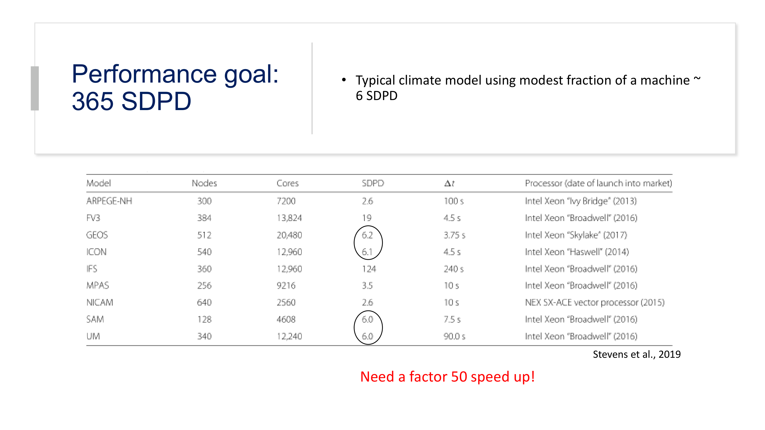
Plain table, no header styling, inconsistent number alignment
After
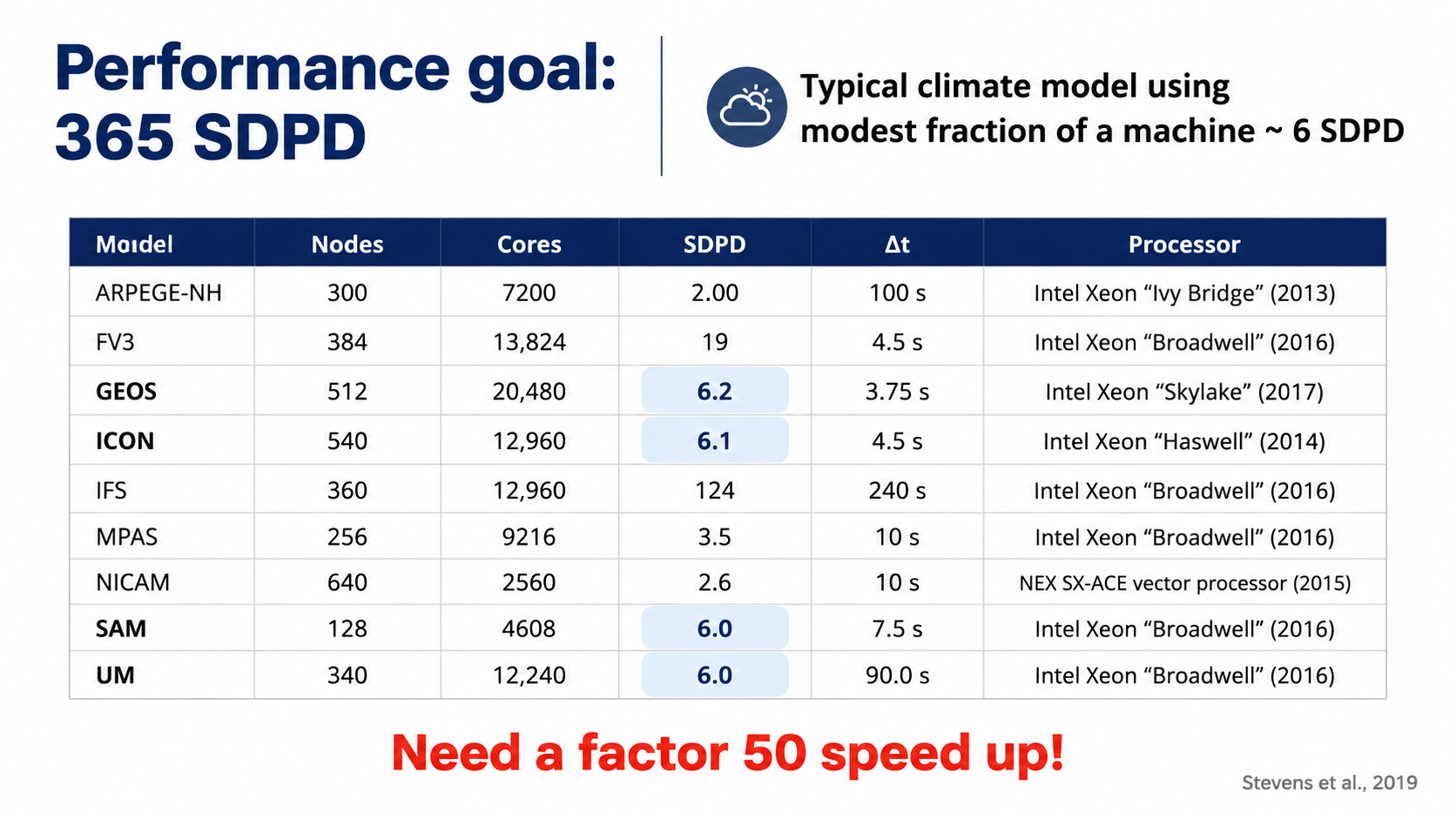
Professional table typography, styled headers
Before
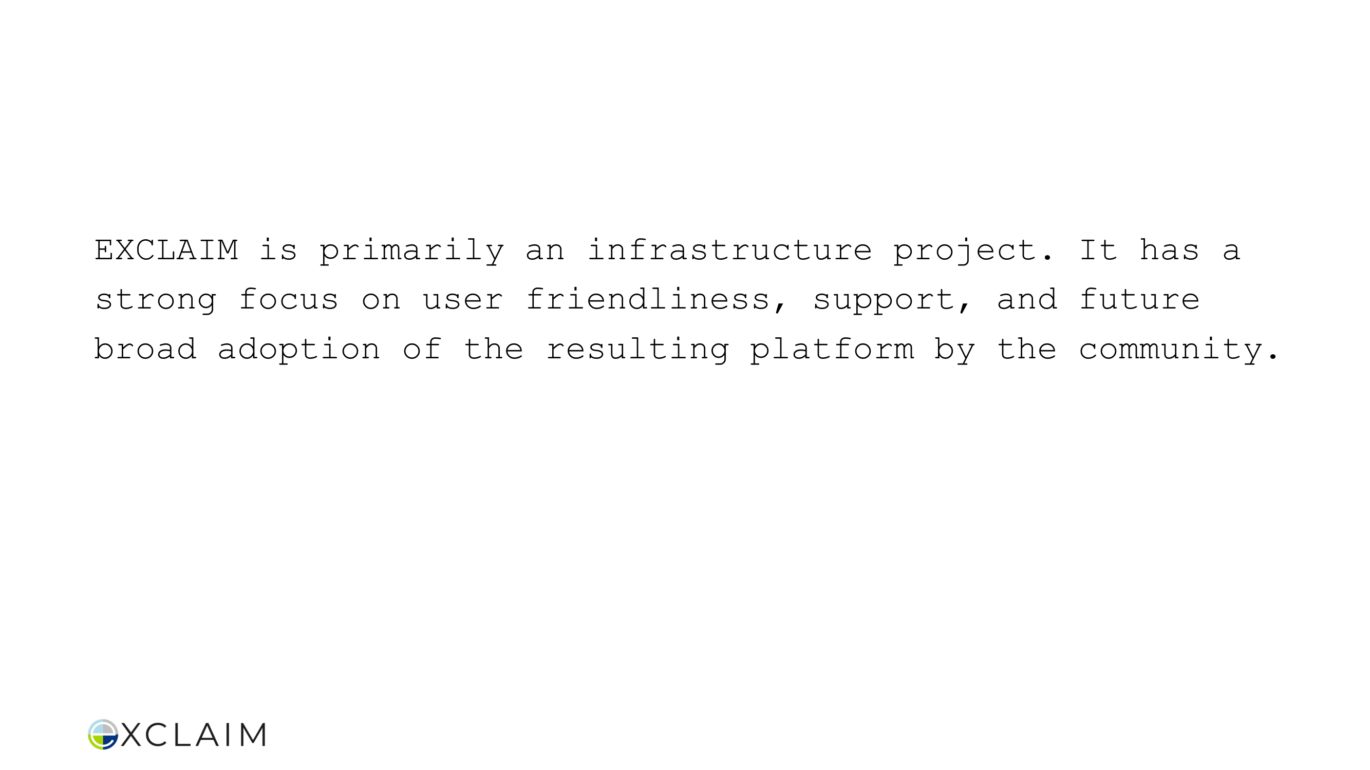
Monospace paragraph on blank slide, zero design, terminal-like
After
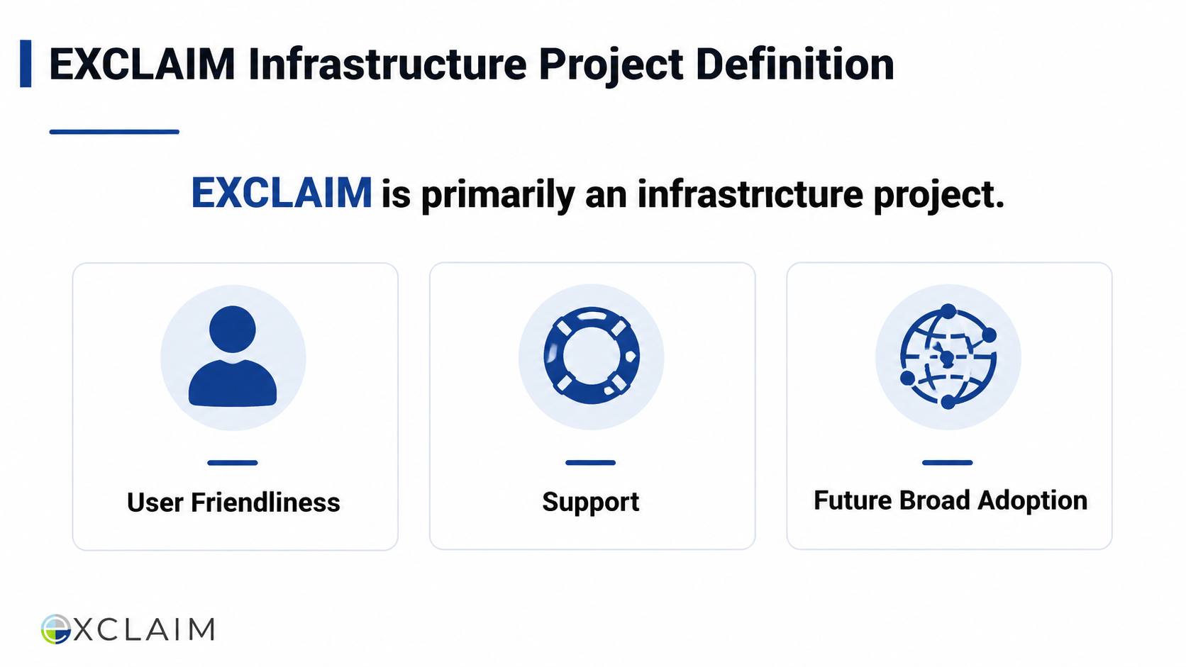
Proper sans-serif typography, structured content cards
Before
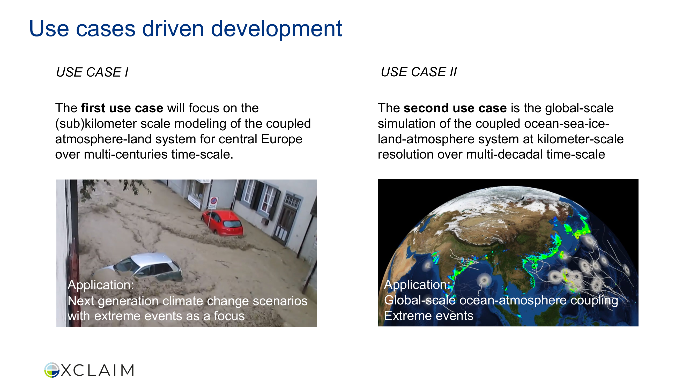
Inconsistent column typography, italic vs regular mixed
After
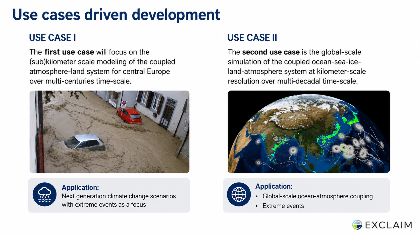
Consistent column styling, balanced layout
Before
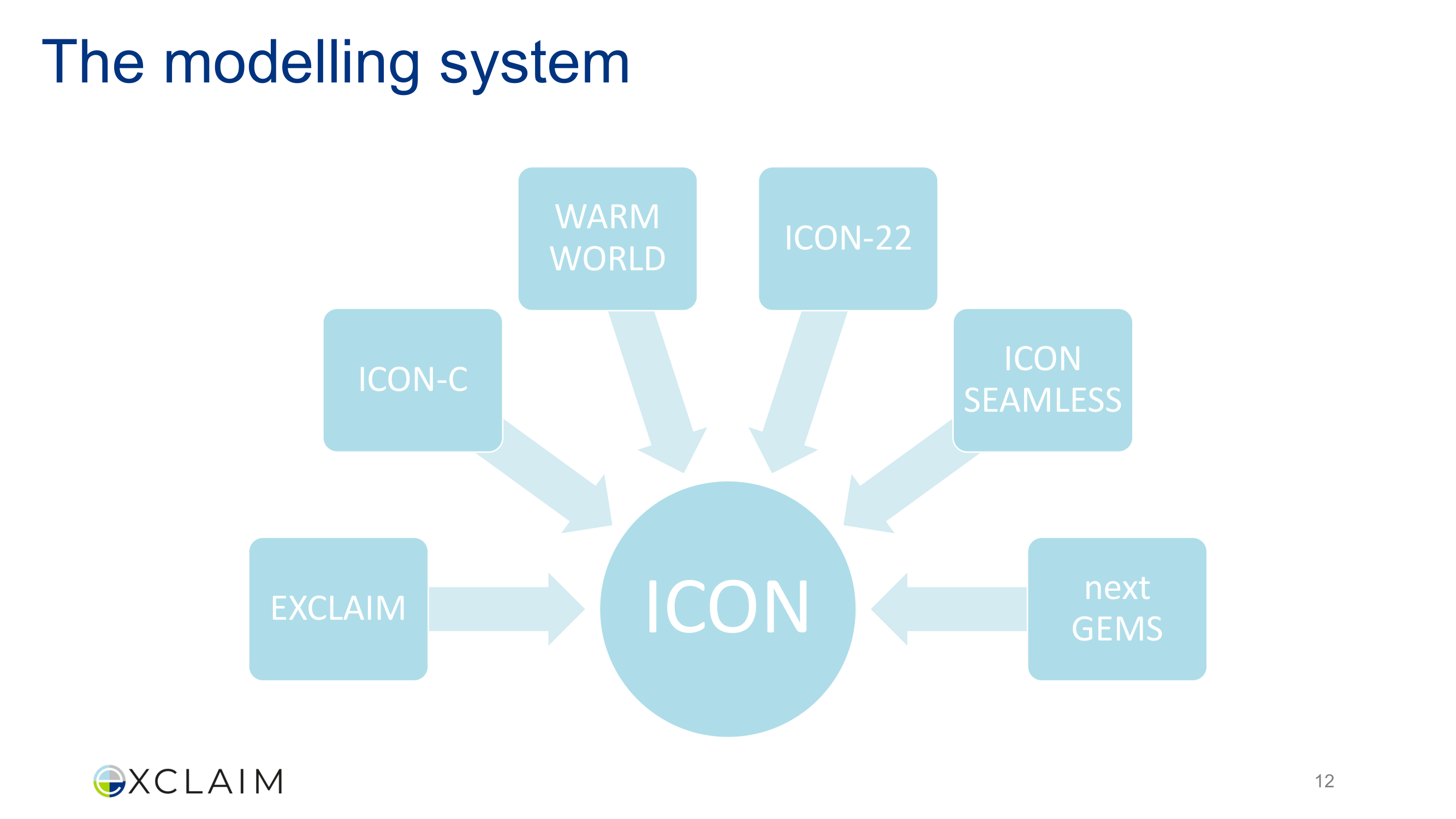
Uniform node styling, no visual weight differentiation
After
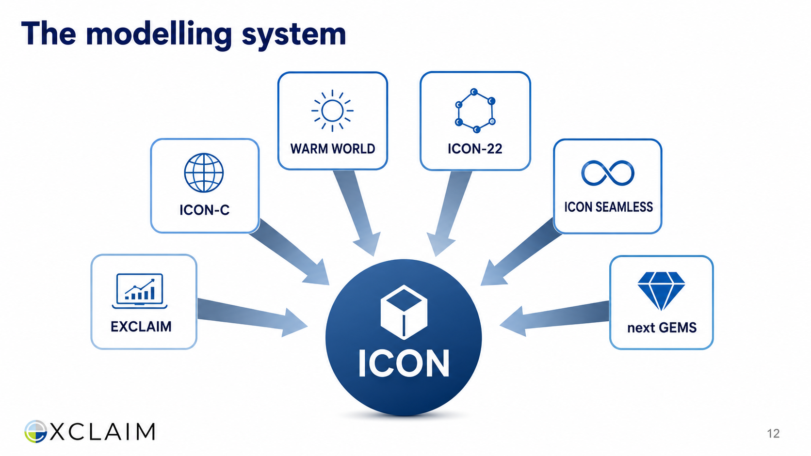
Styled nodes with depth, improved label hierarchy
Before
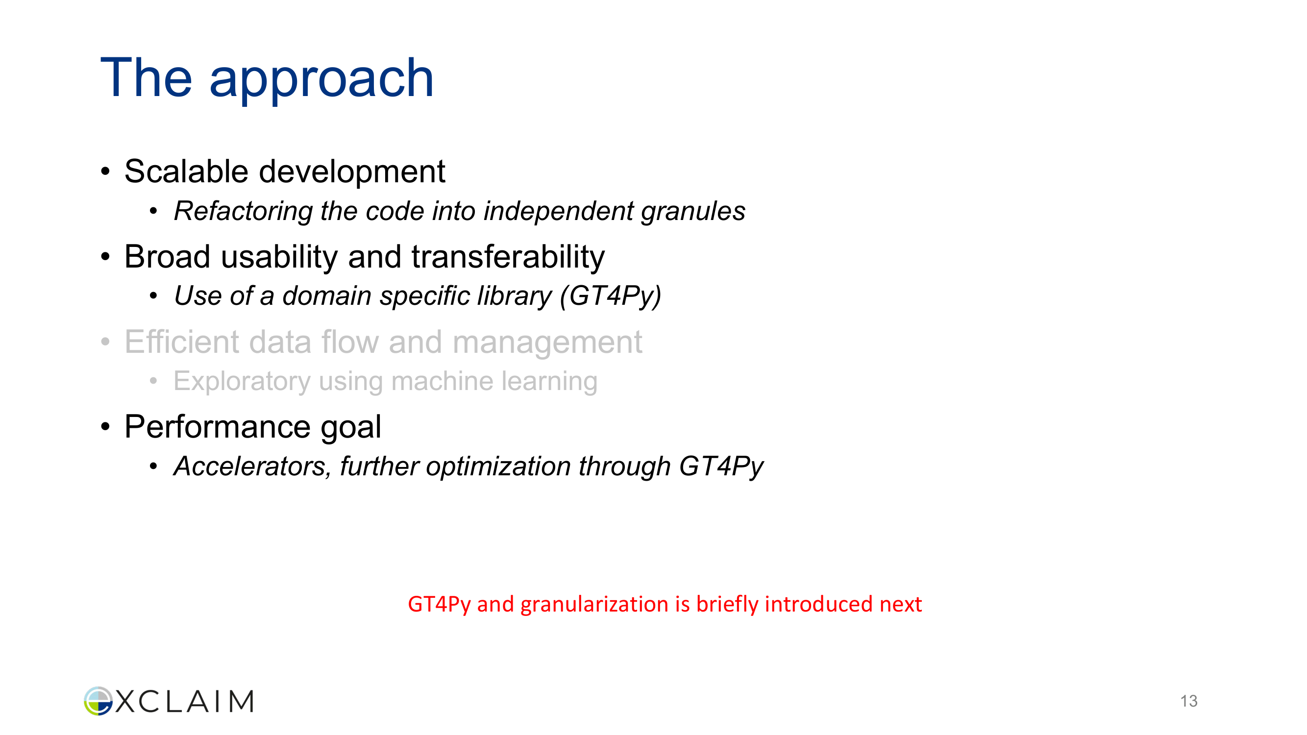
Grey italic text for de-emphasis, confusing visual hierarchy
After
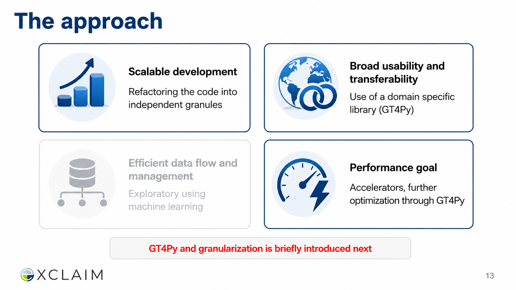
Icon-enhanced approach cards, clear emphasis through design
Before
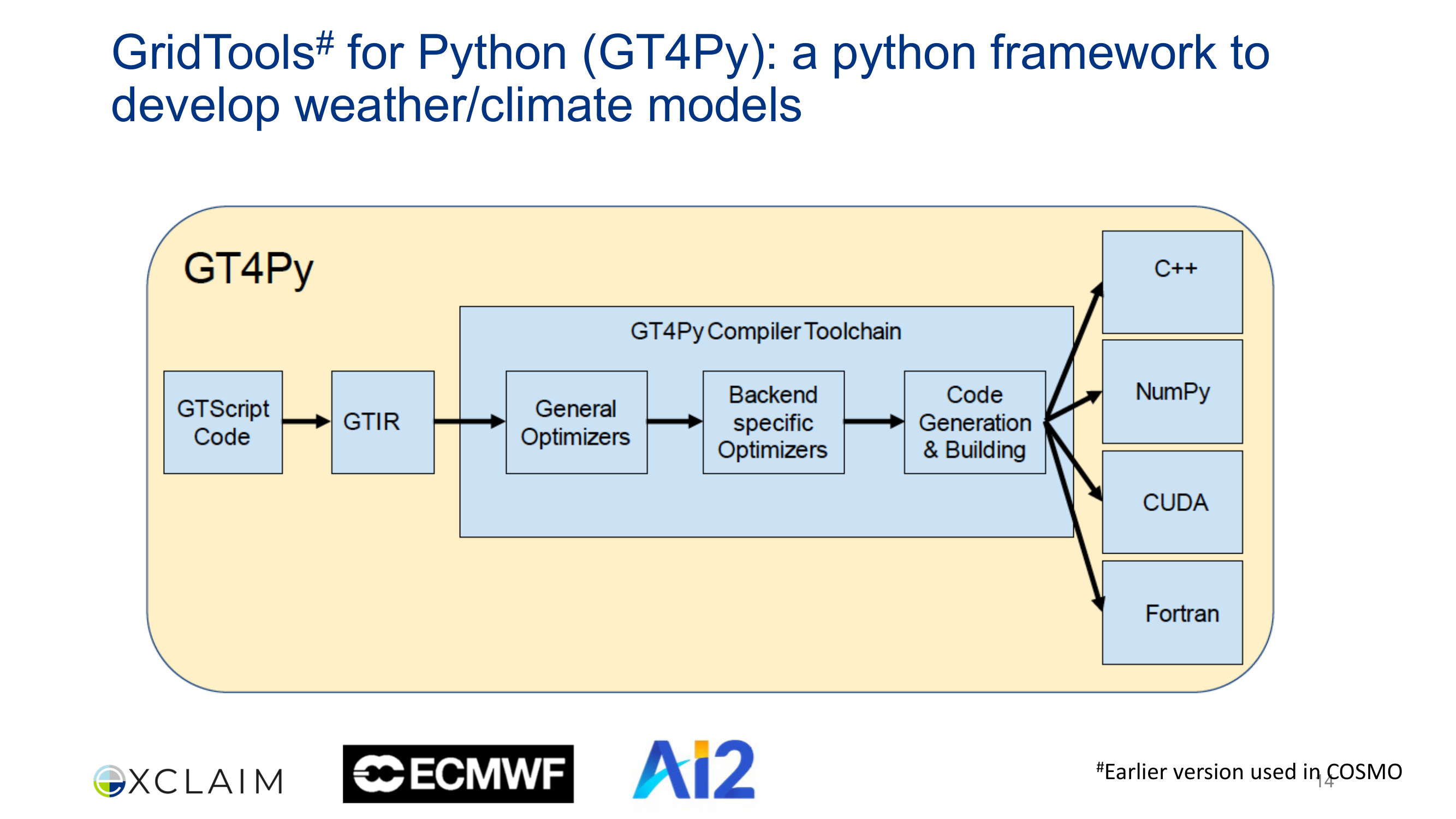
Plain boxes, thin borders, basic pipeline diagram
After
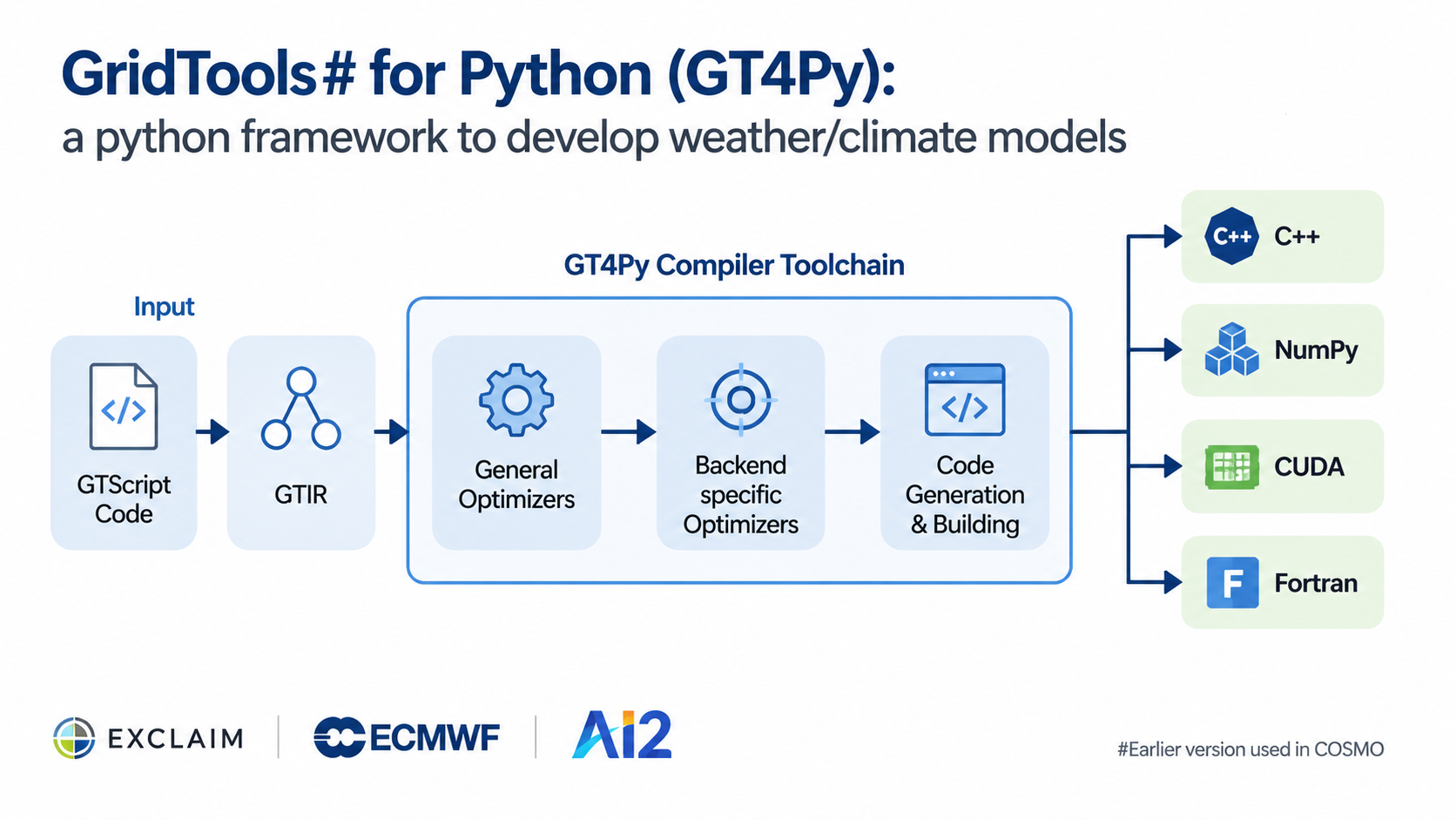
Styled pipeline stages, improved flow visualization
Before

Red-bordered code boxes clashing with blue theme
After
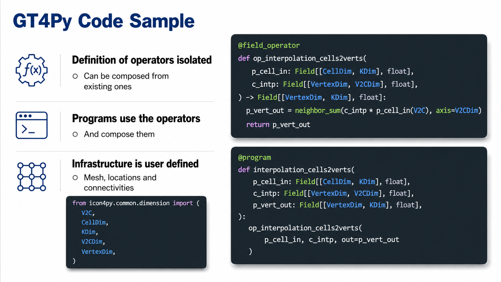
Theme-consistent code styling, proper syntax display
Before
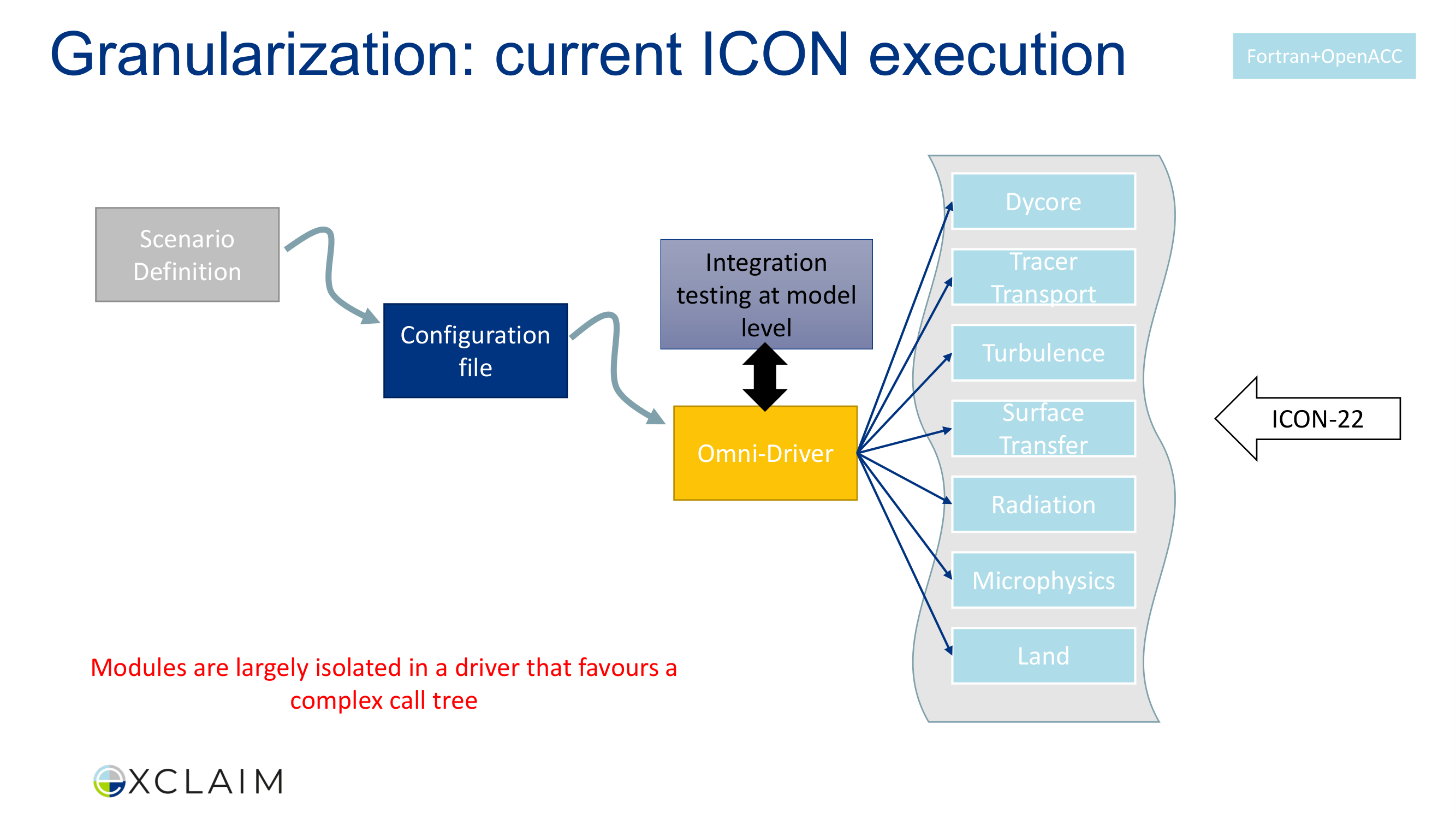
Mixed node colors, inconsistent label sizes
After
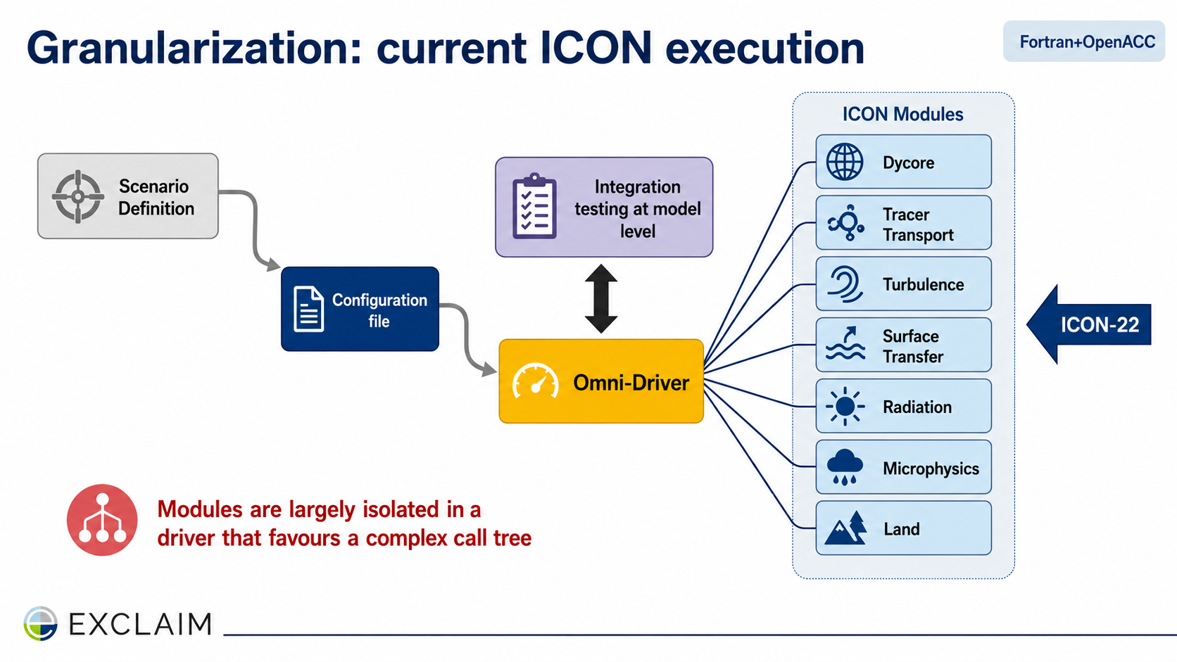
Consistent node styling, clear layer hierarchy
Before
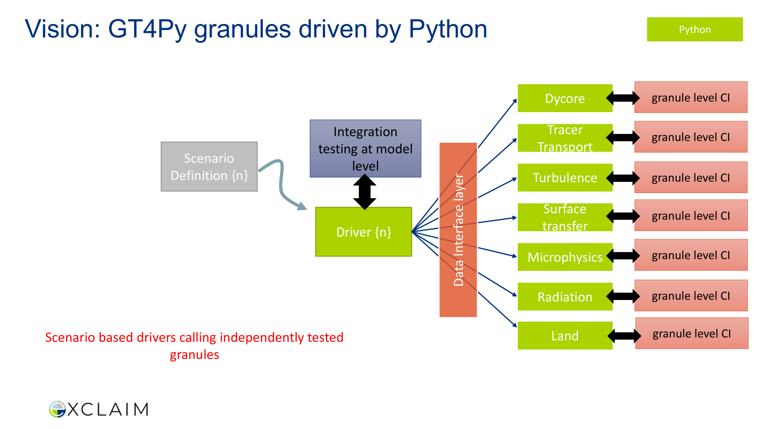
Green nodes, inconsistent badge and label typography
After
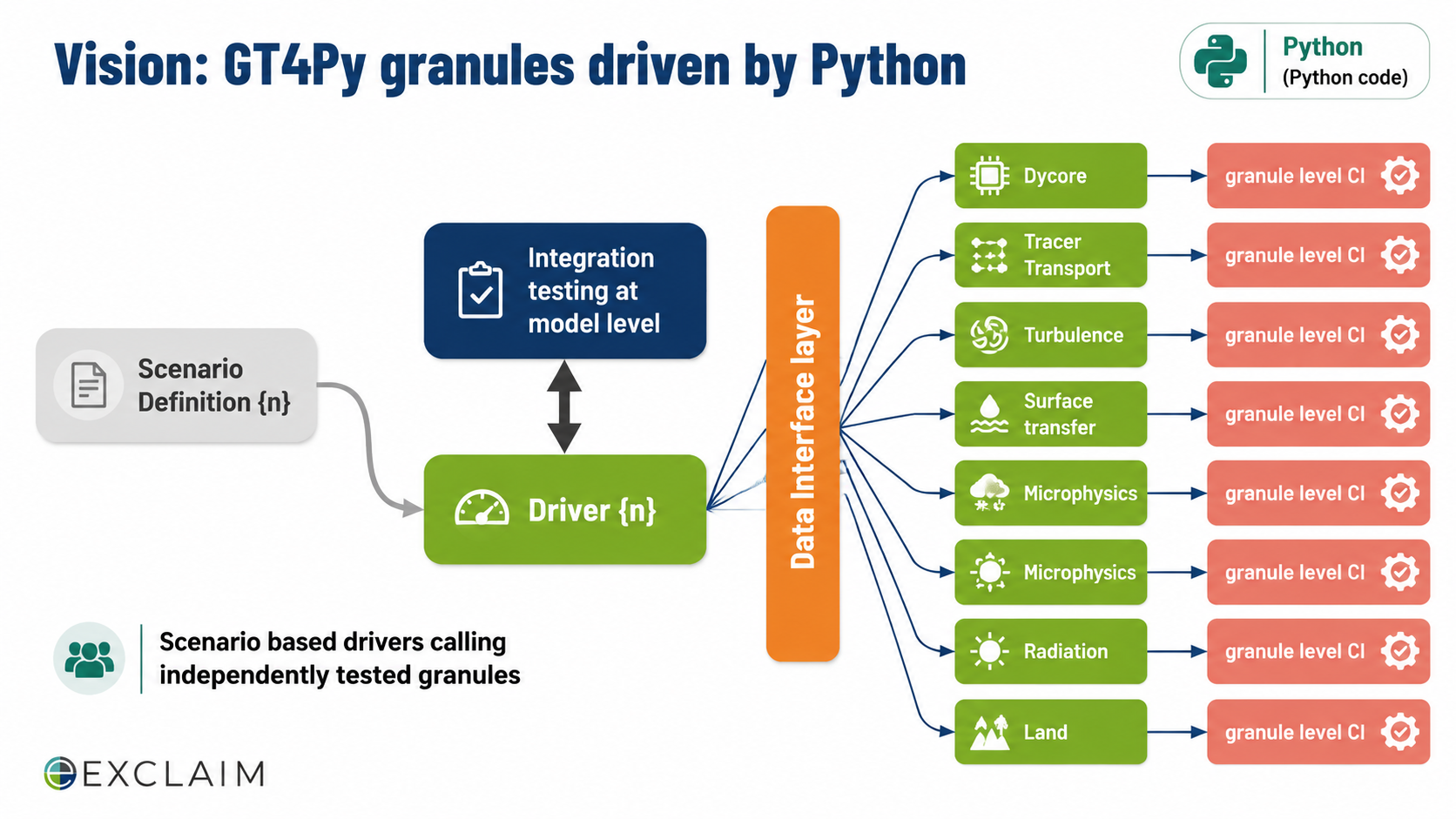
Consistent styling, clear Python vs Fortran distinction
Before
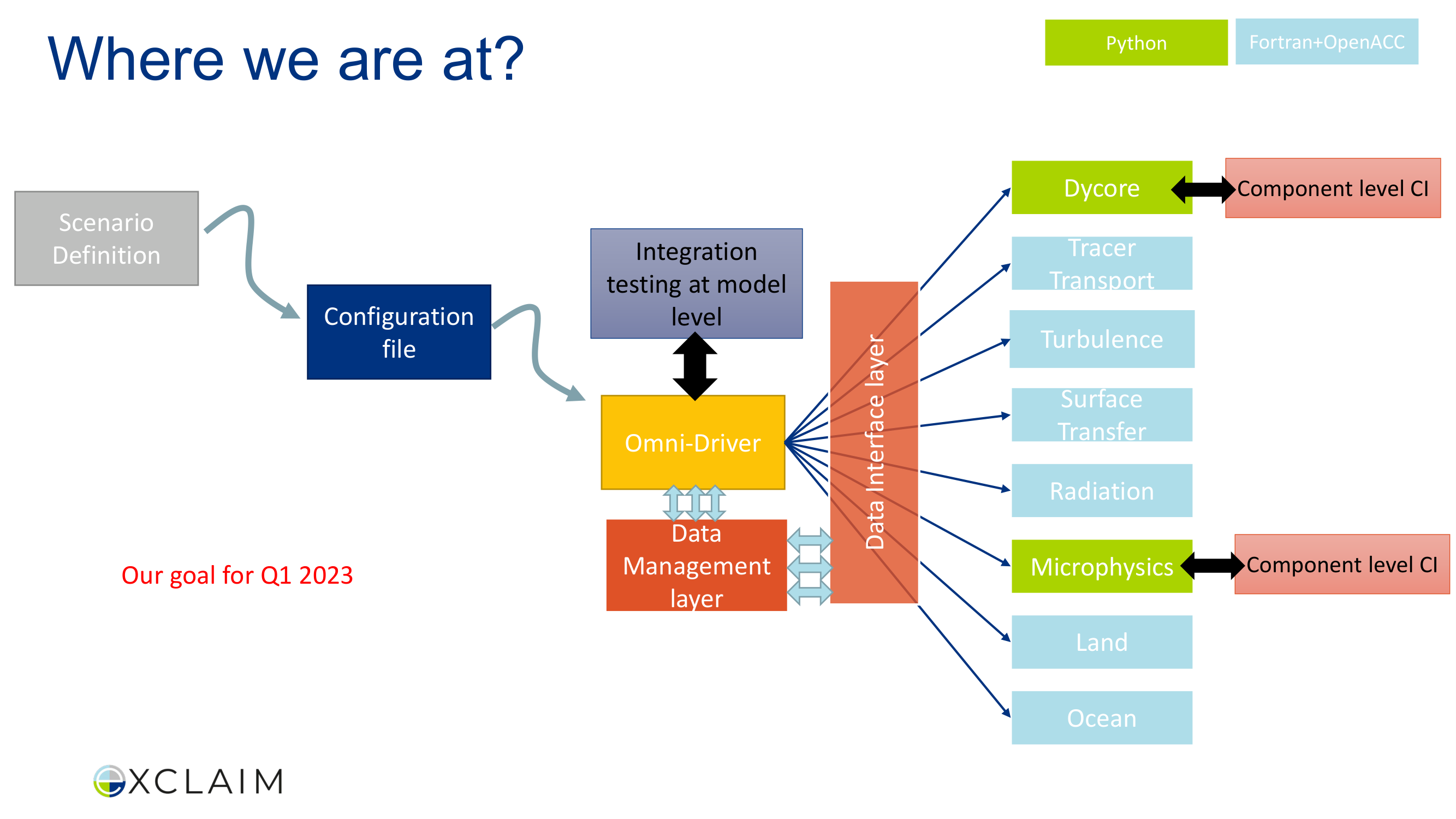
Mixed font sizes, competing annotations, cluttered
After
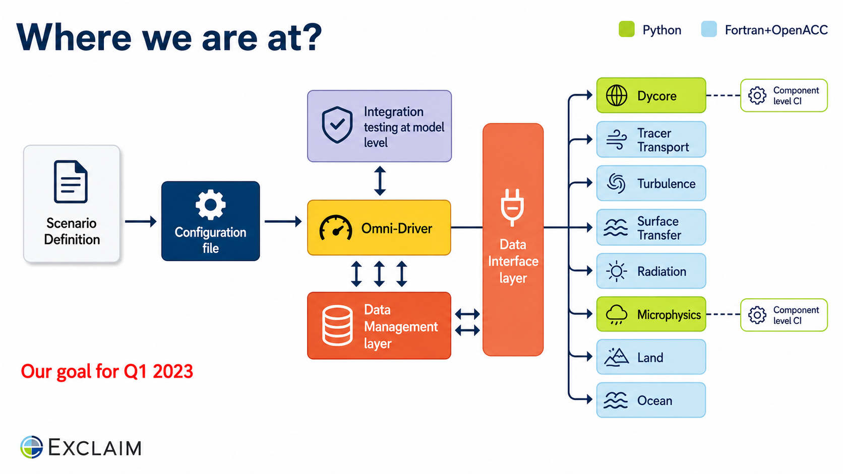
Clear progress visualization, organized annotations
Before

Standard bullet points, no visual weight, forgettable
After
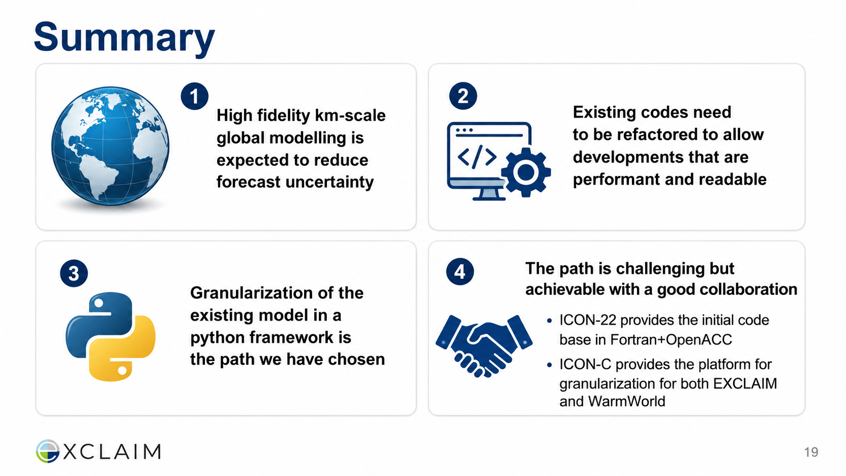
Numbered summary cards with icons, memorable takeaways
Before
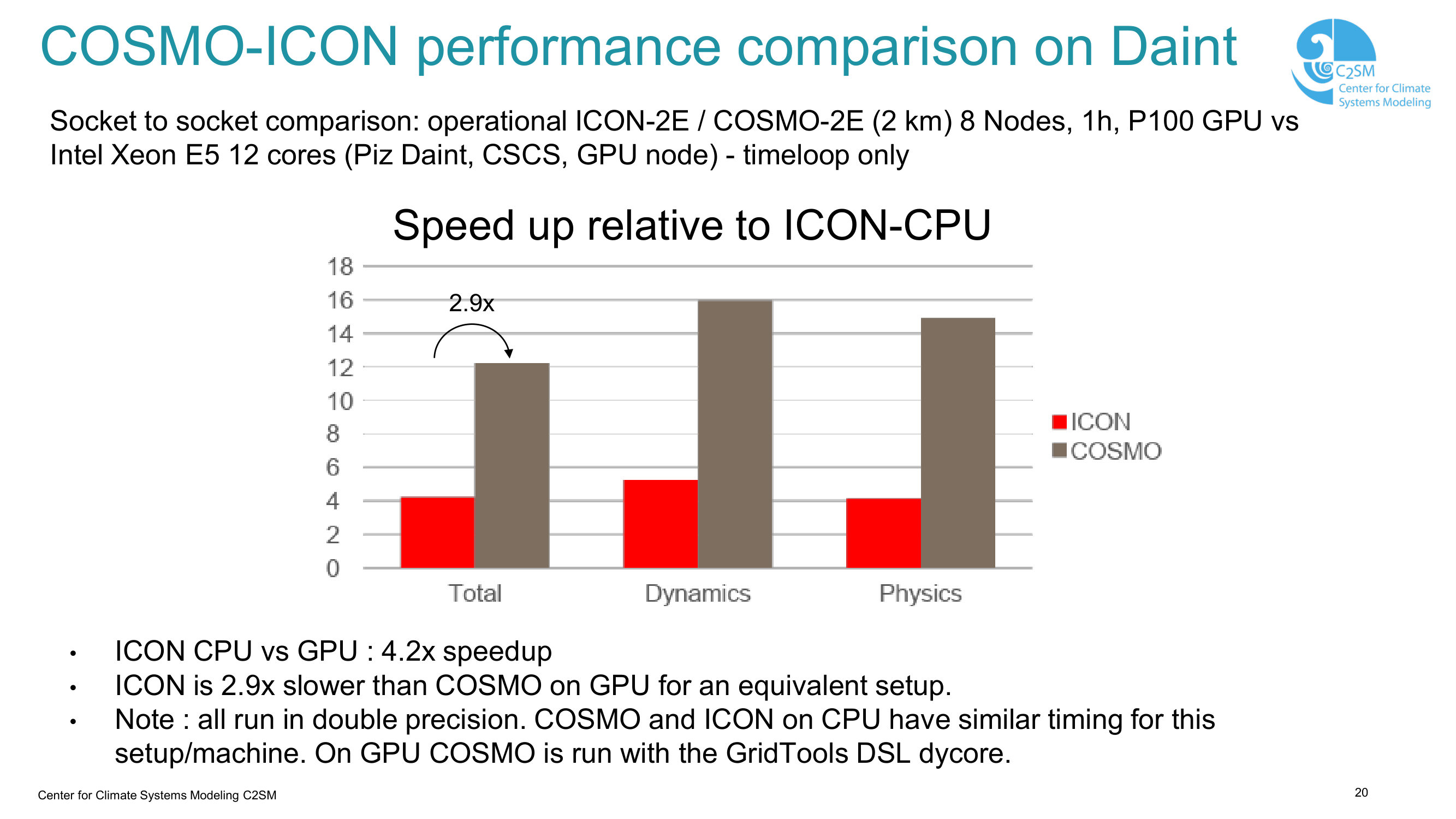
Basic chart, small axis labels, bullet notes below
After
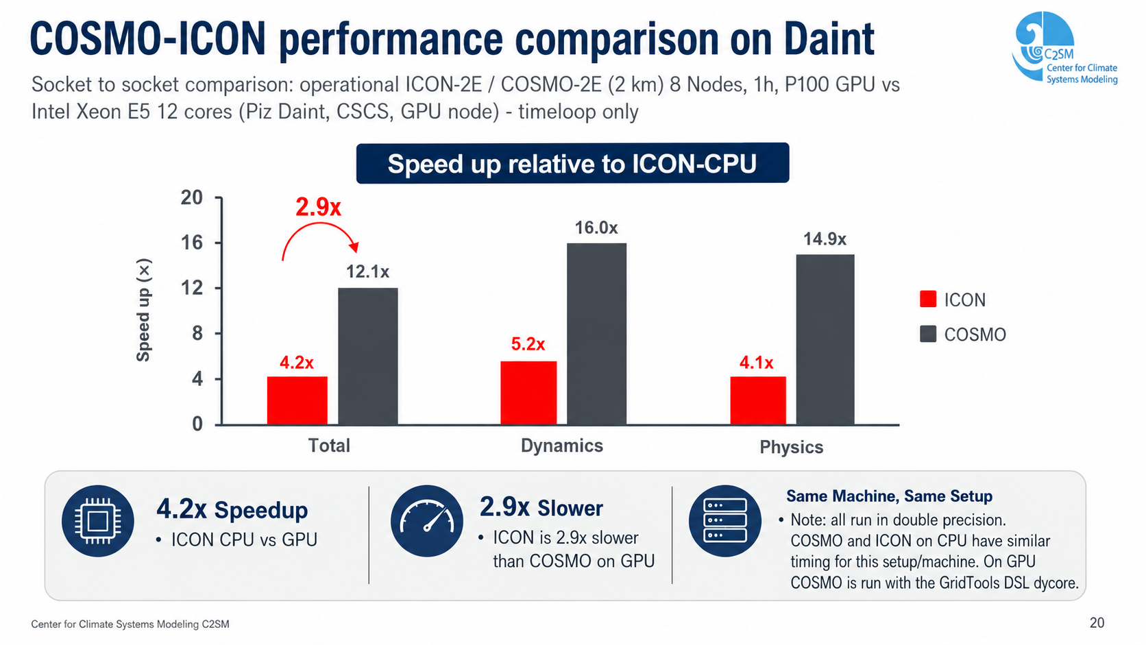
Refined chart typography, integrated performance notes