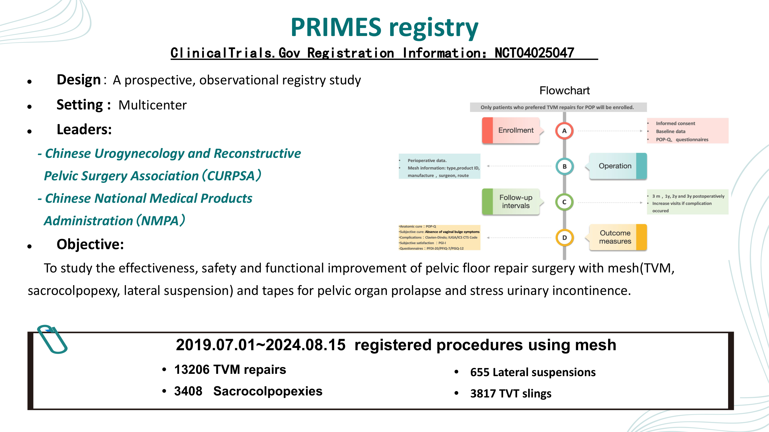
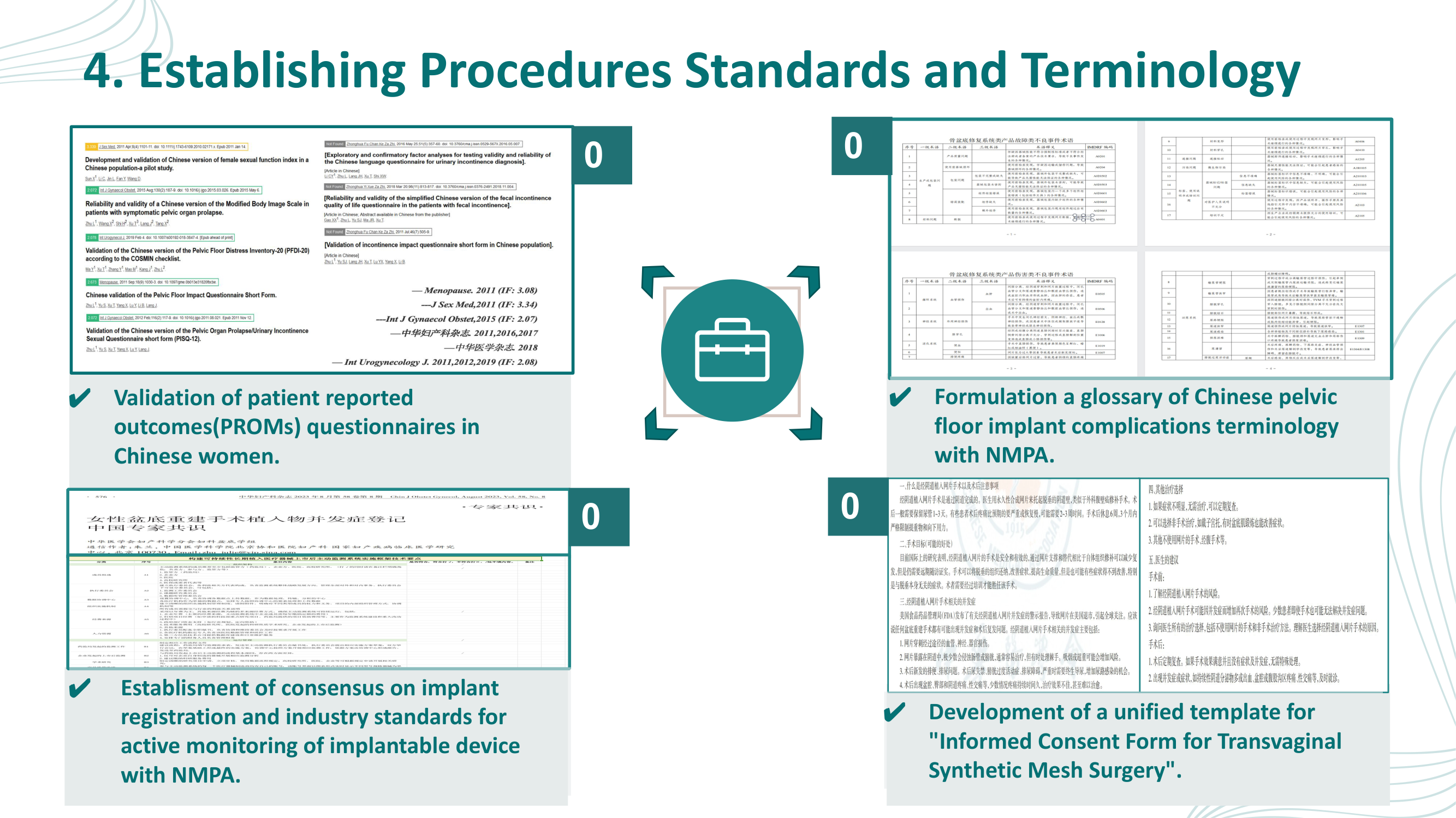
Medical Conference Design — Case Study

Medical Conference Aesthetic for Clinical Presentations — Before & After

A real 22-slide medical conference presentation from Peking Union Medical College Hospital — transformed with a professional teal/navy medical palette, structured data visualization, and healthcare iconography by Arty.

📄 22 slides transformed 🏥 Peking Union Medical College Hospital — PRIMES National Registry 🤖 Style: Medical Conference

Why This Deck Needs a Redesign

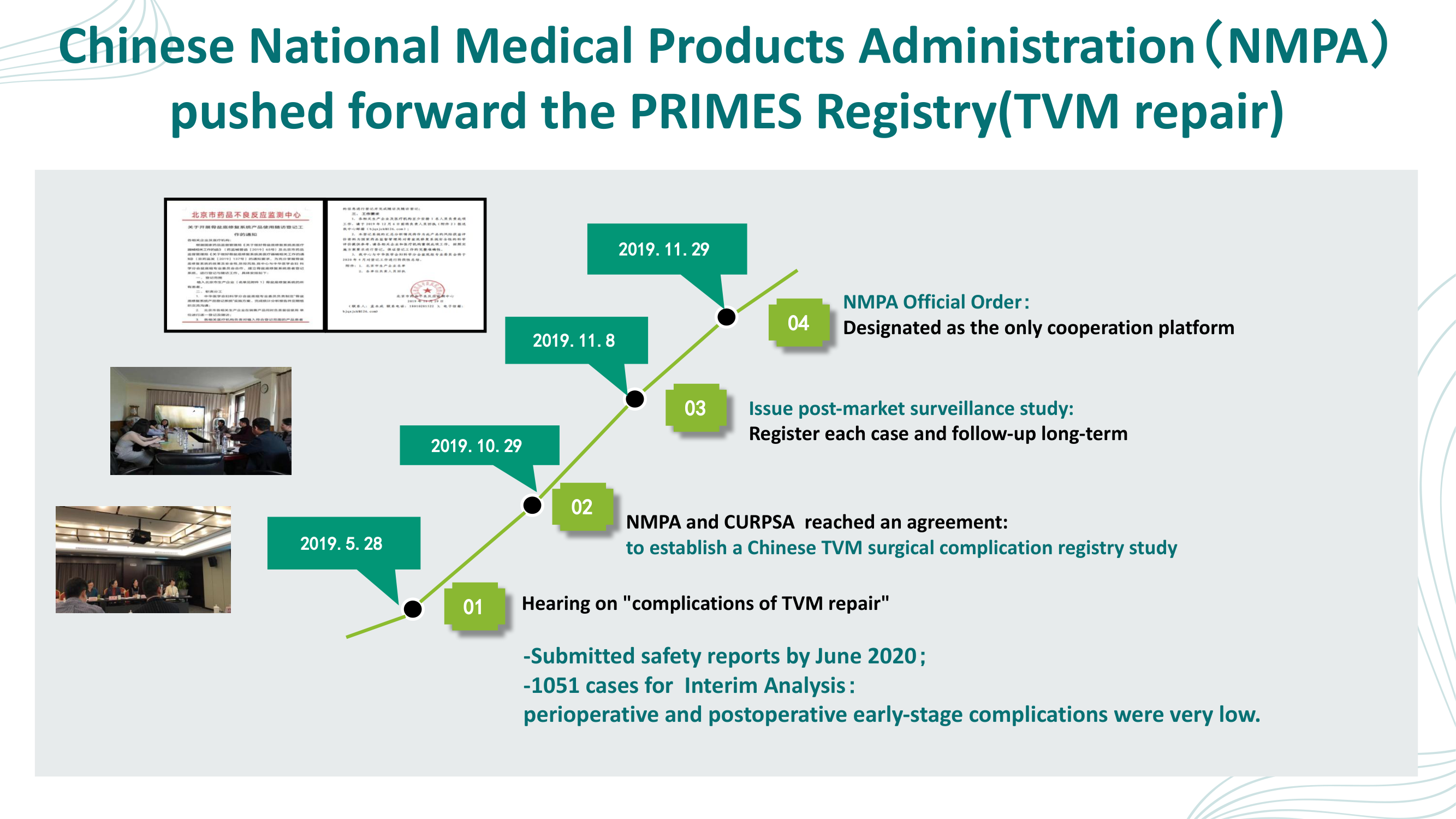
This presentation by Dr. Lan Zhu from Peking Union Medical College Hospital covers the PRIMES Registry — a national registry database for urogynecologic surgical mesh implants, focusing on full cycle safety and quality management. The clinical content is rigorous, but the original slides fall short of the professional standard expected at medical conferences:

Arty's redesign applies a consistent teal/navy medical color palette, professional healthcare iconography, structured card-based layouts, and clear data visualization — all aligned with the visual expectations of medical professionals and conference audiences. The result is a clean, authoritative, and evidence-focused presentation.

Original presentation by Dr. Lan Zhu, Peking Union Medical College Hospital (Beijing, China). "Full Cycle Safety and Quality Management Model Based on National Registry Database" — PRIMES Registry for Urogynecologic Surgical Mesh Implants.
1

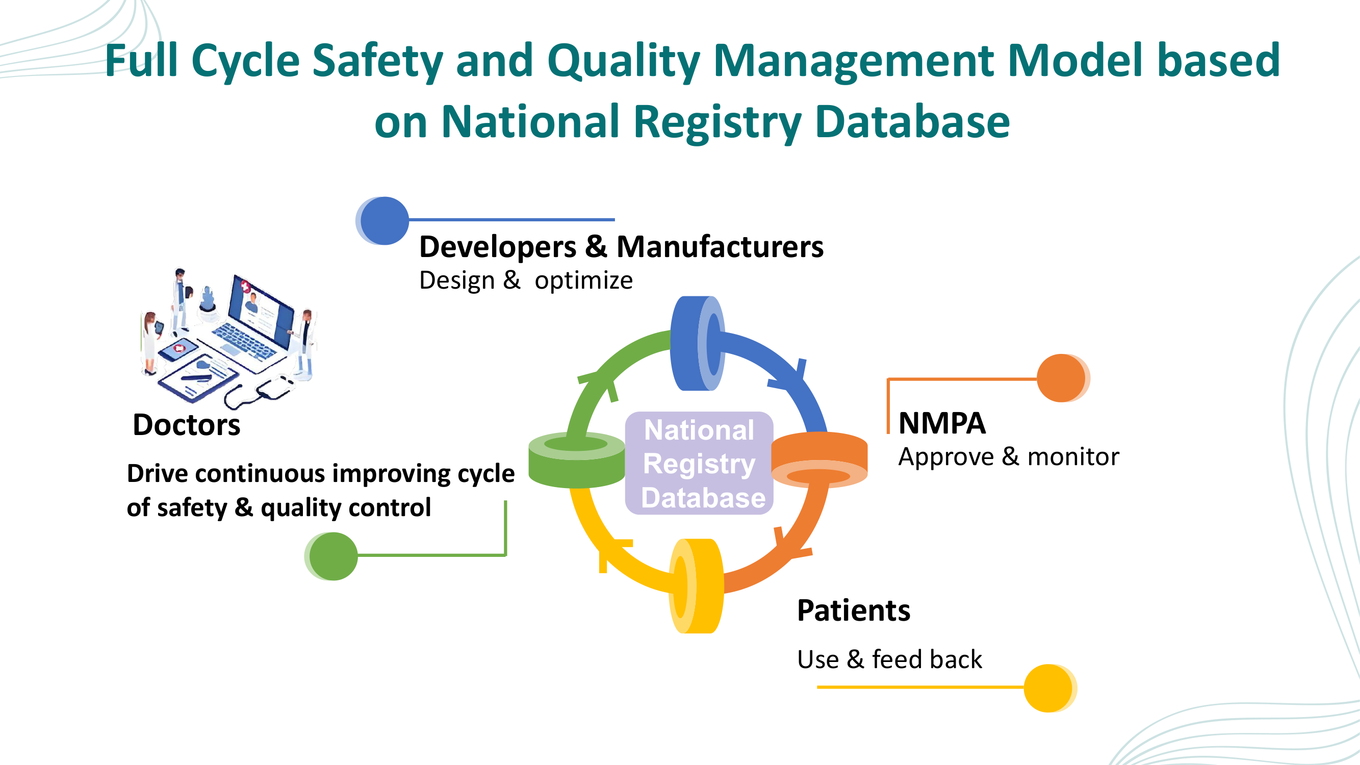
Title — Full Cycle Safety and Quality Management Model

Plain white background with hospital logos and faded illustration. The redesign introduces a professional circular quality management lifecycle diagram with medical icons and DNA helix decoration.

Before
Before: Original slide 1 — plain white title slide with hospital logos
Plain white background, hospital logos, bullet-point author info, faded hospital illustration
After
After: Redesigned slide 1 with professional quality management lifecycle diagram
Professional layout with circular lifecycle diagram (Patient Care → Data Collection → Registry → Analysis → Improvement), medical icons, DNA helix
2

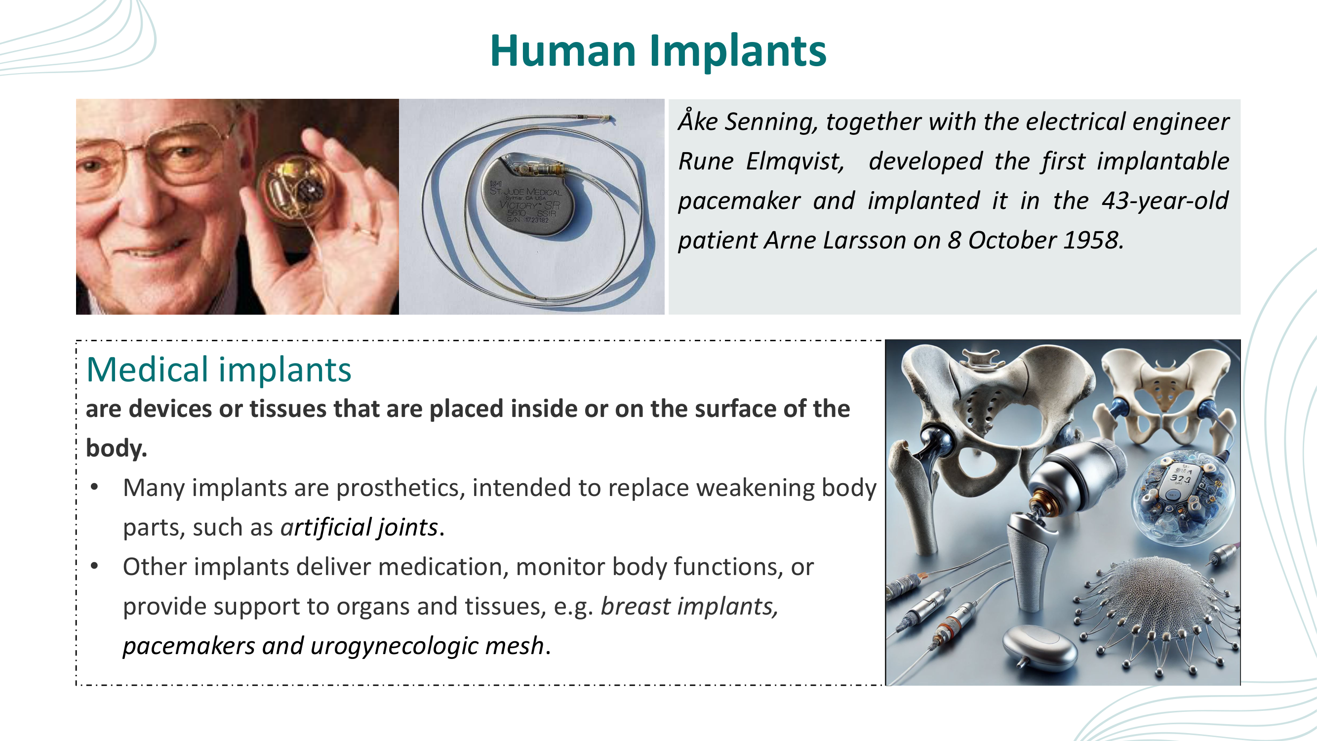
Human Implants — History and Types

Scattered photos of old pacemaker inventor and device renders in a cramped layout. The redesign features a full-height transparent anatomical figure with organized Type 1/Type 2 implant cards and a Historical Note callout.

Before
Before: Original slide 2 — scattered medical implant photos
Scattered photos of pacemaker inventor, device photos, 3D joint renders, cramped text layout
After
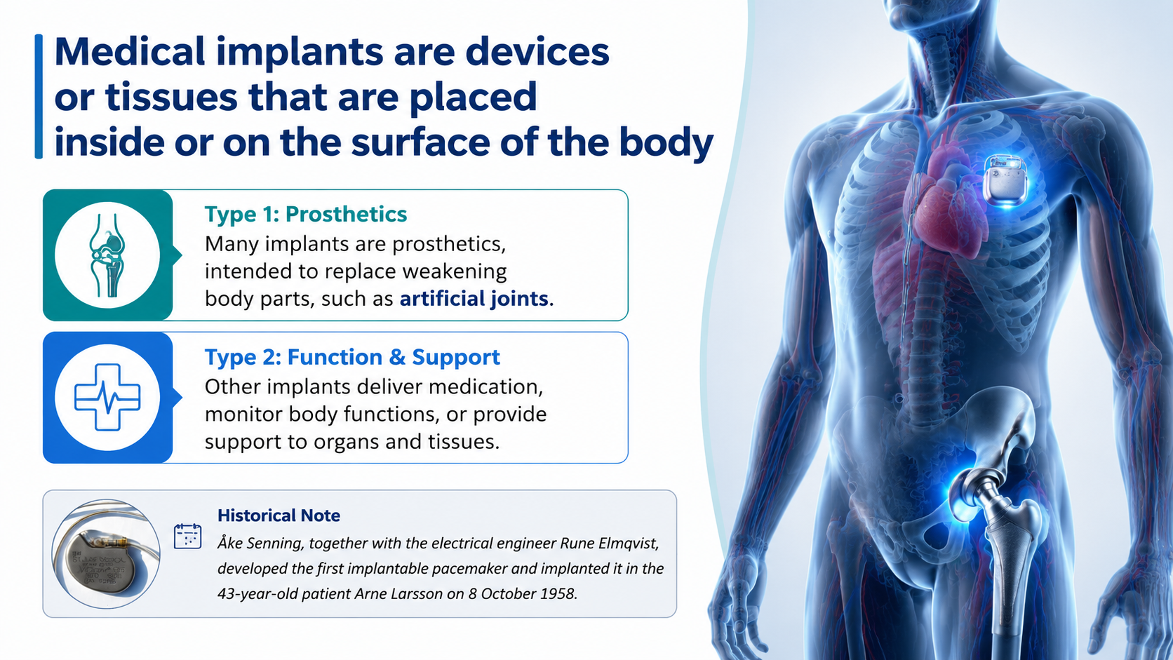
After: Redesigned slide 2 with anatomical figure and organized implant type cards
Full-height anatomical figure showing implant locations, organized Prosthetics / Function & Support cards with icons
3

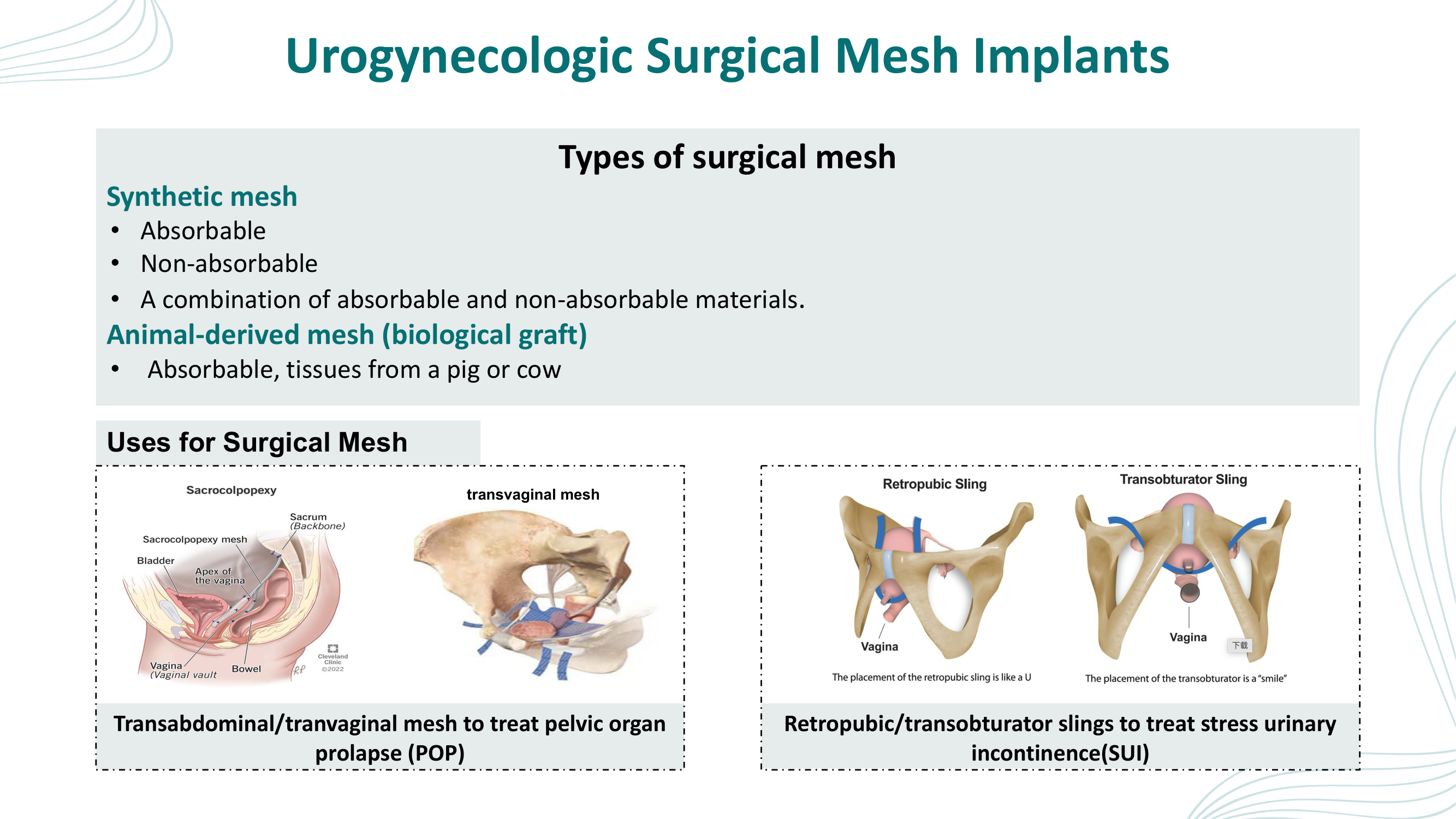
Urogynecologic Surgical Mesh Implants — Types and Uses

Grey boxes with mixed anatomical diagrams from inconsistent sources. The redesign applies a clean medical aesthetic with consistent anatomical illustrations throughout.

Before
Before: Original slide 3 — grey boxes with inconsistent anatomical diagrams
Grey boxes with mixed anatomical diagrams from different sources, inconsistent illustration styles
After
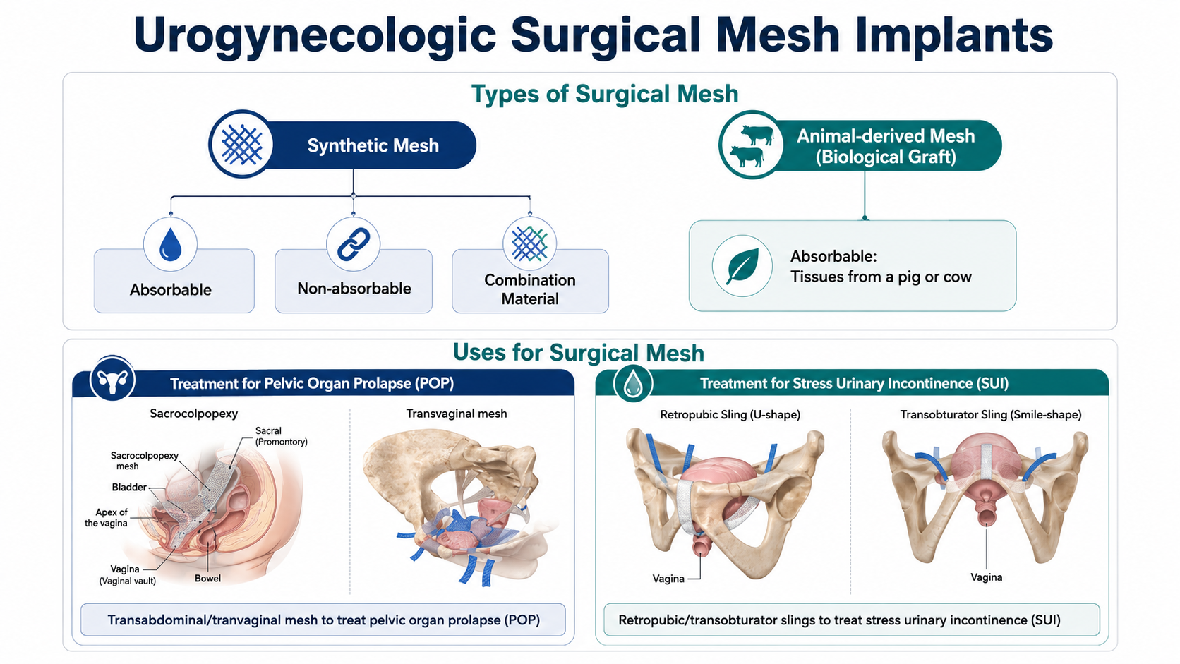
After: Redesigned slide 3 with consistent medical illustrations
Clean medical aesthetic with consistent anatomical illustrations and professional layout
4

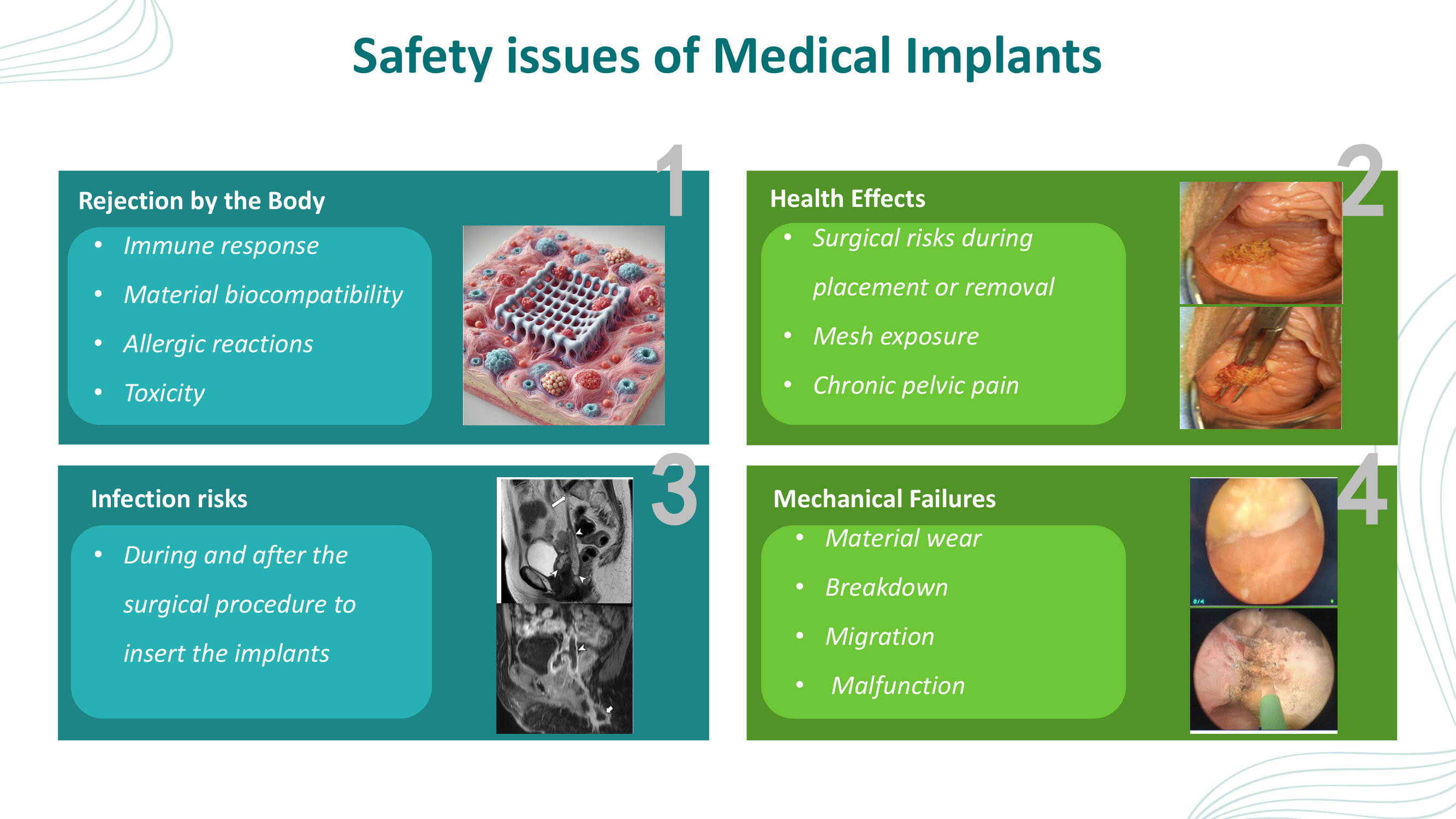
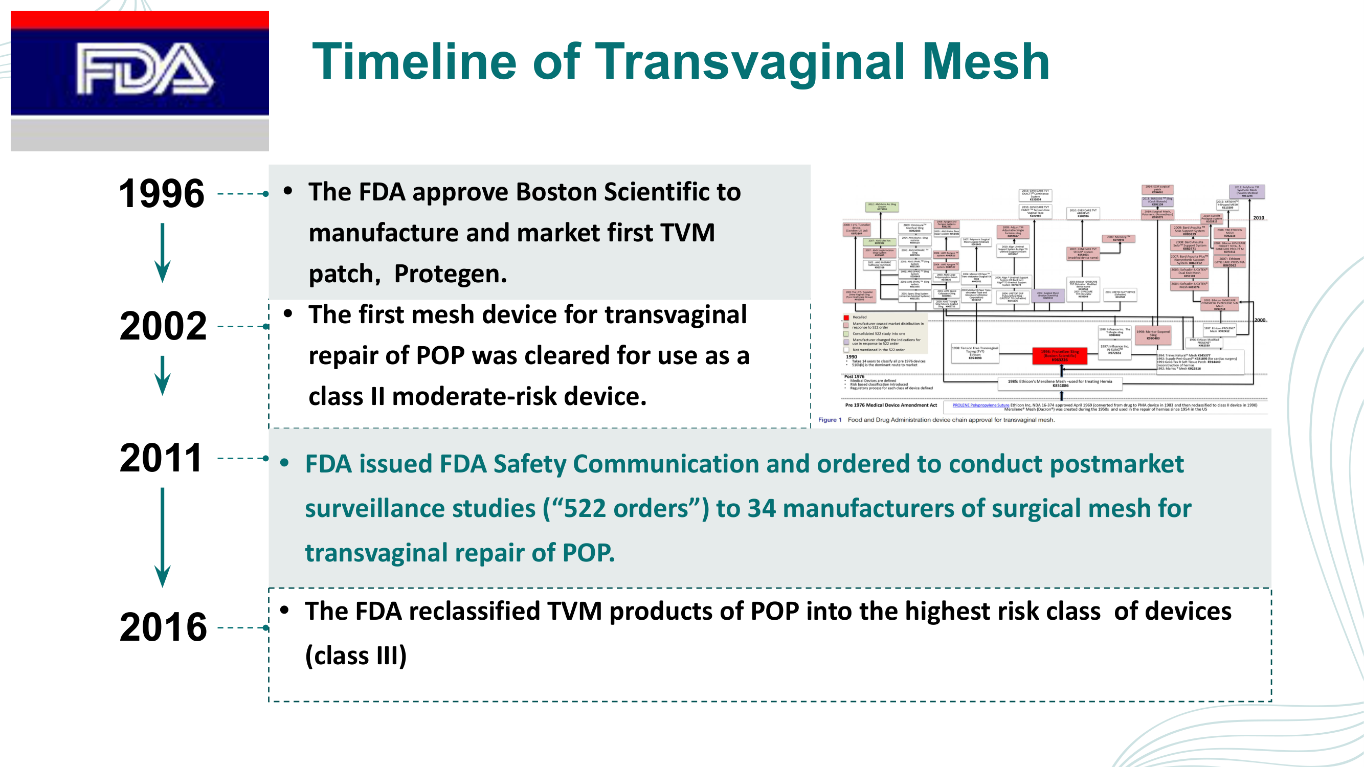
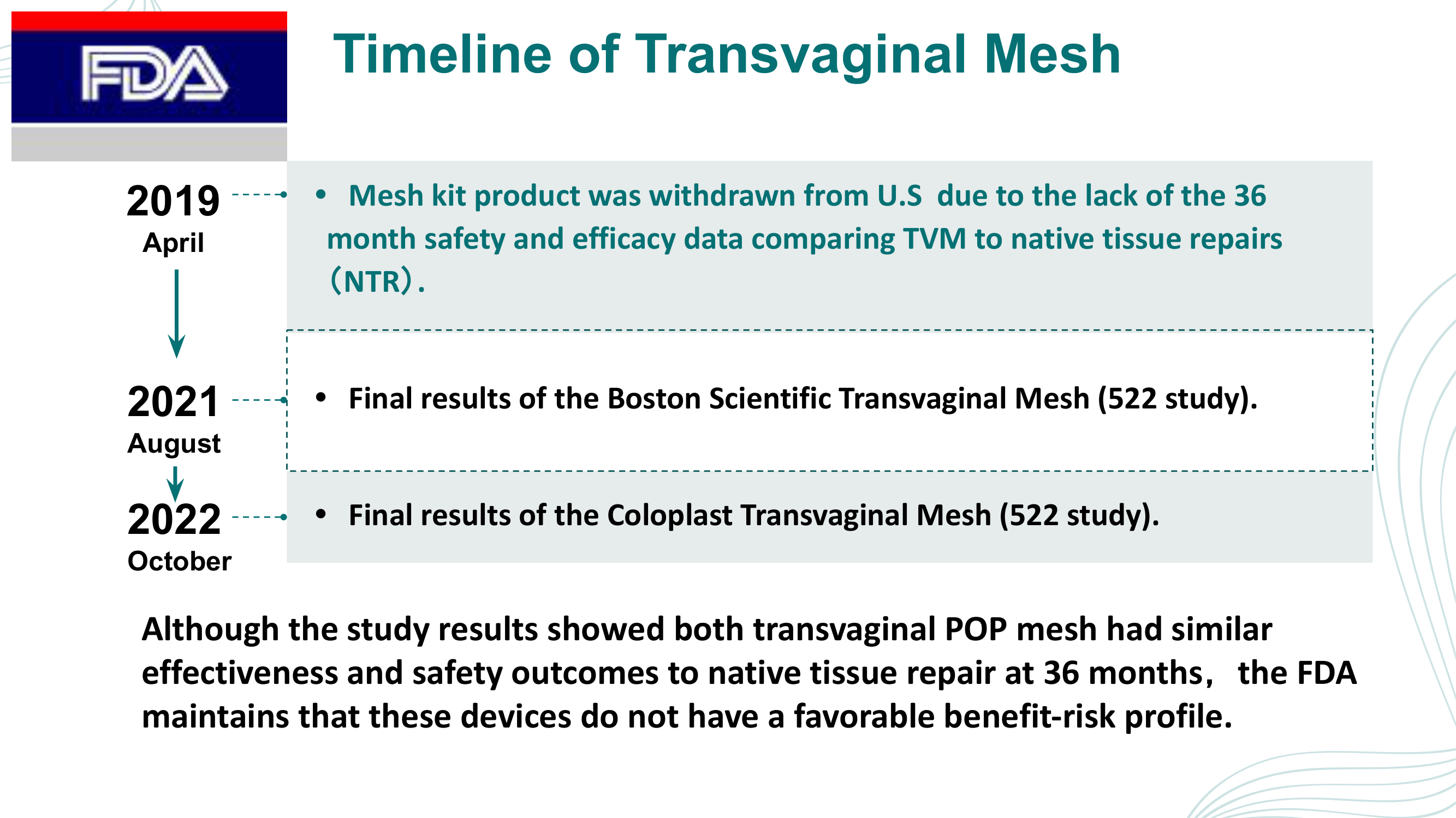
Safety Issues Background — FDA Timeline

Text-heavy slide with a scattered timeline of FDA actions. The redesign presents a professional timeline with consistent medical iconography and clear chronological flow.

Before
Before: Original slide 4 — text-heavy FDA action timeline
Text-heavy with scattered timeline of FDA actions, no visual hierarchy
After
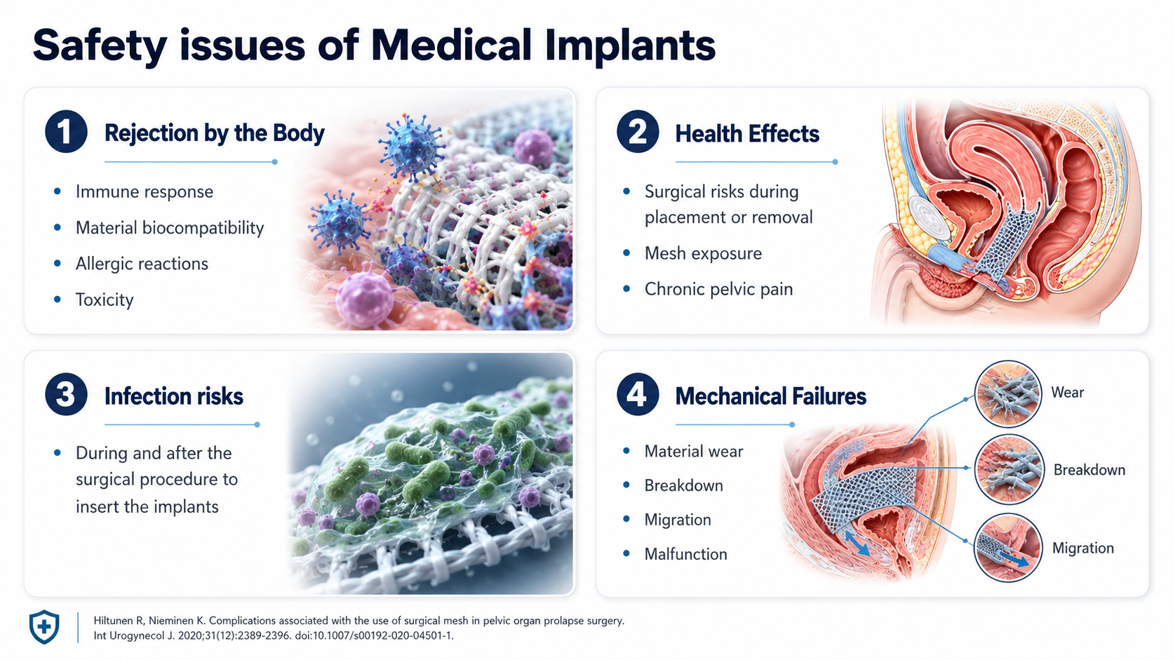
After: Redesigned slide 4 with professional FDA timeline
Professional timeline with consistent medical iconography and clear chronological flow
5

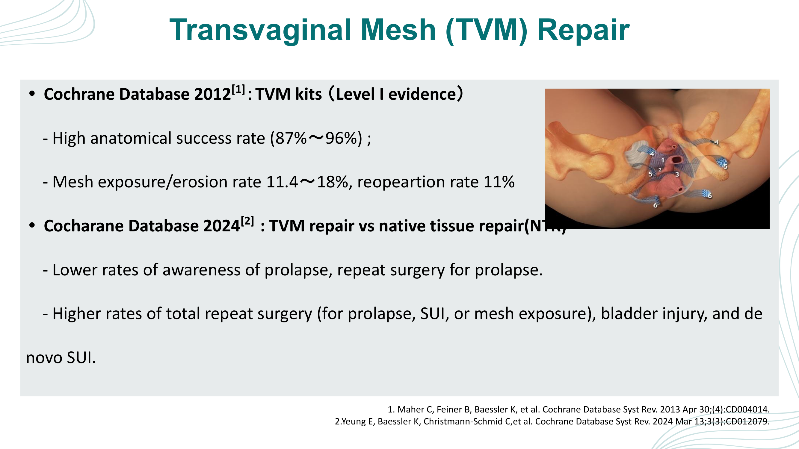
Transvaginal Mesh Repair — Cochrane Database Evidence

Bullet points with small clinical photo and plain text statistics. The redesign visualizes data with colored progress bars (87%-96% success rate), up/down arrow indicators for Cochrane 2024 comparison, and labeled clinical imagery.

Before
Before: Original slide 5 — bullet point statistics and small clinical photo
Bullet points with small clinical photo, plain text statistics buried in paragraphs
After
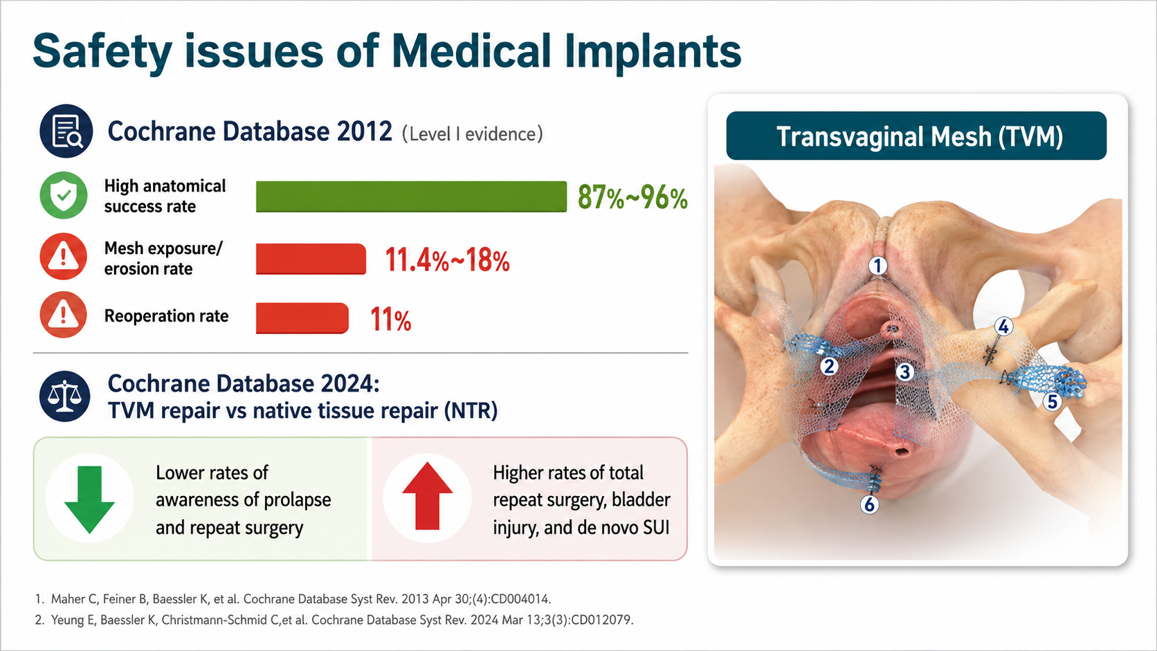
After: Redesigned slide 5 with data visualization progress bars and clinical evidence
Colored progress bars (87%-96% success, 11.4%-18% exposure, 11% reoperation), Cochrane comparison arrows, labeled clinical photo
6

Pelvic Floor Surgery Registry Context

Text about FDA actions and regulatory bans in paragraph form. The redesign structures the content with a professional medical layout and clear regulatory context cards.

Before
Before: Original slide 6 — text about FDA actions and bans
Dense text about FDA actions and bans, no visual structure
After
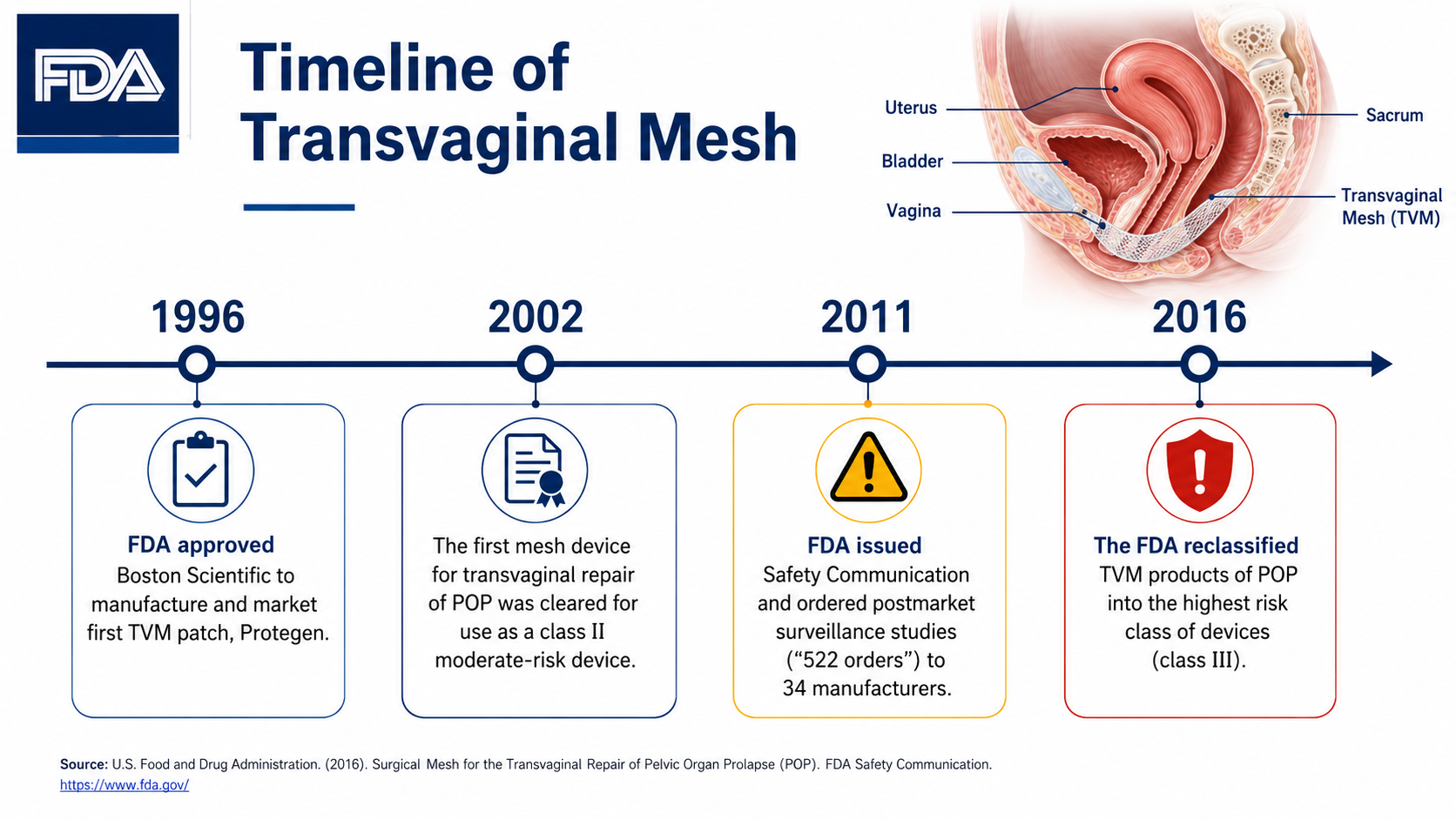
After: Redesigned slide 6 with structured regulatory context layout
Structured layout with professional medical design and clear regulatory context
7

China's Regulatory Background — NMPA Regulations

Dense text about NMPA regulations with no visual aids. The redesign presents clean cards with medical regulatory iconography and organized policy highlights.

Before
Before: Original slide 7 — dense NMPA regulation text
Dense text about NMPA regulations, no visual hierarchy or iconography
After
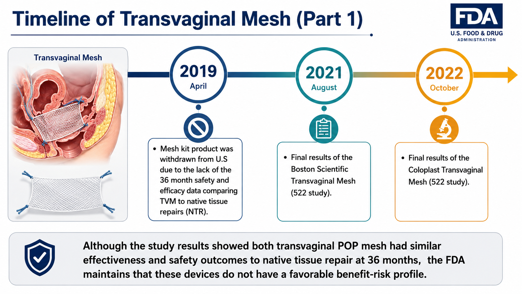
After: Redesigned slide 7 with clean regulatory cards and medical iconography
Clean cards with medical regulatory iconography and organized policy highlights
8

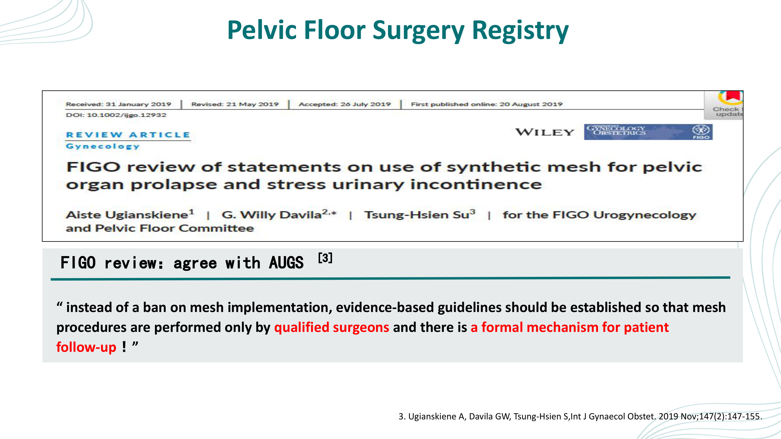
Pelvic Floor Surgery Registry — FIGO Review

Embedded journal article screenshot with quote text. The redesign replaces the screenshot with a professional quote layout, anatomical illustration of pelvic floor mesh sling placement, and effectiveness callouts.

Before
Before: Original slide 8 — embedded journal article screenshot
Embedded journal article screenshot and quote text, looks hastily assembled
After
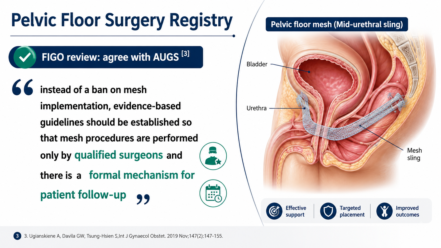
After: Redesigned slide 8 with professional quote layout and anatomical illustration
Professional quote layout with labeled anatomical illustration (Bladder, Urethra, Mesh sling), effectiveness callouts
9

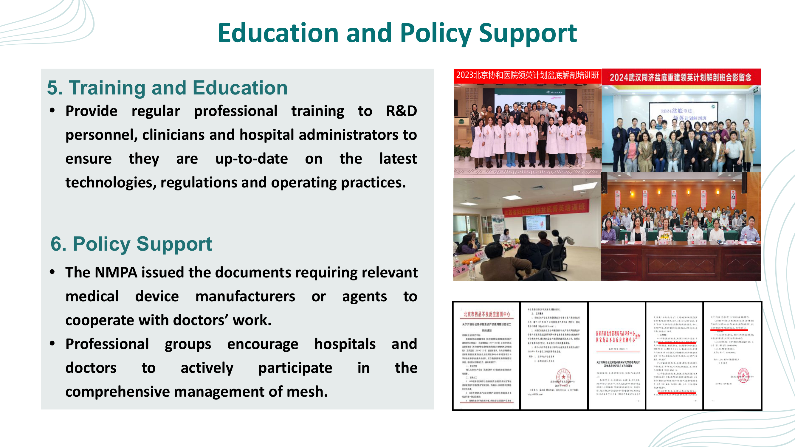
Surgeon Training Requirements

Text with training photos in an unstructured layout. The redesign presents a professional medical education layout with structured training pathway visualization.

Before
Before: Original slide 9 — unstructured text and training photos
Text with training photos, unstructured and visually inconsistent
After
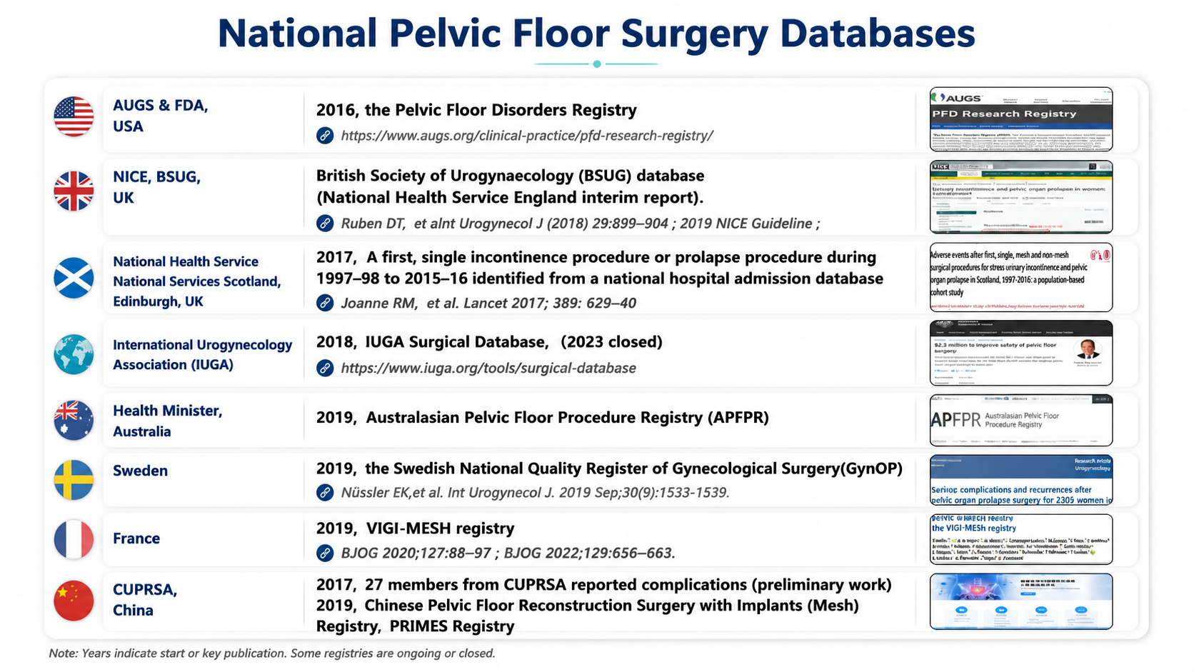
After: Redesigned slide 9 with professional medical education layout
Professional medical education layout with structured training pathway and clean iconography
10

Quality Management Model Overview

Simple diagram and text describing the quality management model. The redesign transforms it into a structured infographic with clear process flow and professional medical styling.

Before
Before: Original slide 10 — simple quality management diagram
Simple diagram and text, basic visual treatment of quality management model
After
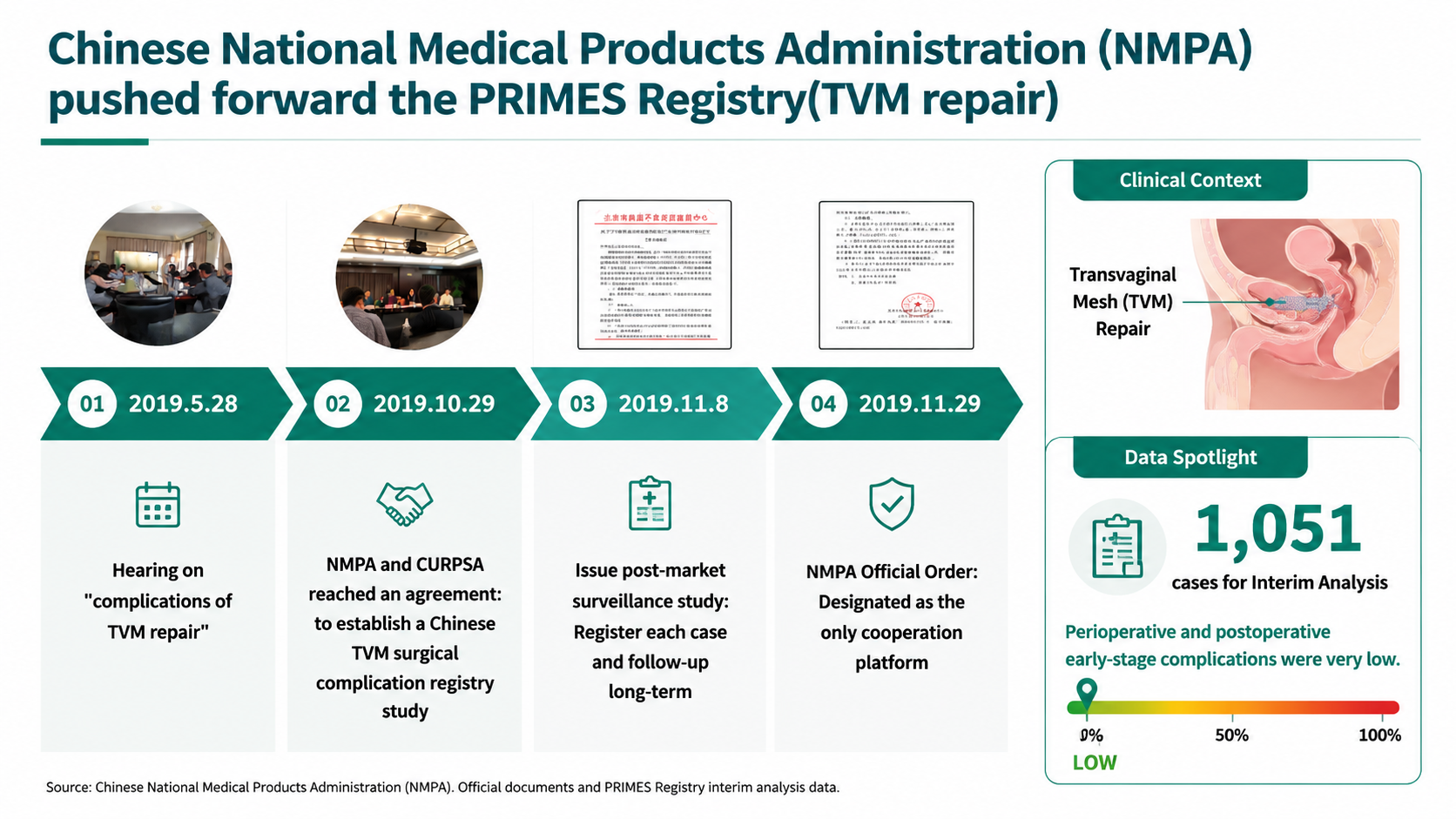
After: Redesigned slide 10 with structured infographic quality management model
Structured infographic with clear process flow and professional medical styling
11

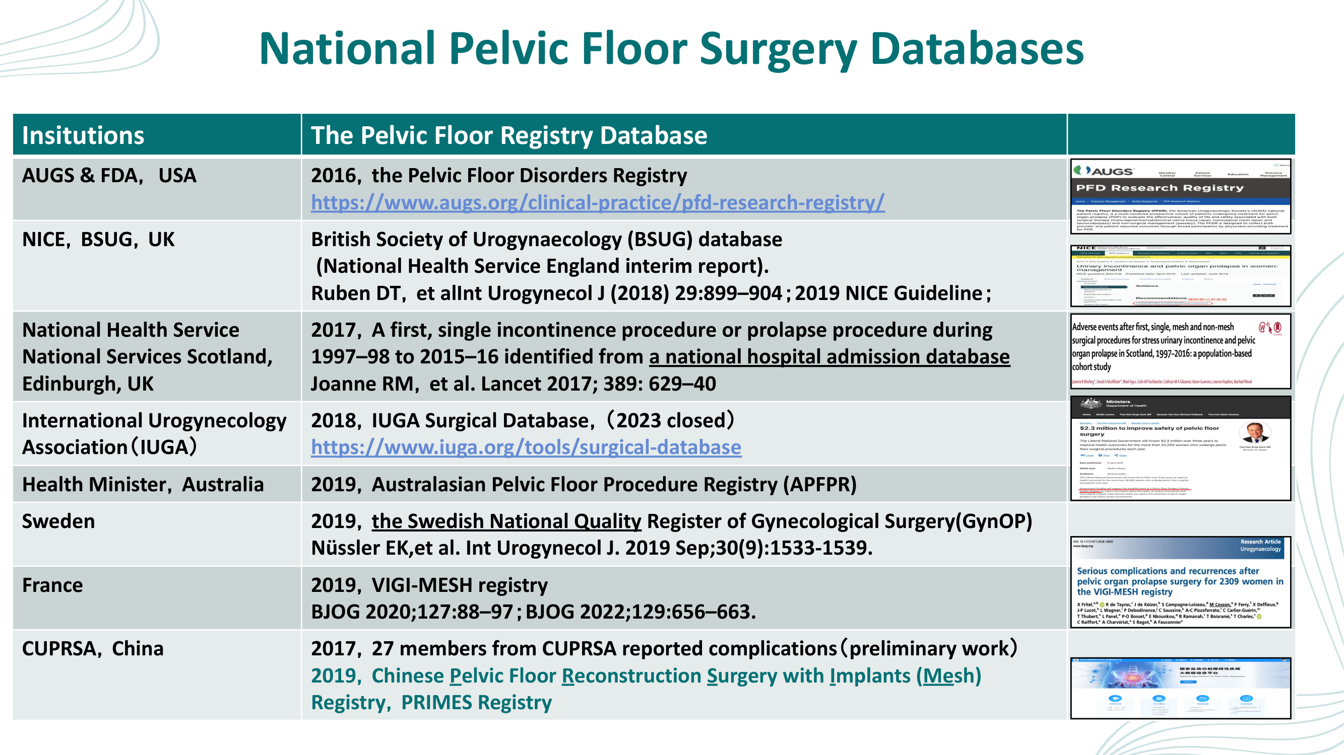
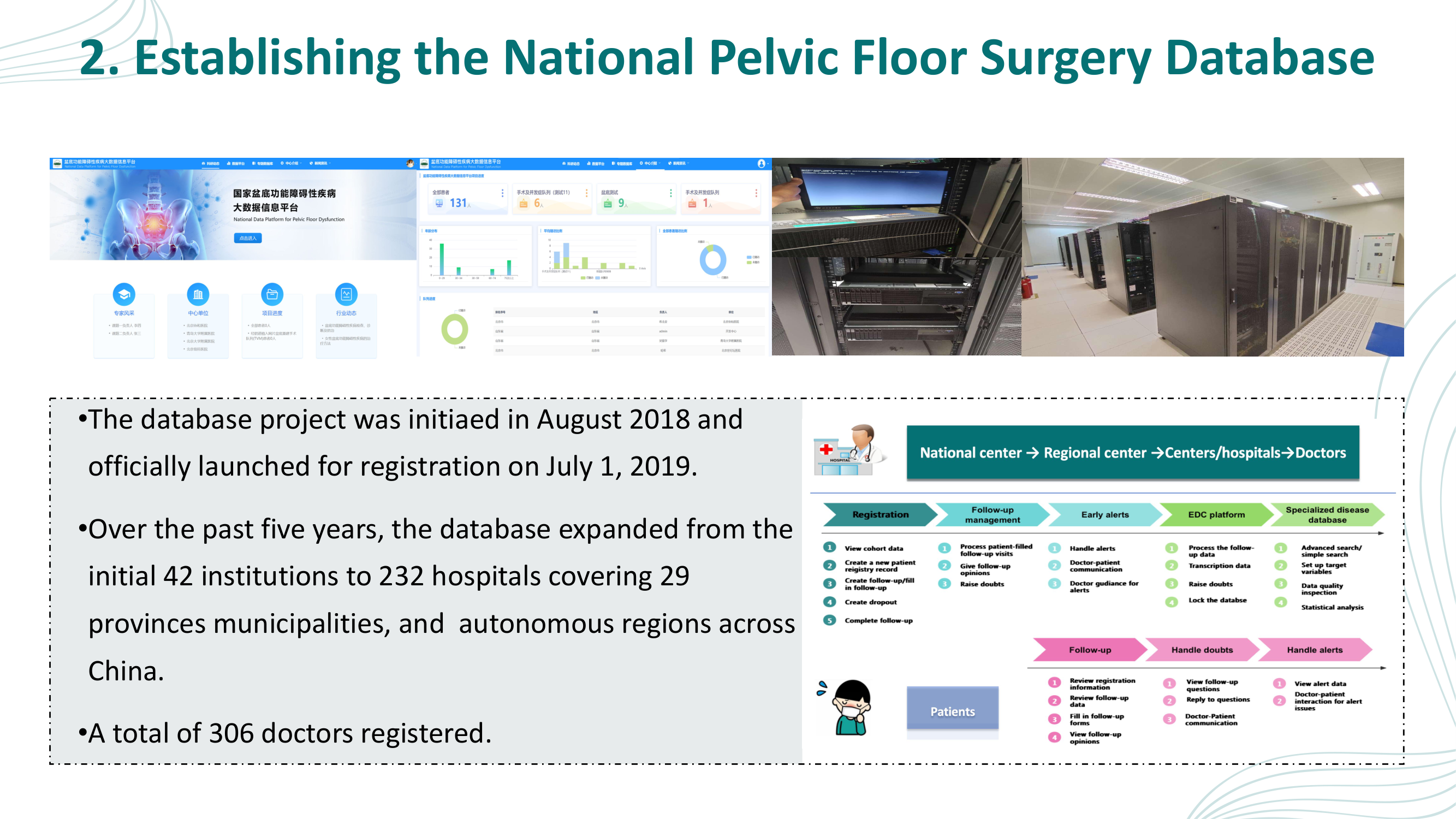
Database/Registry System Overview

Screenshots and text describing the registry system. The redesign replaces raw screenshots with a professional dashboard mockup style and clean data architecture visualization.

Before
Before: Original slide 11 — database screenshots and text
Raw database screenshots and text, unprofessional for conference setting
After
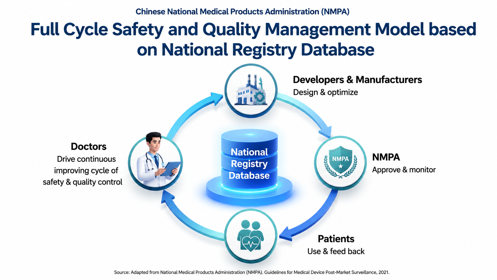
After: Redesigned slide 11 with professional dashboard mockup
Professional dashboard mockup style with clean data architecture visualization
12

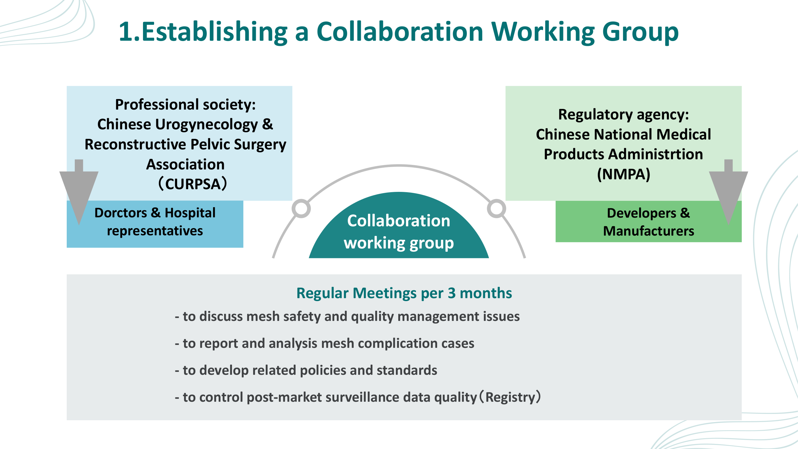
Establishing a Collaboration Working Group

Simple block diagram with bullet list of meeting topics. The redesign introduces a professional organizational chart with medical icons and a circular Quarterly Management Cycle diagram.

Before
Before: Original slide 12 — simple block diagram of collaboration group
Simple block diagram (Society ↔ Working group ↔ Agency), bullet list of meeting topics
After
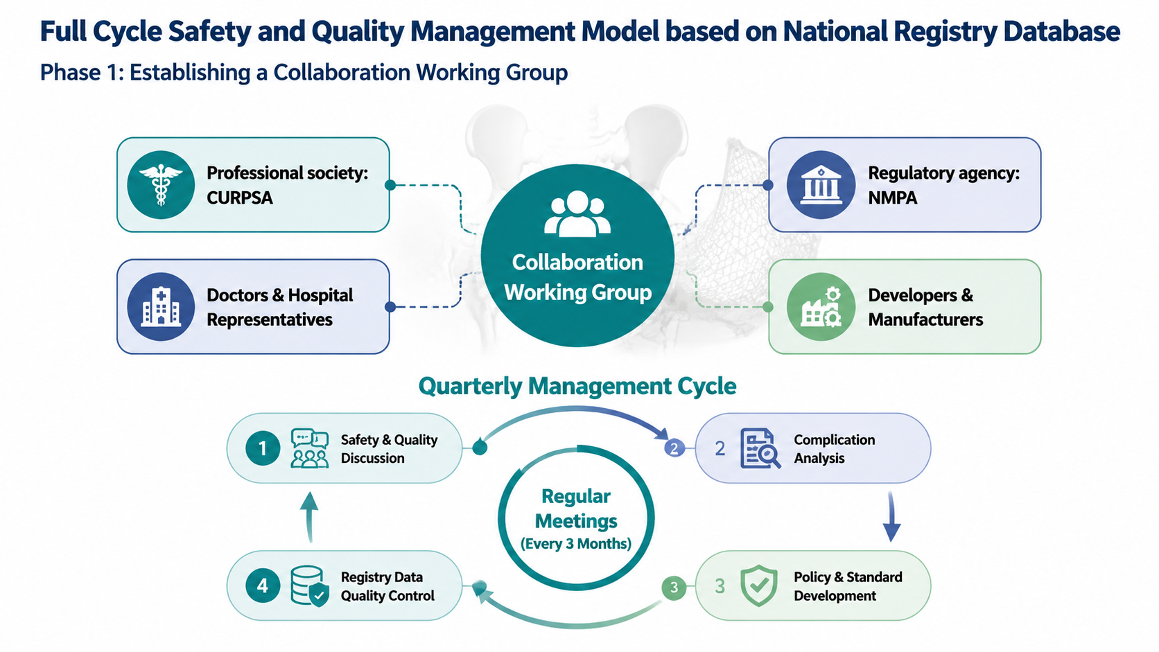
After: Redesigned slide 12 with professional org chart and quarterly cycle diagram
Professional organizational chart with medical icons (stethoscope, hospital, building), circular Quarterly Management Cycle
13

Standardized Surgical Procedures

Text and photos describing surgical standardization. The redesign presents a professional process flow with clean step-by-step visualization and consistent medical imagery.

Before
Before: Original slide 13 — text and photos of surgical procedures
Mixed text and photos describing surgical procedures, no visual consistency
After
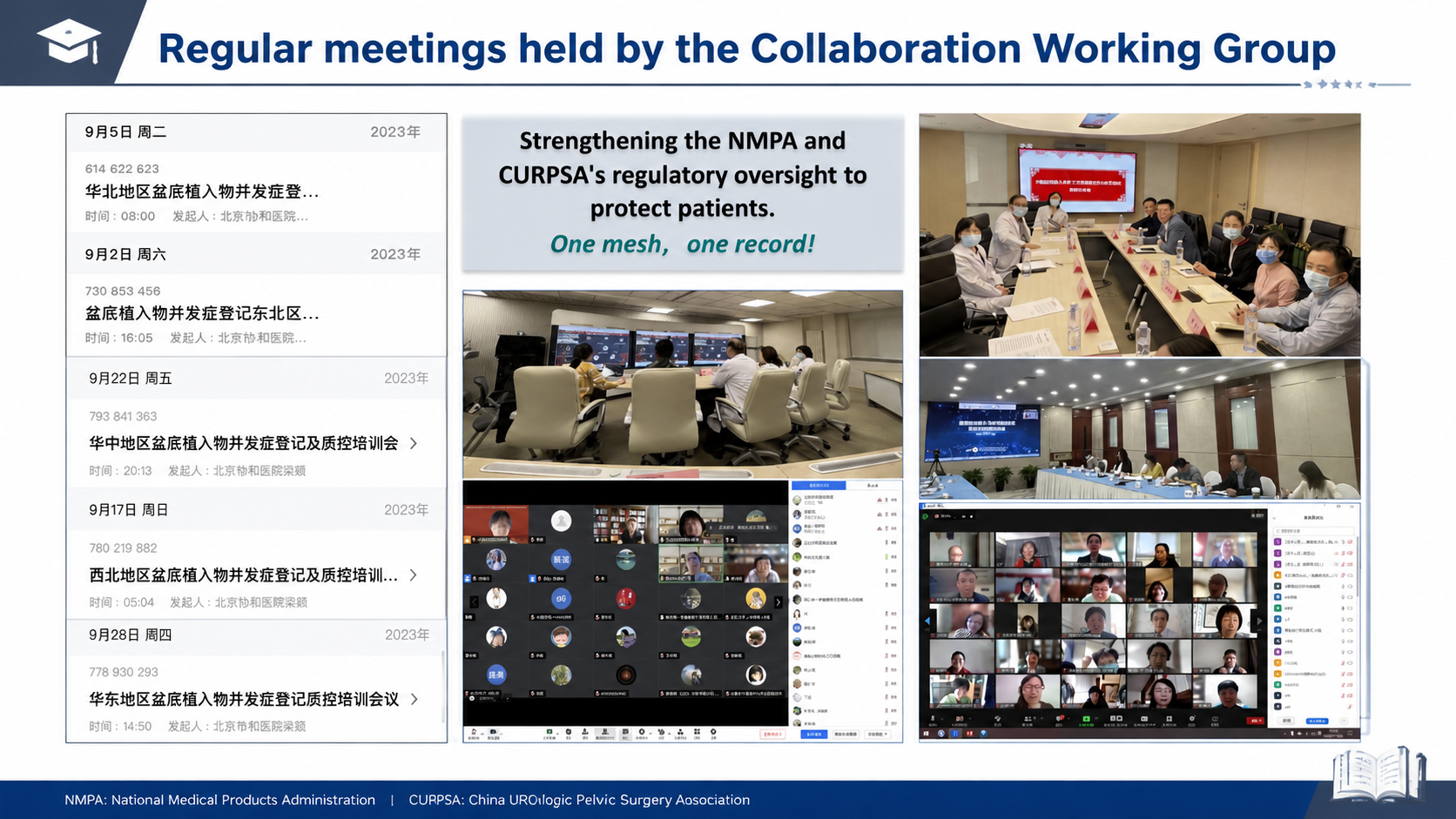
After: Redesigned slide 13 with professional surgical process flow
Professional process flow with step-by-step visualization and consistent medical imagery
14

Training Program Details

Mixed photos and text about the training program. The redesign creates a structured medical education layout with training modules, certification pathway, and clean photo integration.

Before
Before: Original slide 14 — mixed training photos and text
Mixed photos and text about training program, inconsistent layout
After
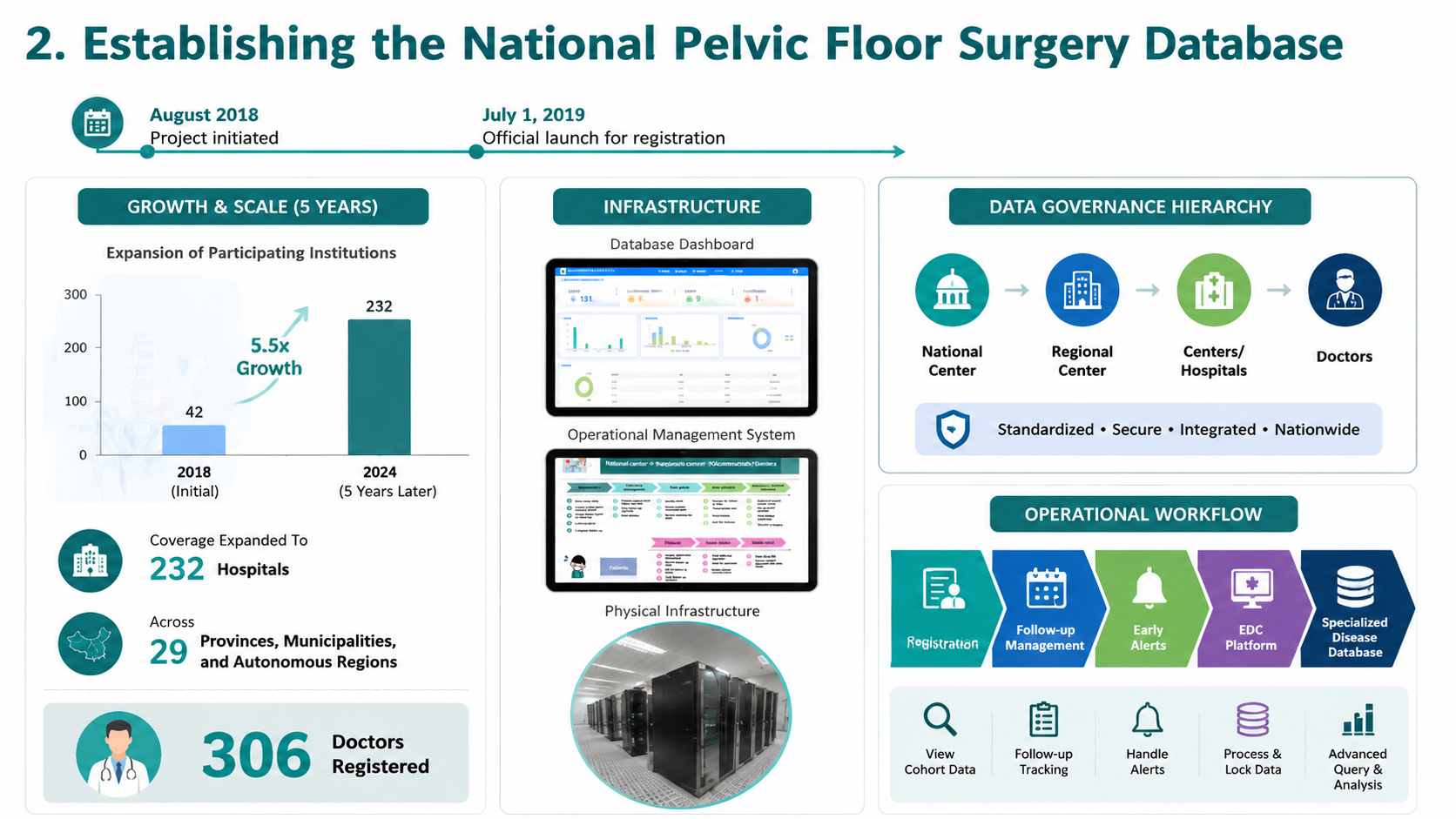
After: Redesigned slide 14 with structured medical education layout
Structured medical education layout with training modules and certification pathway
15

Registry Database Details

Raw database screenshots with minimal context. The redesign presents a professional data platform design with clean interface mockups and data flow visualization.

Before
Before: Original slide 15 — raw database screenshots
Raw database screenshots, unprofessional for conference presentation
After
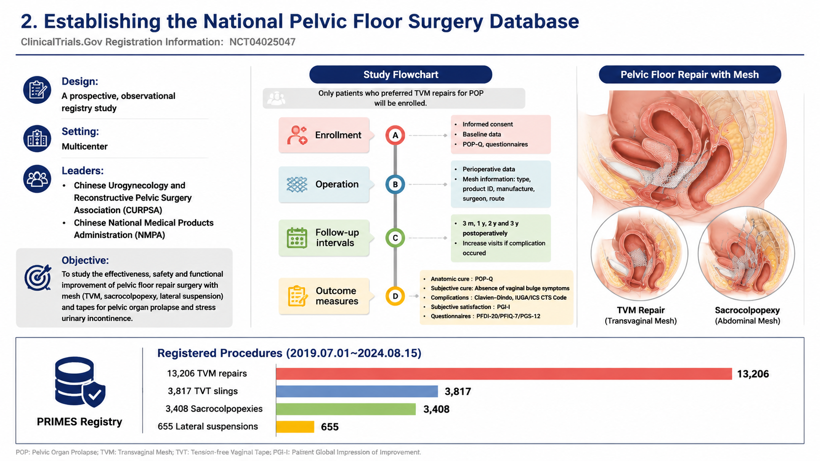
After: Redesigned slide 15 with professional data platform design
Professional data platform design with clean interface mockups and data flow visualization
16

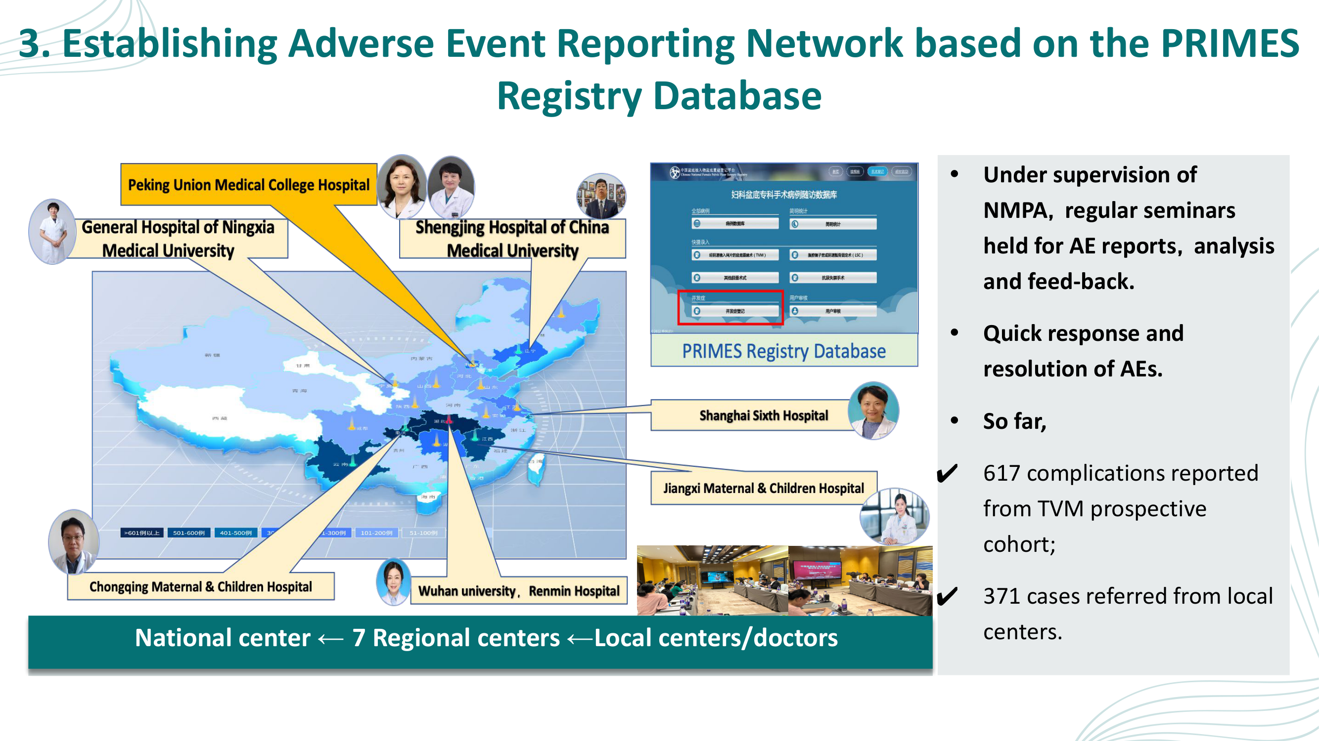
Adverse Event Reporting Network — PRIMES Registry

Cluttered map with scattered headshot photos and database screenshots. The redesign introduces a three-column dashboard layout with network map, PRIMES database mockup, and statistics (617 TVM prospective, 371 referrals, 988 total cases).

Before
Before: Original slide 16 — cluttered map with headshot photos and database
Map with scattered doctor headshots, cluttered database screenshot and bullet points
After
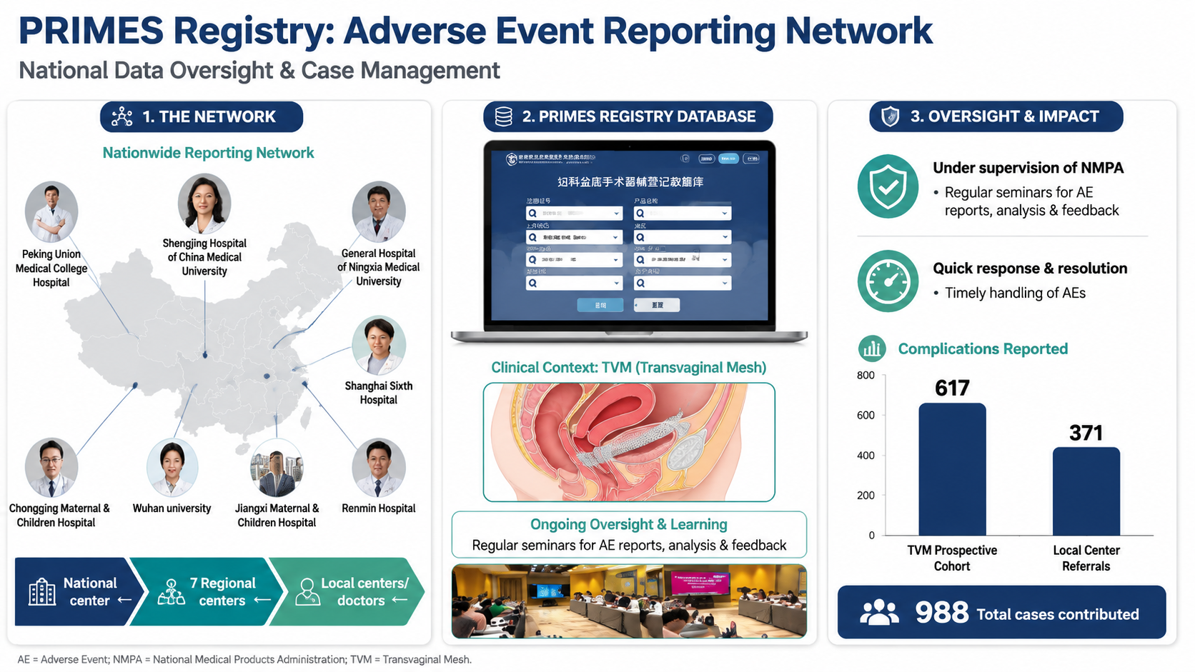
After: Redesigned slide 16 with three-column dashboard and PRIMES statistics
Three-column dashboard: network map, PRIMES database mockup, statistics (617 TVM, 371 referrals, 988 total), professional bar chart
17

Registry Data Results

Data tables and text presenting registry results. The redesign transforms raw data into professional data visualization with clear metrics and trend indicators.

Before
Before: Original slide 17 — data tables and text
Data tables and text, clinical findings buried in dense formatting
After
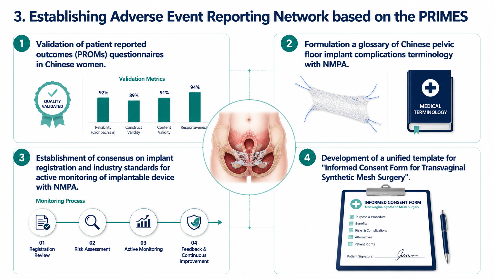
After: Redesigned slide 17 with professional data visualization
Professional data visualization with clear metrics, trend indicators, and clean presentation
18

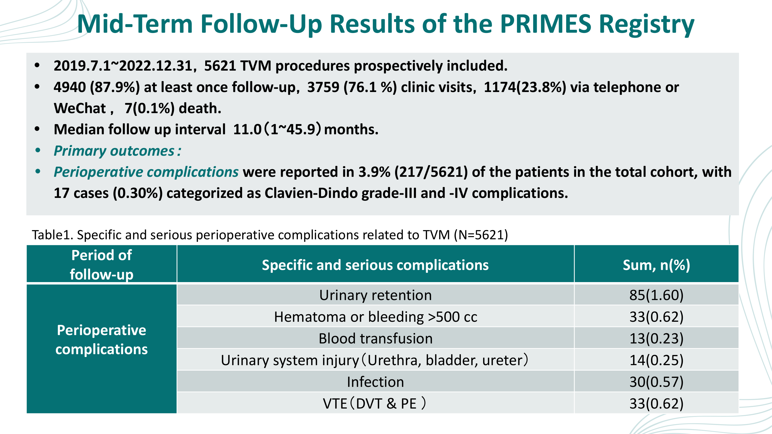
Follow-Up Results

Tables with statistics in a cramped layout. The redesign presents follow-up data with professional statistical cards, visual indicators, and clean data hierarchy.

Before
Before: Original slide 18 — cramped statistics tables
Tables with statistics, cramped layout with no visual differentiation
After
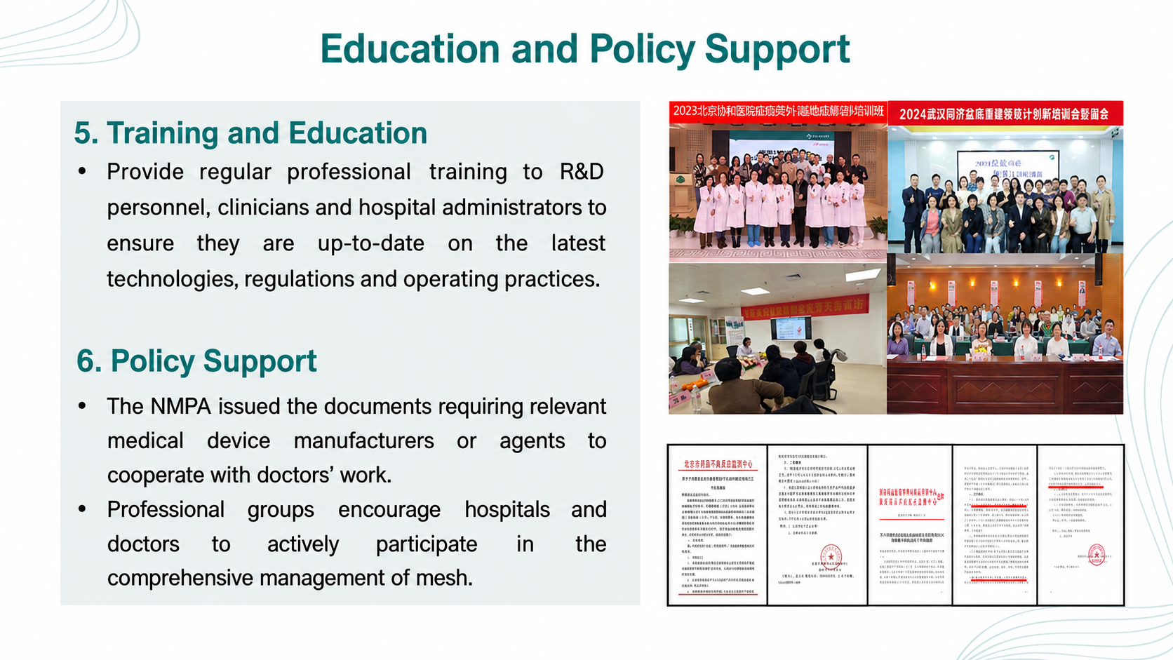
After: Redesigned slide 18 with professional statistical presentation
Professional statistical cards with visual indicators and clean data hierarchy
19

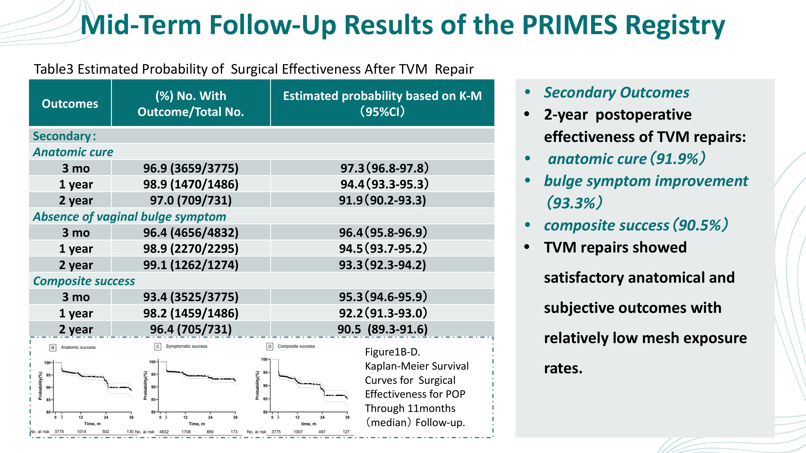
Clinical Outcomes

Dense data presentation with no visual structure. The redesign presents outcomes in clean medical data cards with highlighted key findings and professional color coding.

Before
Before: Original slide 19 — dense clinical outcomes data
Dense data presentation, clinical outcomes buried in text
After
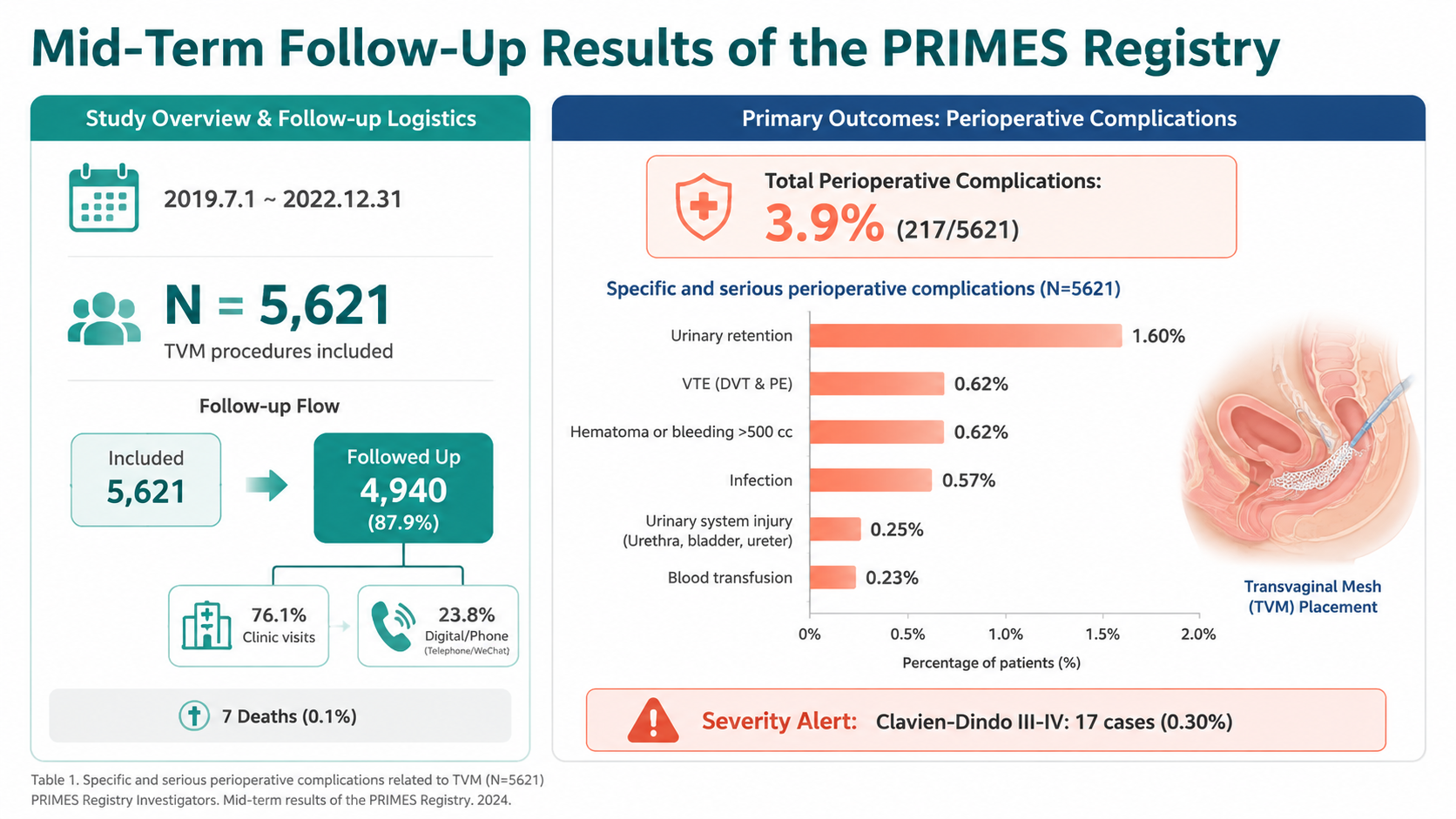
After: Redesigned slide 19 with clean medical data cards
Clean medical data cards with highlighted key findings and professional color coding
20

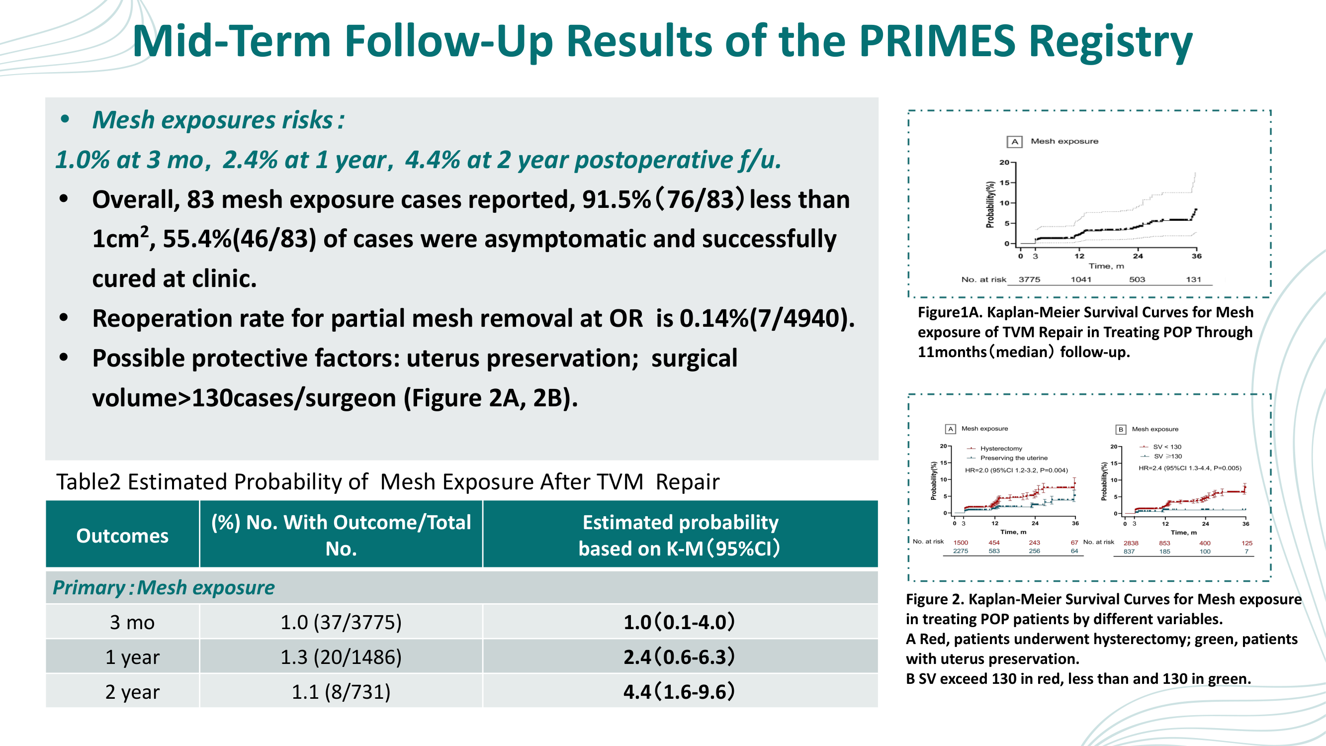
Mid-Term Follow-Up Results — Complications

Dense bullet points with small Kaplan-Meier curves and cramped data table. The redesign creates a dashboard-style layout with highlighted mesh exposure timeline (1.0% → 2.4% → 4.4%), management success metrics, and a prominent 0.14% reoperation rate callout.

Before
Before: Original slide 20 — dense bullet points with small Kaplan-Meier curves
Dense bullet points, small Kaplan-Meier survival curves, cramped data table layout
After
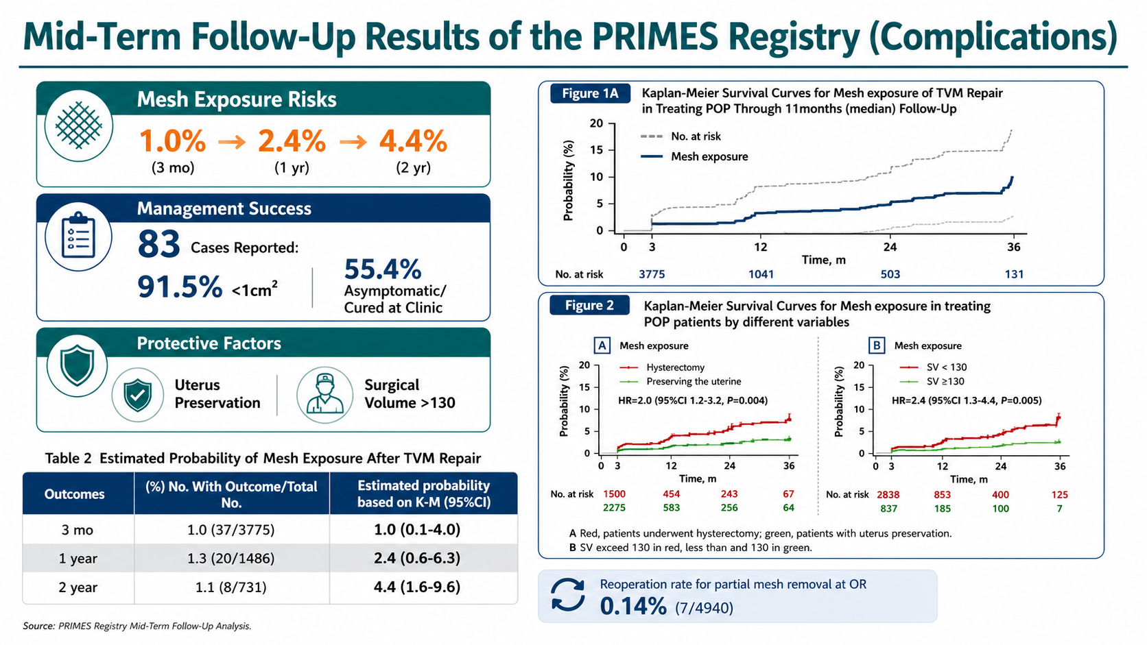
After: Redesigned slide 20 with dashboard-style complications data
Dashboard layout: mesh exposure timeline (1.0%→2.4%→4.4%), management metrics (83 cases, 91.5%, 55.4%), 0.14% reoperation callout, cleaner Kaplan-Meier charts
21

Summary and Conclusions

Text summary in plain bullet format. The redesign presents key takeaways in a professional layout with highlighted conclusion cards and visual emphasis on key findings.

Before
Before: Original slide 21 — plain text summary
Plain text summary, bullet format with no visual hierarchy
After
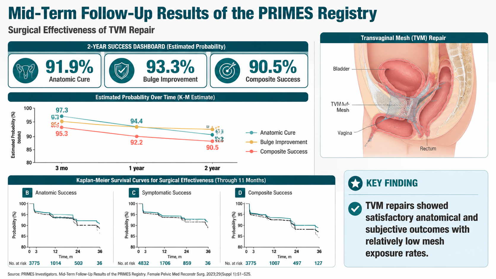
After: Redesigned slide 21 with professional key takeaway layout
Professional key takeaway layout with highlighted conclusion cards and visual emphasis
22

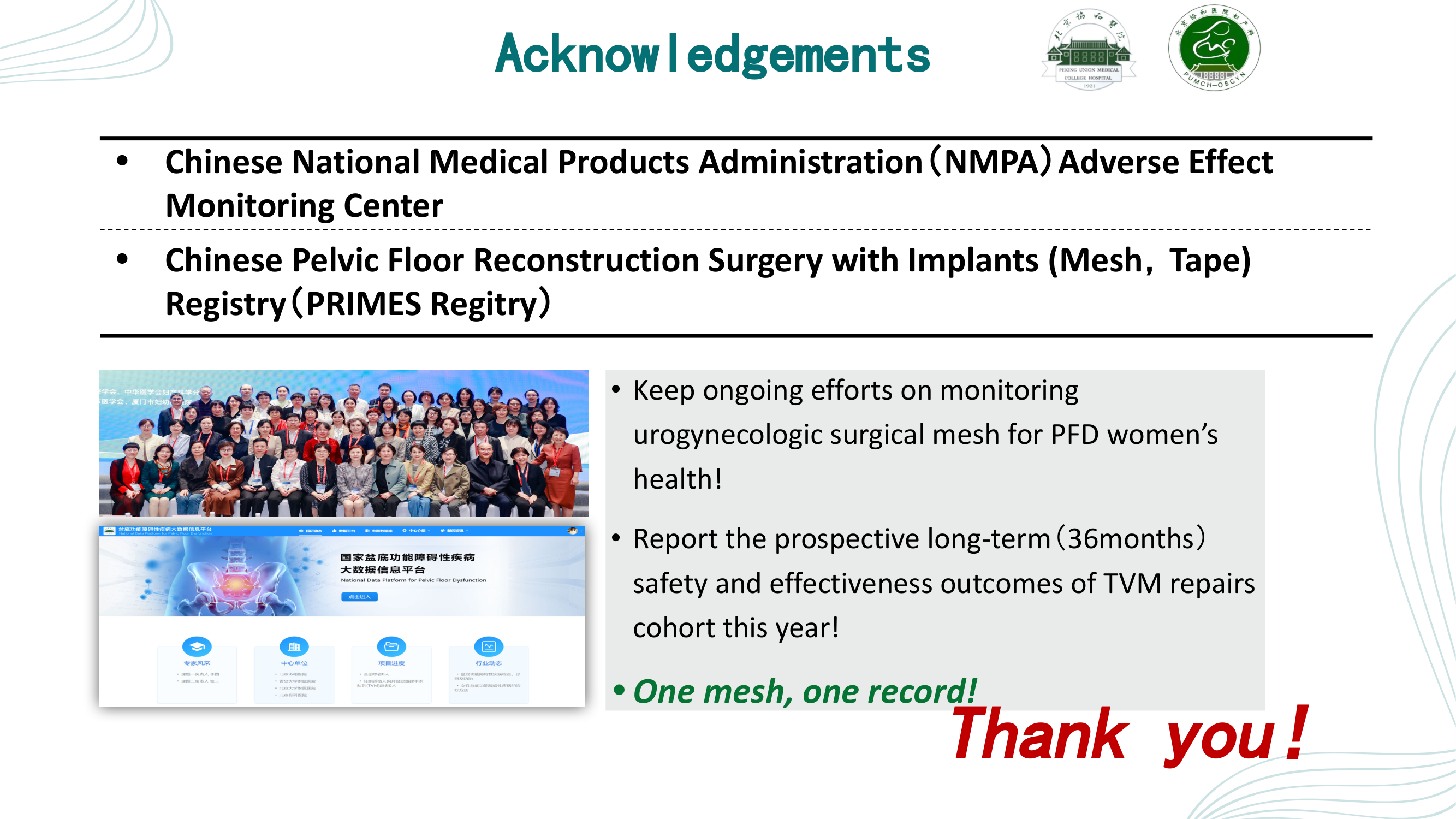
Acknowledgements — Thank You

Bullet points, group photo, website screenshot, and handwritten "Thank you!" text. The redesign features a clean Partners section, organized ongoing efforts with icons, and a professional closing with anatomical mesh illustration.

Before
Before: Original slide 22 — bullet points with group photo and handwritten thank you
Bullet points, group photo, website screenshot, handwritten-style "Thank you!" text
After
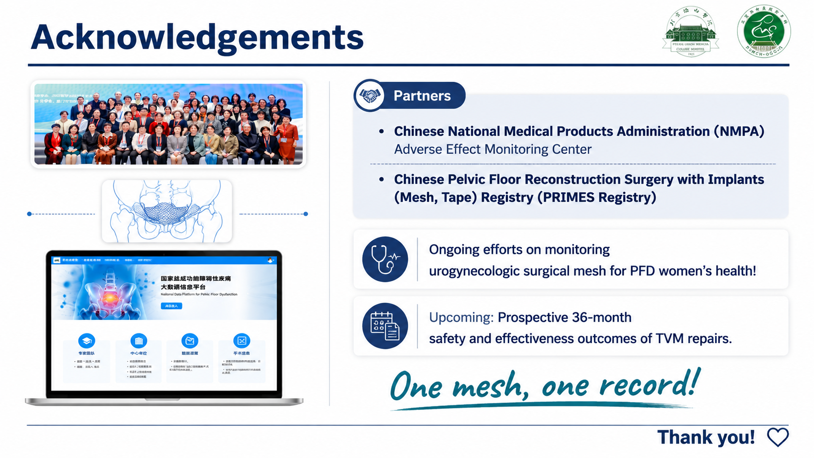
After: Redesigned slide 22 with clean acknowledgements and professional closing
Clean Partners section, organized efforts and upcoming items with icons, professional "Thank you!" with anatomical mesh illustration

Transform Your Medical Conference Presentations

Upload your deck, pick a style, and let Arty apply a professional clinical aesthetic. Your evidence stays — the design levels up.

Try Deckly.art Free