AI Lecture Redesign — Case Study

From Raw Data to Visual Intelligence

A real university lecture with 20 slides — redesigned by Arty into a polished, data-rich, visually clear deck. Every chart, table, and diagram preserved and enhanced.

📄 20 slides transformed 🎓 Justus-Liebig-Universität Gießen 🤖 Style: Academic Lecture

Why This Deck Needs a Redesign

This lecture from Justus-Liebig-Universität Gießen's "Economics of Regulation" course (Summer Term 2020, Prof. Dr. Georg Götz) introduces regulation of network industries — covering market structures, monopoly instruments, and real-world data from European utilities. The original slides are packed with valuable data but suffer from poor visual presentation:

Arty's redesign transforms every data element: tables get professional headers with industry icons, charts receive modern color palettes and icon-enriched legends, flowcharts gain depth with styled nodes and visual layer indicators — all while preserving every data point and label exactly as the professor intended.

Original lecture from Justus-Liebig-Universität Gießen — Economics of Regulation, Summer Term 2020, Prof. Dr. Georg Götz, Chair for Industrial Organization, Regulation, and Antitrust.
1

Title — Economics of Regulation

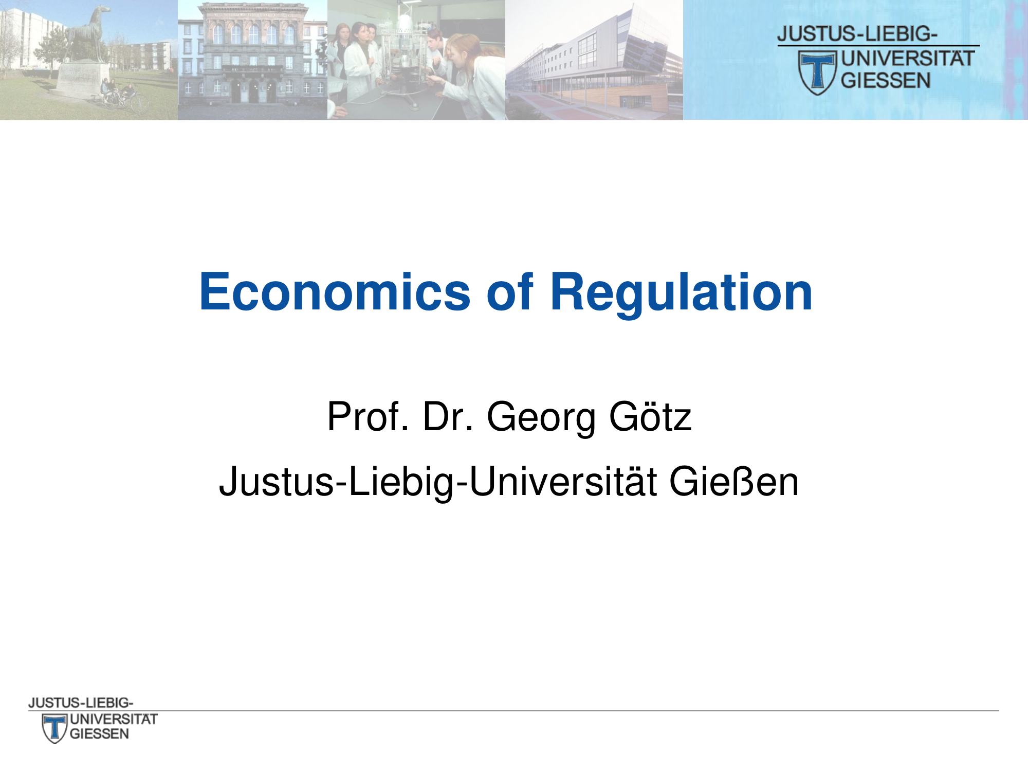
The original title slide uses a dated university template with small campus photos. The redesign creates a bold, modern cover with a high-quality building photo and prominent typography.

Before
Before: Original title slide — dated university template with small campus photos
Dated template, small campus thumbnails, cramped layout
After
After: Redesigned title slide with bold typography and professional hero image
Bold typography, professional hero image, clean branding
2

Contents

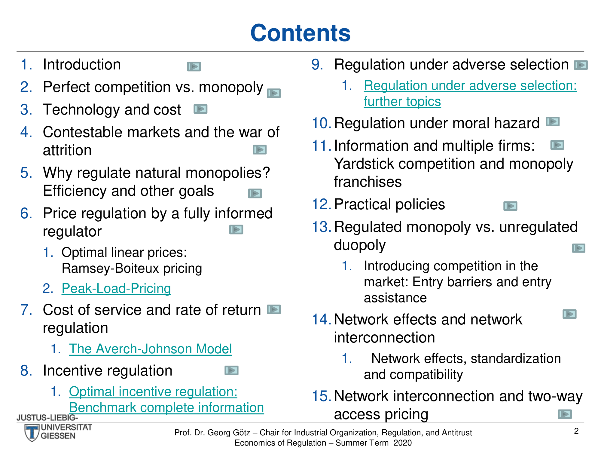
A dense two-column table of contents with 15 numbered topics and sub-items. The redesign should preserve the structure while improving readability and navigation clarity.

Before
Before: Original contents slide — cramped two-column list
Cramped two-column list, small text, hyperlinks hard to spot
After
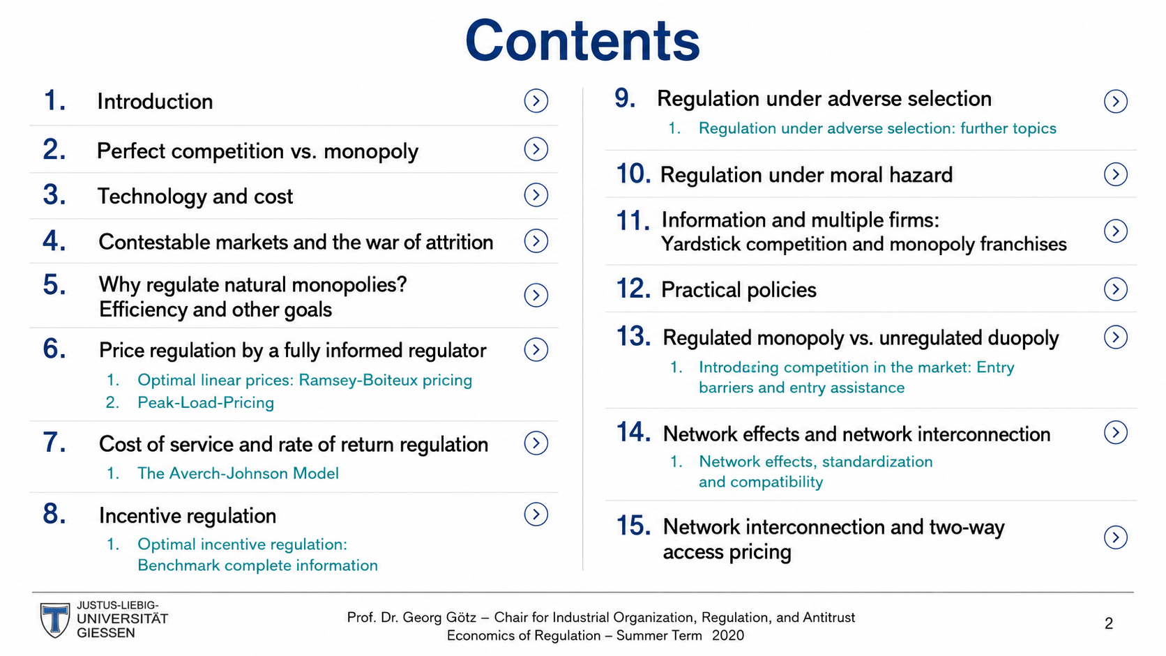
After: Redesigned contents slide with clean typographic hierarchy
Clean typographic hierarchy, improved spacing and readability
3

Why You Should Take This Course

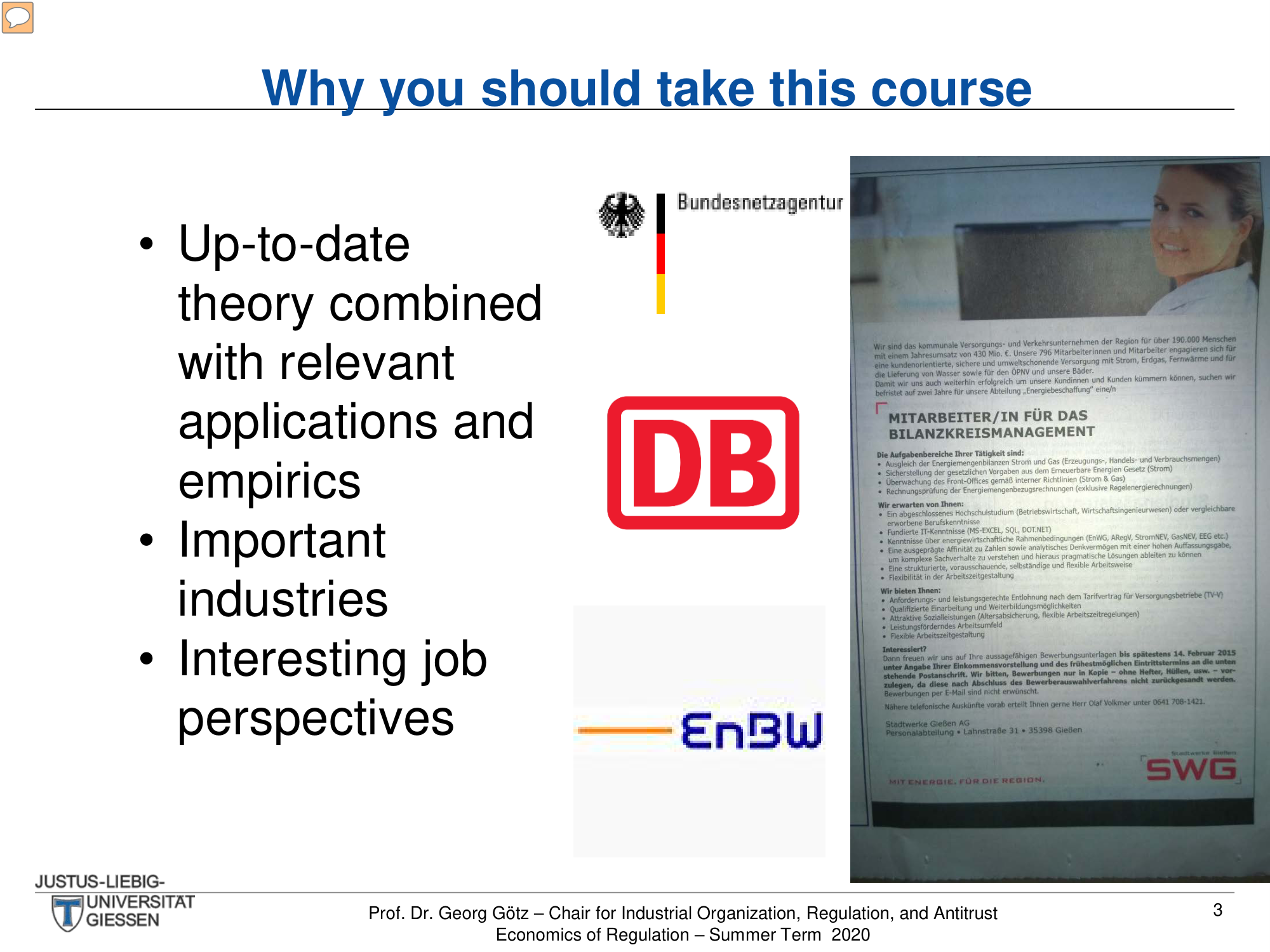
Bullet points with overlapping industry logos (DB, EnBW, Bundesnetzagentur) and a job posting screenshot. The redesign brings visual order to the collage.

Before
Before: Original slide — random logo placement and overlapping images
Random logo placement, overlapping images, bullet text
After
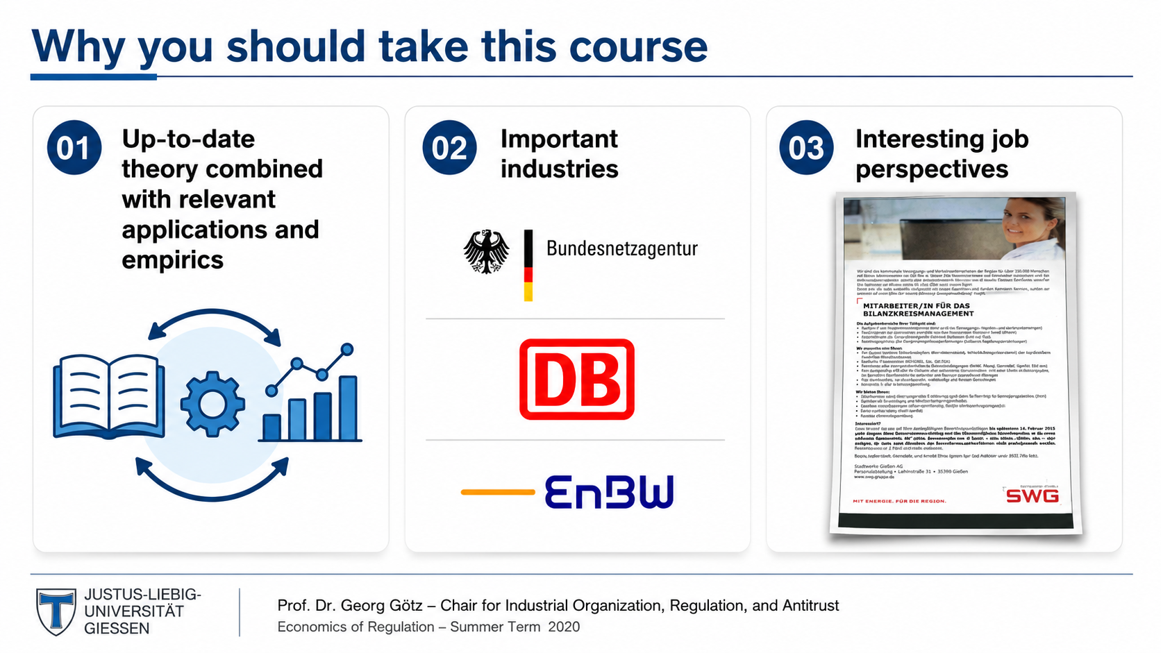
After: Redesigned slide with organized layout and professional styling
Organized layout, clear value proposition, professional styling
4

Network Regulation — RIIO Model

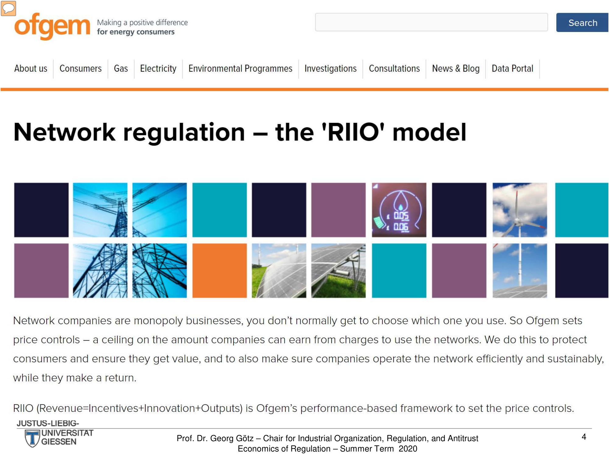
A raw screenshot of the Ofgem website pasted directly into the slide. The redesign turns this into a proper presentation of the RIIO framework.

Before
Before: Original slide — pasted website screenshot with no slide design
Pasted website screenshot, no slide design
After
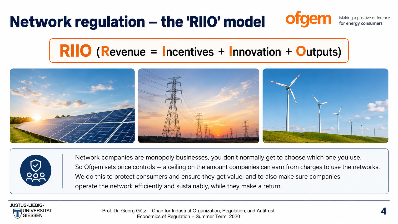
After: Redesigned slide with integrated content and proper formatting
Integrated content, proper slide formatting
5

(Traditional) Topics

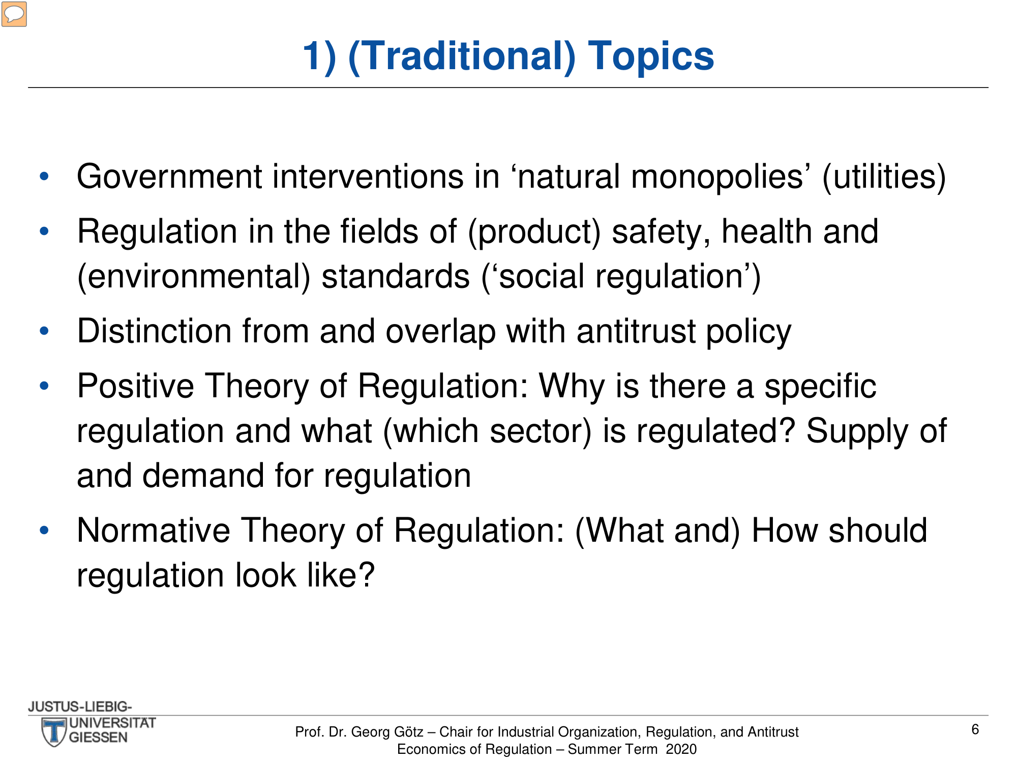
Five bullet points listing regulation topics with no visual differentiation. The redesign adds structure to distinguish each topic area.

Before
Before: Original slide — plain bullet list with all items same visual weight
Plain bullet list, all items same visual weight
After
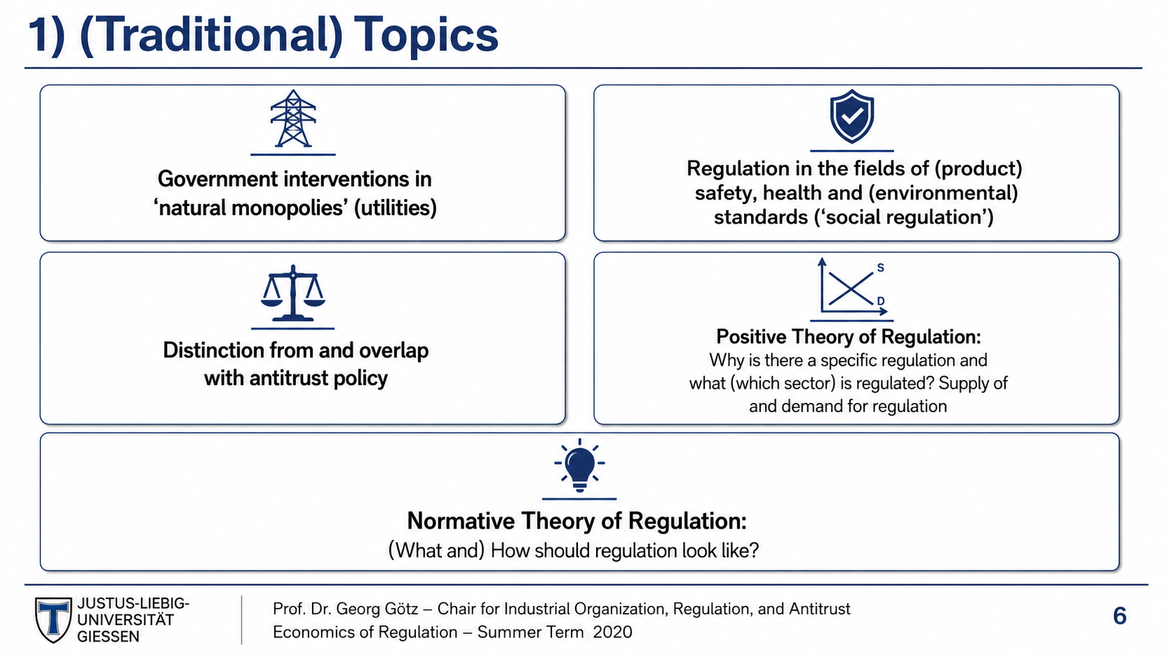
After: Redesigned slide with structured topic cards and visual hierarchy
Structured topic cards, visual hierarchy
6

'Burning' Questions

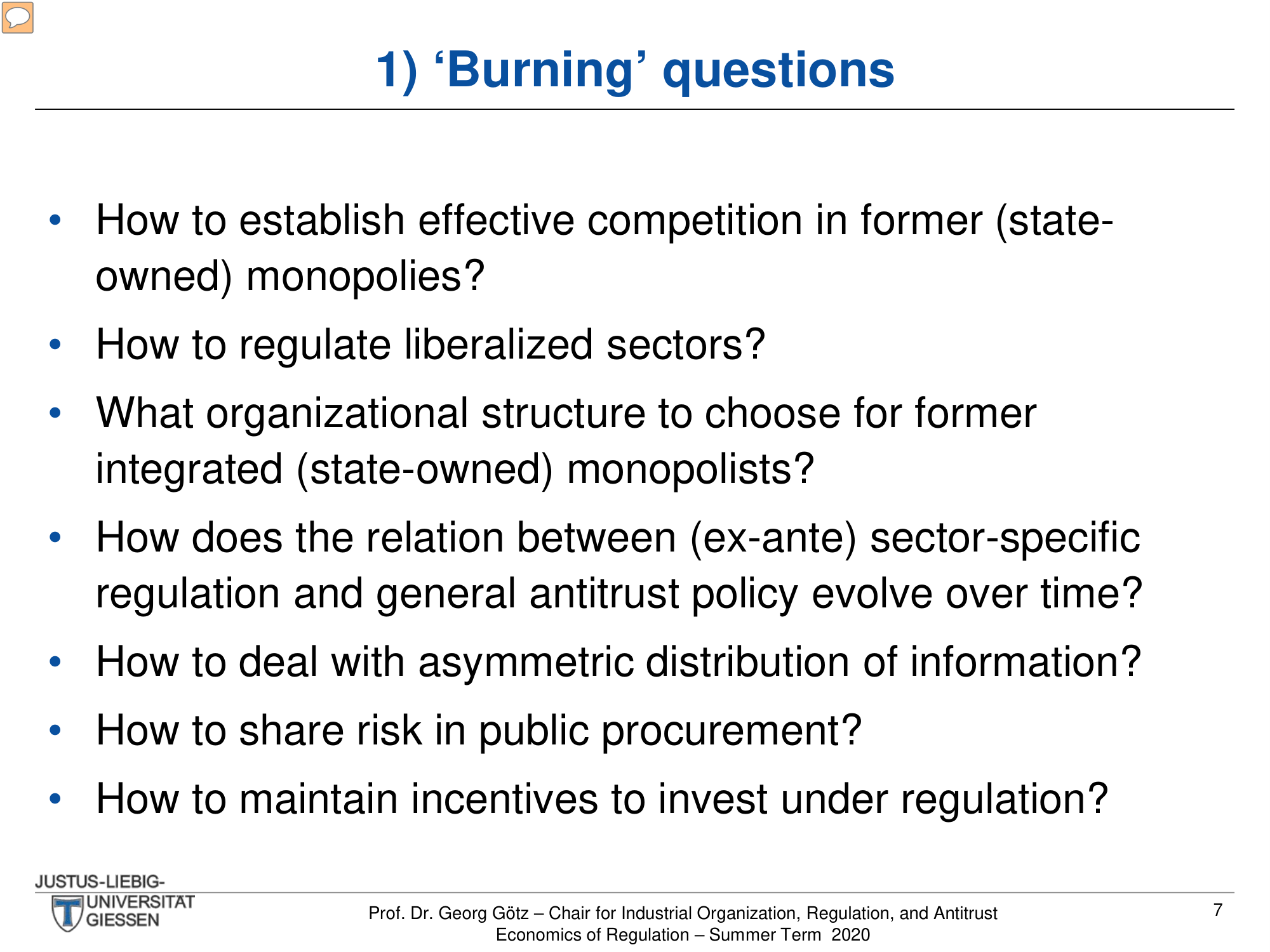
Seven long-form questions crammed into a single slide. The redesign gives each question visual breathing room while maintaining academic rigor.

Before
Before: Original slide — seven dense questions as wall of text
Seven dense questions, wall of text
After
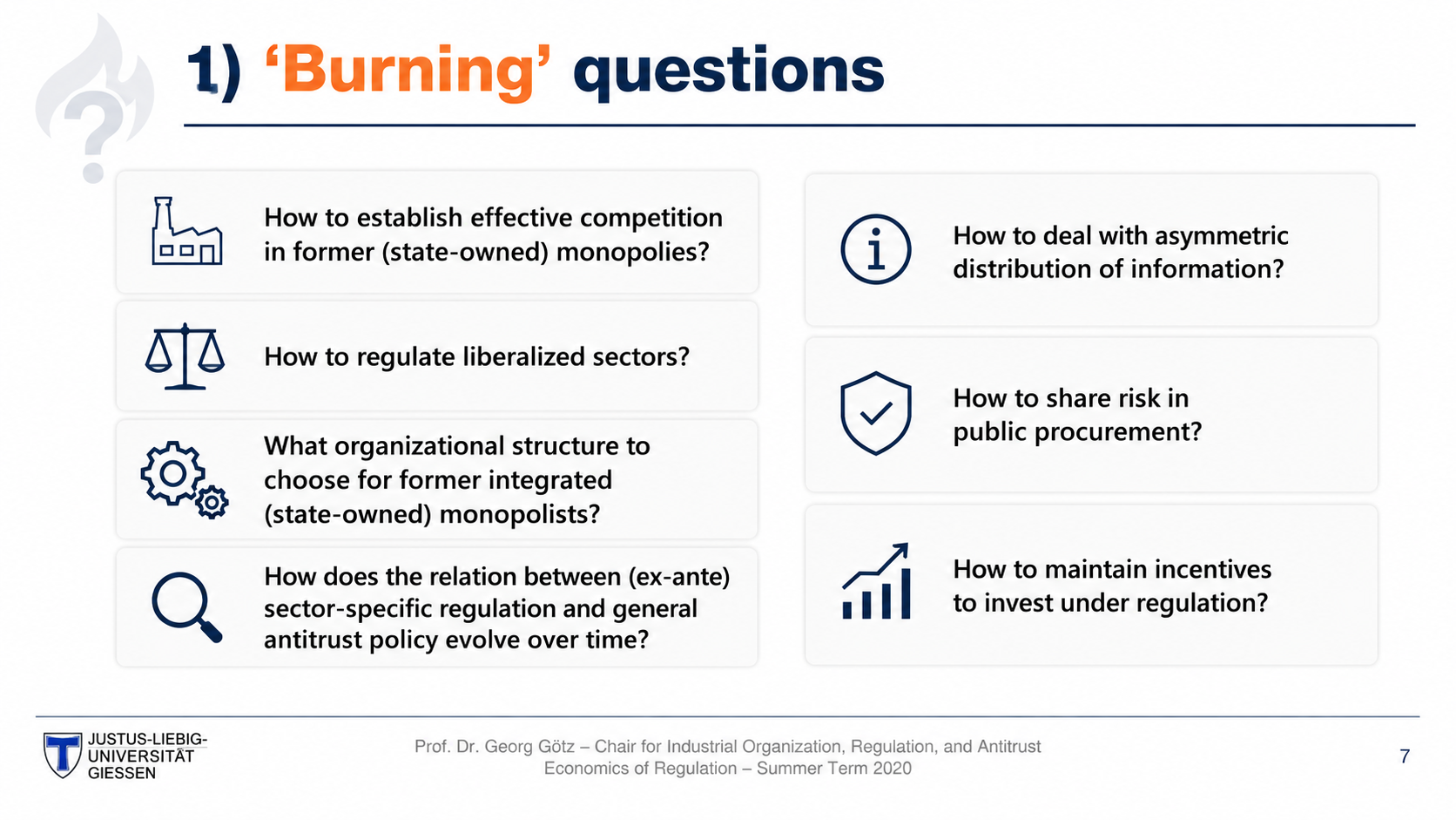
After: Redesigned slide with visually separated, scannable questions
Each question visually separated, scannable layout
7

Network Industries — Gross Value Added (Chart)

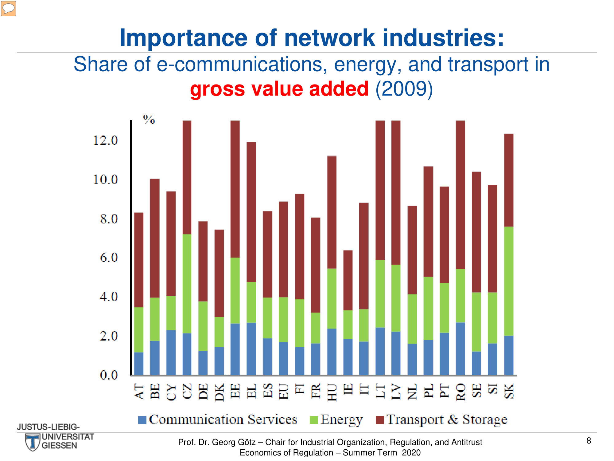
A stacked bar chart showing network industry share across 25 EU countries. The redesign modernizes the chart with cleaner colors and icon-enriched legends.

Before
Before: Original chart — basic Excel-style stacked bar chart
Basic Excel chart, small legend, dated color palette
After
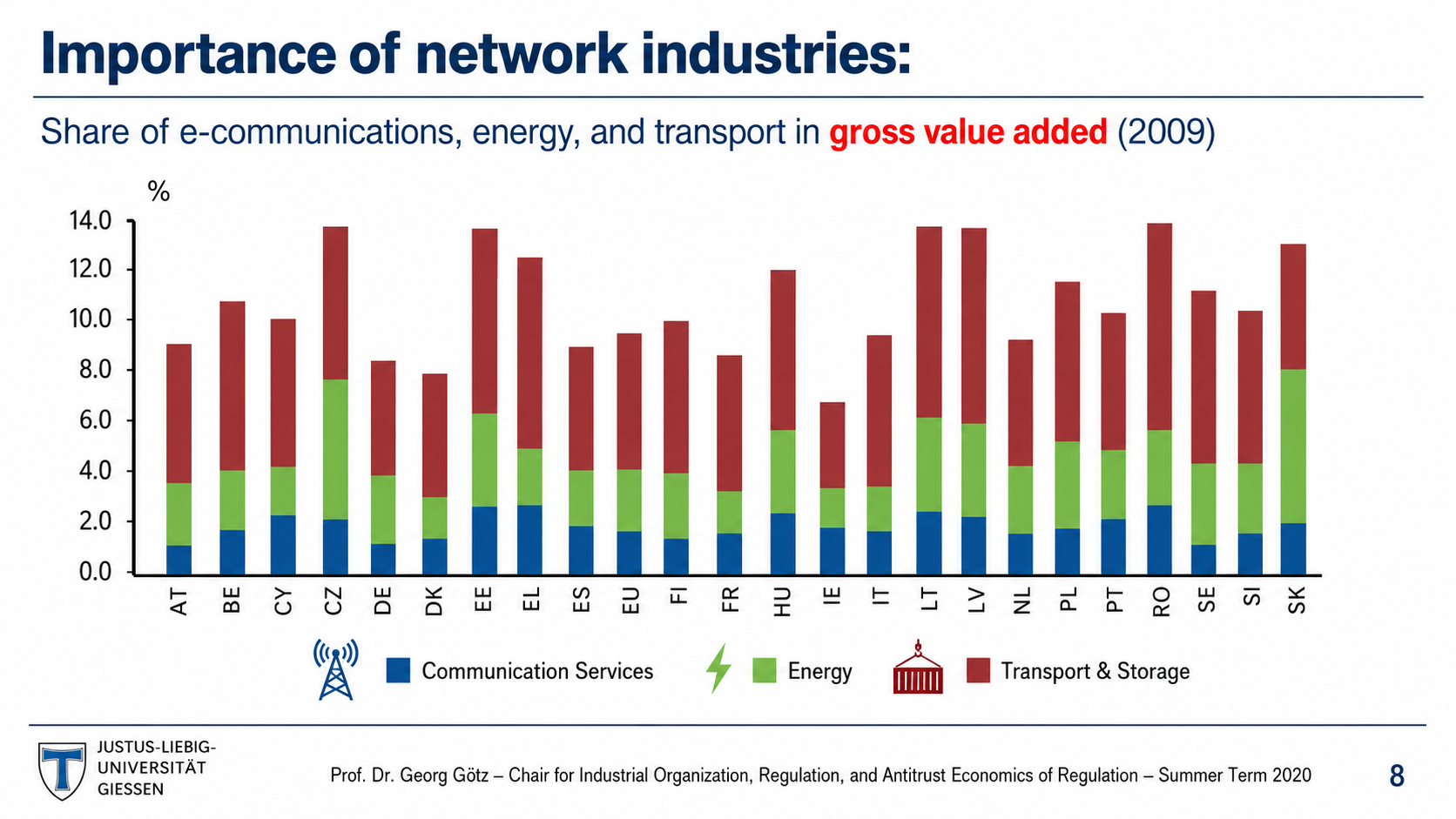
After: Redesigned chart with modern styling and icon legends
Modern chart styling, icon legends, cleaner axis labels
8

Network Industries — Employment (Chart)

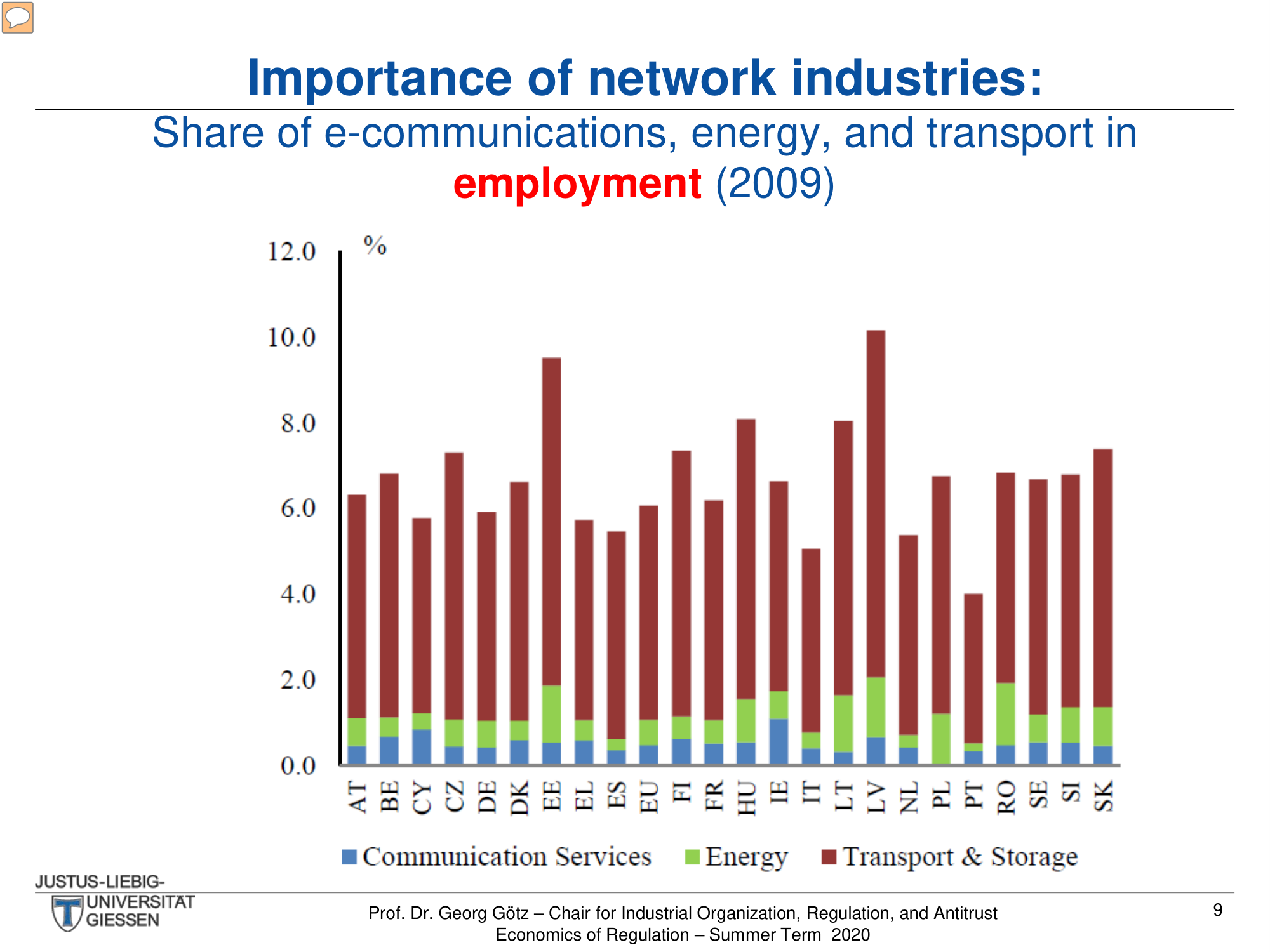
Another stacked bar chart for employment data. The redesign applies consistent modern chart styling matching the previous slide.

Before
Before: Original chart — dated chart style difficult to read at small size
Same dated chart style, difficult to read at small size
After
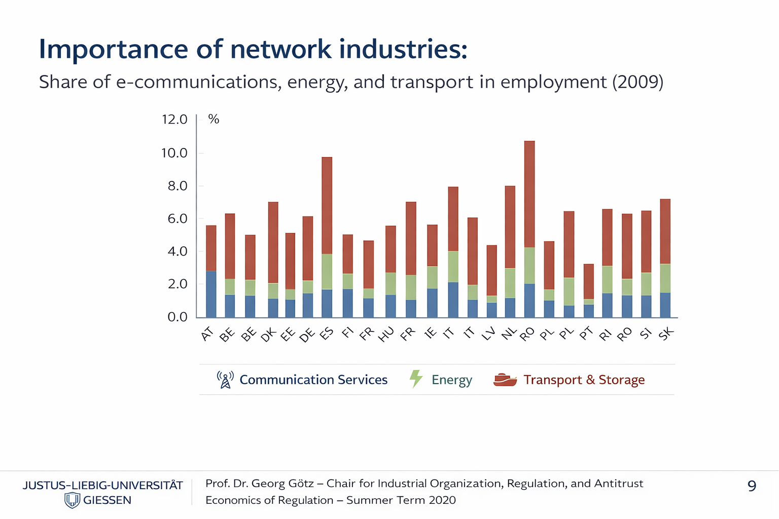
After: Redesigned chart with consistent modern palette
Consistent modern palette, improved readability
9

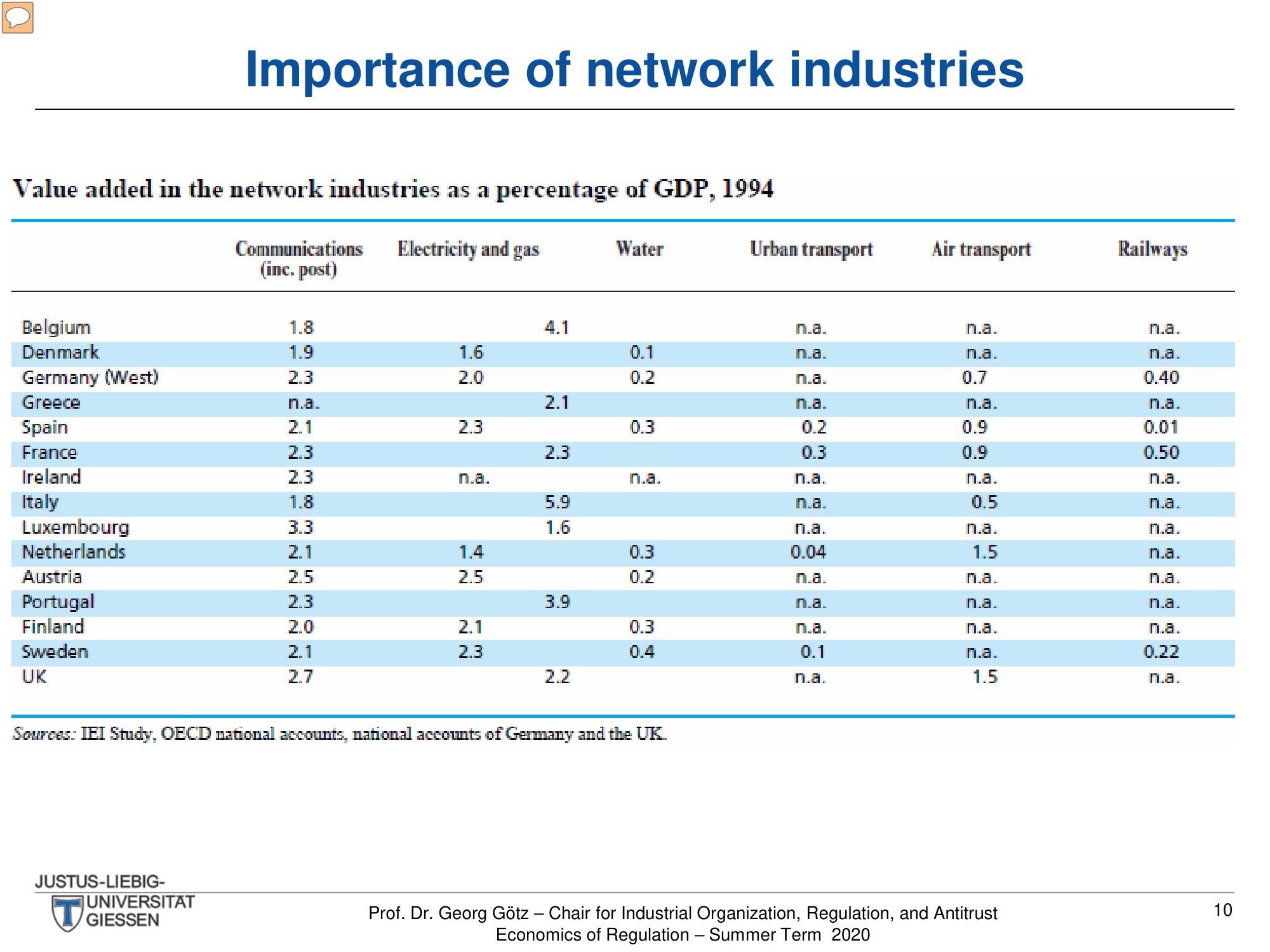
Network Industries GDP Table

A 15-country × 6-sector data table showing value added as percentage of GDP. The redesign transforms this dense data grid into a professionally styled, scannable table.

Before
Before: Original table — dense number grid with poor contrast
Dense number grid, alternating blue rows but poor contrast
After
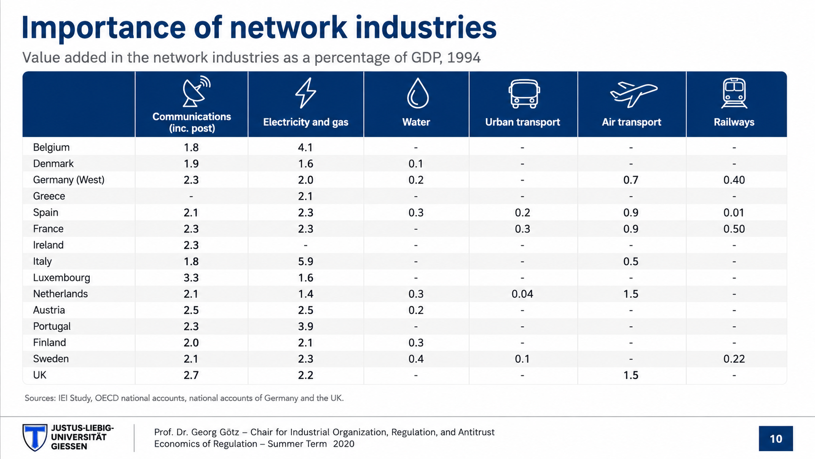
After: Redesigned table with icon column headers and clean typography
Professional table with icon column headers, clean typography
10

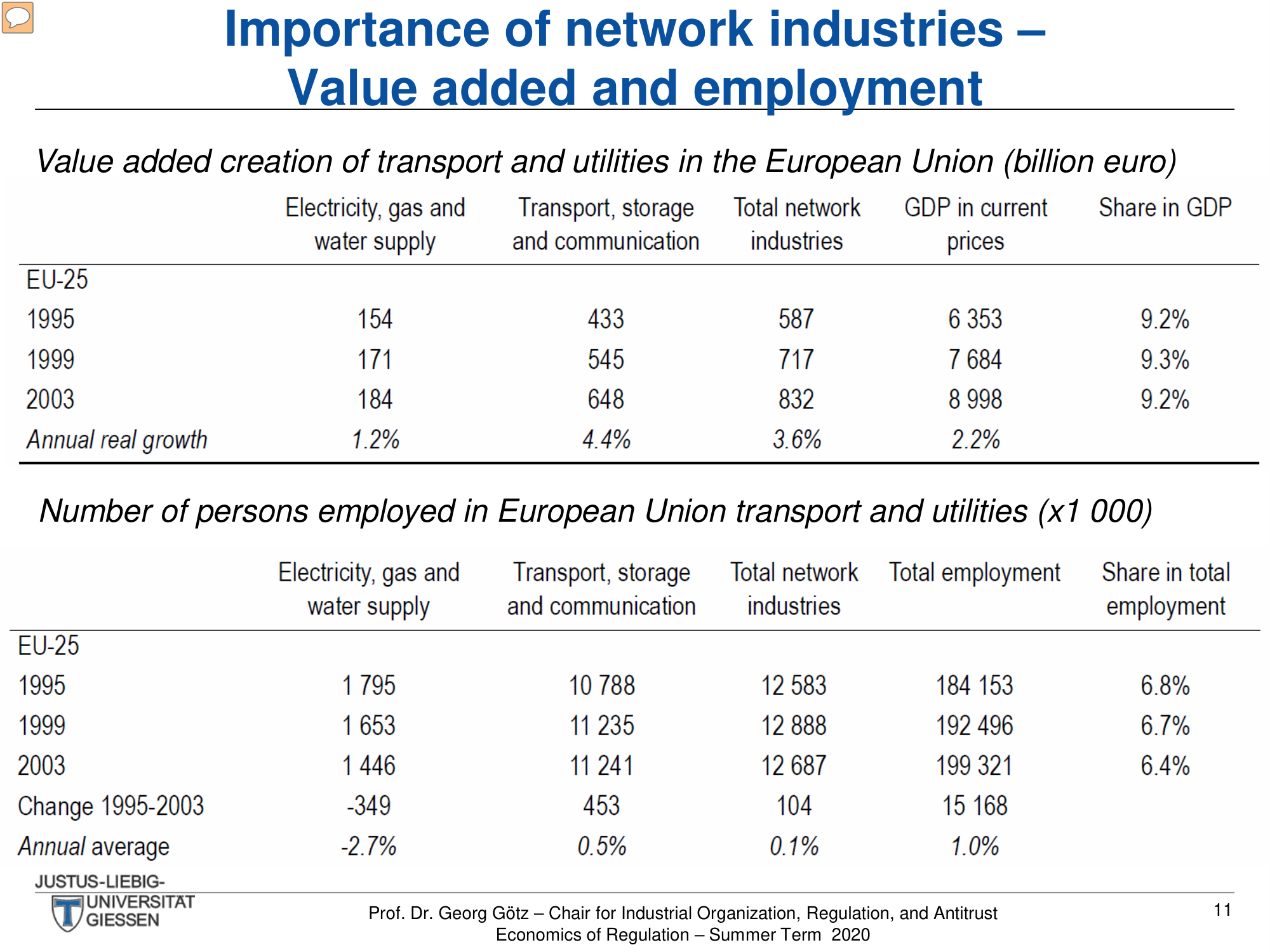
Value Added and Employment Table

Two stacked data tables covering EU-25 transport and utilities from 1995-2003. The redesign separates and styles both tables for clarity.

Before
Before: Original tables — two cramped tables with small text
Two cramped tables, small text, minimal visual separation
After
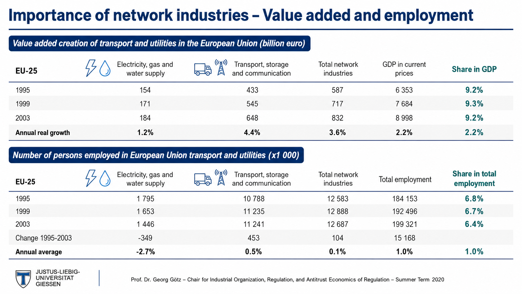
After: Redesigned tables with clear separation and styled headers
Clear table separation, styled headers, readable numbers
11

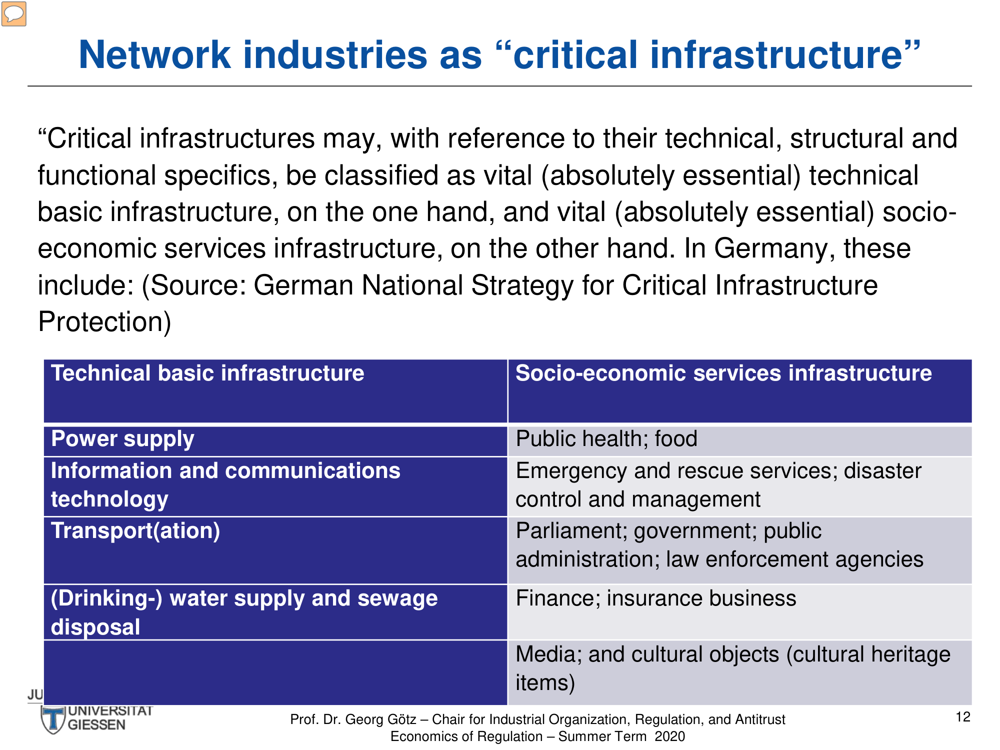
Critical Infrastructure Table

A two-column table categorizing technical vs socio-economic infrastructure. The redesign uses icons to visually represent each infrastructure type.

Before
Before: Original table — plain table with purple headers and dense text
Plain table with purple headers, dense text in cells
After
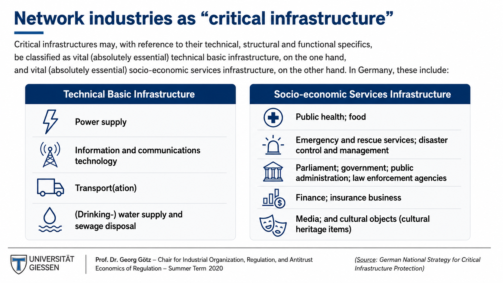
After: Redesigned table with icon-enhanced categories
Icon-enhanced categories, visual distinction between columns
12

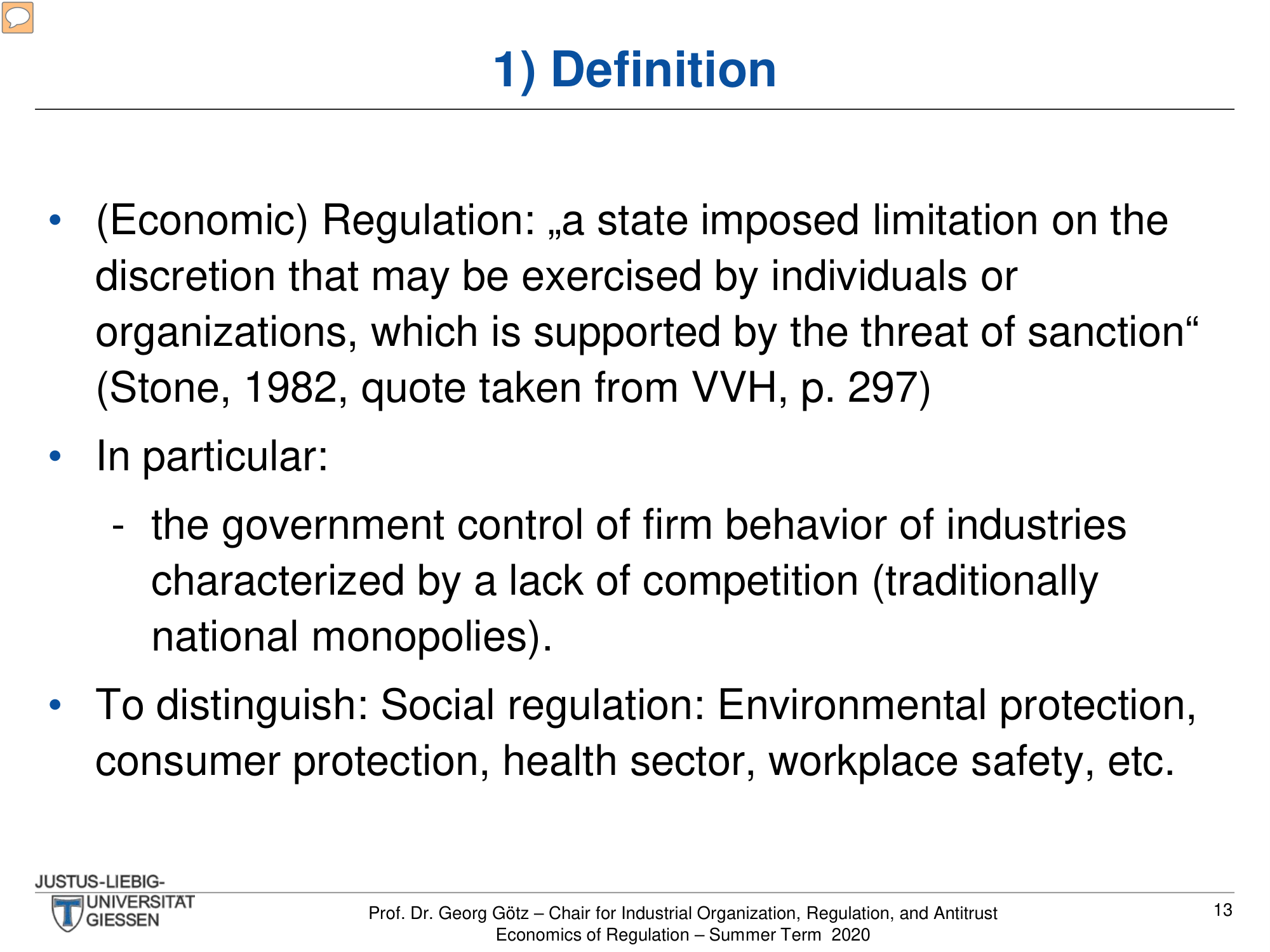
Definition of Regulation

Academic definition with citation and bullet-point elaboration. The redesign gives the quote and key distinctions proper visual treatment.

Before
Before: Original slide — long quote and bullets with no visual emphasis
Long quote and bullets, no visual emphasis
After
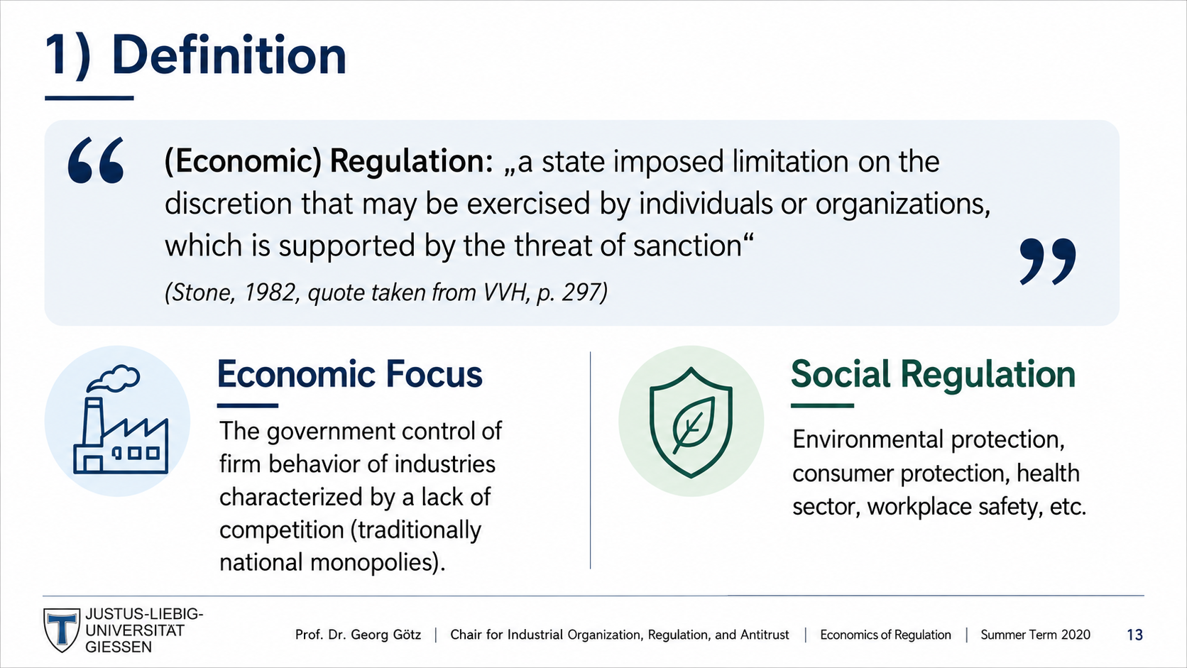
After: Redesigned slide with styled quotation and clear concept separation
Styled quotation, clear concept separation
13

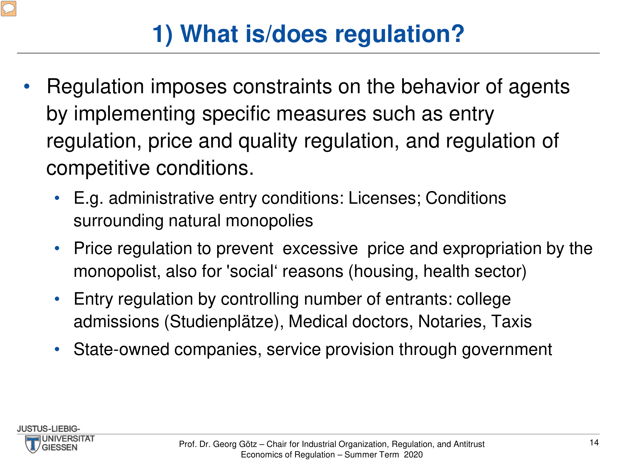
What Is/Does Regulation?

Multi-level bullet points explaining regulatory measures. The redesign structures the information into a clear hierarchy.

Before
Before: Original slide — nested bullets with all text same size
Nested bullets, all text same size
After
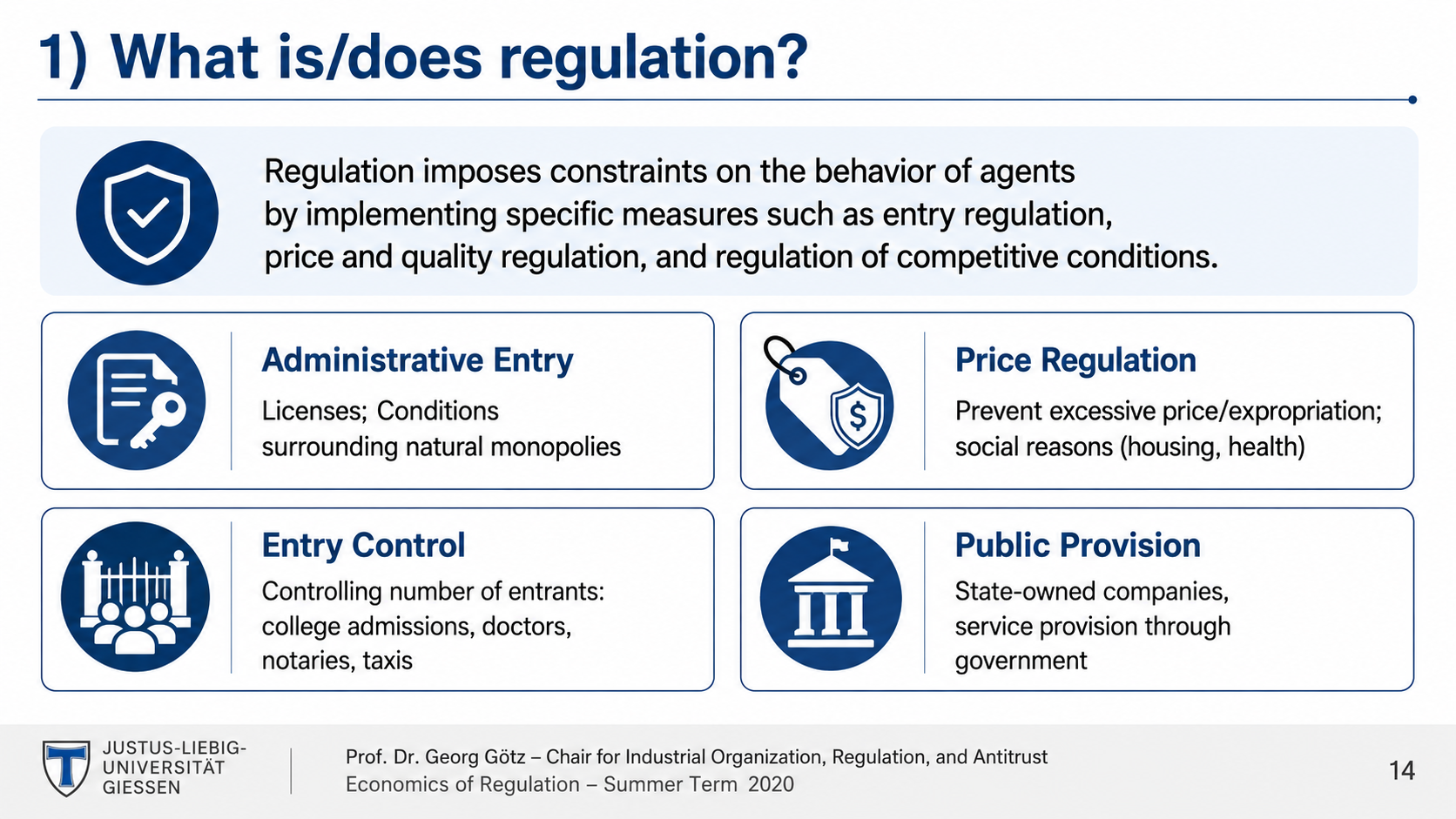
After: Redesigned slide with structured layout and clear measure categorization
Structured layout, clear measure categorization
14

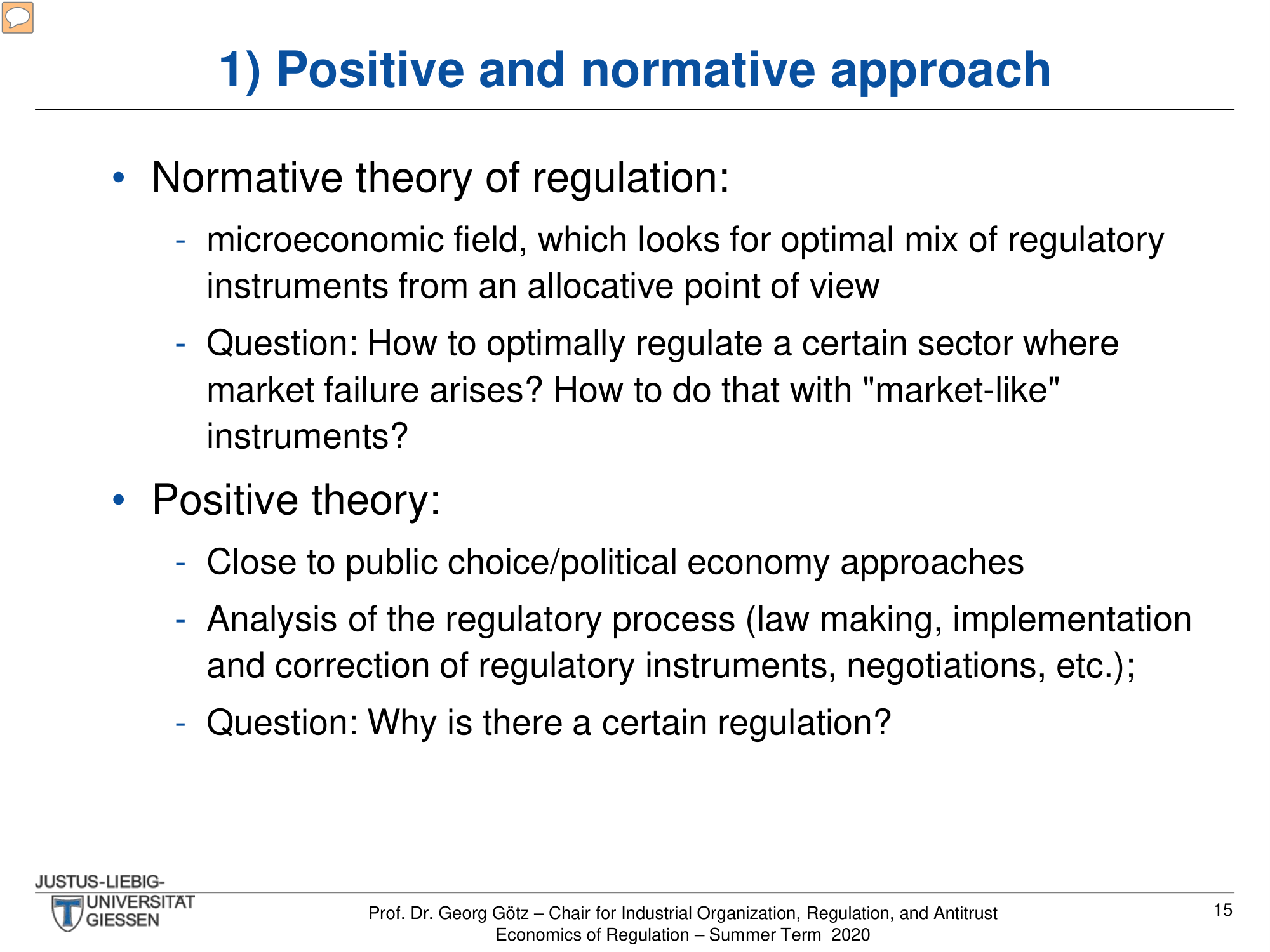
Positive and Normative Approach

Two theoretical frameworks explained in nested bullets. The redesign visually separates the two approaches for clearer comparison.

Before
Before: Original slide — mixed bullet levels with two concepts blended
Mixed bullet levels, two concepts blended together
After
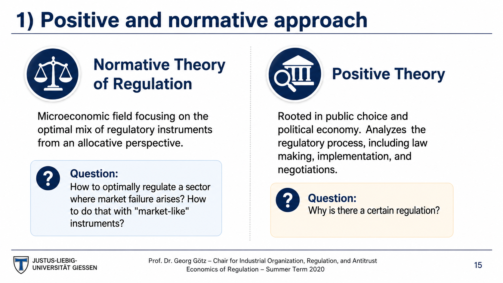
After: Redesigned slide with clear distinction between approaches
Side-by-side or sectioned comparison, clear distinction
15

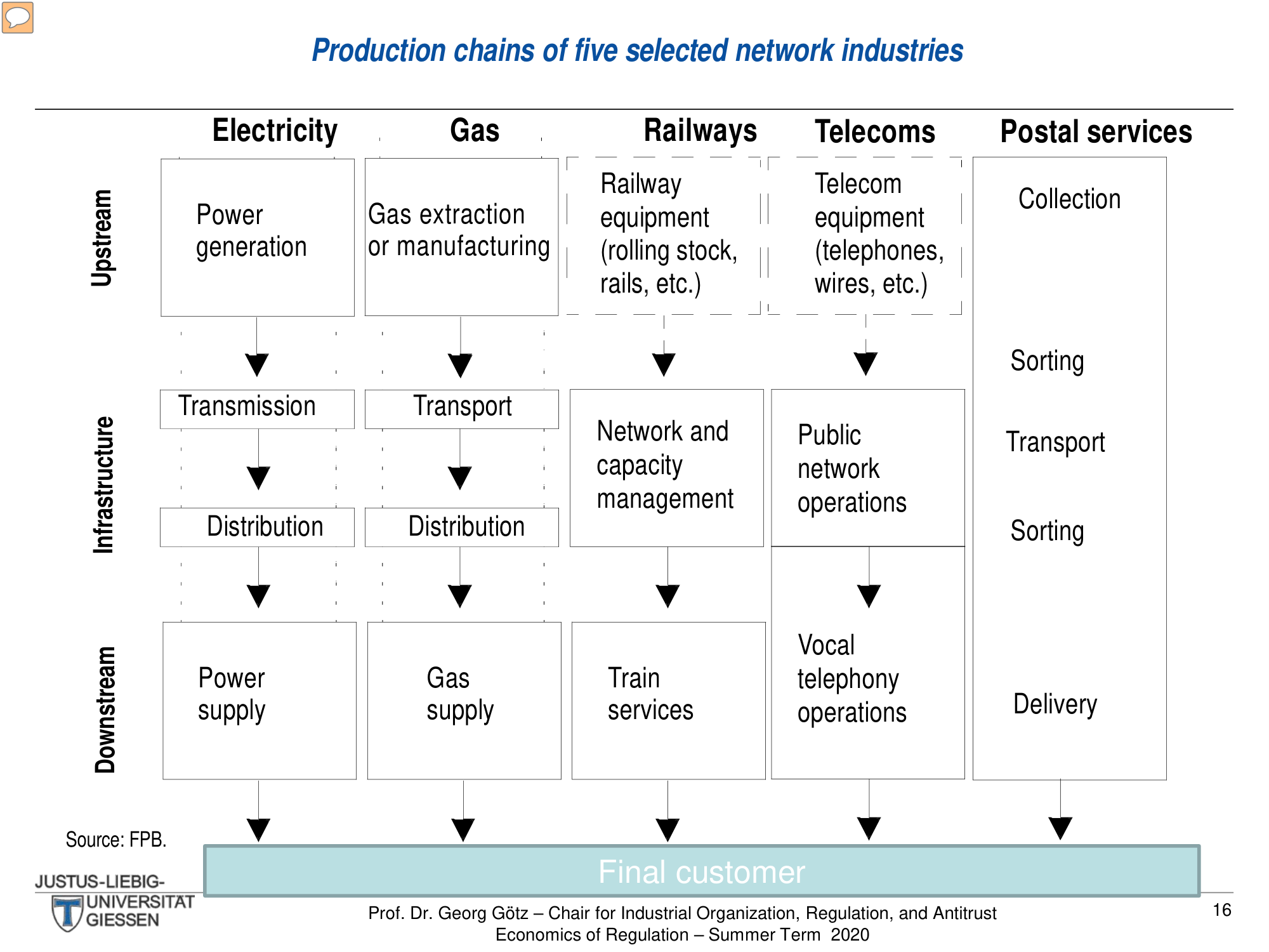
Production Chains Flowchart

A complex flowchart showing upstream/infrastructure/downstream chains for 5 network industries (electricity, gas, railways, telecoms, postal). The redesign adds icons and visual depth.

Before
Before: Original flowchart — plain boxes with thin arrows
Plain boxes, thin arrows, no visual differentiation between layers
After
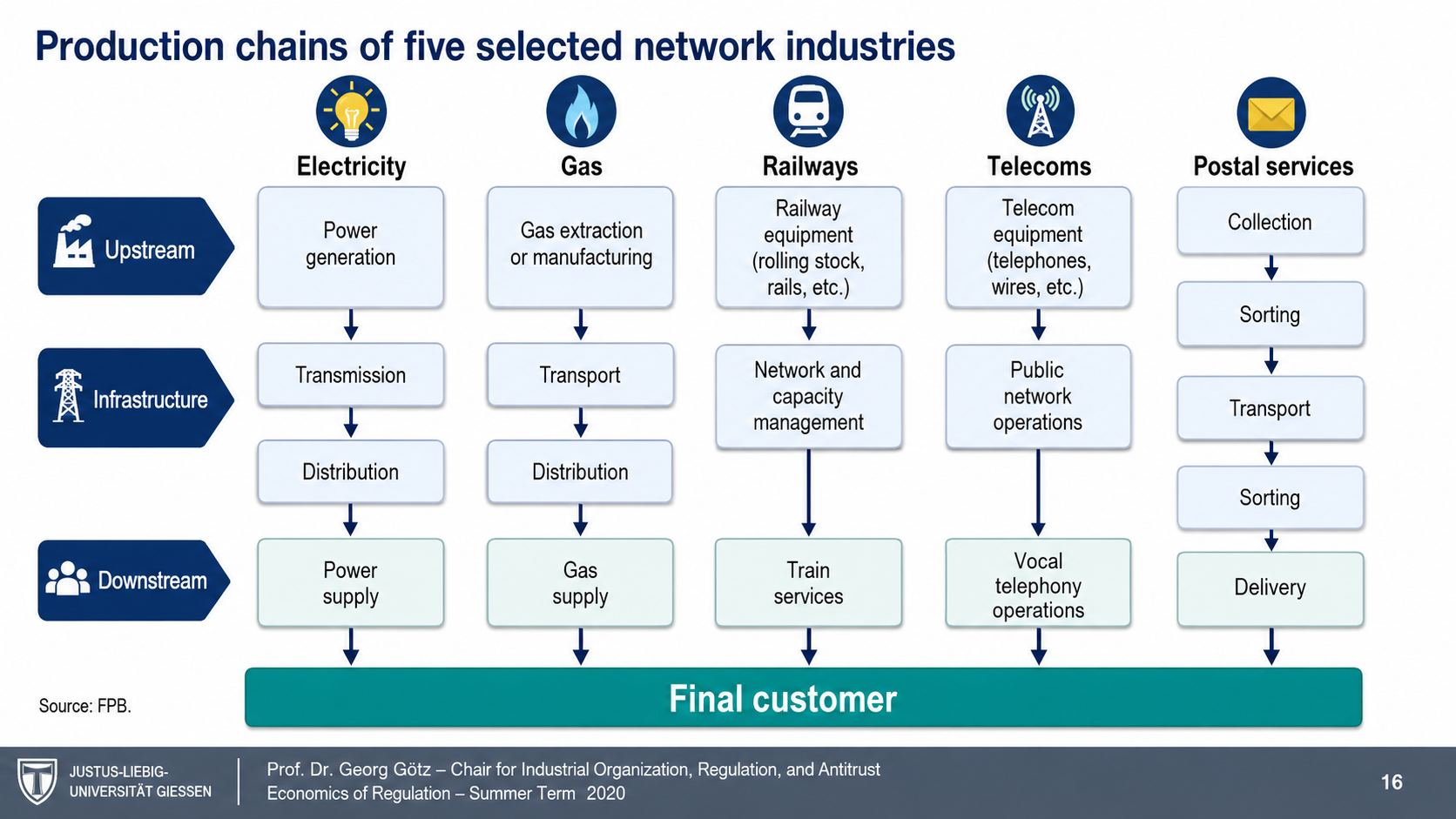
After: Redesigned flowchart with icon-enhanced headers and styled layers
Icon-enhanced industry headers, styled flow layers, modern node design
16

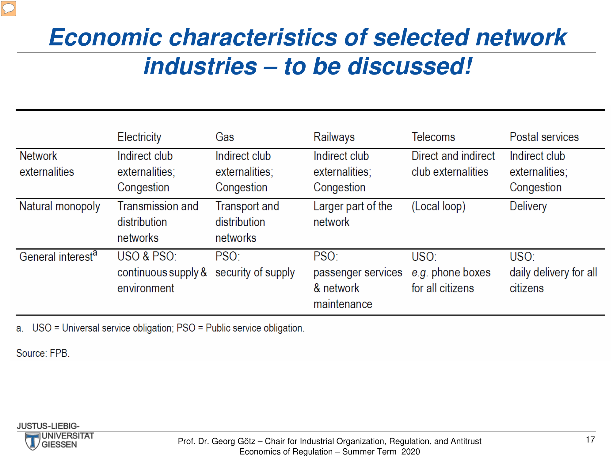
Economic Characteristics Table

A multi-column comparison table of network externalities, natural monopoly, and general interest across five industries. The redesign creates a cleaner, more readable format.

Before
Before: Original table — dense comparison grid hard to scan
Dense comparison grid, hard to scan across columns
After
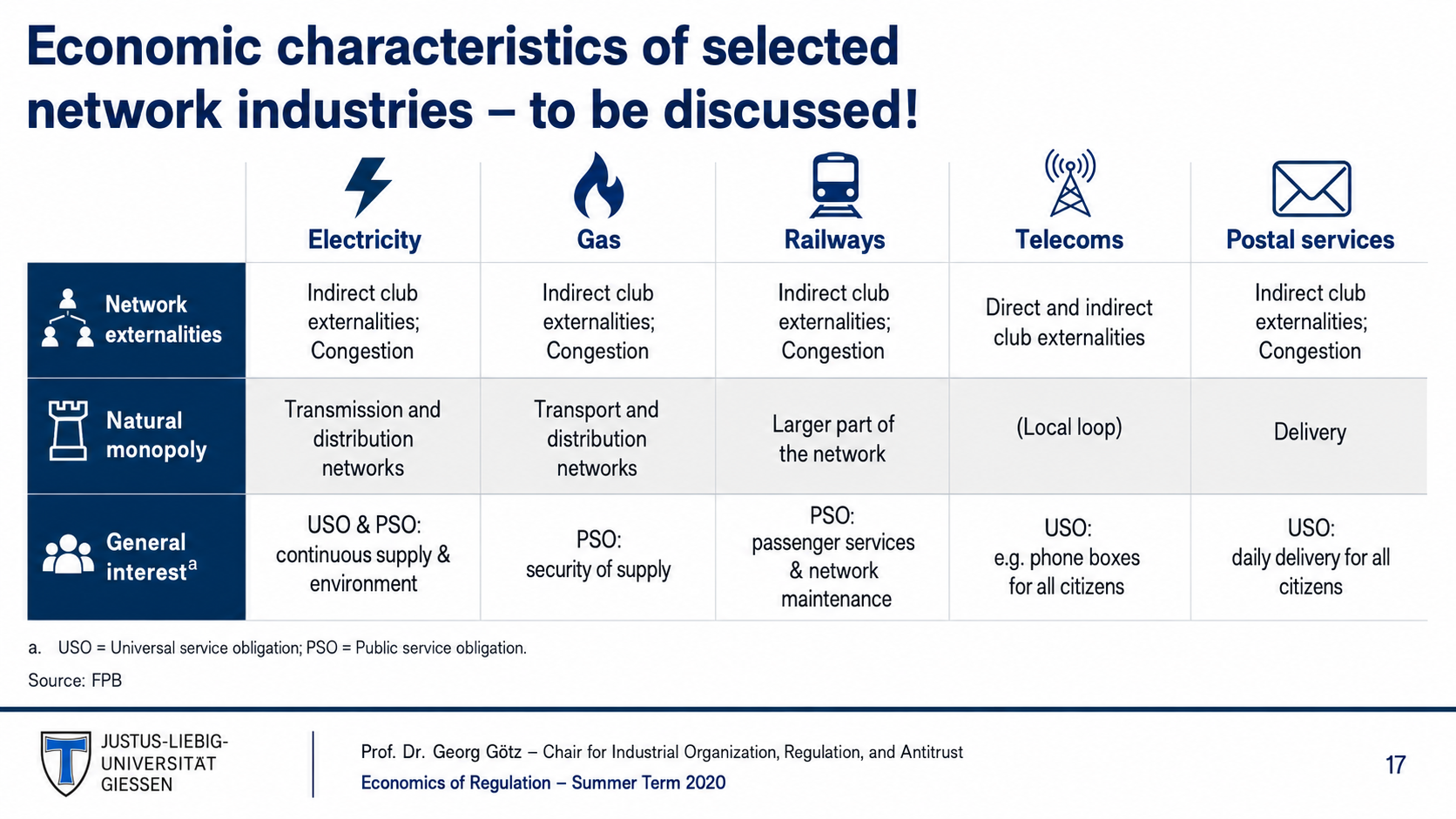
After: Redesigned table with professional styling and improved readability
Professional table styling, improved column readability
17

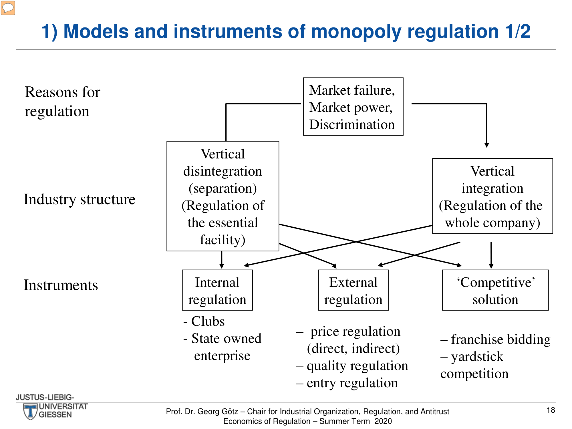
Monopoly Regulation Models 1/2 (Flowchart)

A hierarchical diagram showing reasons for regulation, industry structures, and regulatory instruments. The redesign adds icons and visual depth to each node.

Before
Before: Original diagram — plain boxes with connecting lines
Plain boxes with connecting lines, no visual coding
After
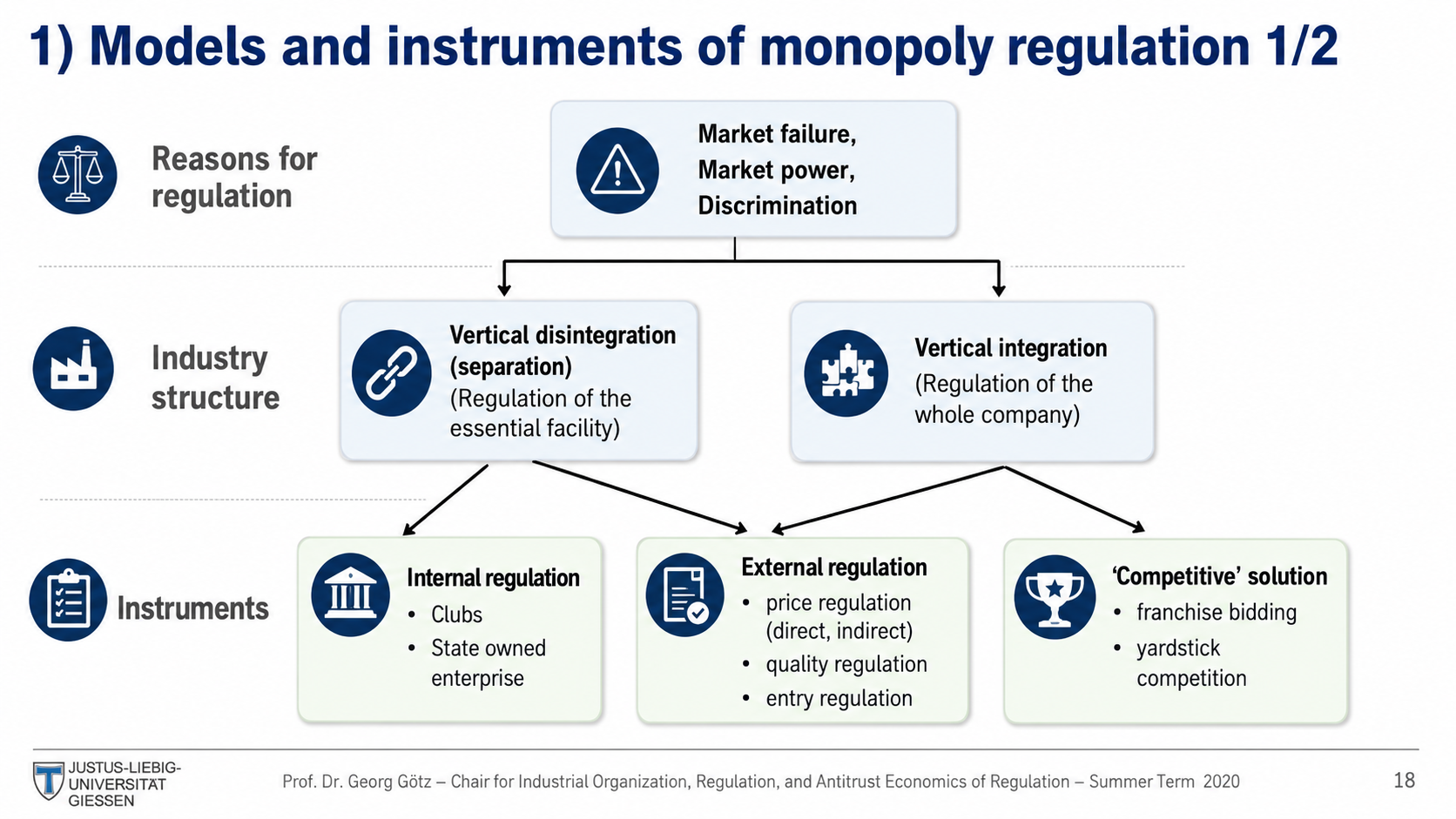
After: Redesigned diagram with icon-enriched nodes and visual hierarchy
Icon-enriched nodes, styled connections, visual layer hierarchy
18

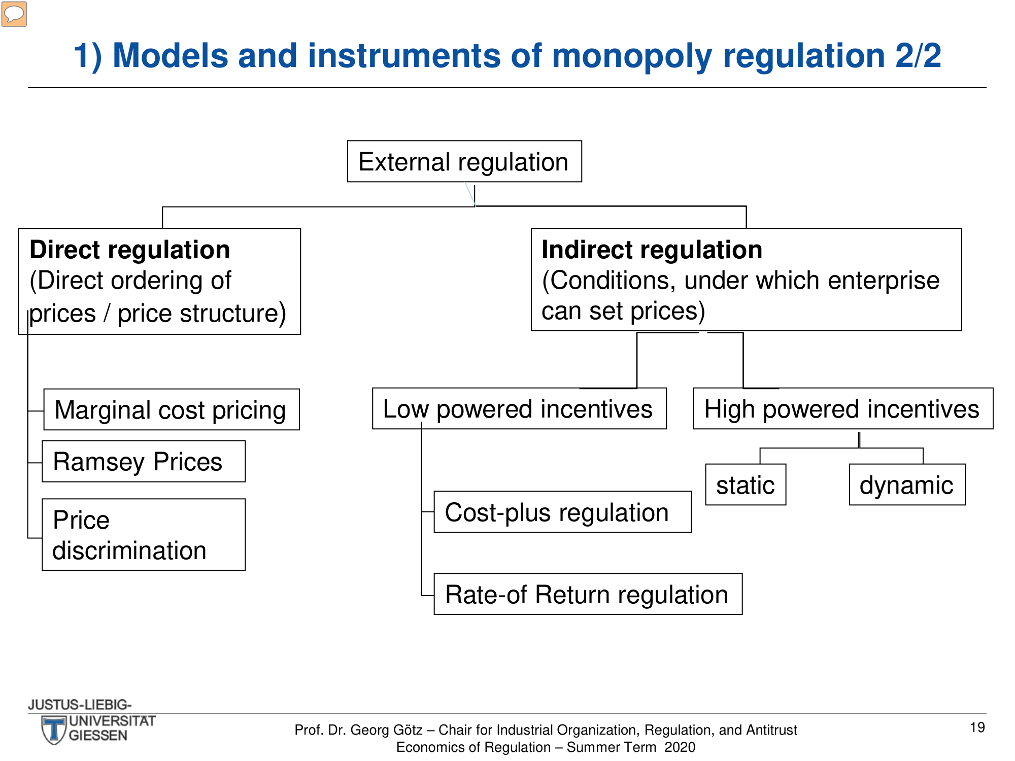
Monopoly Regulation Models 2/2 (Flowchart)

A tree diagram of external regulation showing direct vs indirect approaches. The redesign maintains the hierarchy while adding visual polish.

Before
Before: Original tree — basic structure with plain boxes
Basic tree structure, plain boxes, no color coding
After
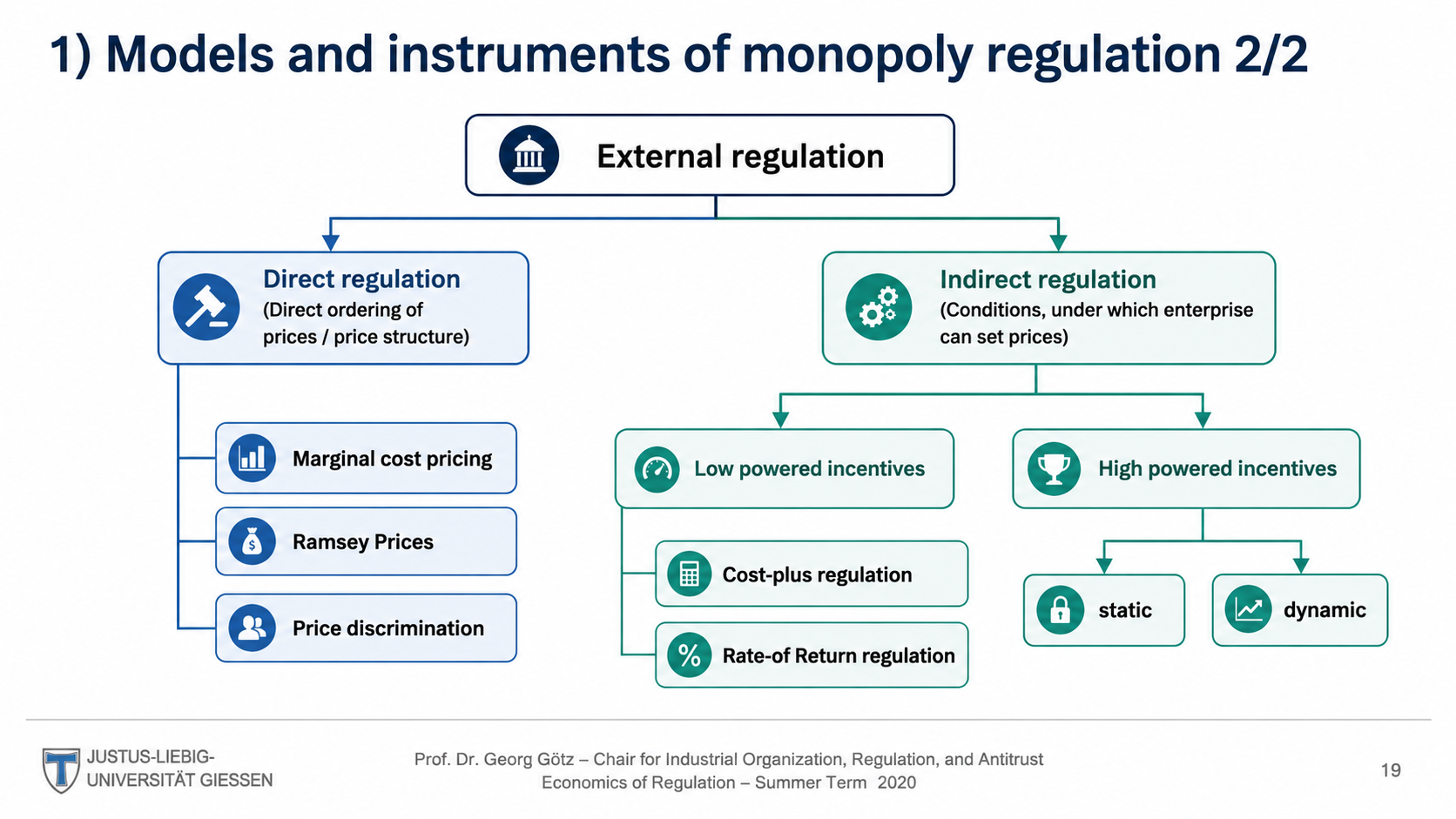
After: Redesigned tree with depth and color-coded branches
Styled tree with depth, color-coded branches
19

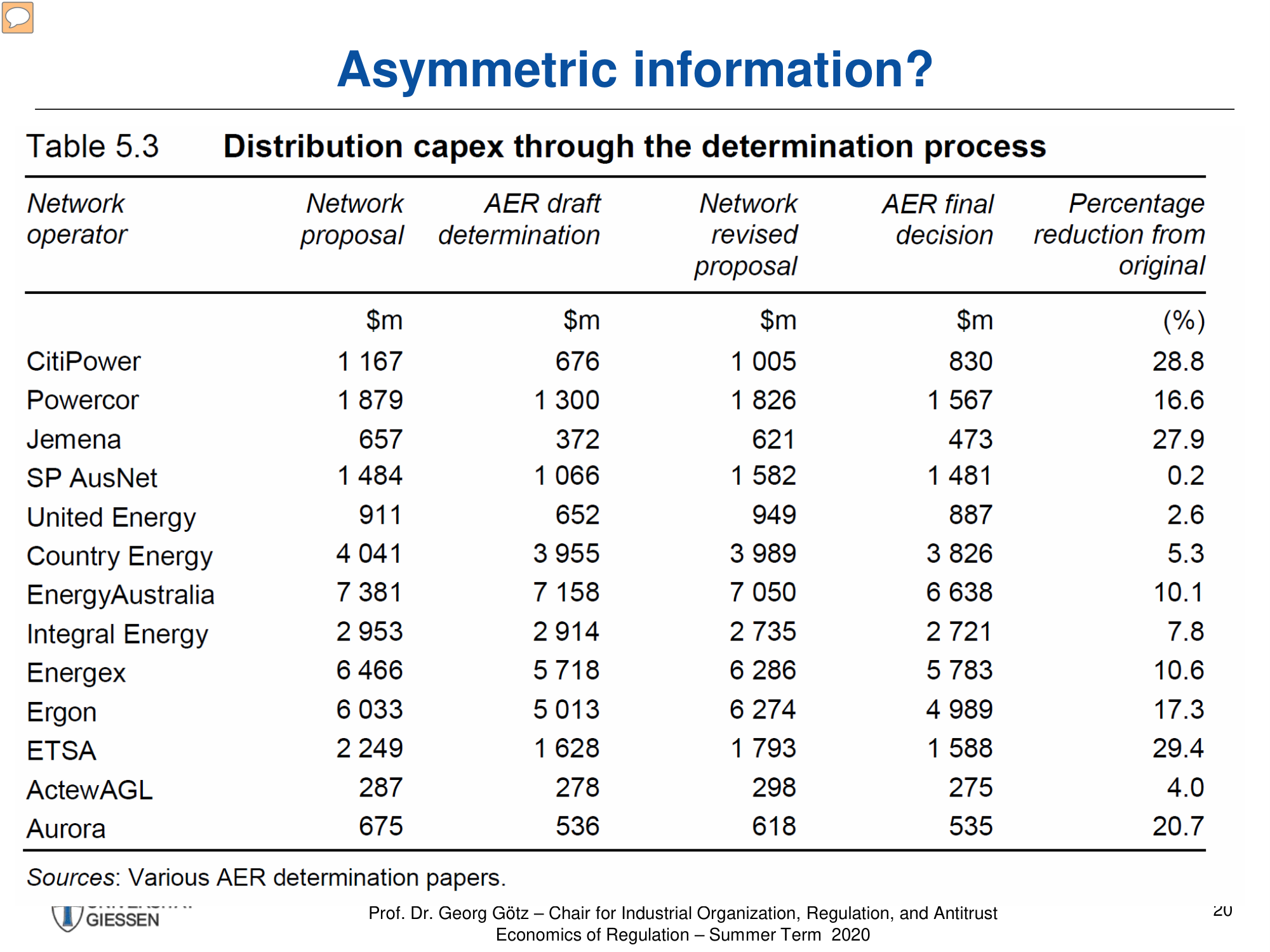
Asymmetric Information Table

A detailed 13-row data table showing distribution capex through determination process for Australian network operators. The redesign creates a professional financial table.

Before
Before: Original table — dense financial data with small text
Dense financial data table, small text, cramped columns
After
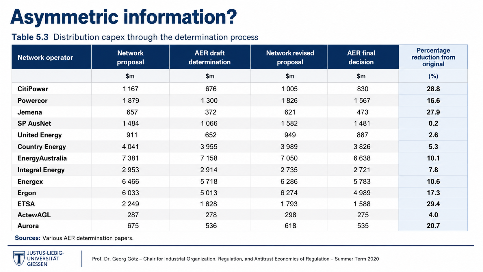
After: Redesigned table with highlighted reduction column and clean styling
Professional data table, highlighted reduction column, clean styling
20

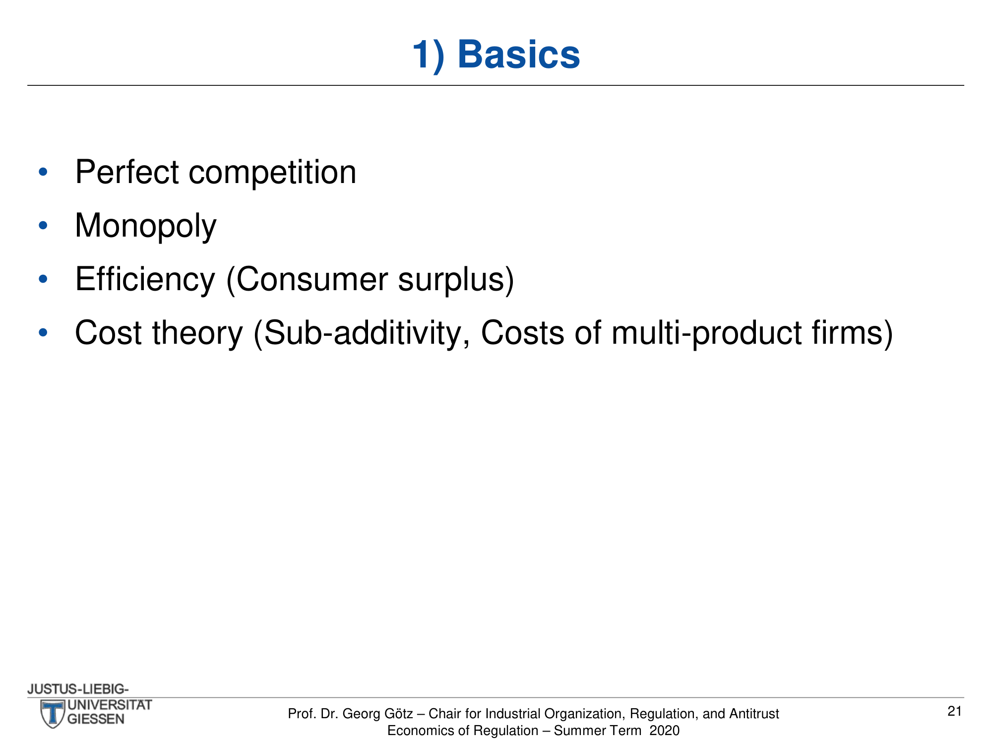
Basics

Four brief bullet points listing foundational concepts. The redesign uses icons to give each concept visual weight.

Before
Before: Original slide — sparse slide with four bare bullet points
Sparse slide, four bare bullet points, mostly empty
After
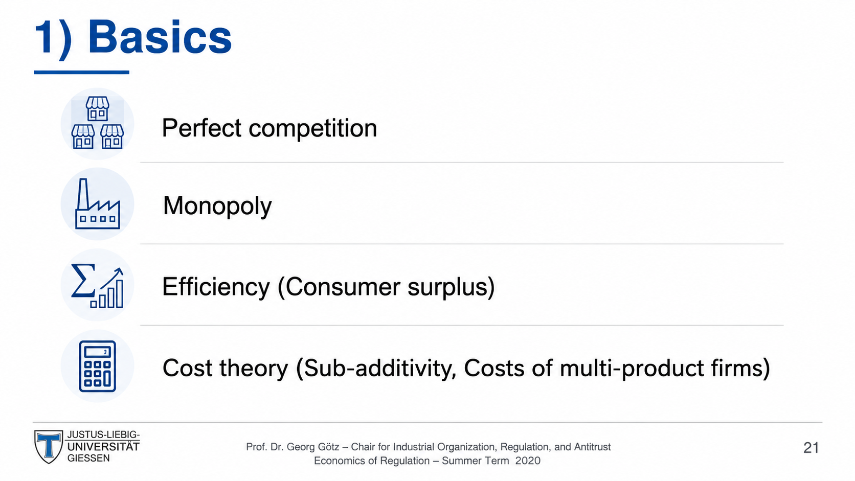
After: Redesigned slide with icon-based concept cards
Icon-based concept cards, visual weight to each topic

Transform Your Lecture Slides in Minutes

Upload your deck, pick a style, and let Arty handle the rest. Your words stay — the design levels up.

Try Deckly.art Free