AI Medical Illustration — Case Study

Consistent Medical Illustrations for Clinical Presentations — Before & After

A real 15-slide AHA Scientific Statement on Cardiovascular-Kidney-Metabolic (CKM) Syndrome — inconsistent clip art, generic icons, and dense clinical text transformed into unified realistic 3D medical illustrations with intuitive visual hierarchies by Arty.

📄 15 slides transformed 🏥 AHA — Cardiovascular-Kidney-Metabolic Syndrome Statement 🤖 Style: Realistic 3D Medical

Why This Deck Needs a Redesign

This AHA Clinical Slide Series covers the 2023 Scientific Statement on Cardiovascular-Kidney-Metabolic (CKM) Syndrome — a complex interplay between heart disease, kidney disease, and metabolic disorders. The clinical content is authoritative, but the original slides suffer from significant visual problems:

Arty's redesign generates unified realistic 3D medical illustrations — hearts, kidneys, liver, adipose tissue, blood vessels — all in a consistent visual style across every slide. Dense clinical text is reorganized into clear visual hierarchies with section headers, card-based layouts, and illustration-supported content that makes complex CKM staging and treatment protocols instantly accessible.

Original slides from the American Heart Association — 2023 Scientific Statement: Cardiovascular-Kidney-Metabolic Syndrome. AHA Clinical Slide Series.
1

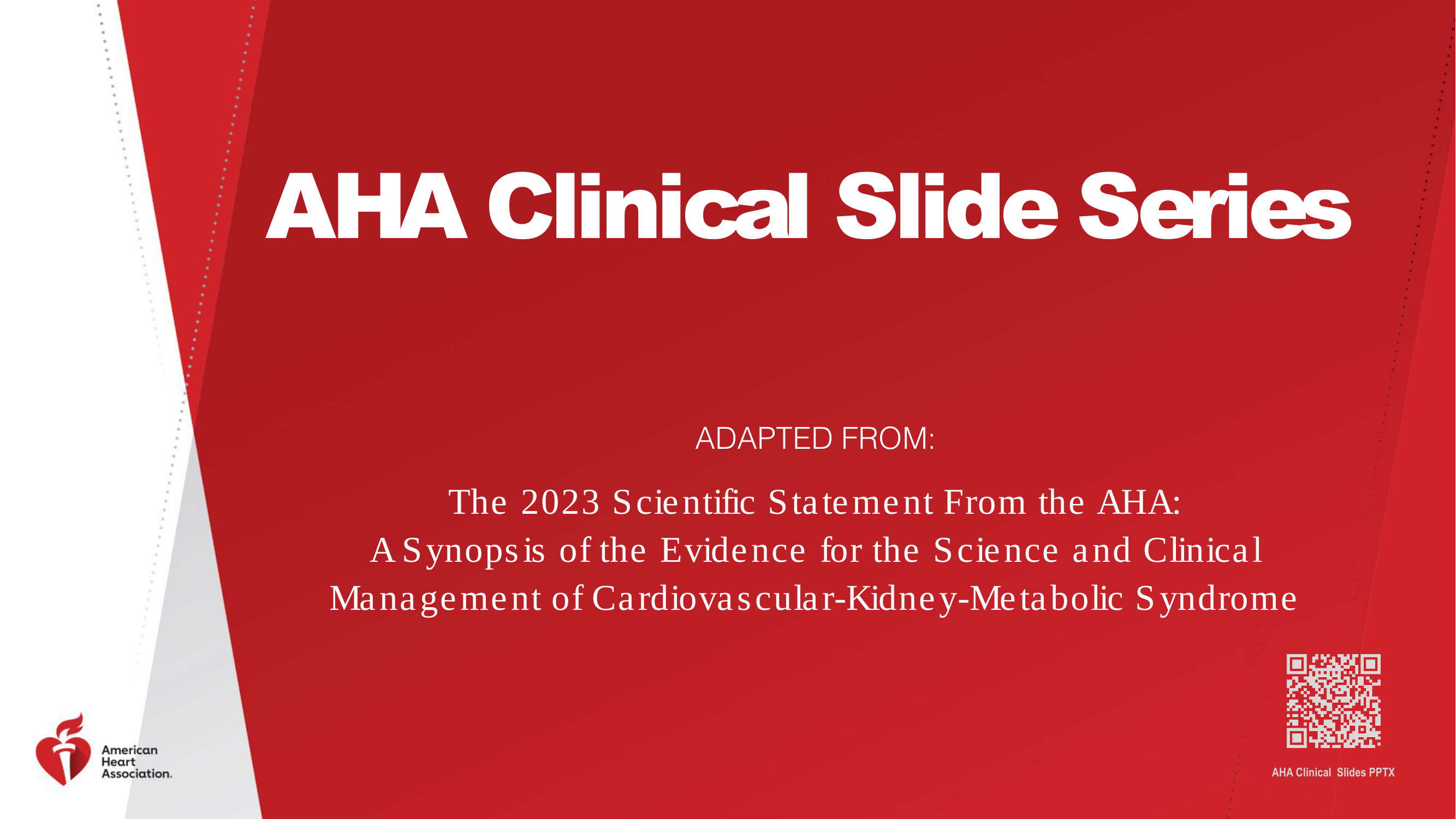
Title — AHA Clinical Slide Series: CKM Syndrome

Plain red background with text and AHA logo. The redesign adds realistic illustrations of heart, kidneys, and metabolic molecules in a connected triad diagram showing the CKM relationship.

Before
Before: Original slide 1 — plain red title slide with AHA logo
Plain red background with text only, no visual representation of CKM concept
After
After: Redesigned slide 1 with realistic CKM triad illustration
Realistic 3D illustrations of heart, kidneys, and metabolic molecules in connected triad diagram
2

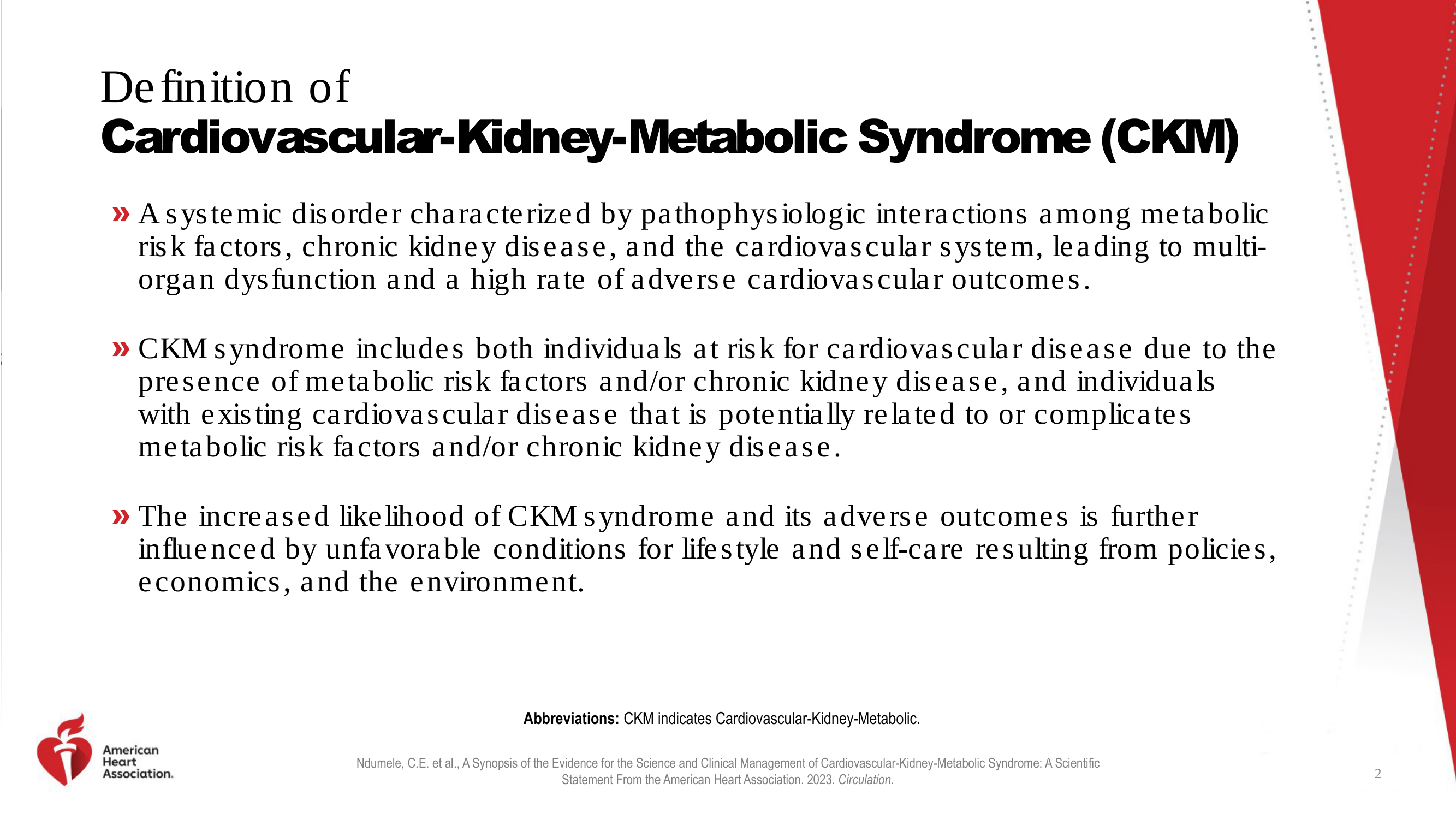
Definition of Cardiovascular-Kidney-Metabolic Syndrome

Three dense text paragraphs with bullet points and no visuals. The redesign introduces a clean layout with visual hierarchy and medical illustration support.

Before
Before: Original slide 2 — dense text definition of CKM syndrome
Dense text paragraphs with bullet points, no visual aids
After
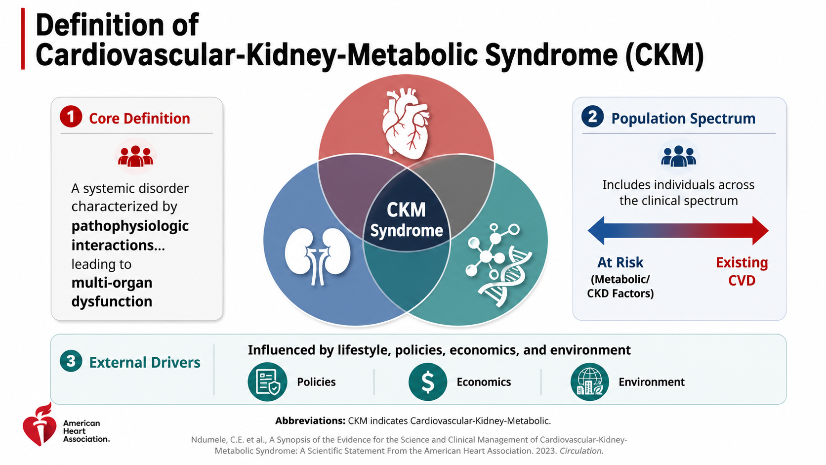
After: Redesigned slide 2 with visual hierarchy and medical illustrations
Clean visual hierarchy with consistent medical illustration support
3

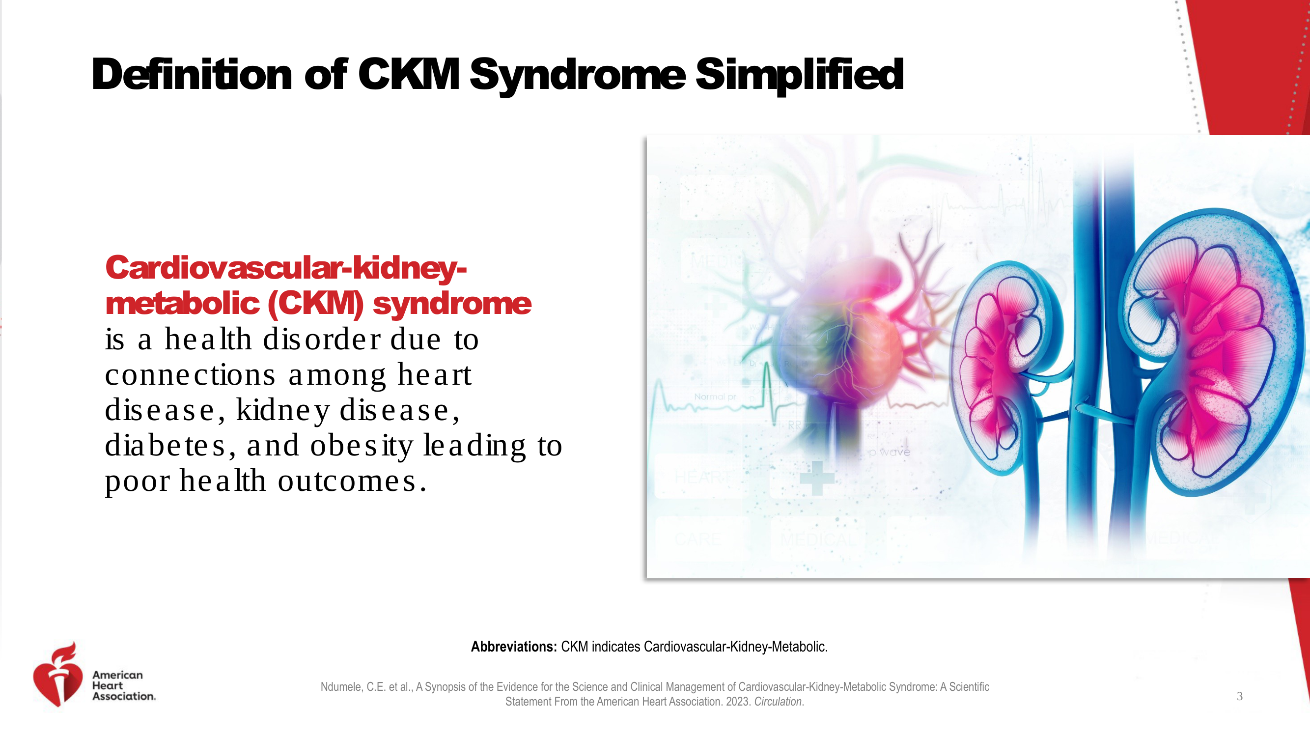
Definition of CKM Syndrome Simplified

Text with a generic stock image of kidneys. The redesign replaces the stock photo with a consistent-style illustration and cleaner layout.

Before
Before: Original slide 3 — text with generic kidney stock image
Generic stock kidney image, inconsistent with rest of deck
After
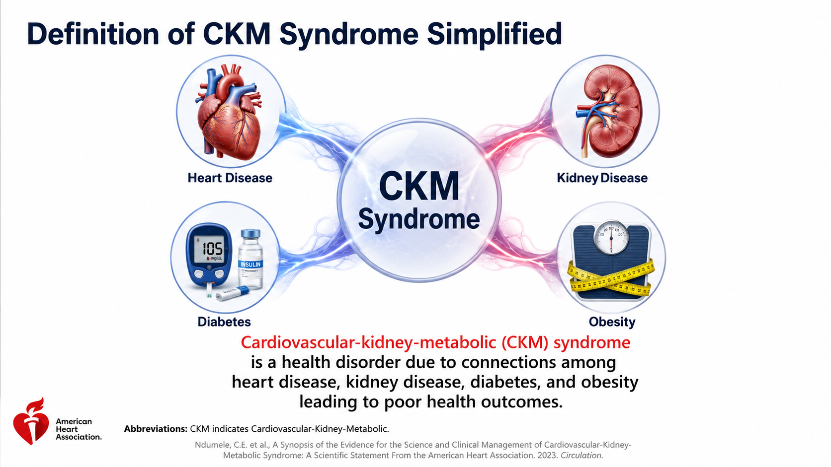
After: Redesigned slide 3 with consistent medical illustration style
Consistent illustration style replacing stock photo, cleaner text layout
4

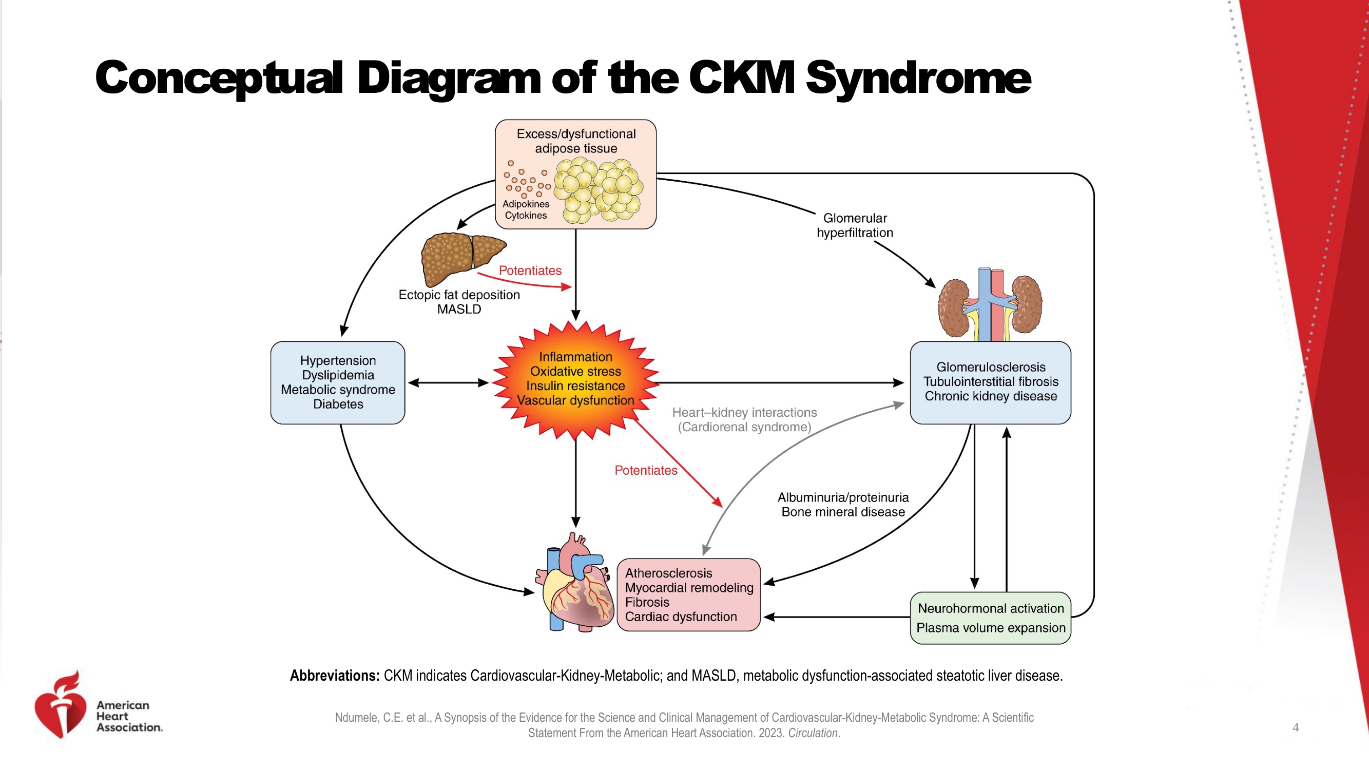
Conceptual Diagram of the CKM Syndrome

Flowchart with small, inconsistent clip art — tiny liver, cartoon adipose tissue, small heart. The redesign uses large, detailed, realistic 3D medical illustrations of each organ all in the same style.

Before
Before: Original slide 4 — flowchart with inconsistent clip art organs
Flowchart with tiny, inconsistent clip art — cartoon liver, adipose tissue, and heart
After
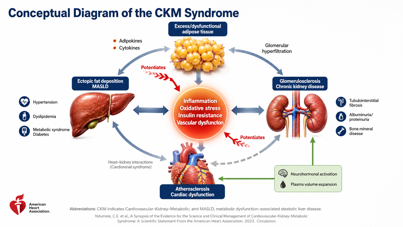
After: Redesigned slide 4 with large realistic 3D organ illustrations
Large, detailed realistic 3D illustrations — liver, kidneys, heart, adipose tissue — all unified style
5

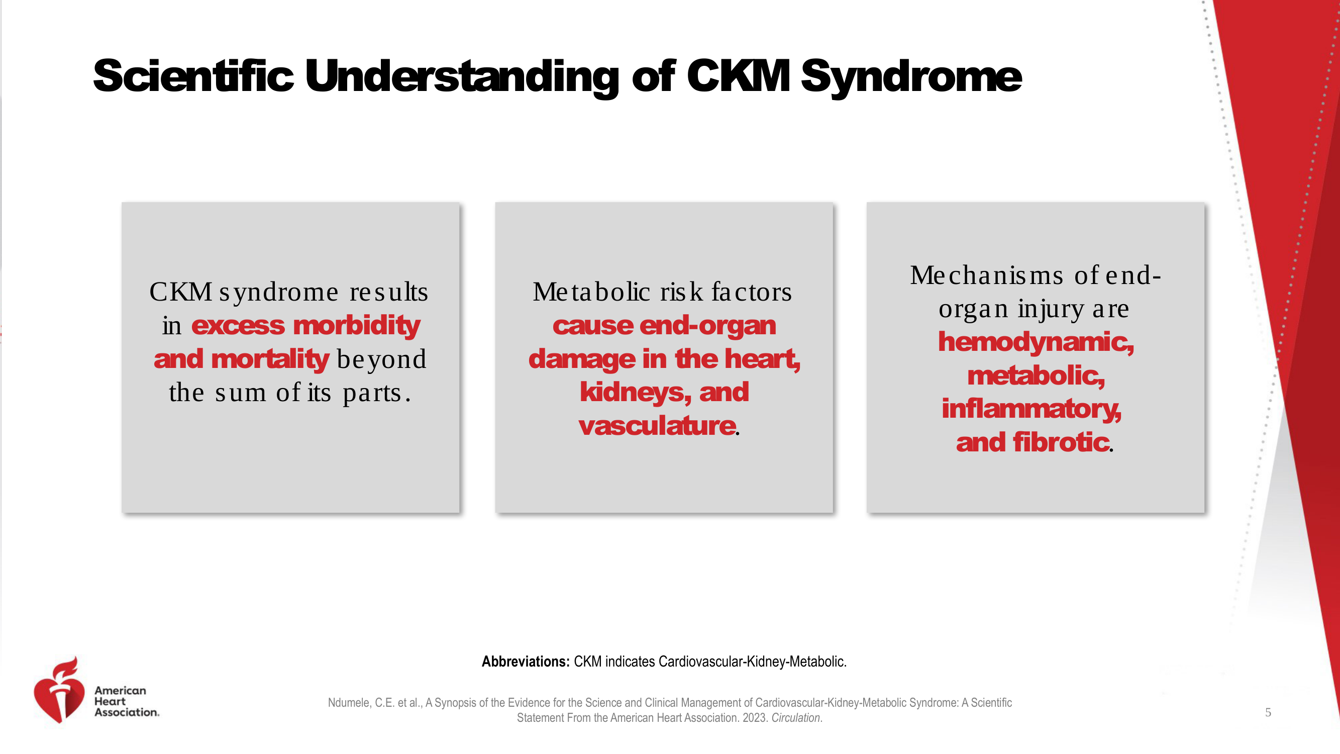
Scientific Understanding of CKM Syndrome

Three grey boxes with text and no visuals. The redesign presents each concept as a card with consistent medical illustrations accompanying the text.

Before
Before: Original slide 5 — grey text boxes with no visuals
Three grey text boxes, no visual aids for complex scientific concepts
After
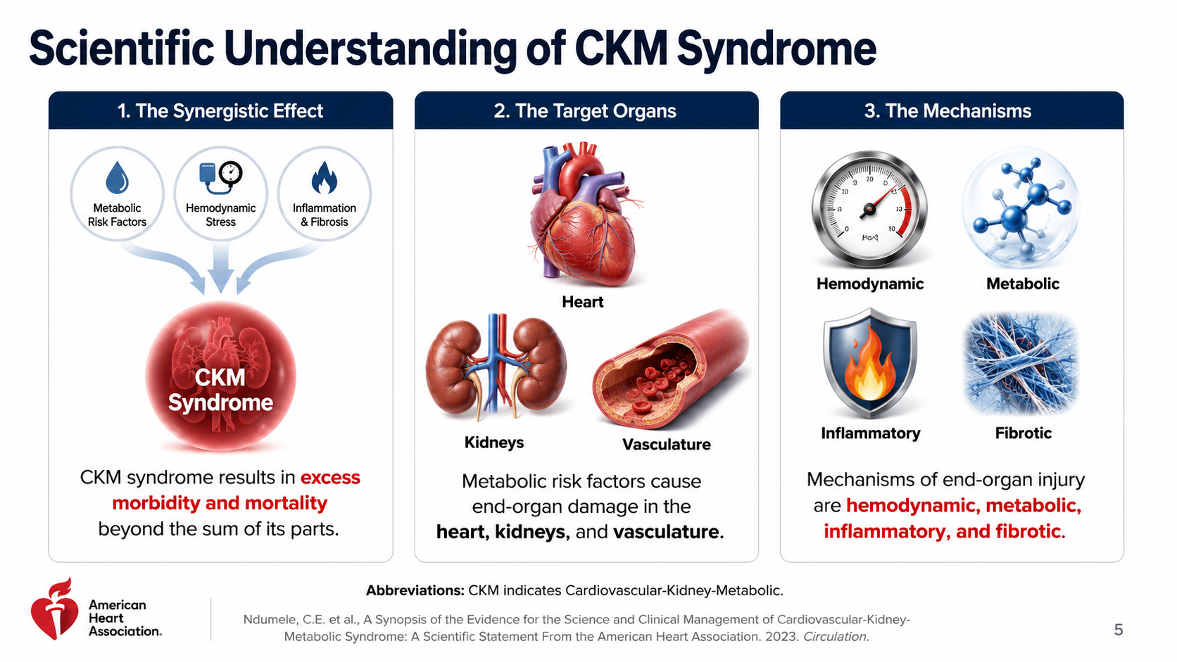
After: Redesigned slide 5 with illustrated concept cards
Card layout with consistent medical illustrations accompanying each scientific concept
6

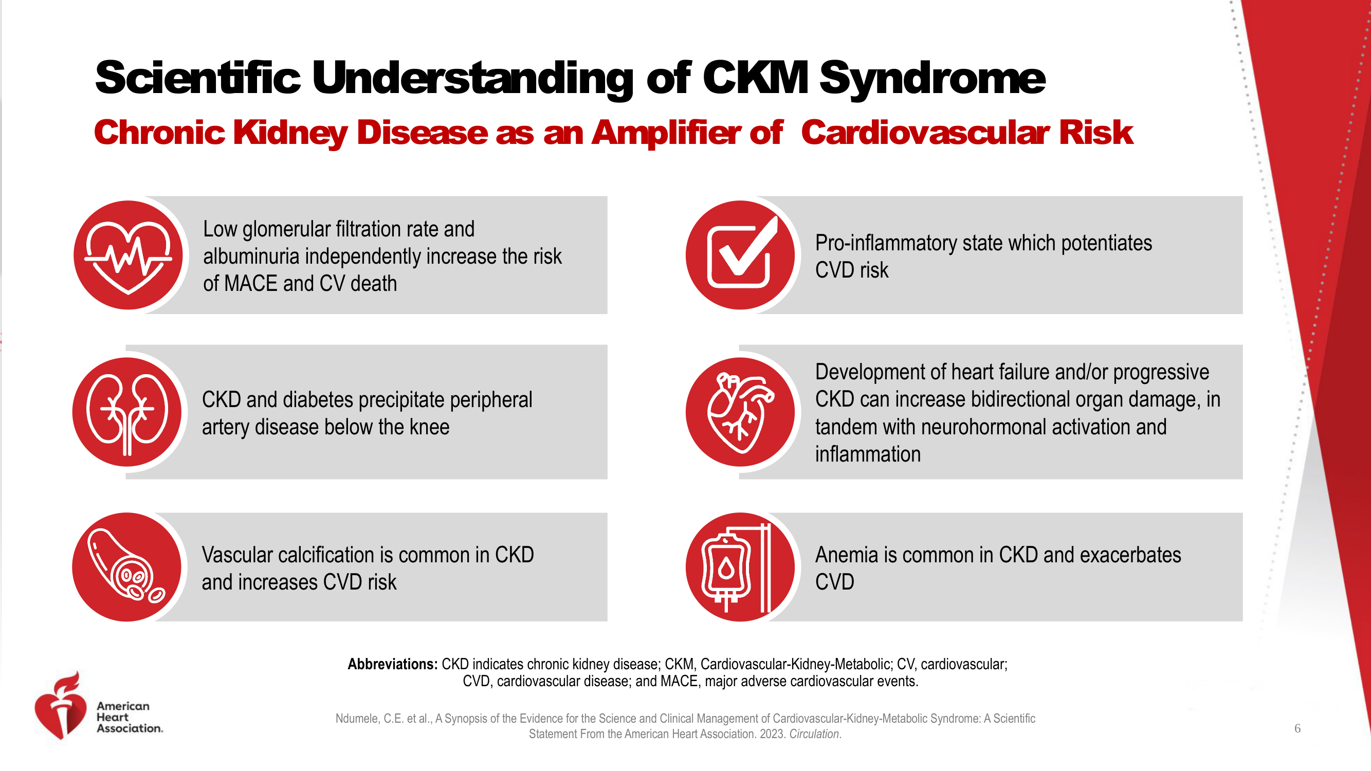
Scientific Understanding — CKD as Amplifier of CV Risk

Red circle icons in generic line-art style with text descriptions. The redesign replaces generic icons with consistent realistic medical illustrations that convey each concept.

Before
Before: Original slide 6 — generic red circle icons with text
Generic red circle line-art icons that don't convey medical concepts
After
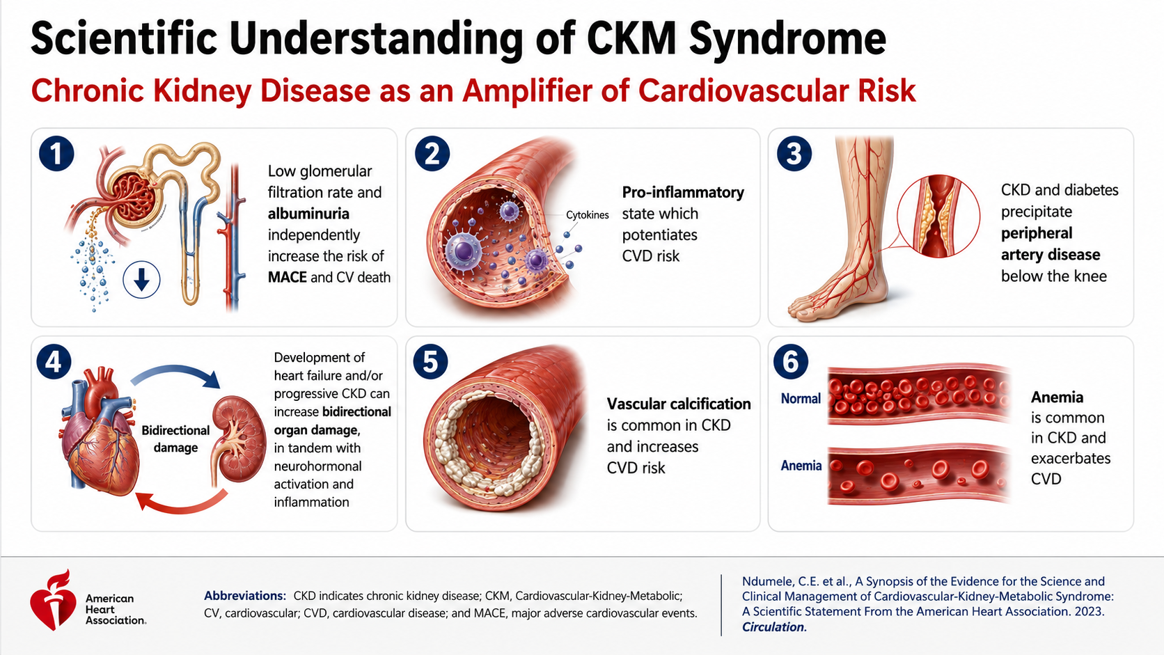
After: Redesigned slide 6 with realistic medical illustrations replacing icons
Consistent realistic medical illustrations replacing generic icons for each risk factor
7

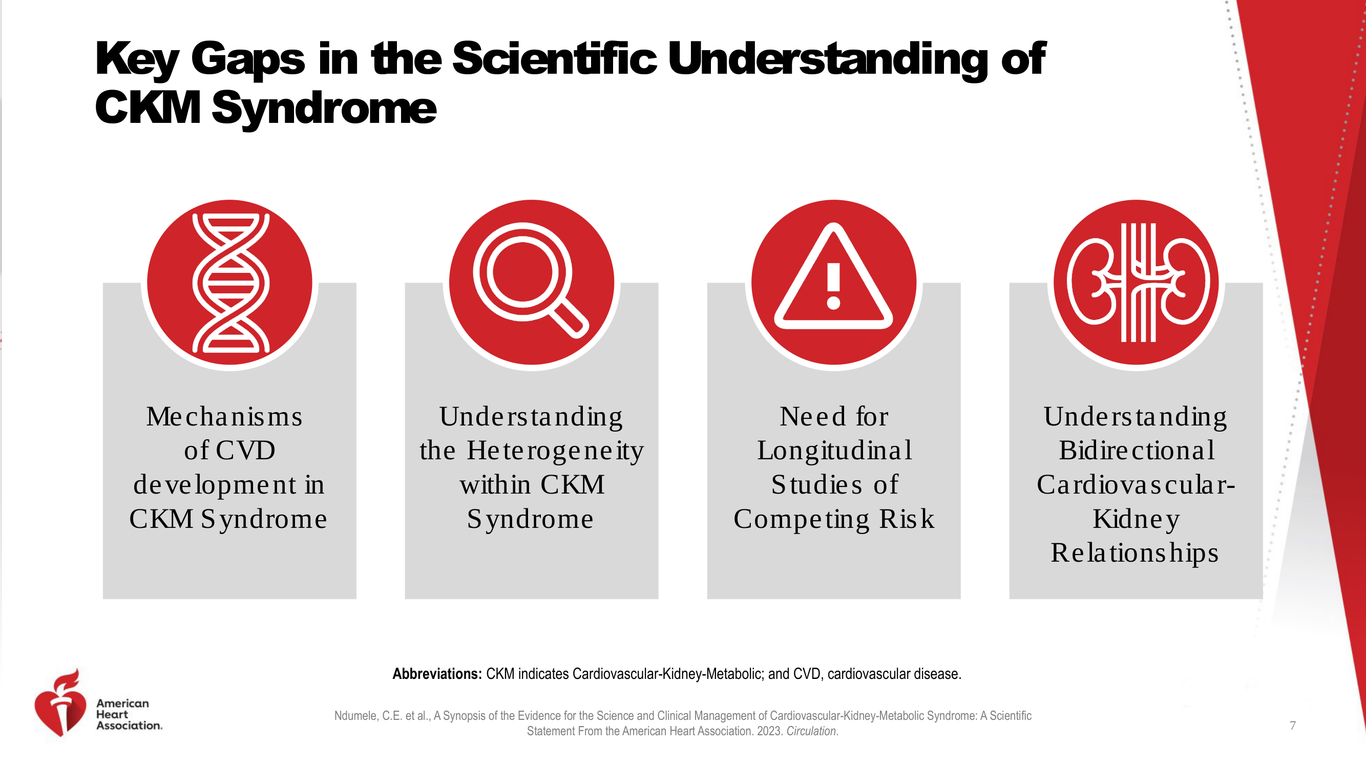
Key Gaps in Scientific Understanding

Generic red circle icons (DNA helix, magnifying glass, warning sign, heart) with text below. The redesign uses consistent illustration style with meaningful medical imagery for each gap.

Before
Before: Original slide 7 — generic icons for scientific gaps
Generic red circle icons — DNA helix, magnifying glass, warning sign — lack medical specificity
After
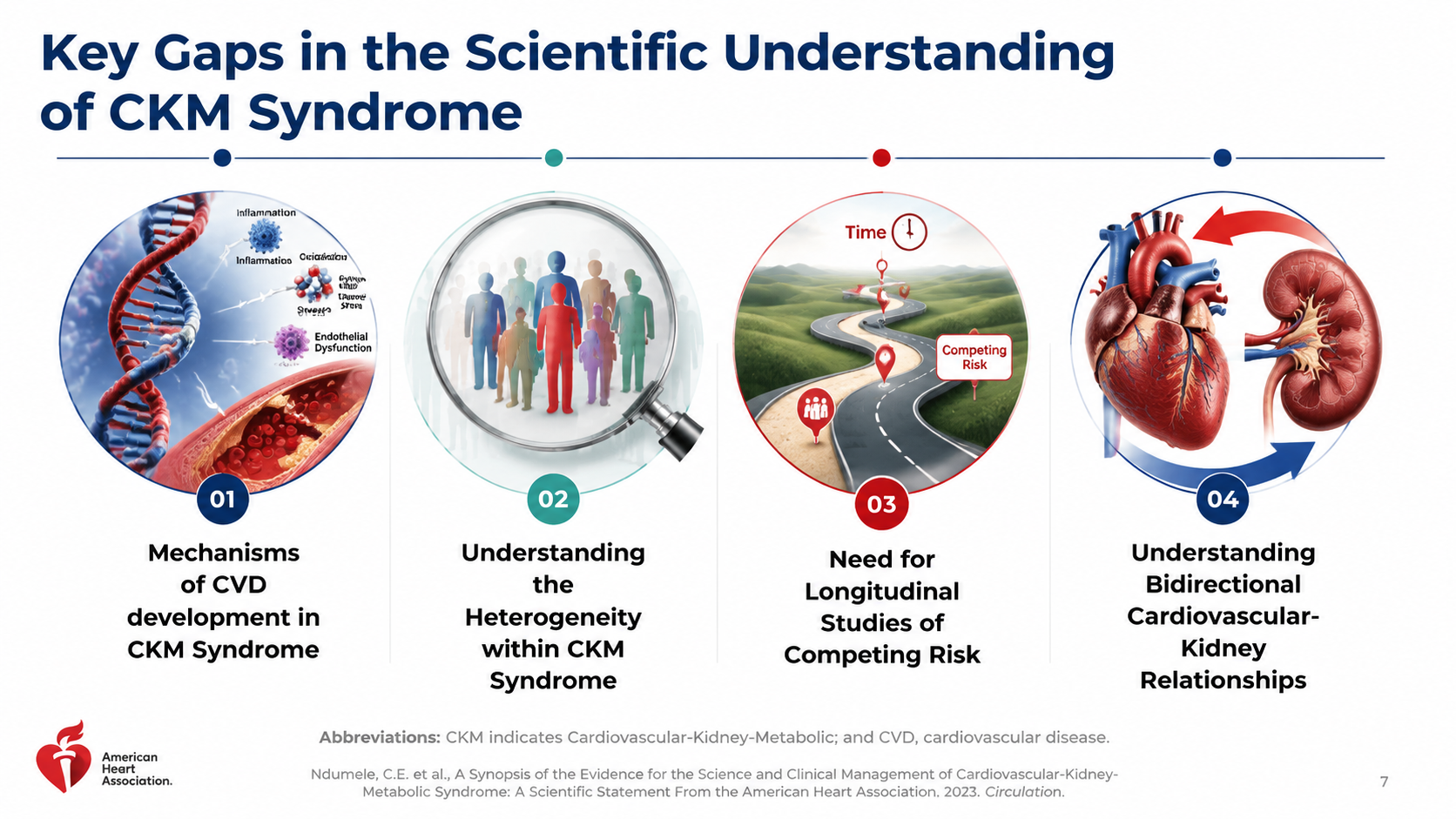
After: Redesigned slide 7 with meaningful medical imagery
Consistent illustration style with meaningful medical imagery for each knowledge gap
8

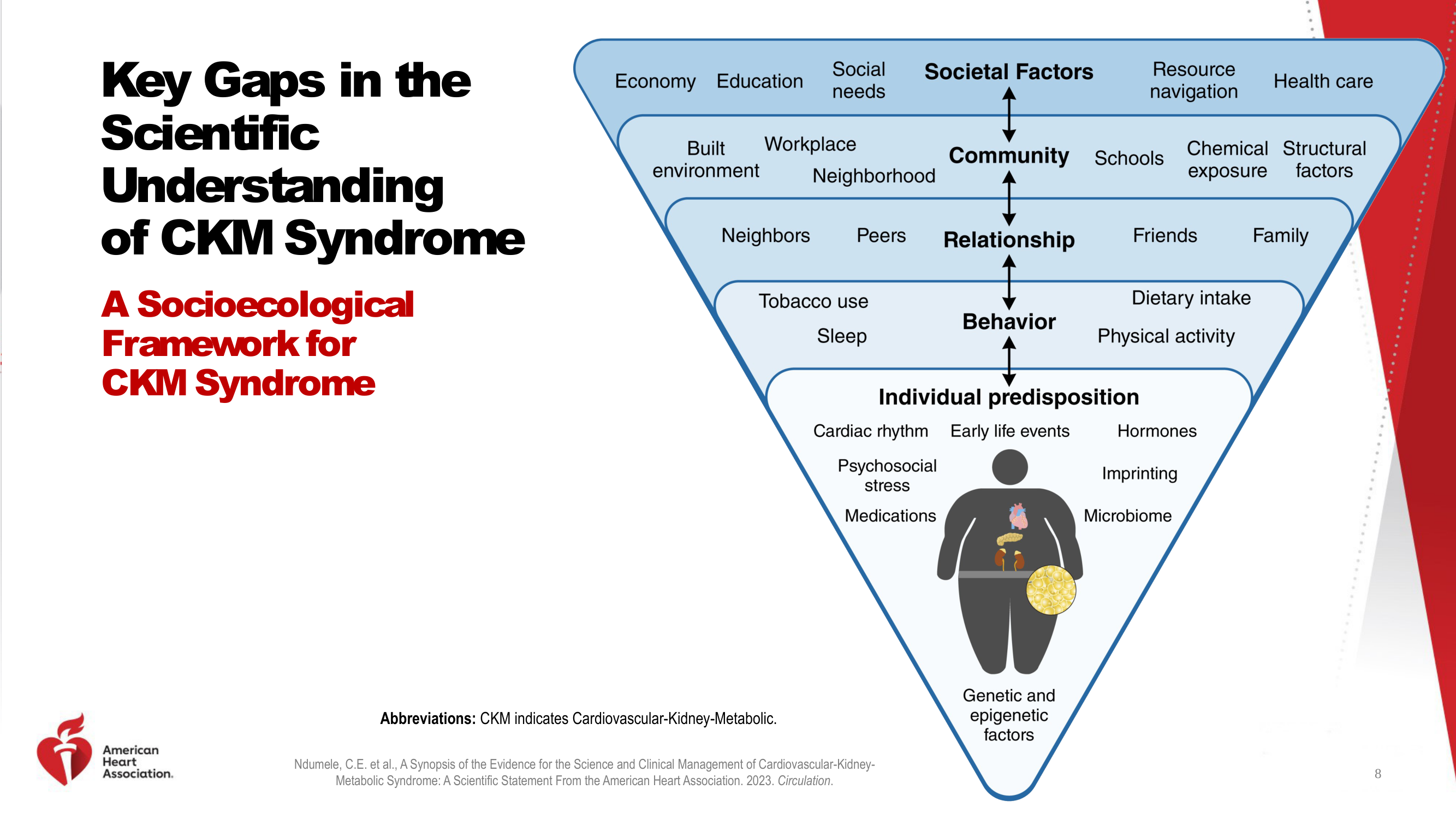
Socioecological Framework for CKM Syndrome

Inverted pyramid diagram with cartoon figure and minimal icons. The redesign enriches the pyramid with consistent illustrated icons for each layer — buildings, people, food, exercise, organs.

Before
Before: Original slide 8 — inverted pyramid with cartoon figure
Inverted pyramid with cartoon figure and minimal generic icons
After
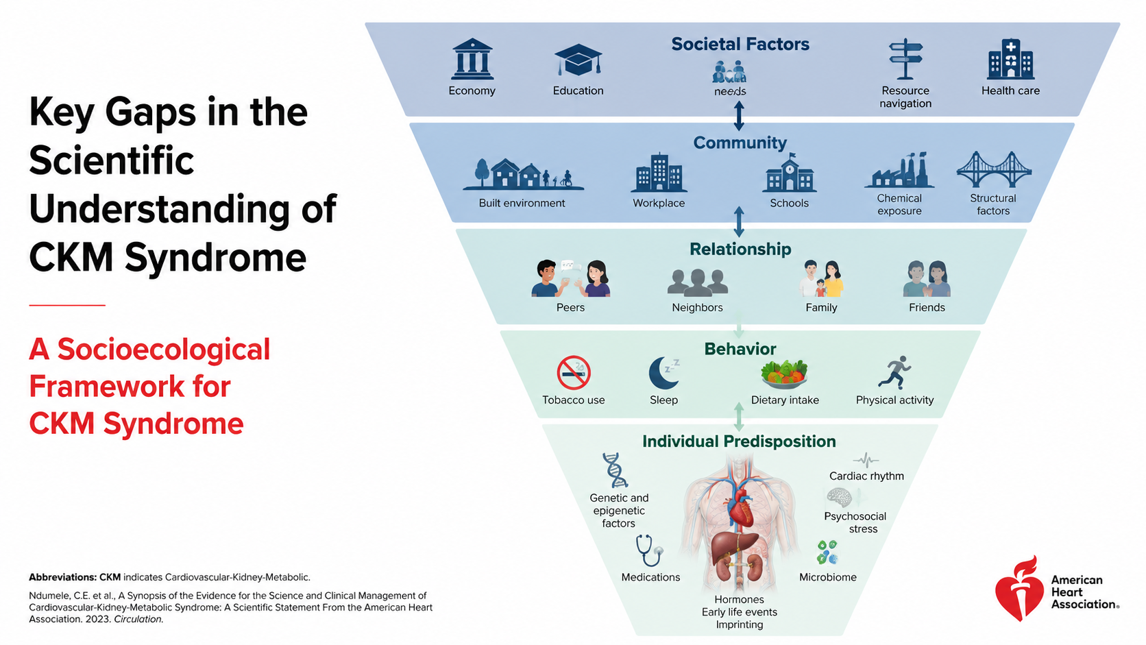
After: Redesigned slide 8 with richly illustrated socioecological pyramid
Rich inverted pyramid with consistent illustrated icons for each socioecological layer
9

Key Gaps in Screening Approaches

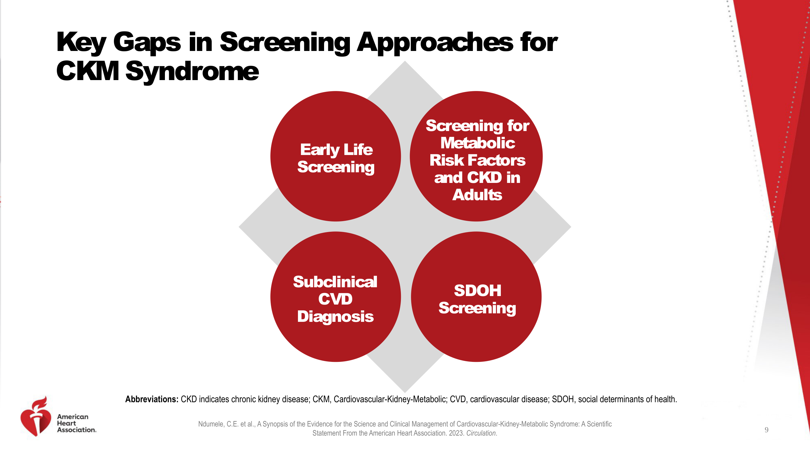
Four red circles with white text on grey diamond background. The redesign applies consistent visual treatment with medical imagery to make screening gaps more intuitive.

Before
Before: Original slide 9 — red circles on grey diamond background
Red circles with white text on grey diamond, no medical context
After
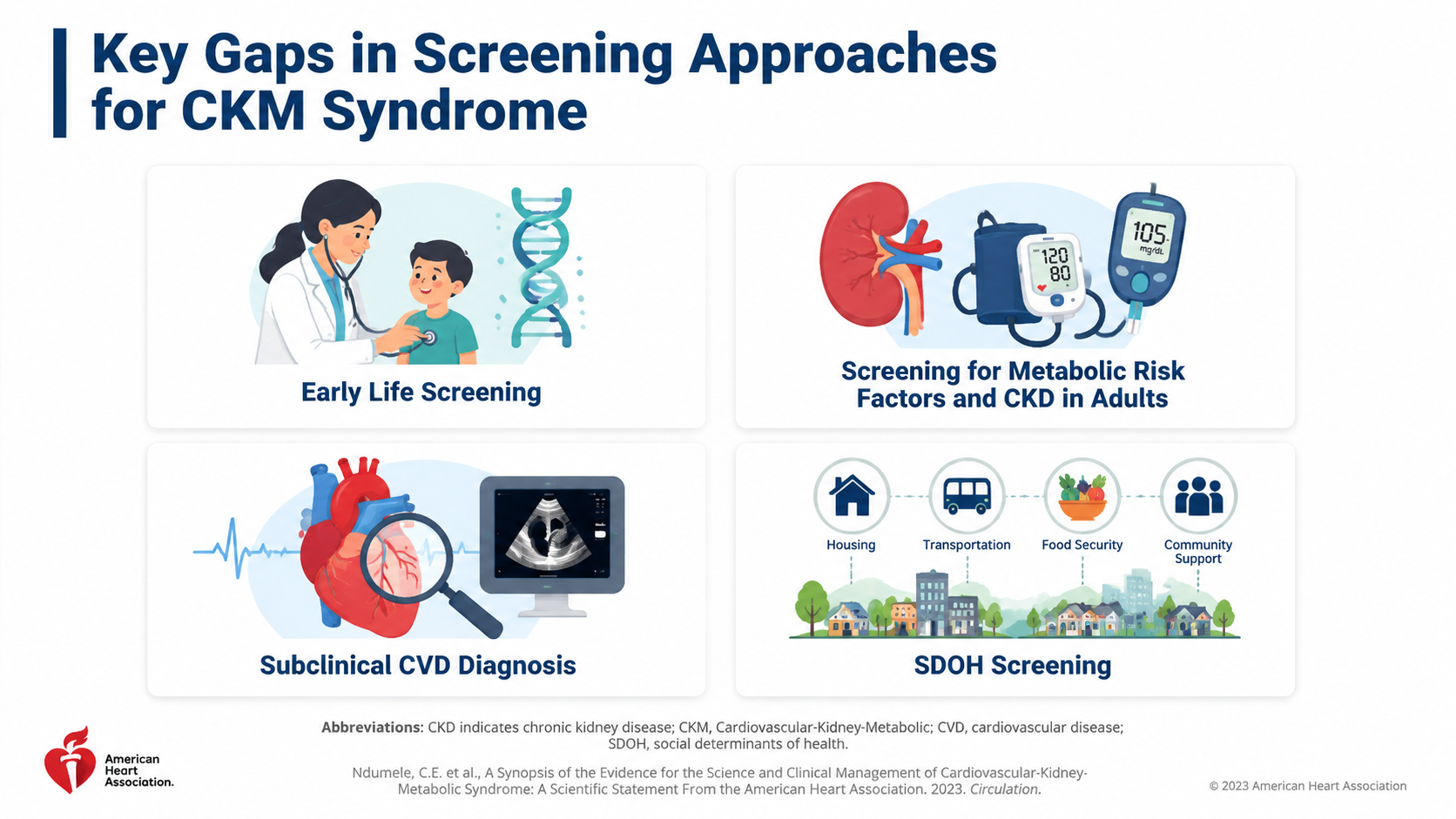
After: Redesigned slide 9 with consistent visual treatment and medical imagery
Consistent visual treatment with medical imagery for each screening gap
10

CKM Syndrome Staging Definitions

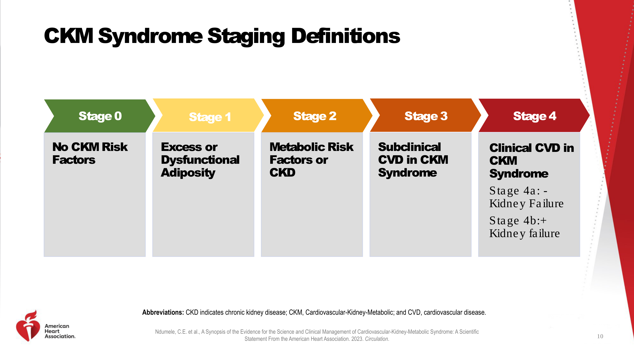
Chevron arrow stages (Stage 0–4) with text descriptions, color-coded but no illustrations. The redesign adds a realistic medical illustration for each stage — healthy heart, adipose tissue, blood pressure monitor, magnified heart, warning icons.

Before
Before: Original slide 10 — chevron staging with text only
Color-coded chevron stages with text descriptions only, no anatomical visuals
After
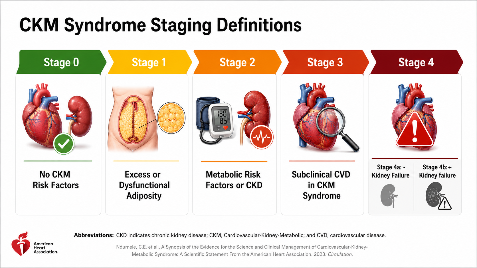
After: Redesigned slide 10 with illustrated staging definitions
Each stage gets a realistic medical illustration — consistent style across all staging levels
11

Evidence for Prevention — Stage 0 & 1

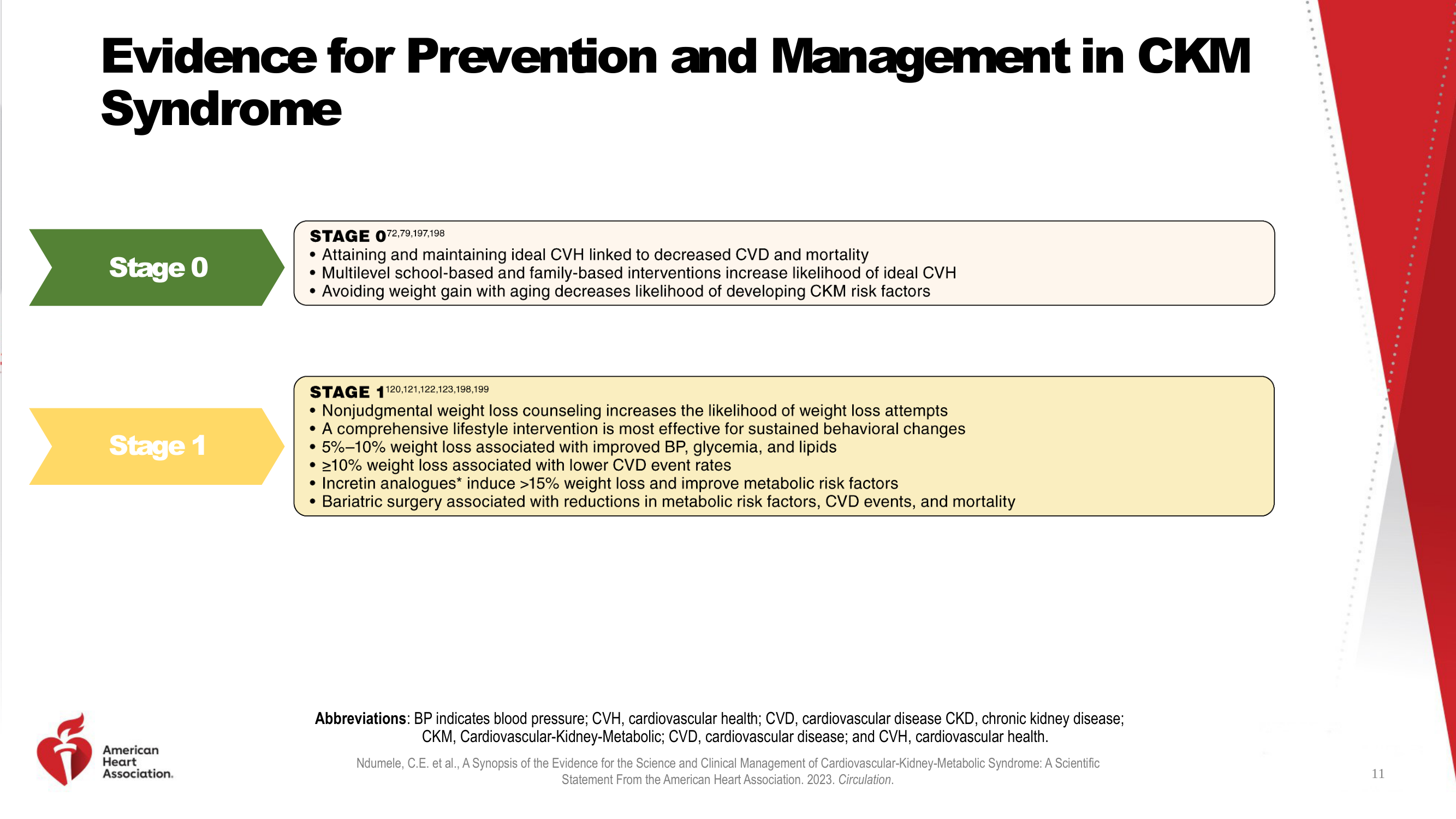
Color-coded text boxes with bullet points and no visuals. The redesign presents each stage as a card with consistent medical illustrations supporting the prevention evidence.

Before
Before: Original slide 11 — text boxes for Stage 0 and 1 prevention
Color-coded text boxes with bullet points, no visual support
After
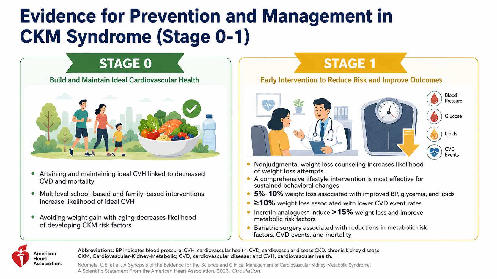
After: Redesigned slide 11 with illustrated prevention cards
Card layout with consistent medical illustrations for each prevention stage
12

Evidence for Prevention — Stage 2 & 3

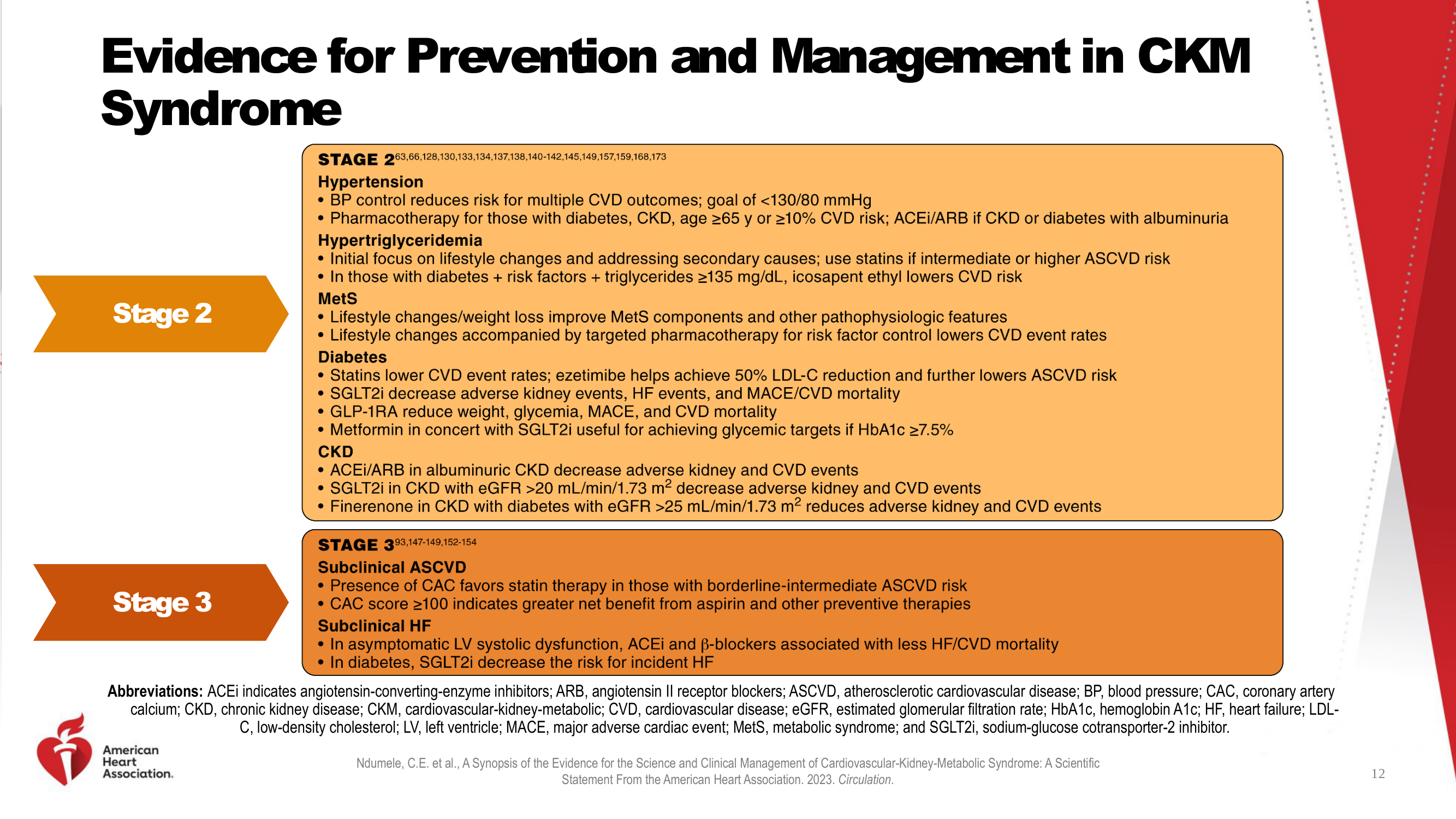
Dense text in colored boxes, extremely text-heavy with medical abbreviations. The redesign organizes into clear sections with medical illustrations — blood pressure cuff, blood drops, kidneys, heart — each in consistent realistic style.

Before
Before: Original slide 12 — extremely dense text for Stage 2 and 3
Extremely dense text with medical abbreviations, wall of clinical information
After
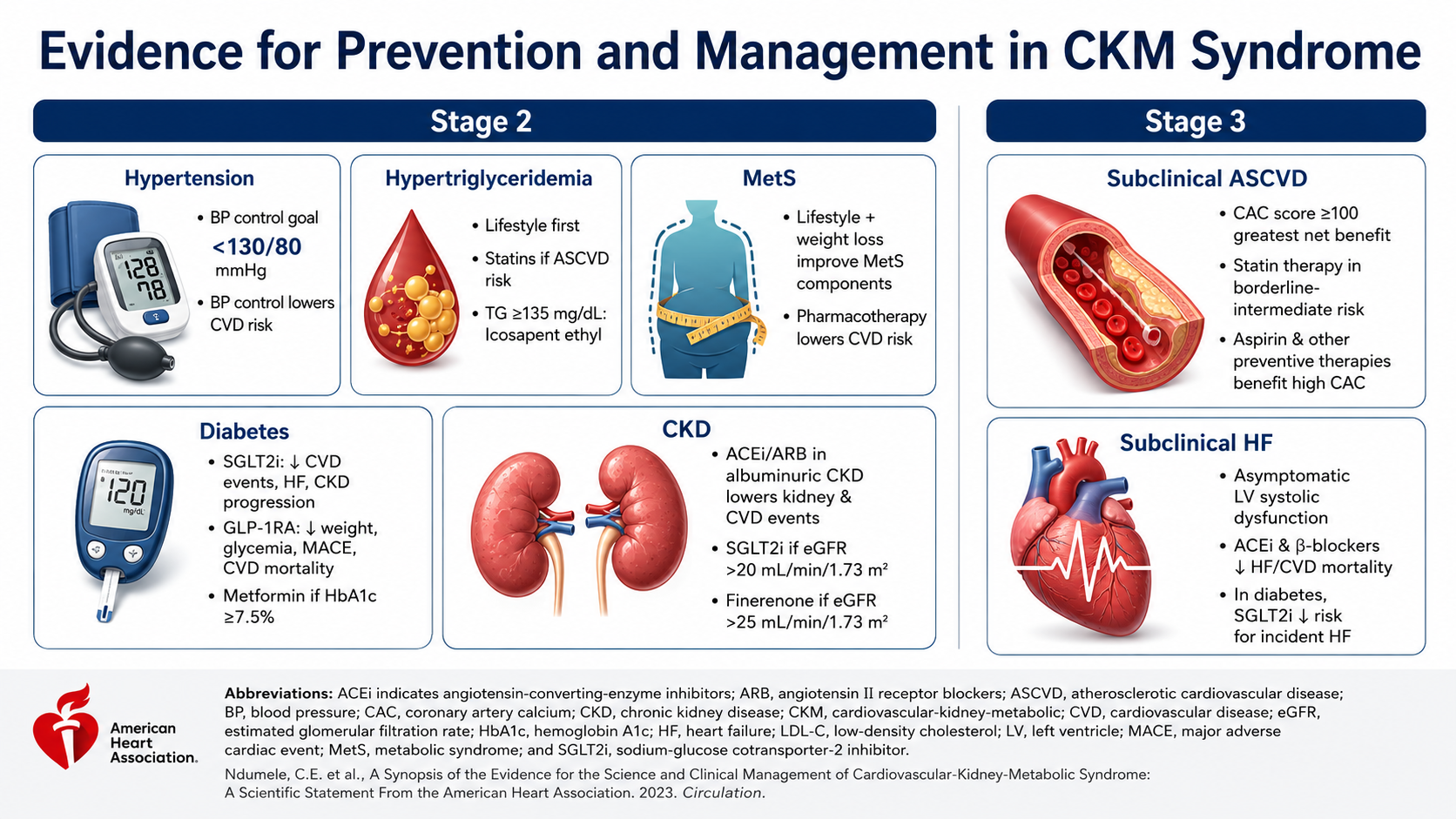
After: Redesigned slide 12 with organized sections and medical illustrations
Organized sections with consistent realistic illustrations — blood pressure, kidneys, heart
13

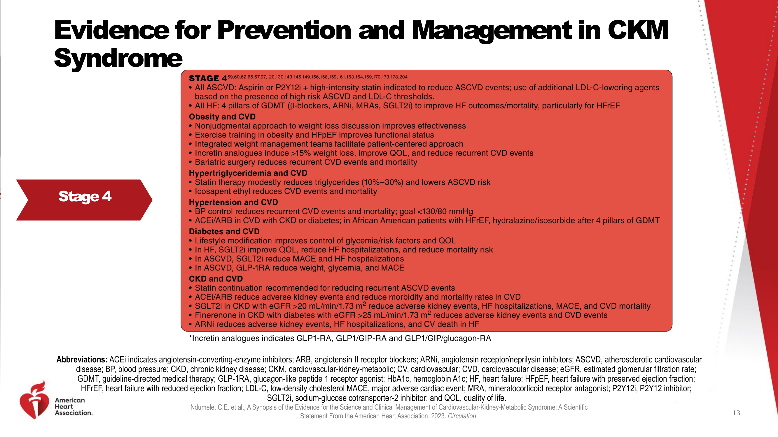
Evidence for Prevention — Stage 4

Extremely dense text in red box — a wall of medical treatment details. The redesign organizes into clear categorized sections with consistent medical illustrations for each treatment area.

Before
Before: Original slide 13 — wall of text for Stage 4 treatment
Wall of dense medical treatment details in red box, overwhelming to read
After
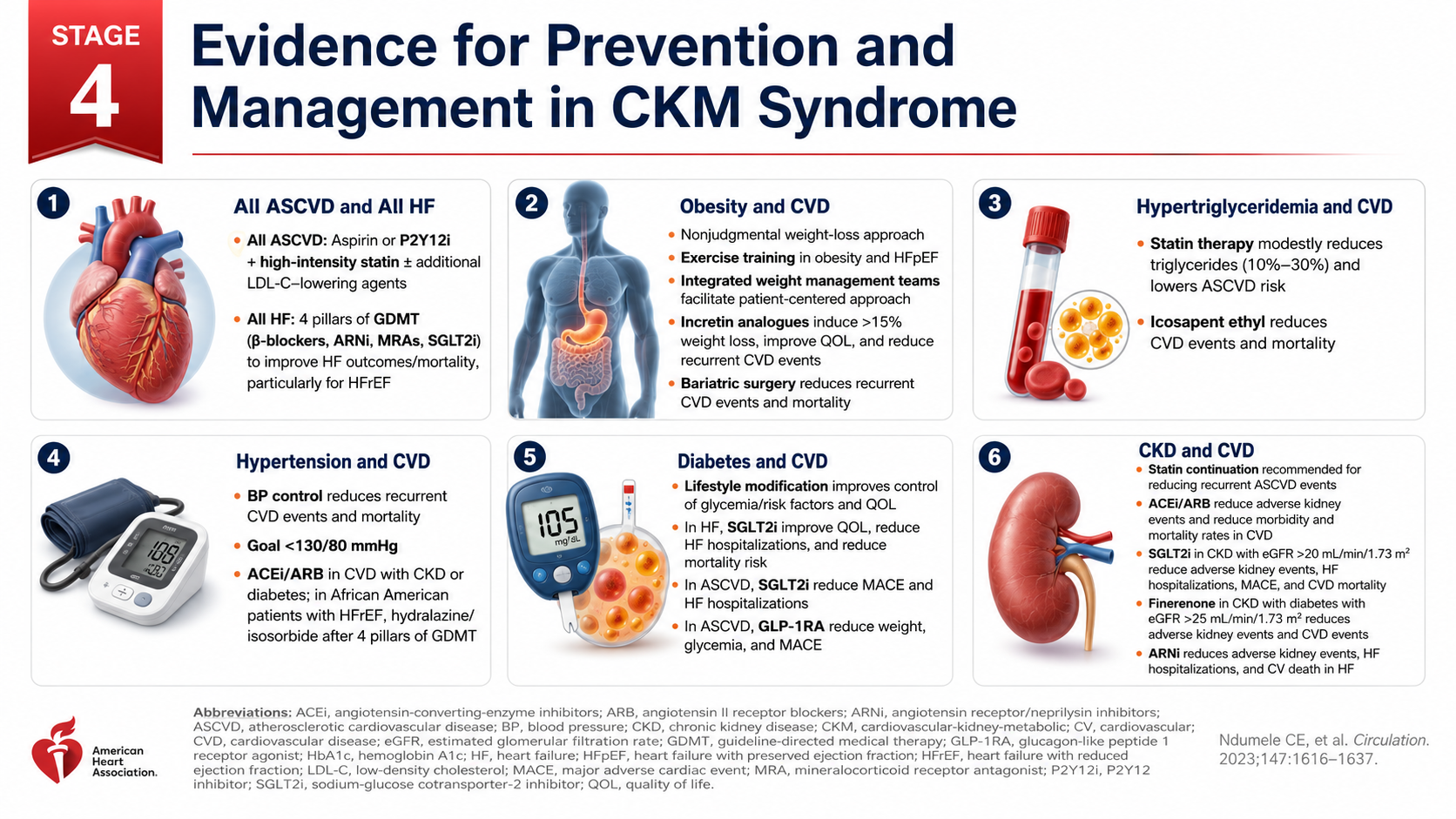
After: Redesigned slide 13 with categorized treatment sections
Clear categorized sections with consistent medical illustrations for each treatment area
14

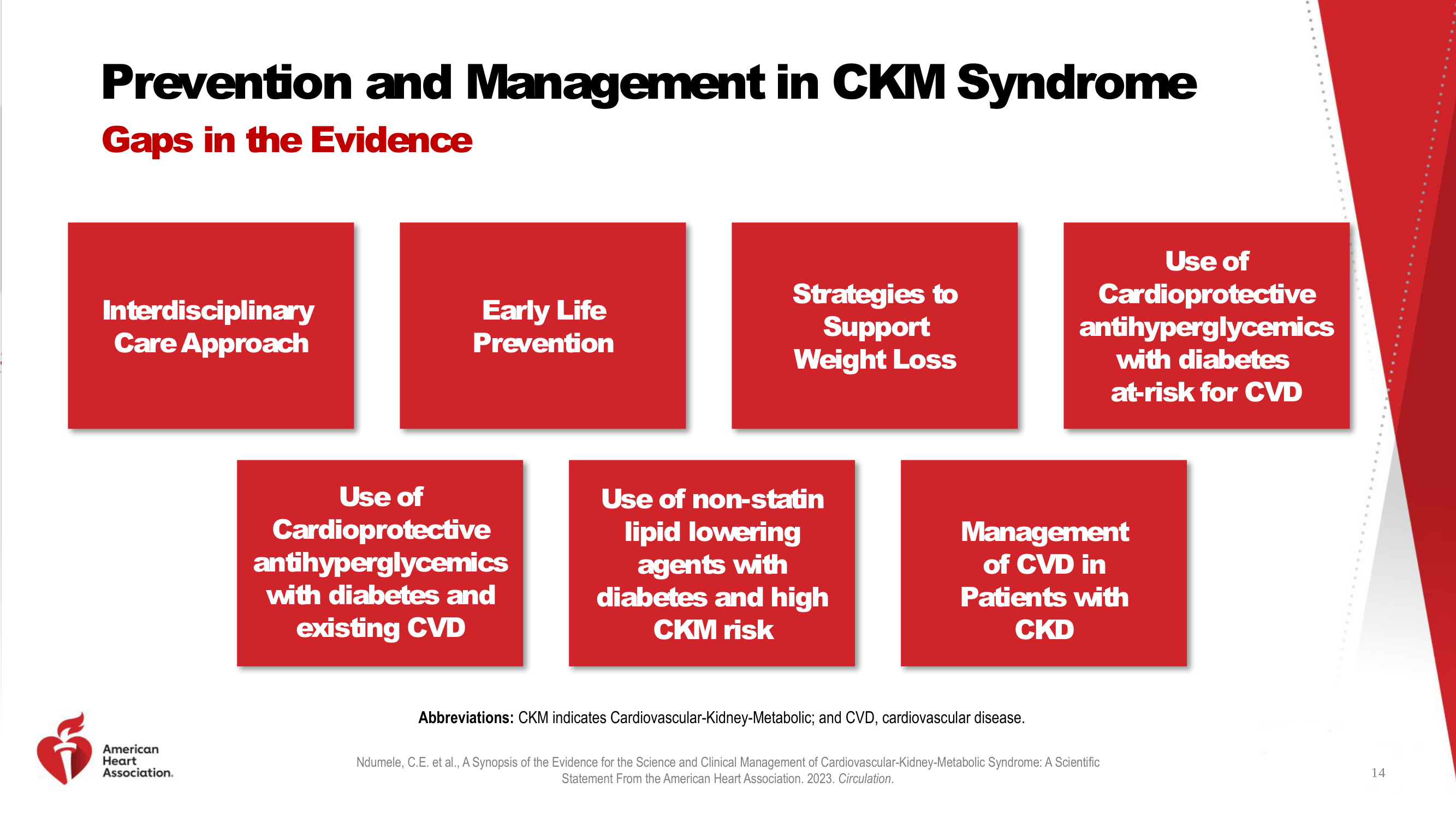
Prevention and Management — Gaps in Evidence

Seven red boxes with white text and no illustrations. The redesign presents each gap as a card with consistent visual treatment and supporting medical imagery.

Before
Before: Original slide 14 — red boxes with white text
Seven red boxes with white text, no illustrations or visual context
After
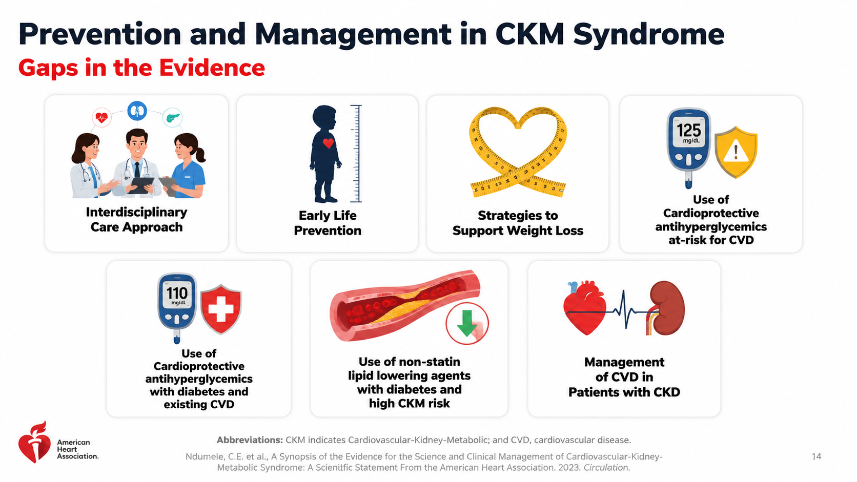
After: Redesigned slide 14 with illustrated evidence gap cards
Cards with consistent visual treatment and medical imagery for each evidence gap
15

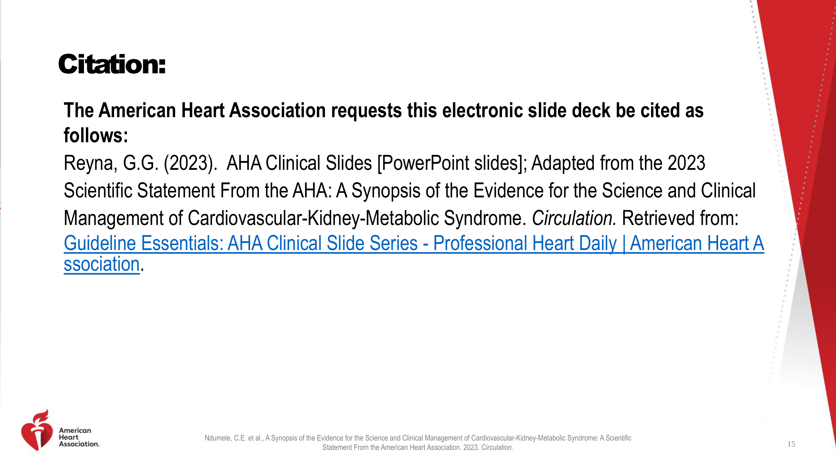
Citation

Plain text citation page with no visual identity. The redesign presents a clean citation layout with decorative CKM triad illustration maintaining visual consistency.

Before
Before: Original slide 15 — plain text citation
Plain text citation page, no visual identity
After
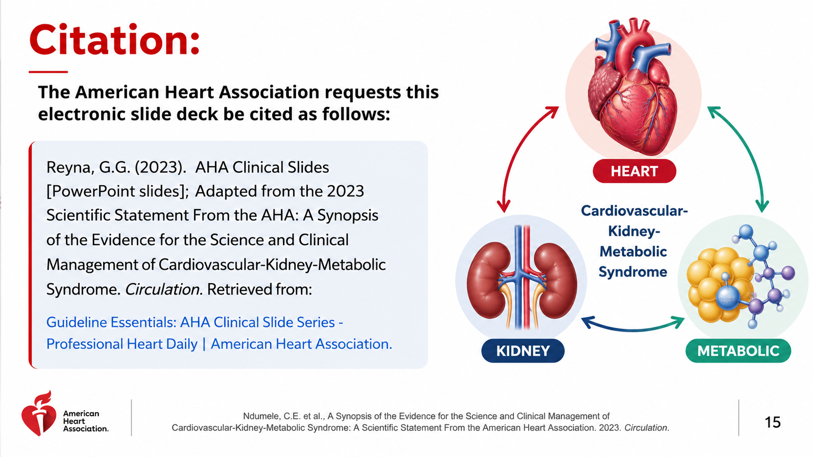
After: Redesigned slide 15 with clean citation and CKM illustration
Clean citation layout with decorative CKM triad illustration for visual consistency

Transform Your Clinical Presentations in Minutes

Upload your deck, pick a style, and let Arty generate consistent medical illustrations. Your content stays — the visuals level up.

Try Deckly.art Free