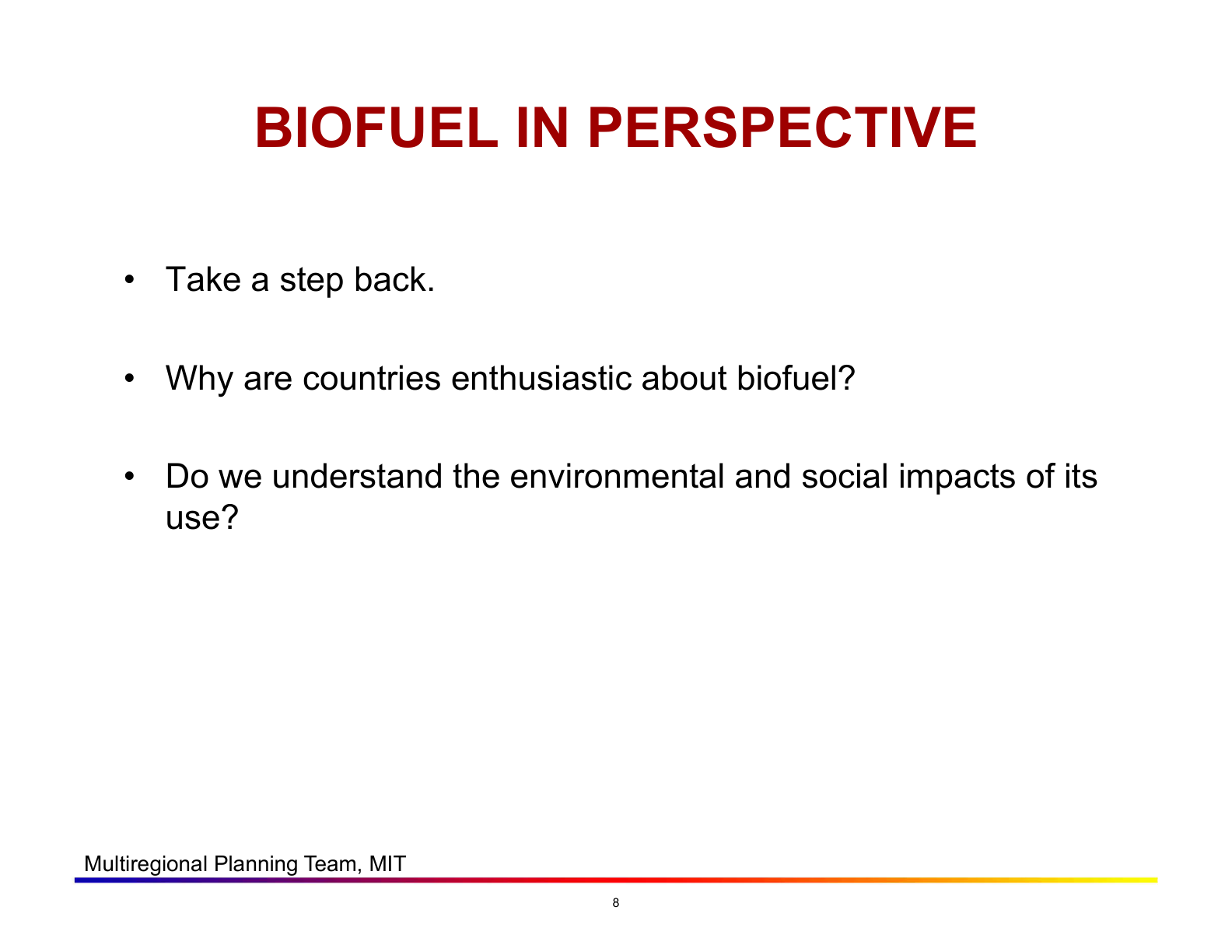
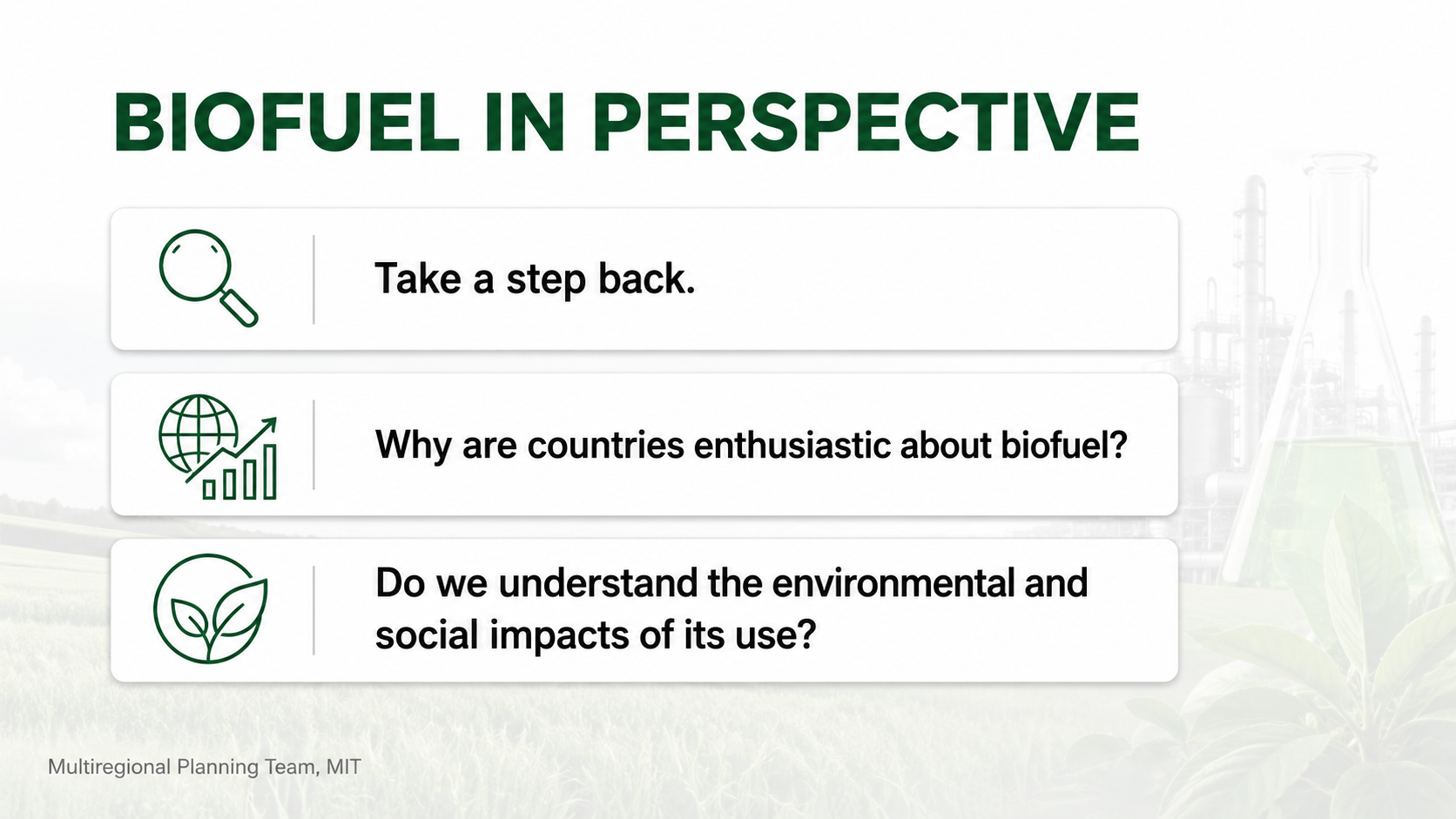
Why This Deck Needs a Redesign
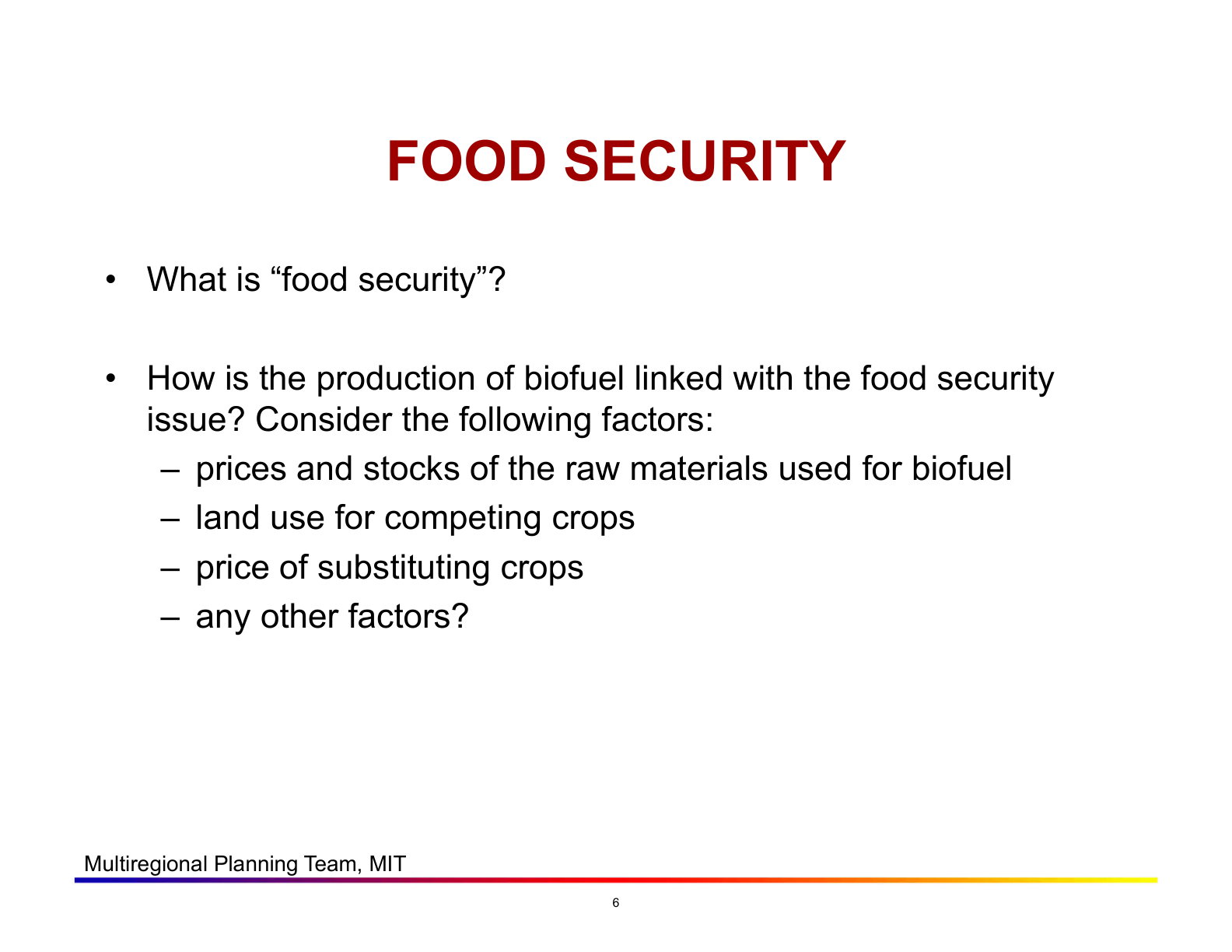
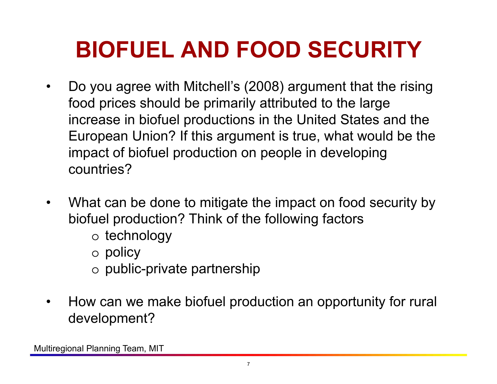
This lecture from MIT's "Infrastructure and Energy Technology Challenges" course covers the Food vs Fuel debate — a thought-provoking topic on biofuels, food security, and global trade. However, the original slides rely almost entirely on plain text and bullet points, which creates several problems for student learning:
- 📝 Dense bullet-point text with no visual anchors — students read instead of listen, causing cognitive overload
- 🏷️ Generic headings like "Biofuels" instead of clear takeaway statements that convey the slide's main point
- 🎨 No visual hierarchy — titles, questions, and body text all look the same size and weight
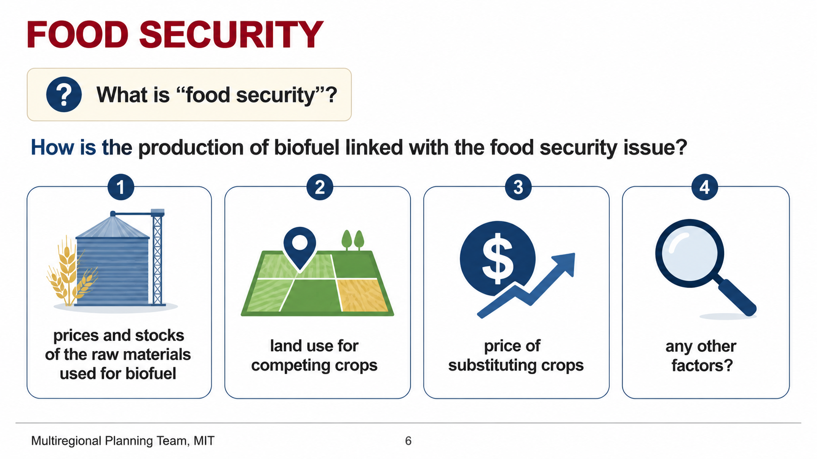
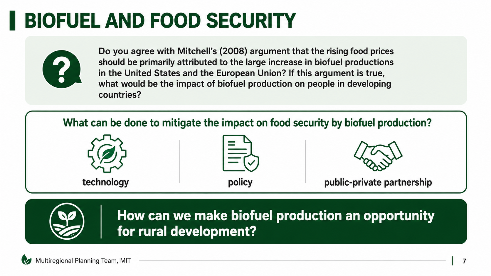
- 📊 Missed opportunities to visualize data, comparisons, and processes that could make complex ideas instantly graspable
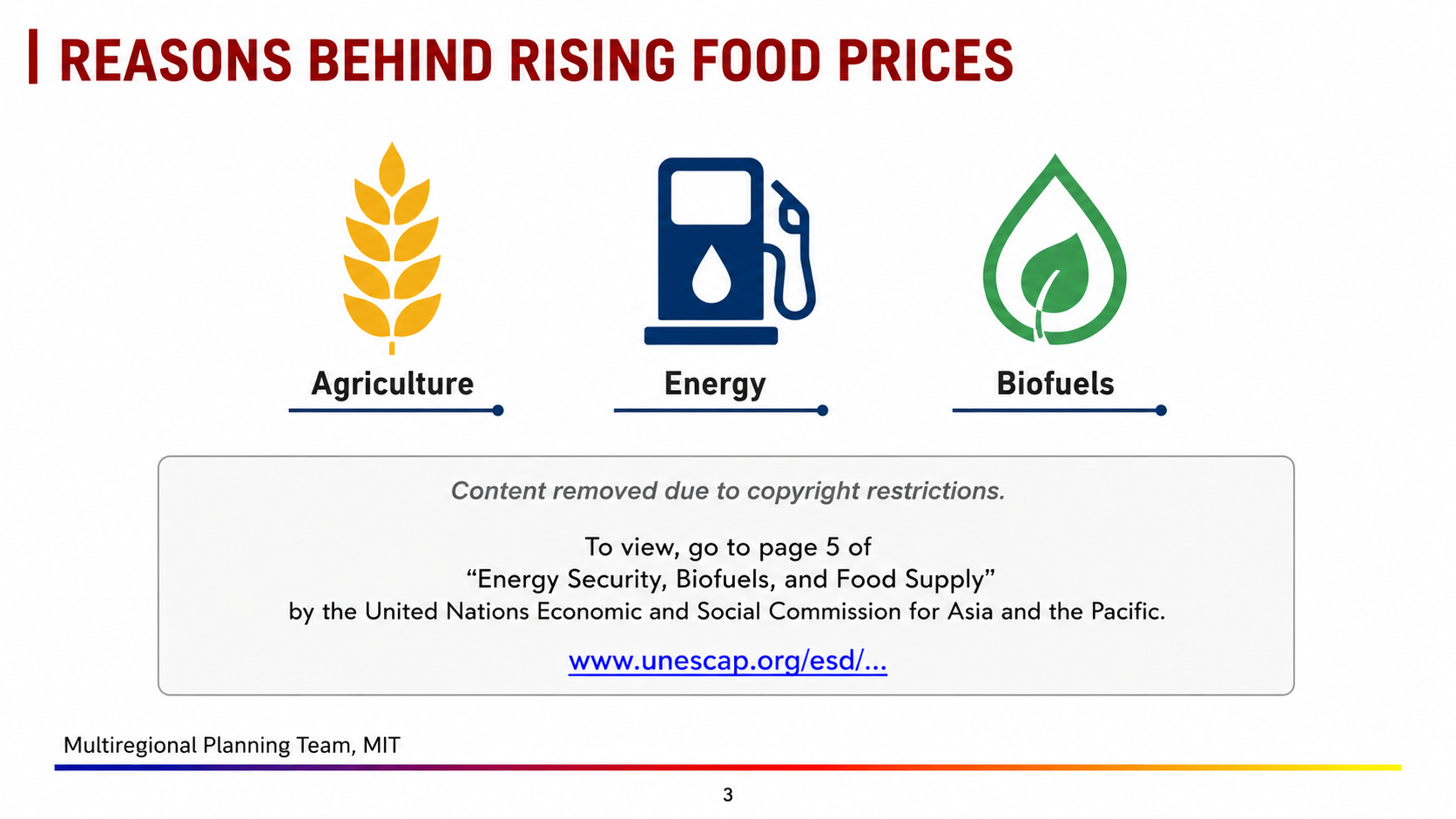
Arty's redesign follows evidence-based lecture design principles: one idea per slide, heading as takeaway, short keyword guide-posts instead of full sentences, and visual metaphors to reinforce each concept — all while keeping the original content untouched.
Original lecture from MIT OpenCourseWare — 11.165/11.477, Fall 2011, Professor Karen R. Polenske. Used under CC BY-NC-SA 4.0.