AI Lecture Redesign — Case Study

Data Tables → Charts: MIT Labor Market Lecture Redesign

A real MIT 14.771 Development Economics lecture with 25 slides — dense LaTeX regression tables with coefficients and standard errors transformed into visual bar charts, dot plots with confidence intervals, and horizontal bar charts by Arty.

📄 25 slides transformed 🎓 MIT 14.771 — Ben Olken, Fall 2021 🤖 Style: Academic Lecture

Why This Deck Needs a Redesign

This lecture from MIT 14.771 — Labor Markets (Development Economics, Ben Olken, Fall 2021) covers signaling, working conditions, and multinational labor policy. The research is rigorous, but the LaTeX/Beamer presentation buries critical findings in impenetrable regression tables:

Arty's redesign transforms every regression table into intuitive visual charts — horizontal bar charts for treatment effects, dot plots with confidence intervals for audit experiments, and grouped comparison charts for multi-panel results. Text slides receive structured card layouts with icons, while preserving every data point and statistical finding from the original.

Original lecture from MIT OpenCourseWare — 14.771 Development Economics: Labor Markets, Ben Olken, Fall 2021. Source: MIT OpenCourseWare. Used under Creative Commons license.
1

Title — 14.771: Labor Markets

Plain Beamer title slide with course number and instructor name on a default template. The redesign creates a professional title card with globe/network illustration and visual identity.

Before
Before: Original slide 1 — plain Beamer title with default template
Default Beamer title slide, generic blue header, no visual identity
After
After: Redesigned slide 1 with professional title and globe illustration
Professional title card with globe/network illustration
2

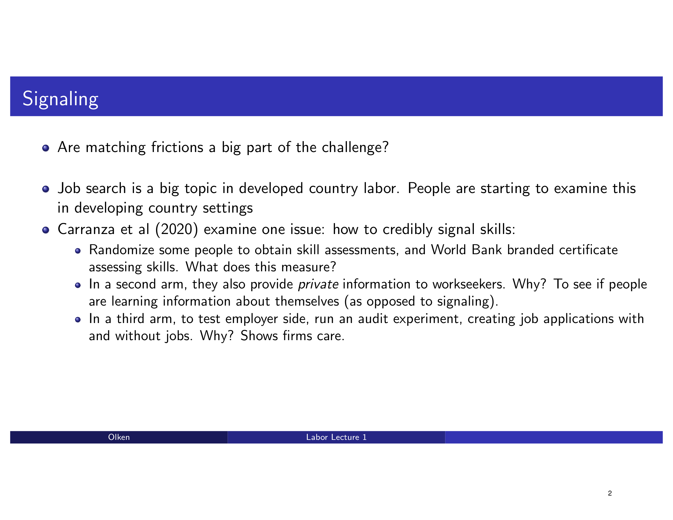
Signaling — Job Search & Skill Signals

Bullet point slide about job search and skill signaling with flat formatting. The redesign introduces a clean structured layout with icons for each concept.

Before
Before: Original slide 2 — flat bullet points on signaling
Flat bullet points, no visual structure, default Beamer layout
After
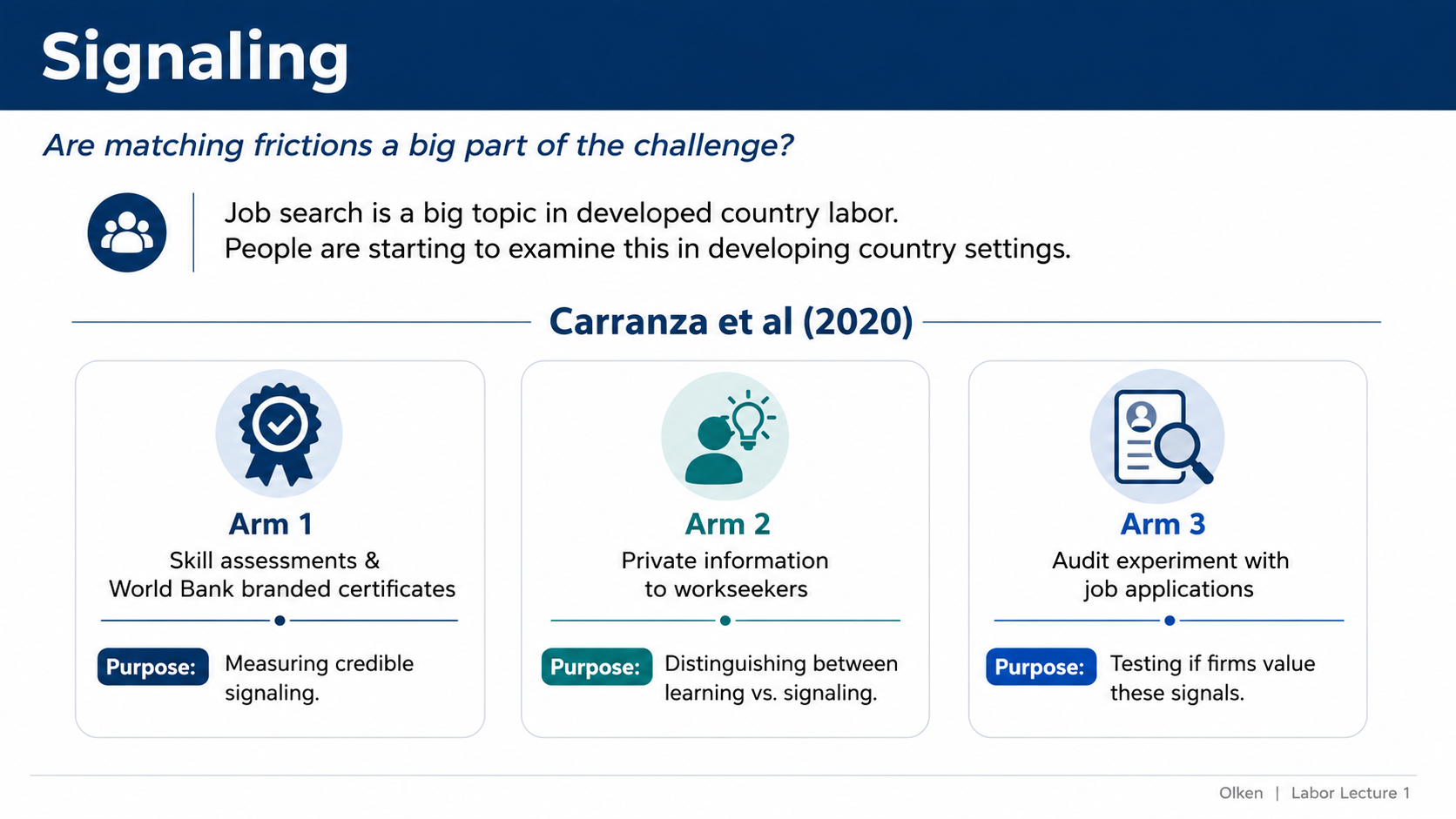
After: Redesigned slide 2 with structured signaling concepts and icons
Clean structured layout with icons for each signaling concept
3

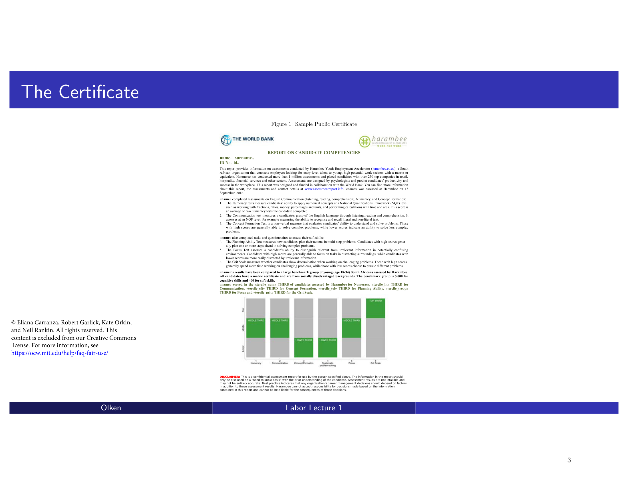
The Certificate — World Bank Sample Document

An embedded World Bank sample certificate document displayed as a raw image on a Beamer slide. The redesign presents it as a clean card-style document showcase with context.

Before
Before: Original slide 3 — raw embedded certificate document
Raw embedded certificate image, minimal framing
After
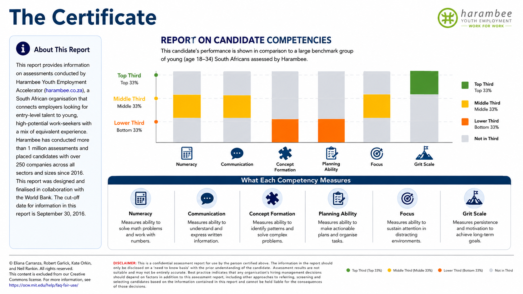
After: Redesigned slide 3 with card-style document showcase
Clean card-style document showcase with contextual framing
4

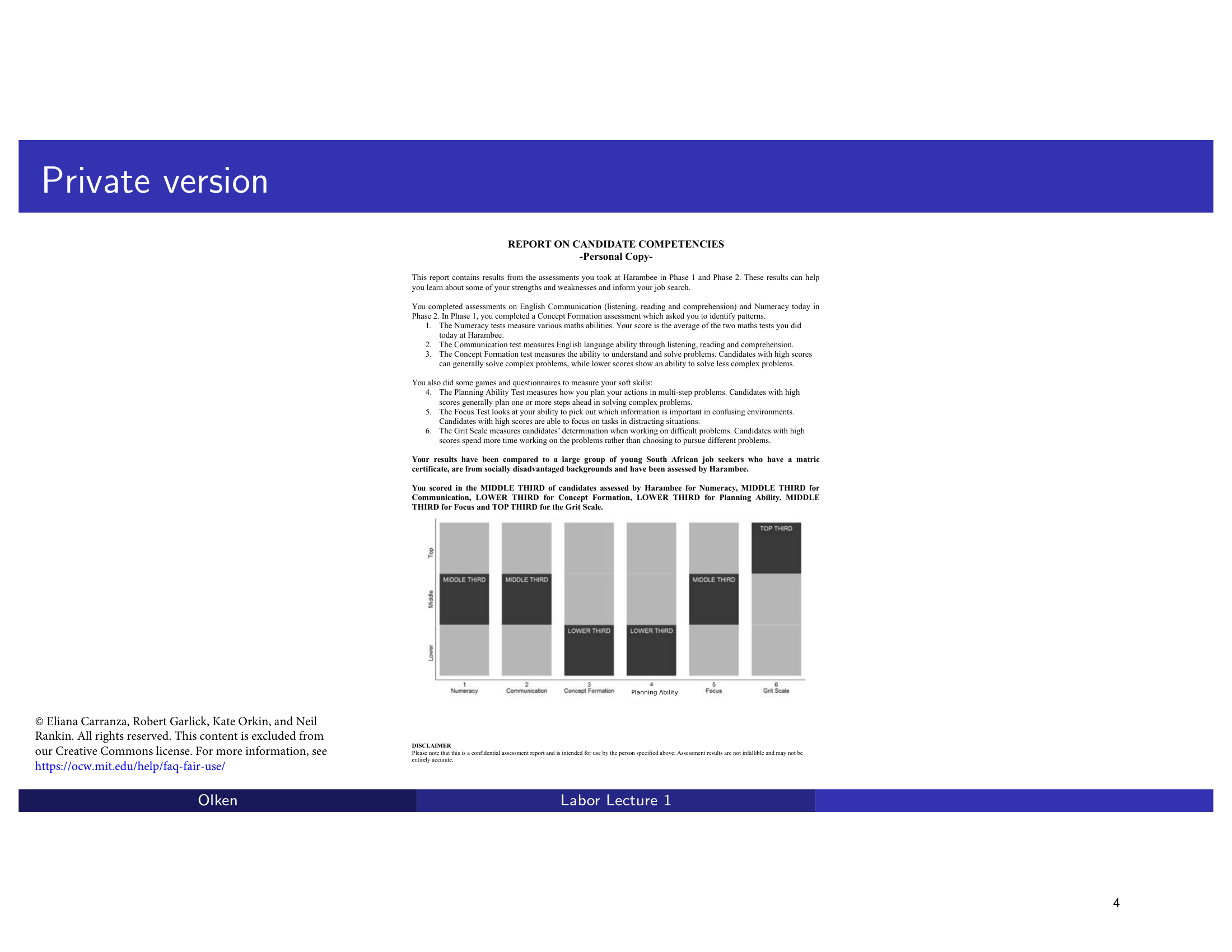
Private Version — Competency Report with Bar Chart

A private certificate report including a bar chart, displayed with default Beamer styling. The redesign presents a clean layout of the competency report with improved chart styling.

Before
Before: Original slide 4 — private certificate report with basic chart
Private report with basic bar chart, default styling
After
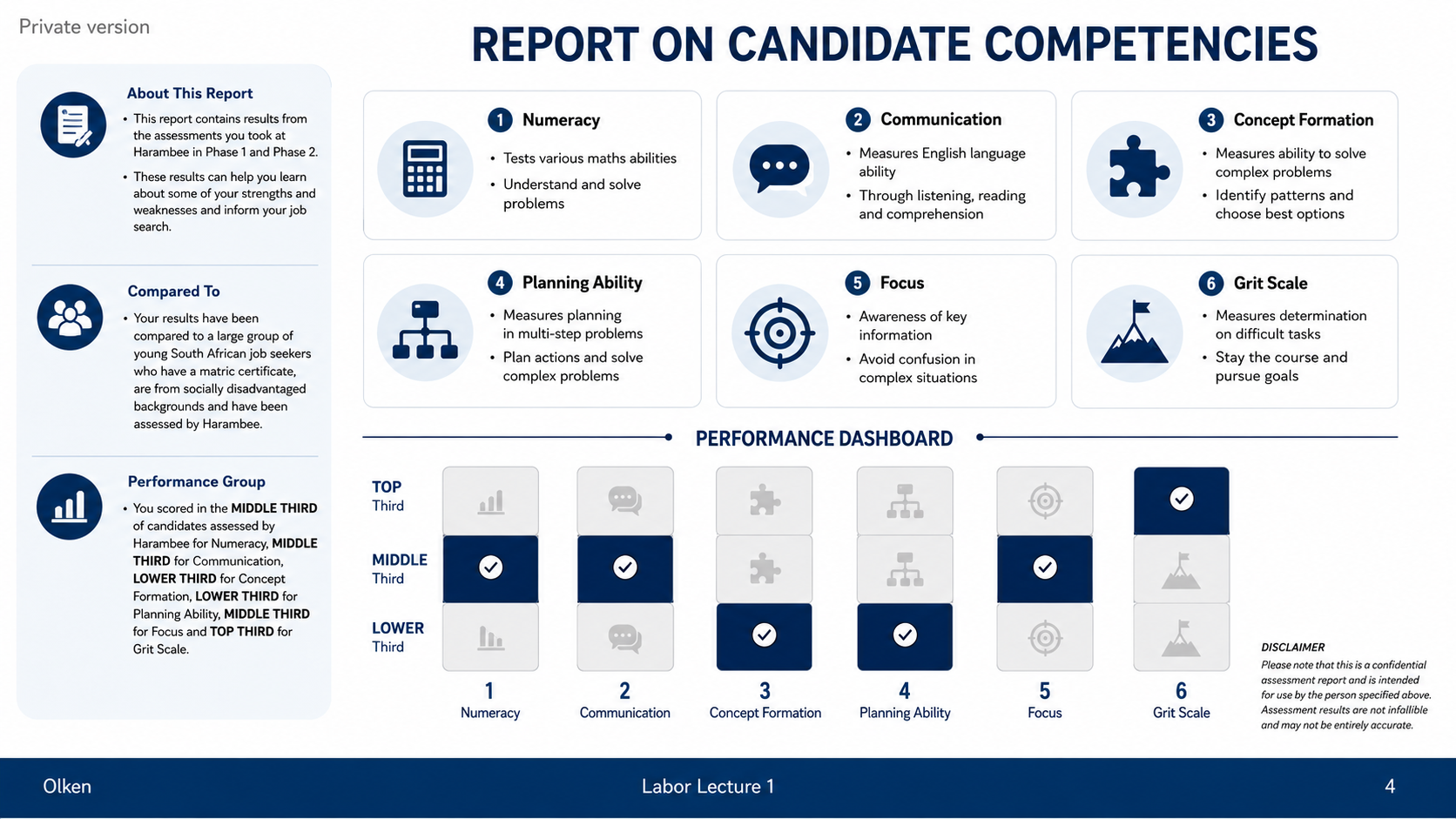
After: Redesigned slide 4 with polished competency report layout
Clean competency report layout with refined chart styling
5

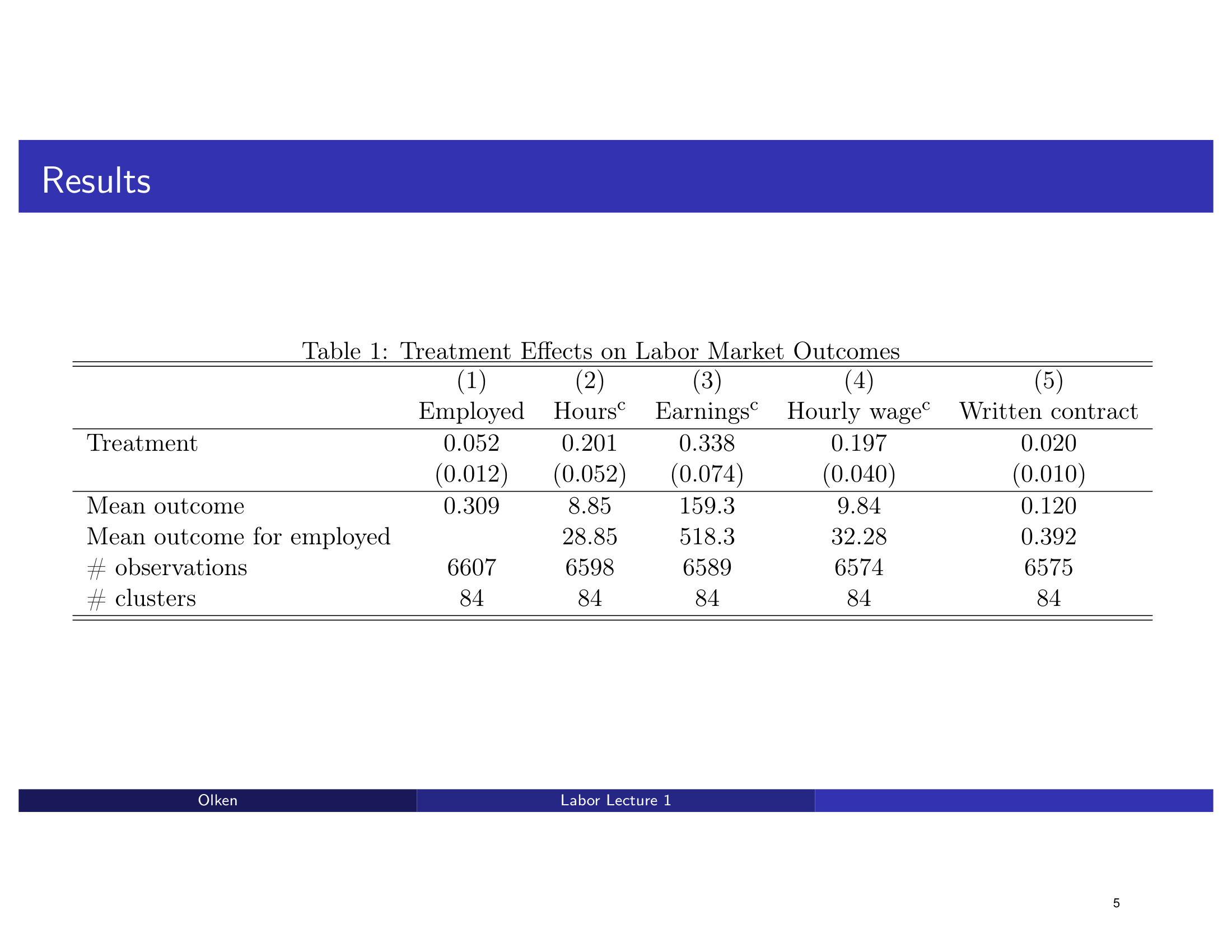
Table 1 → Chart: Treatment Effects on Labor Market Outcomes

Dense 5-column regression table with coefficients, standard errors, and significance stars. The redesign transforms this into a horizontal bar chart with treatment effect coefficients and error bars — making the direction and magnitude of effects instantly visible.

Before
Before: Original slide 5 — dense regression table with 5 columns
Dense regression table, raw coefficients, standard errors in parentheses
After
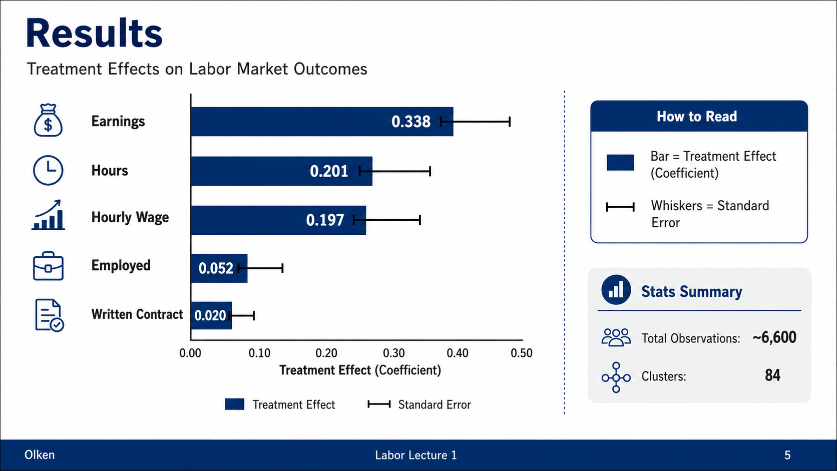
After: Redesigned slide 5 with horizontal bar chart showing treatment effects
Horizontal bar chart with treatment effect coefficients and error bars
6

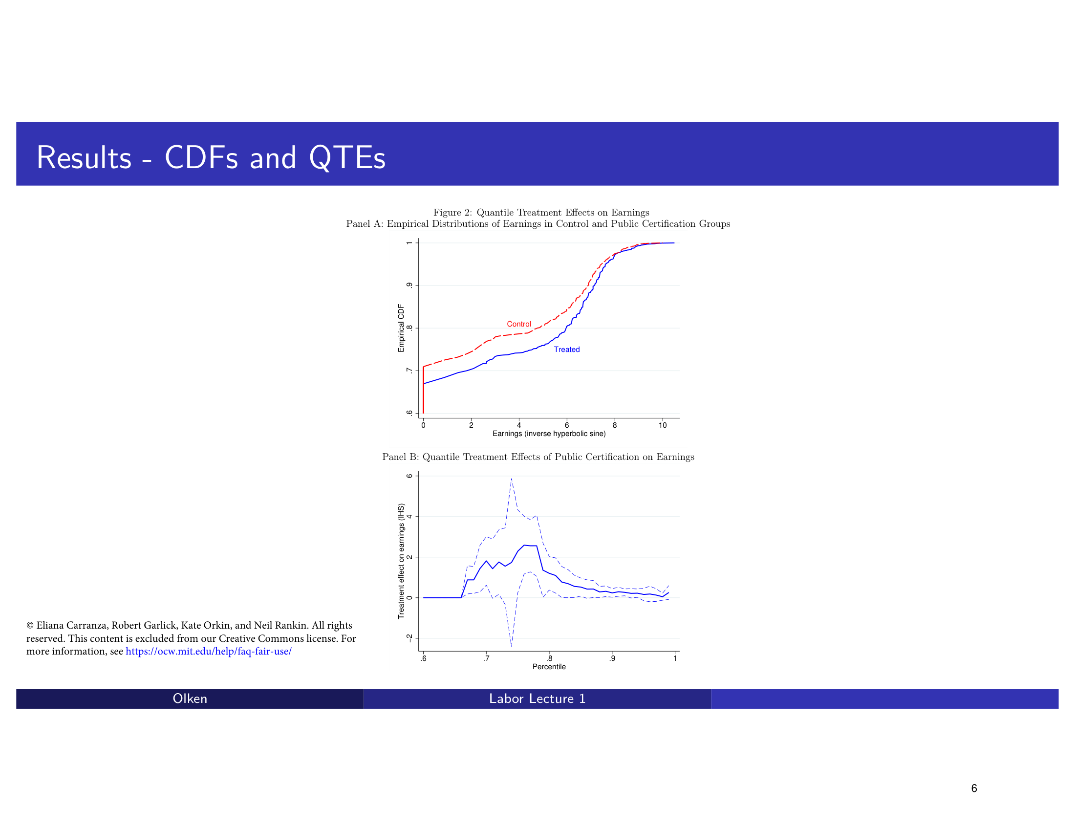
Results — CDFs and Quantile Treatment Effects

Two statistical charts (CDF and quantile treatment effects) with basic academic styling. The redesign produces polished versions of the distribution charts with improved labels and color coding.

Before
Before: Original slide 6 — basic CDF and QTE charts
Basic academic statistical charts, minimal labeling
After
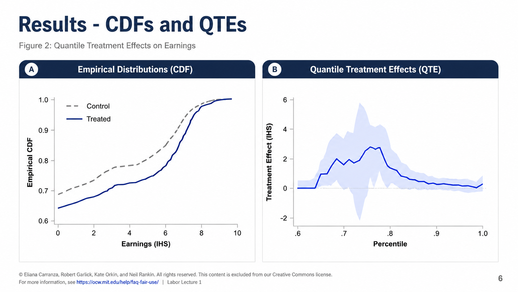
After: Redesigned slide 6 with polished distribution charts
Polished distribution charts with improved labels and color coding
7

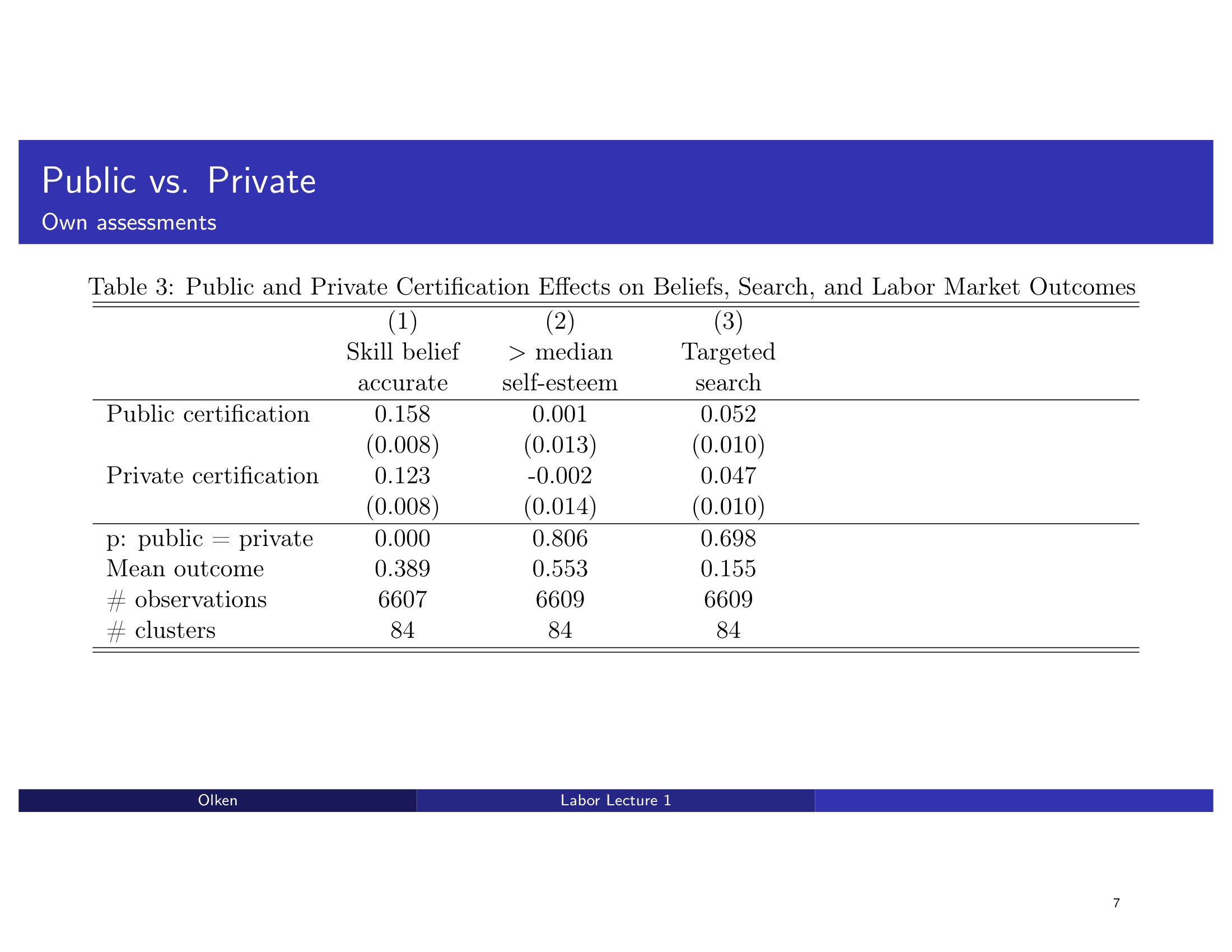
Table 3 → Chart: Public vs. Private / Own Assessments

A 3-column regression table comparing public vs. private certificate effects. The redesign converts it into a grouped comparison chart that makes the differential impact immediately clear.

Before
Before: Original slide 7 — 3-column regression table for public vs private
3-column regression table, public vs private comparison buried in numbers
After
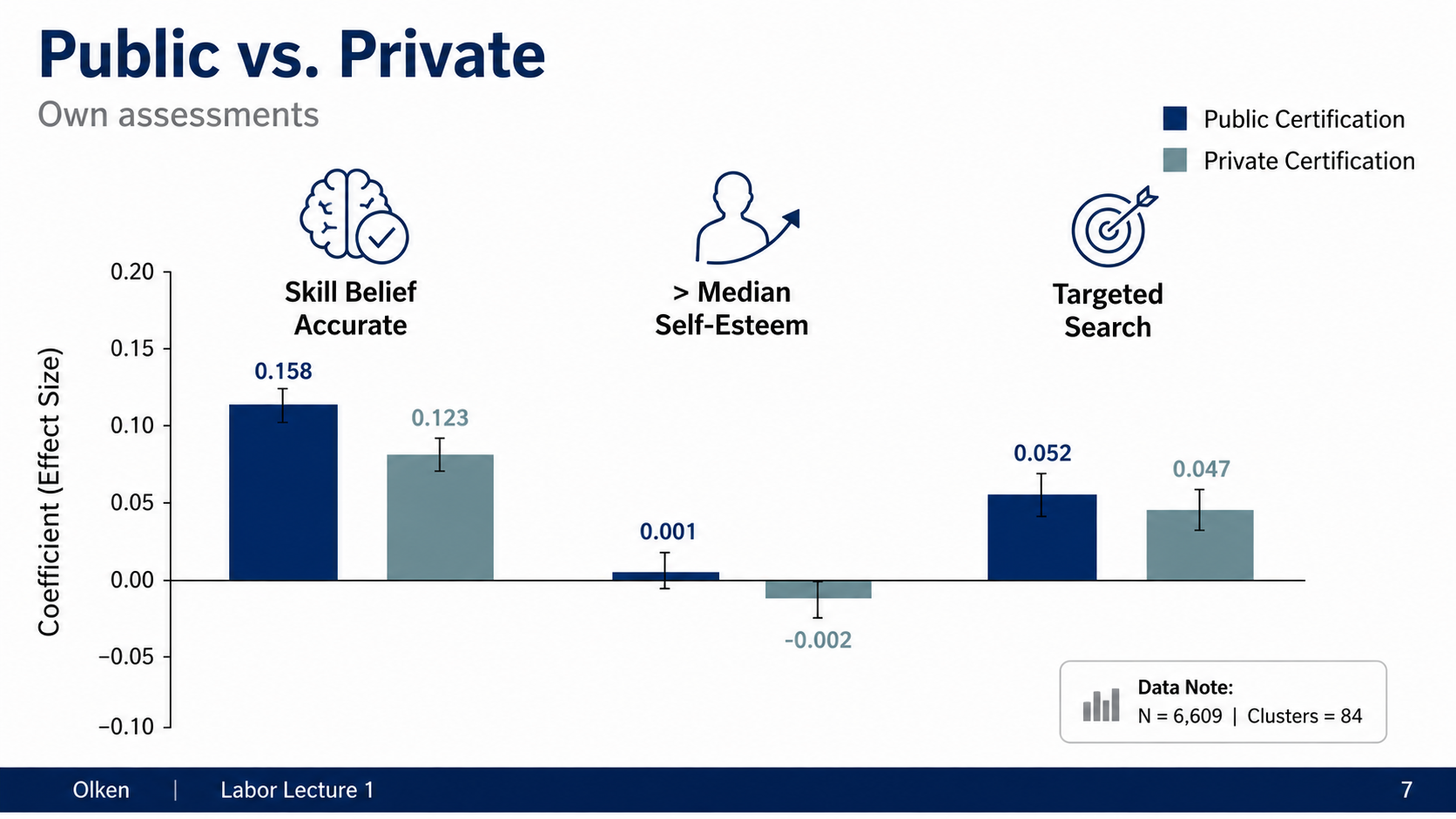
After: Redesigned slide 7 with grouped comparison chart
Grouped comparison chart showing public vs private effects visually
8

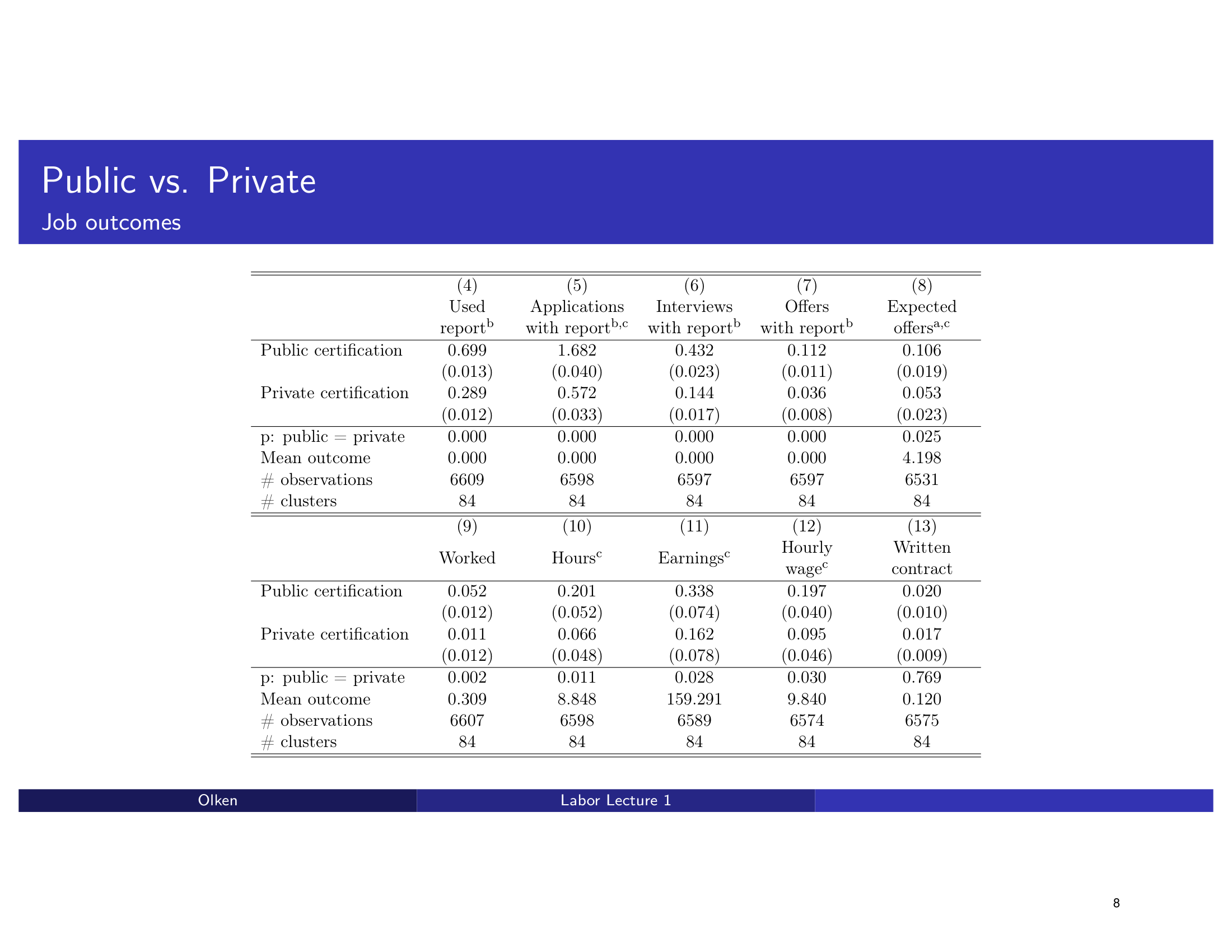
Table → Chart: Public vs. Private / Job Outcomes

Massive 13-column regression table spanning two panels (Panel A and B) — the most data-dense slide in the deck. The redesign breaks this into a multi-panel chart with clear groupings and visual separation.

Before
Before: Original slide 8 — massive 13-column regression table
Massive 13-column table, two panels crammed into one slide
After
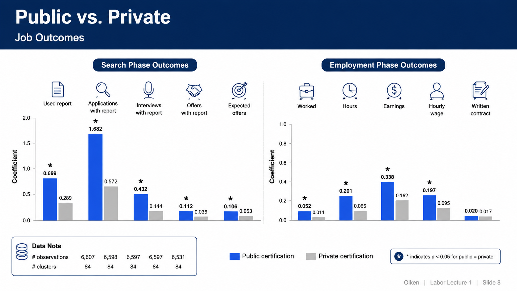
After: Redesigned slide 8 with multi-panel chart visualization
Multi-panel chart with clear groupings and visual separation
9

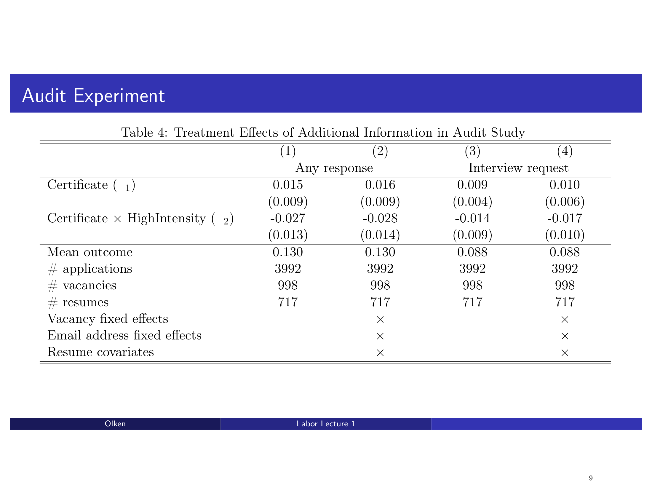
Table 4 → Dot Plot: Audit Experiment Results

A 4-column regression table with fixed effects indicators showing audit experiment results. The redesign transforms it into a dot plot with confidence intervals for any response vs interview request outcomes.

Before
Before: Original slide 9 — 4-column regression table with fixed effects
4-column regression table, fixed effects indicators, dense numeric grid
After
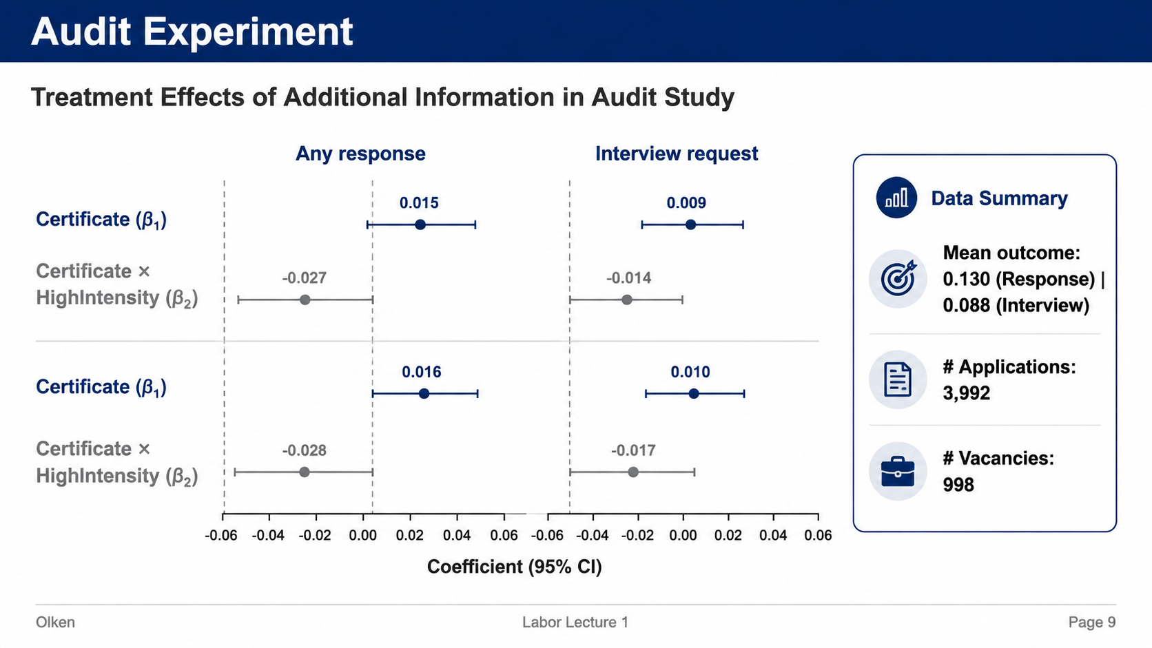
After: Redesigned slide 9 with dot plot and confidence intervals
Dot plot with confidence intervals for audit experiment results
10

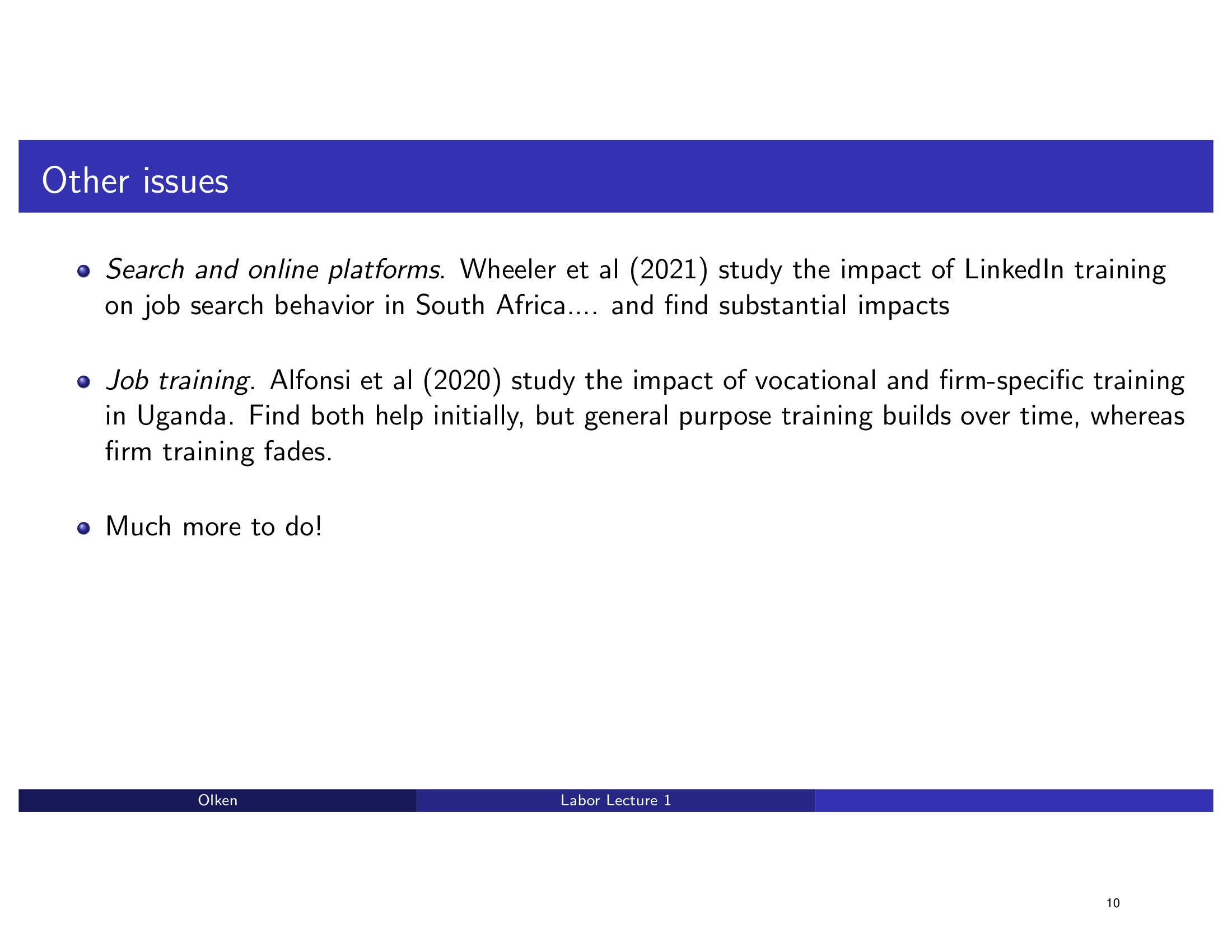
Other Issues — Search Platforms & Job Training

Bullet points about search platforms and job training with no structure. The redesign uses a clean card layout with structured content sections and visual anchors.

Before
Before: Original slide 10 — flat bullet points on other issues
Flat bullet points, no visual structure, wall of text
After
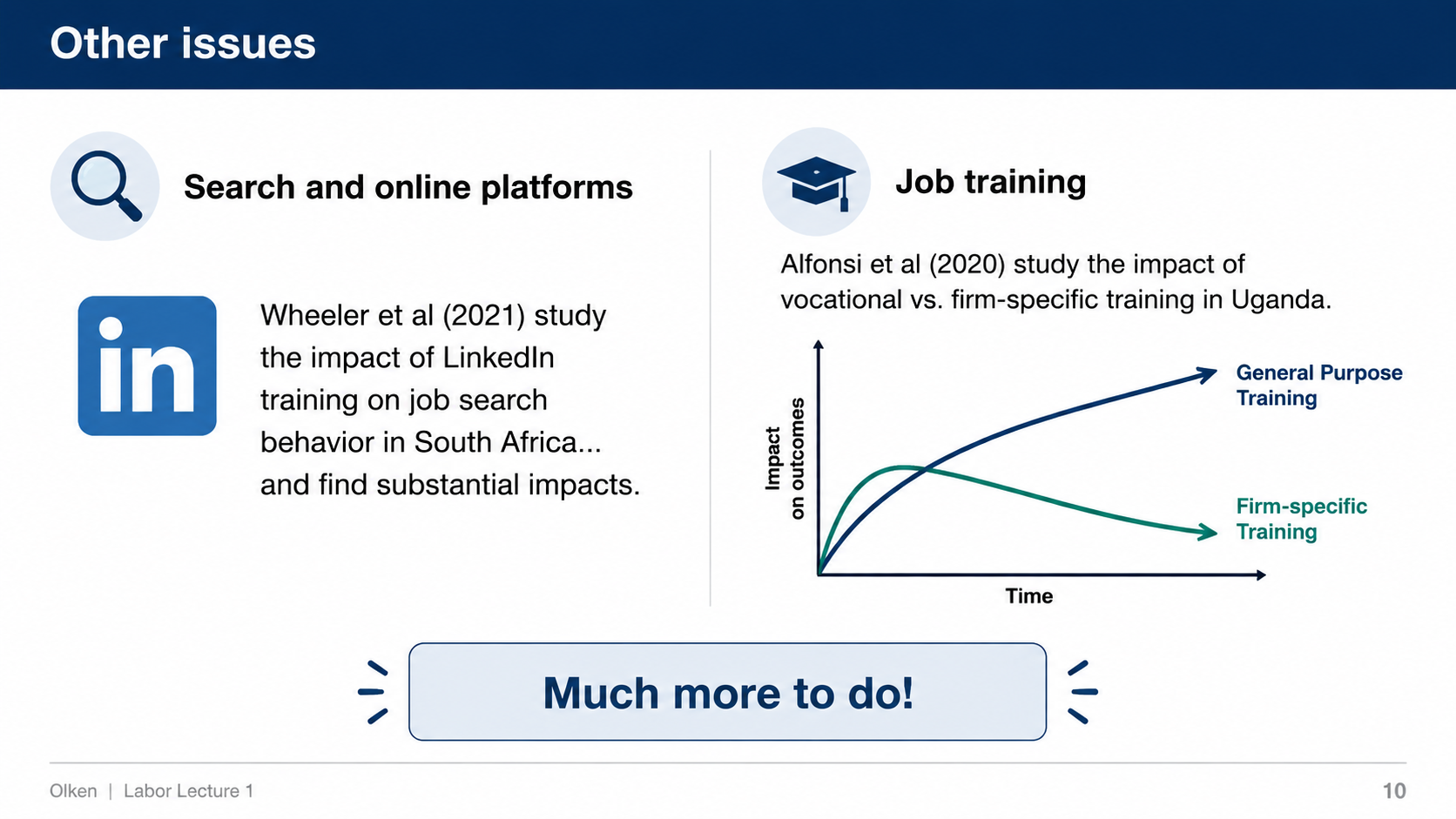
After: Redesigned slide 10 with structured card layout
Clean card layout with structured content sections
11

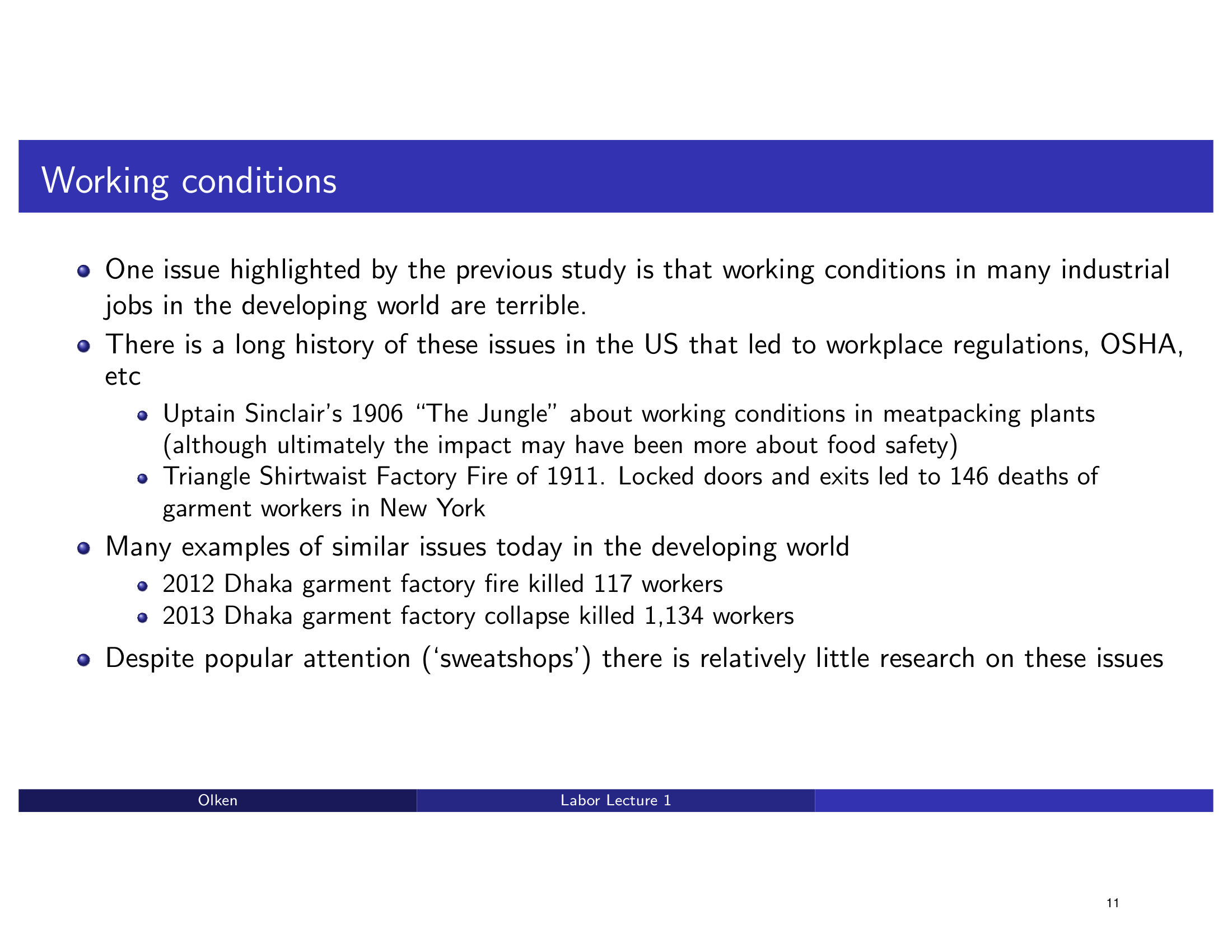
Working Conditions — Factory Safety & Historical Events

Dense bullet points about factory conditions and historical events with no visual hierarchy. The redesign creates a structured timeline/card layout that organizes the information chronologically.

Before
Before: Original slide 11 — dense bullet points on working conditions
Dense bullet points, no visual hierarchy, text-heavy
After
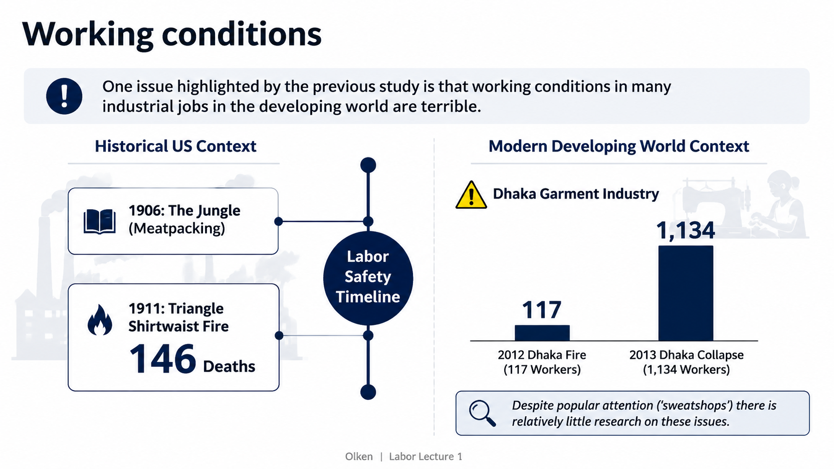
After: Redesigned slide 11 with structured timeline/card layout
Structured timeline/card layout with chronological organization
12

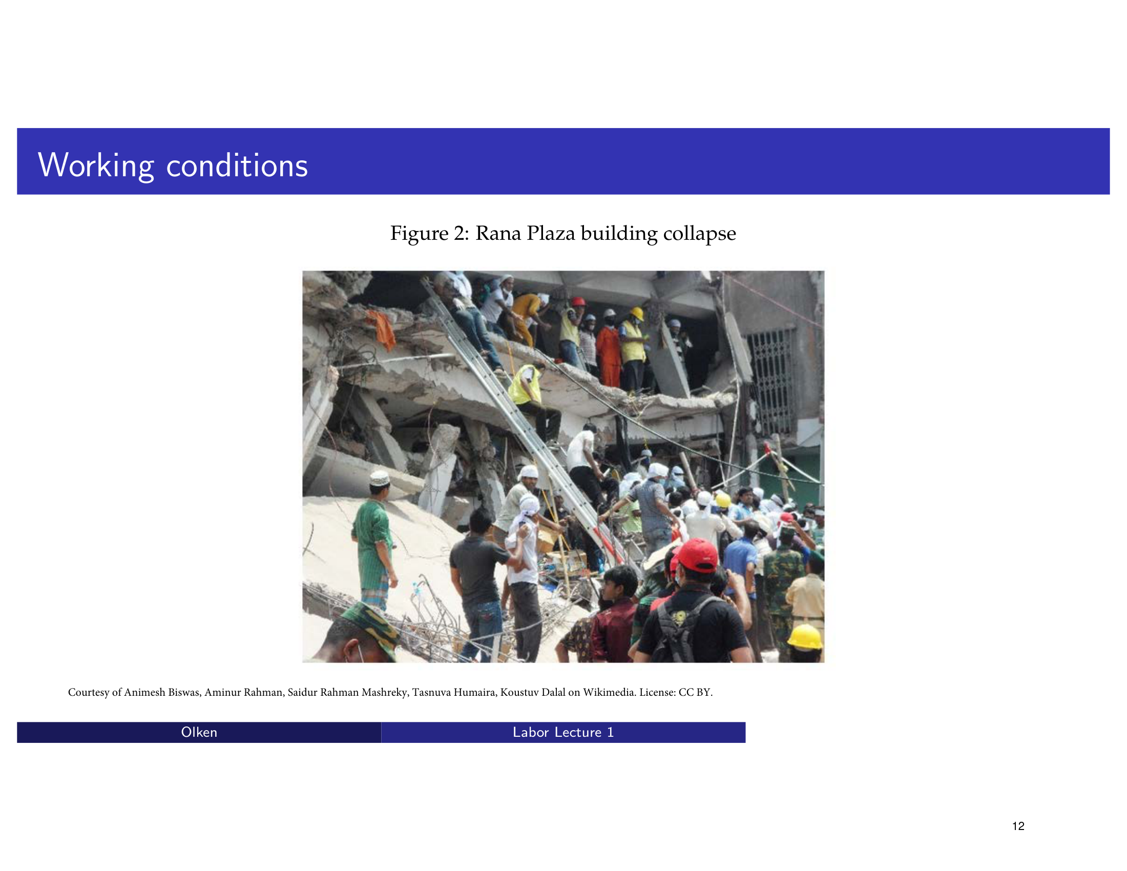
Working Conditions — Rana Plaza Collapse

A photograph of the Rana Plaza building collapse with minimal framing on a Beamer slide. The redesign presents the image with impactful framing and contextual information.

Before
Before: Original slide 12 — Rana Plaza photo with minimal framing
Raw photograph, minimal framing, no contextual layout
After
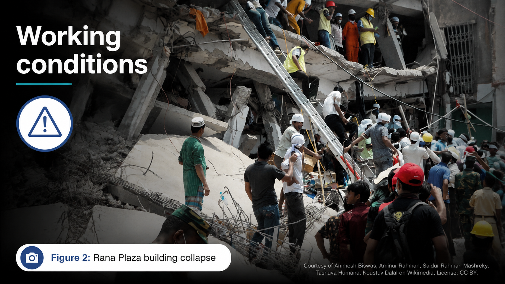
After: Redesigned slide 12 with impactful image framing
Impactful image presentation with better framing and context
13

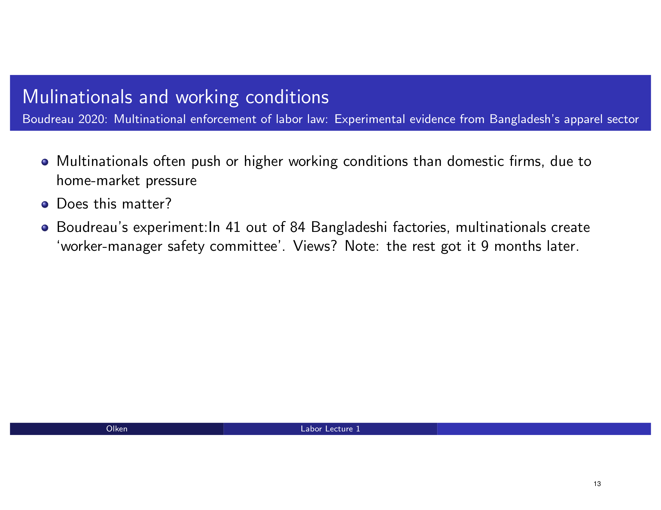
Multinationals & Working Conditions — Boudreau 2020

Bullet points summarizing the Boudreau 2020 study on multinationals. The redesign converts this into a clean research summary card with structured findings.

Before
Before: Original slide 13 — flat bullet points on Boudreau 2020
Flat bullet points summarizing research, no visual structure
After
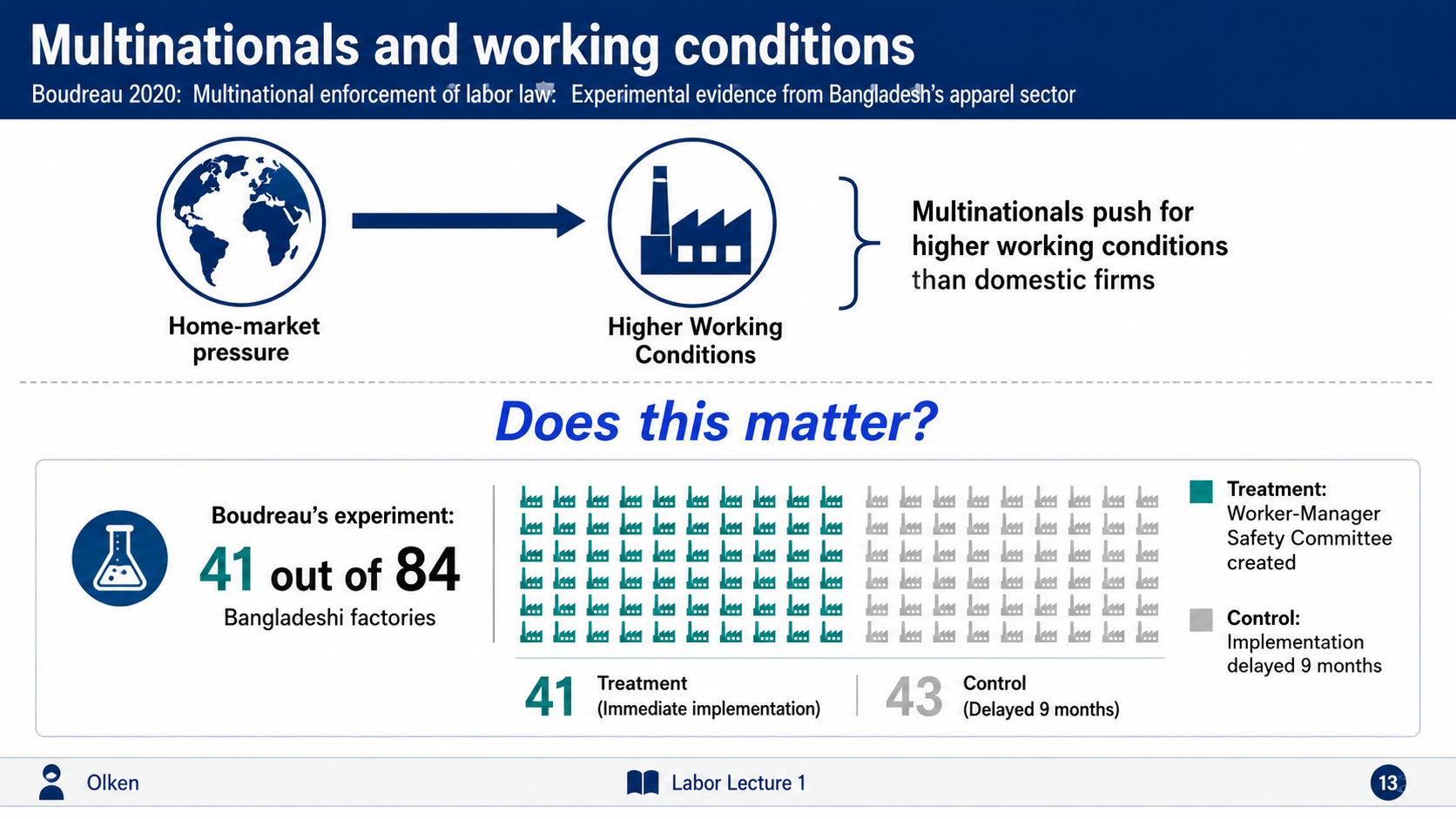
After: Redesigned slide 13 with clean research summary card
Clean research summary card with structured findings
14

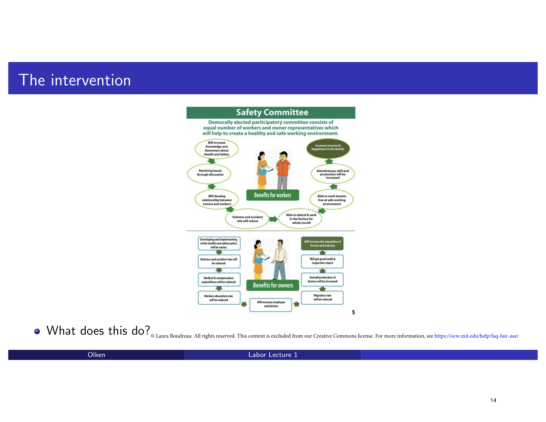
The Intervention — Safety Committee Infographic

An external safety committee infographic embedded on a Beamer slide with default framing. The redesign presents the intervention diagram with clean, integrated styling.

Before
Before: Original slide 14 — raw embedded infographic
Raw embedded infographic, default Beamer framing
After
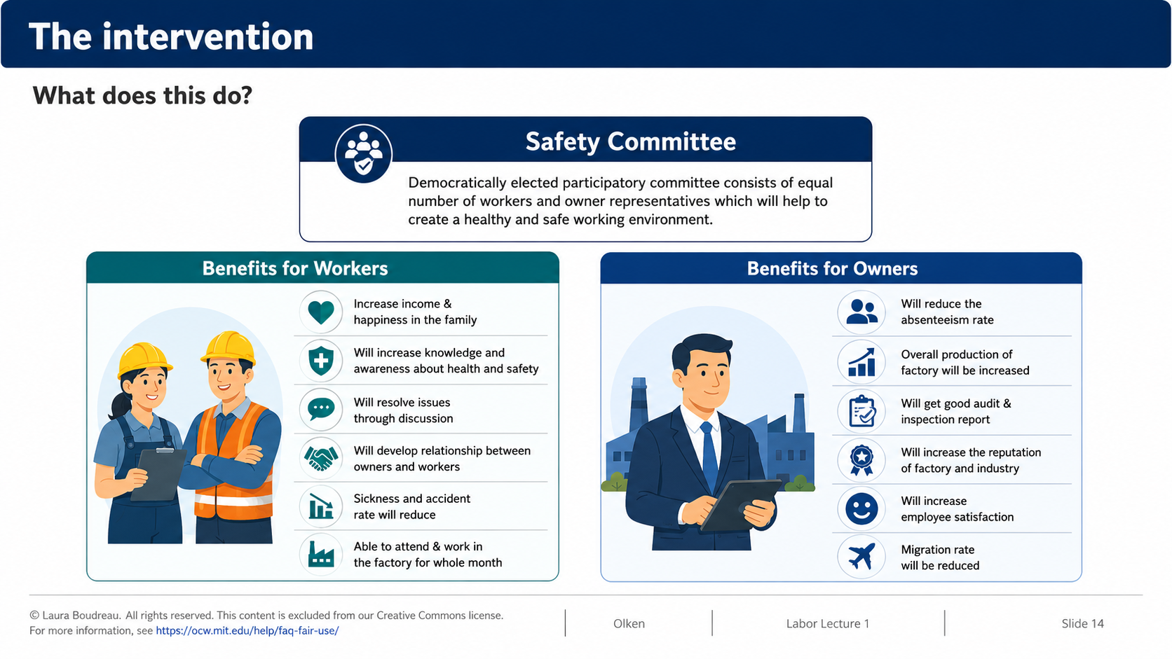
After: Redesigned slide 14 with clean intervention diagram
Clean presentation of the intervention diagram with integrated styling
15

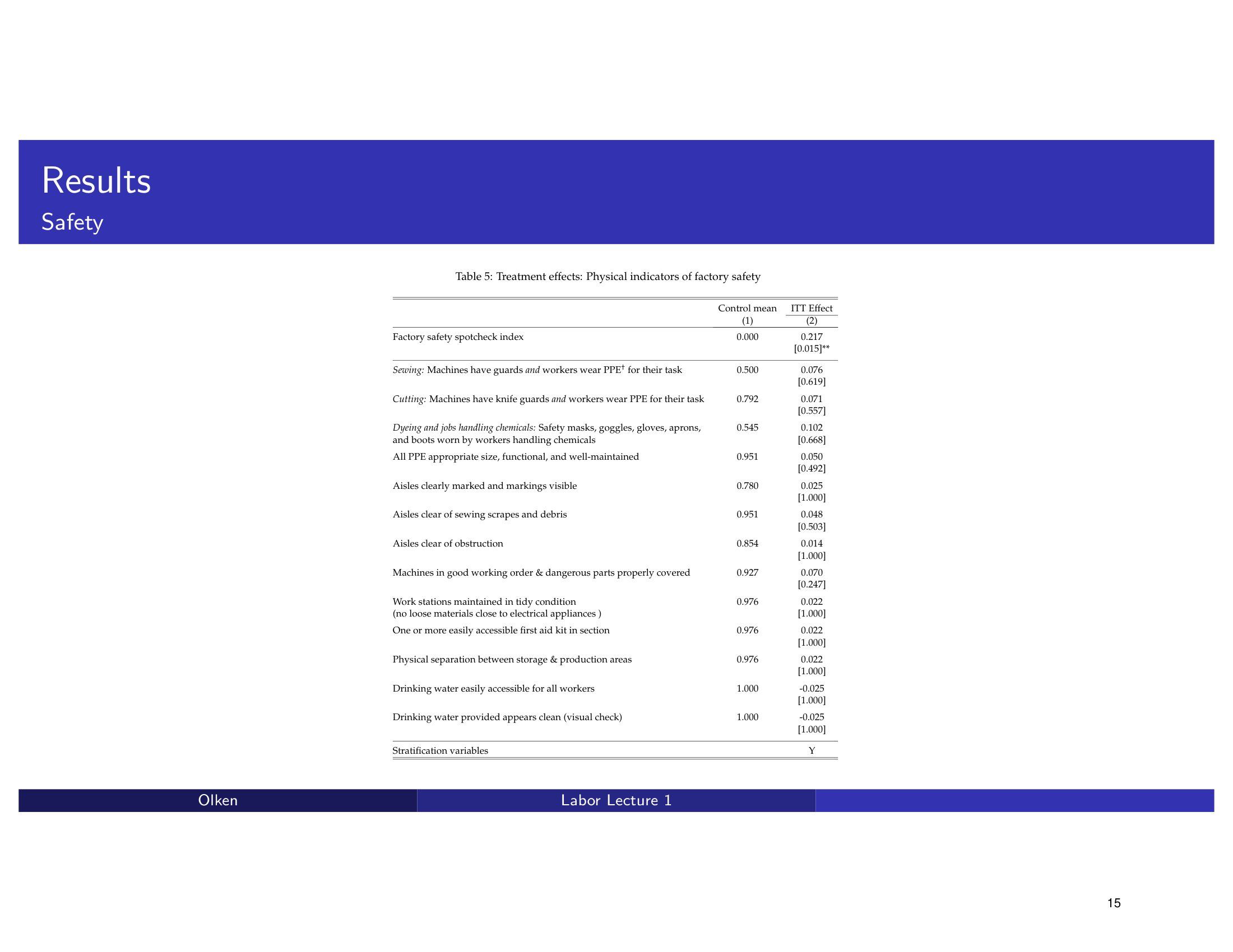
Table 5 → Bar Chart: Physical Indicators of Factory Safety

A long regression table with 15+ rows showing physical indicators of factory safety. The redesign transforms it into a horizontal bar chart showing ITT effects with significance markers — instantly revealing which safety measures improved.

Before
Before: Original slide 15 — long regression table with 15+ rows
Long regression table, 15+ rows of coefficients and standard errors
After
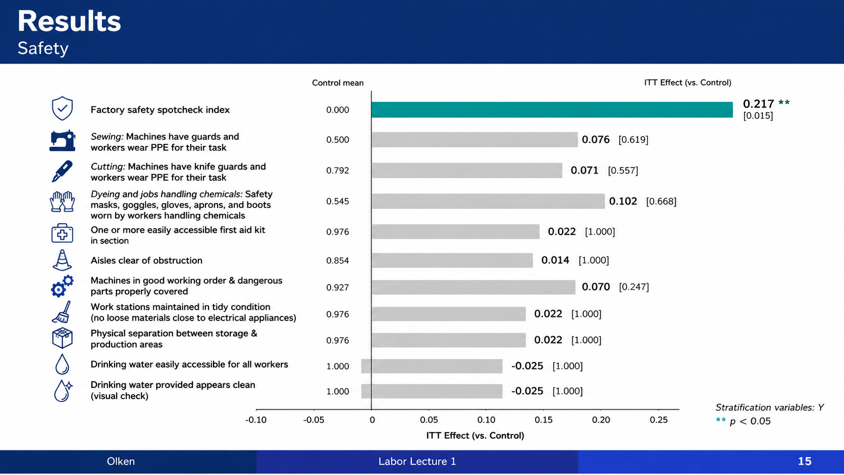
After: Redesigned slide 15 with horizontal bar chart of safety indicators
Horizontal bar chart with ITT effects and significance markers
16

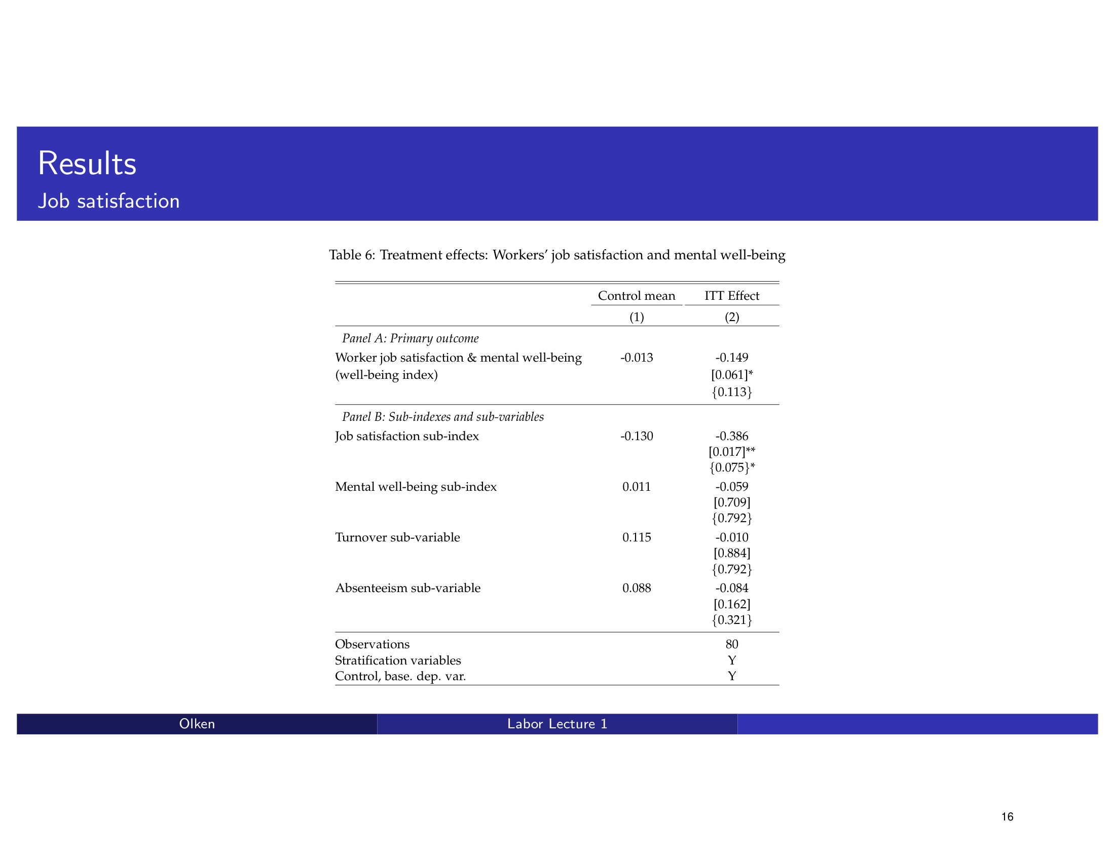
Table 6 → Chart: Job Satisfaction & Mental Well-Being

Regression table showing workers' job satisfaction and mental well-being treatment effects. The redesign creates a visual comparison chart that highlights the direction and magnitude of each outcome.

Before
Before: Original slide 16 — regression table on job satisfaction
Regression table, treatment effects on satisfaction and well-being
After
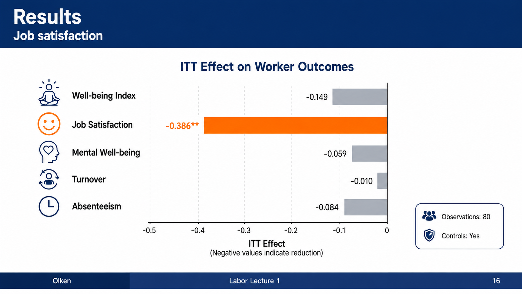
After: Redesigned slide 16 with visual comparison chart
Visual comparison chart highlighting treatment effect direction and magnitude
17

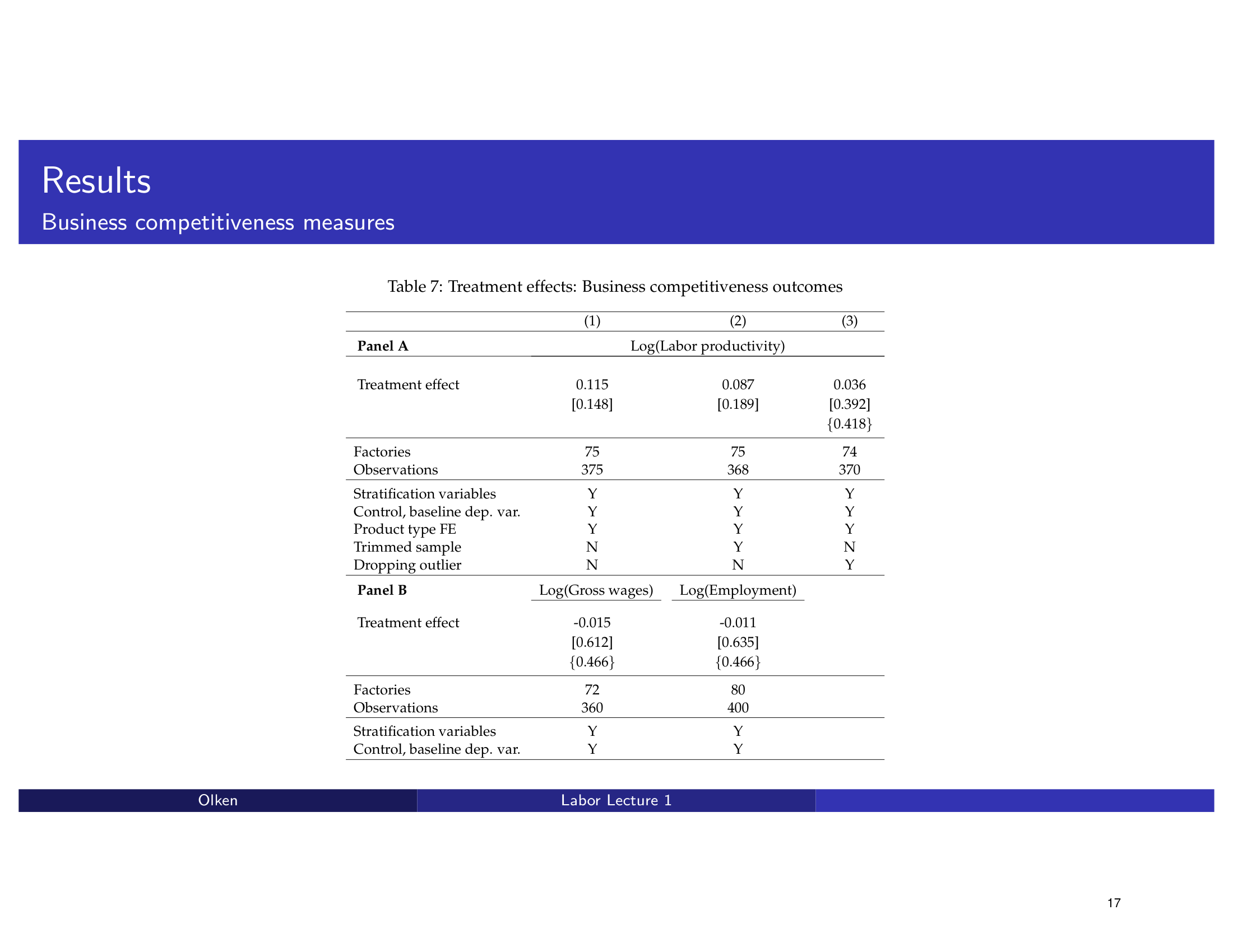
Table 7 → Dot Plot: Business Competitiveness

Two-panel regression table (Panel A and Panel B) on business competitiveness results. The redesign converts it into a multi-panel dot plot visualization with clear panel separation.

Before
Before: Original slide 17 — two-panel regression table
Two-panel regression table, Panel A and B crammed together
After
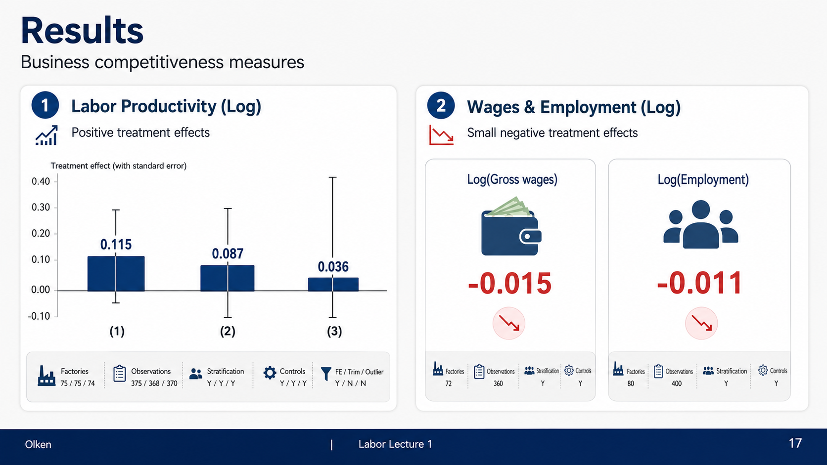
After: Redesigned slide 17 with multi-panel dot plot
Multi-panel dot plot visualization with clear panel separation
18

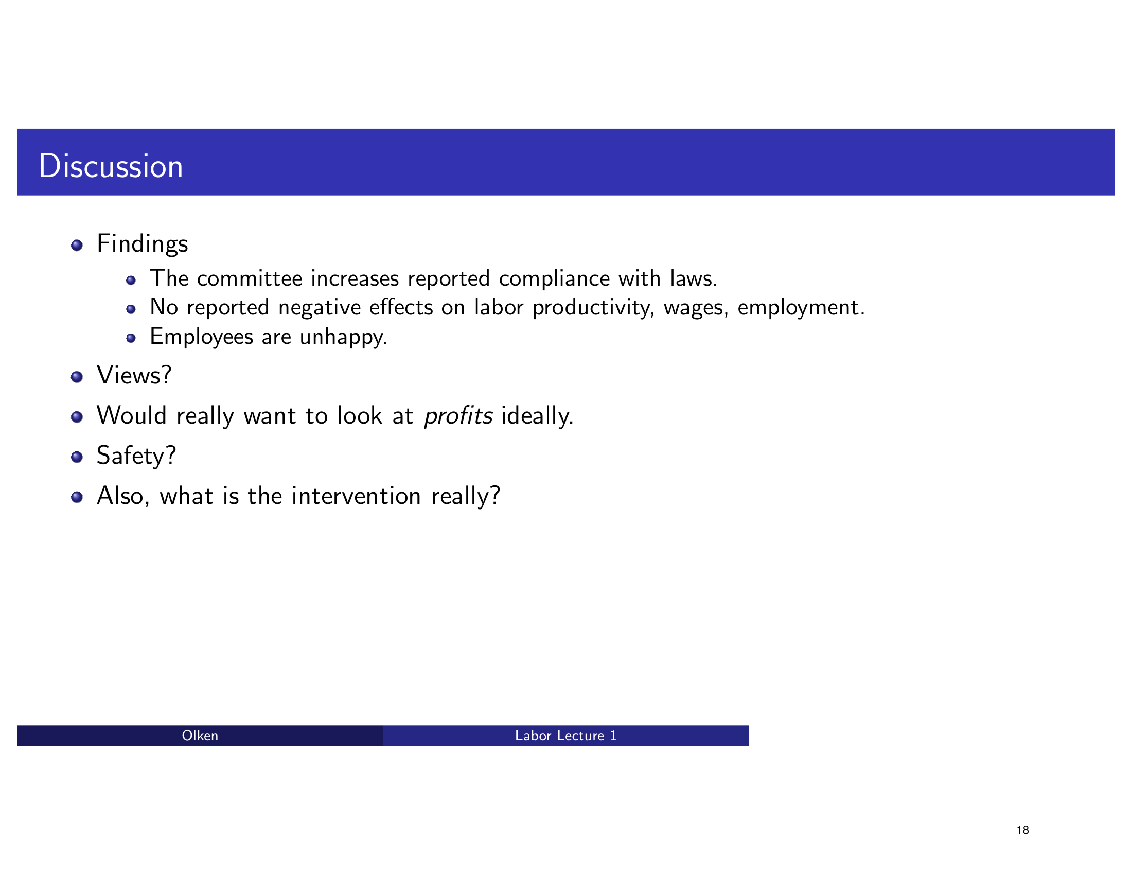
Discussion — Findings & Questions

Bullet point discussion of findings and open questions with flat formatting. The redesign creates a structured discussion layout with visual grouping of findings vs. questions.

Before
Before: Original slide 18 — flat bullet point discussion
Flat bullet points, findings and questions mixed together
After
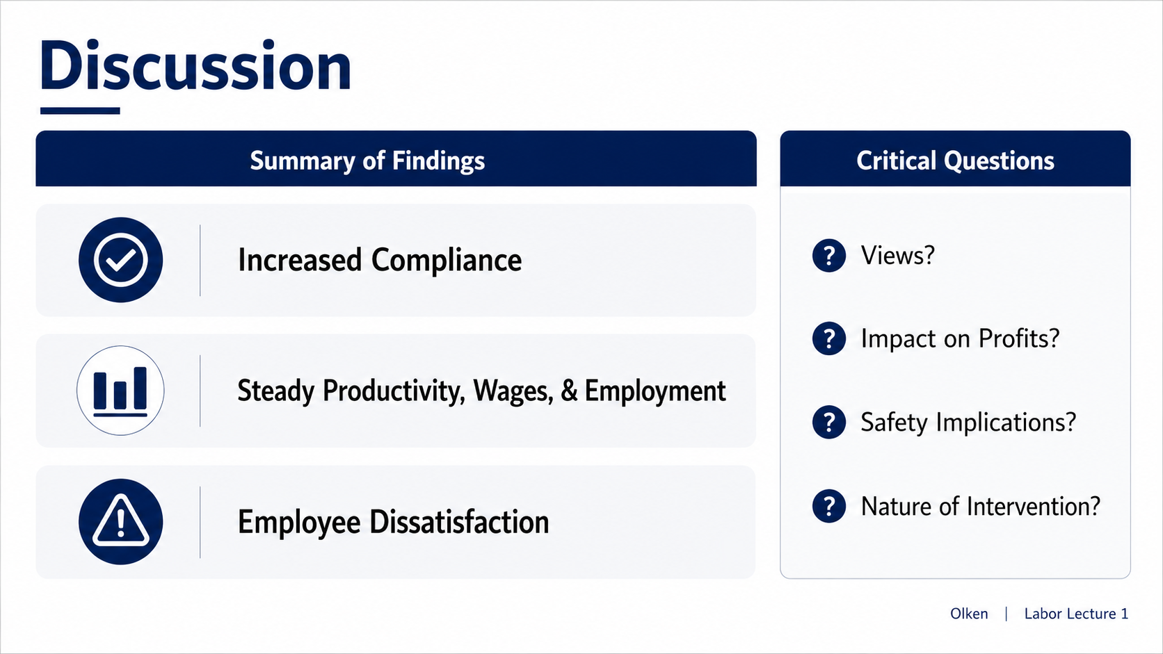
After: Redesigned slide 18 with structured discussion layout
Structured discussion layout with visual grouping
19

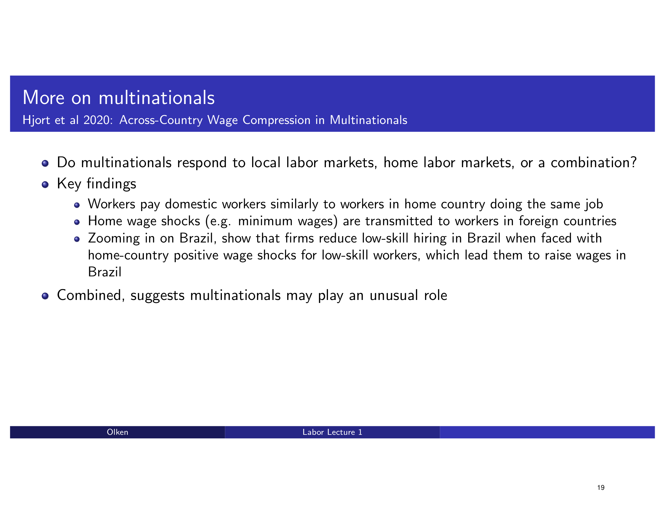
More on Multinationals — Hjort et al 2020

Bullet points summarizing the Hjort et al 2020 study on multinational labor effects. The redesign presents it as a clean research summary with key findings highlighted.

Before
Before: Original slide 19 — bullet points on Hjort et al 2020
Bullet point research summary, flat formatting
After
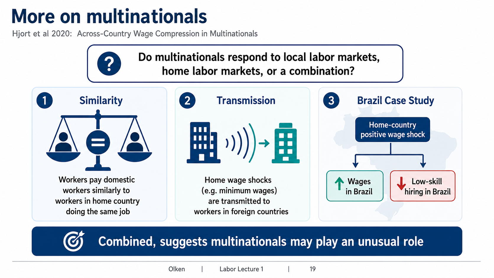
After: Redesigned slide 19 with clean research summary
Clean research summary with highlighted key findings
20

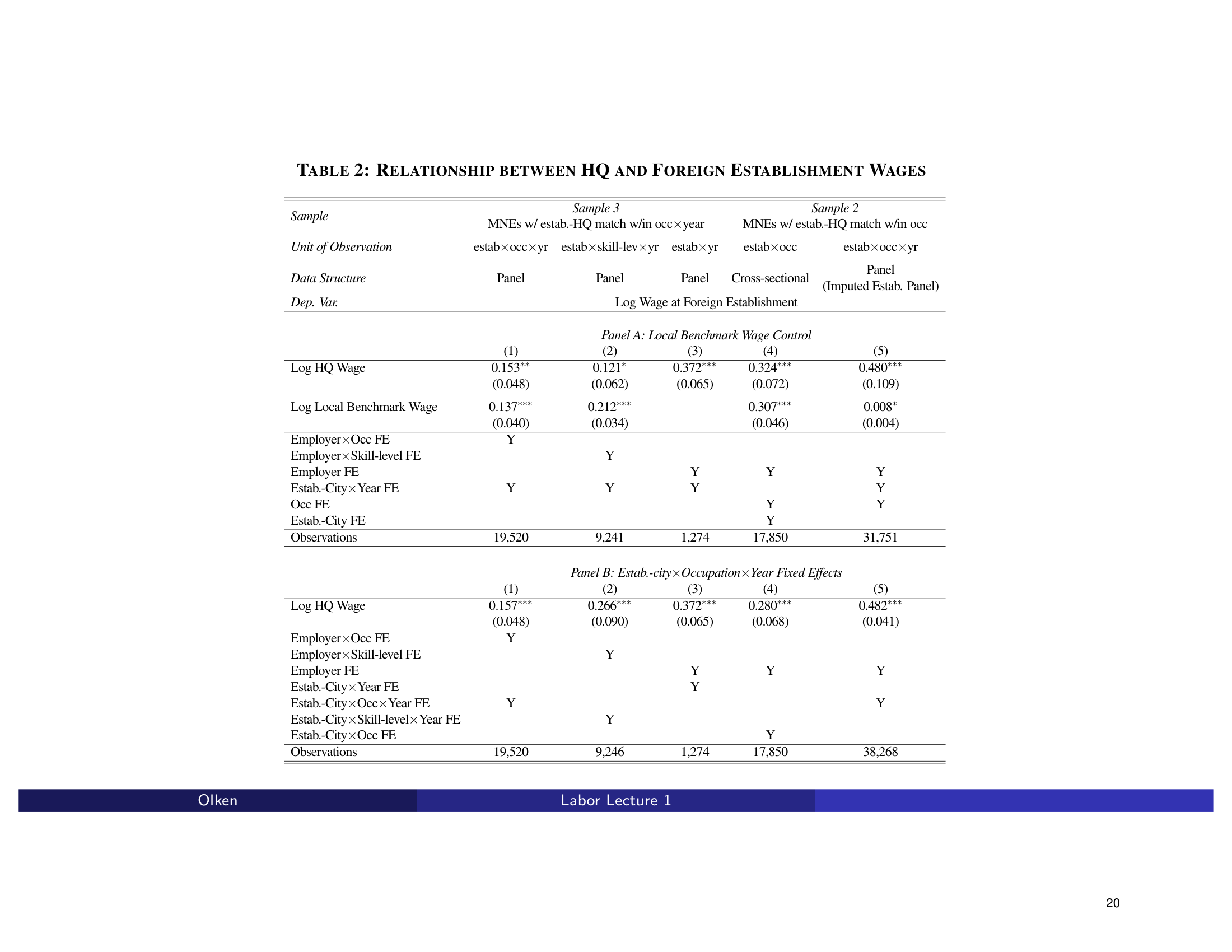
Table 2 → Forest Plot: HQ and Foreign Establishment Wages

Massive 2-panel regression table showing the relationship between HQ and foreign establishment wages. The redesign creates a dual forest plot with a fixed effects checklist for clear comparison.

Before
Before: Original slide 20 — massive 2-panel regression table
Massive 2-panel regression table, dense numeric grid
After
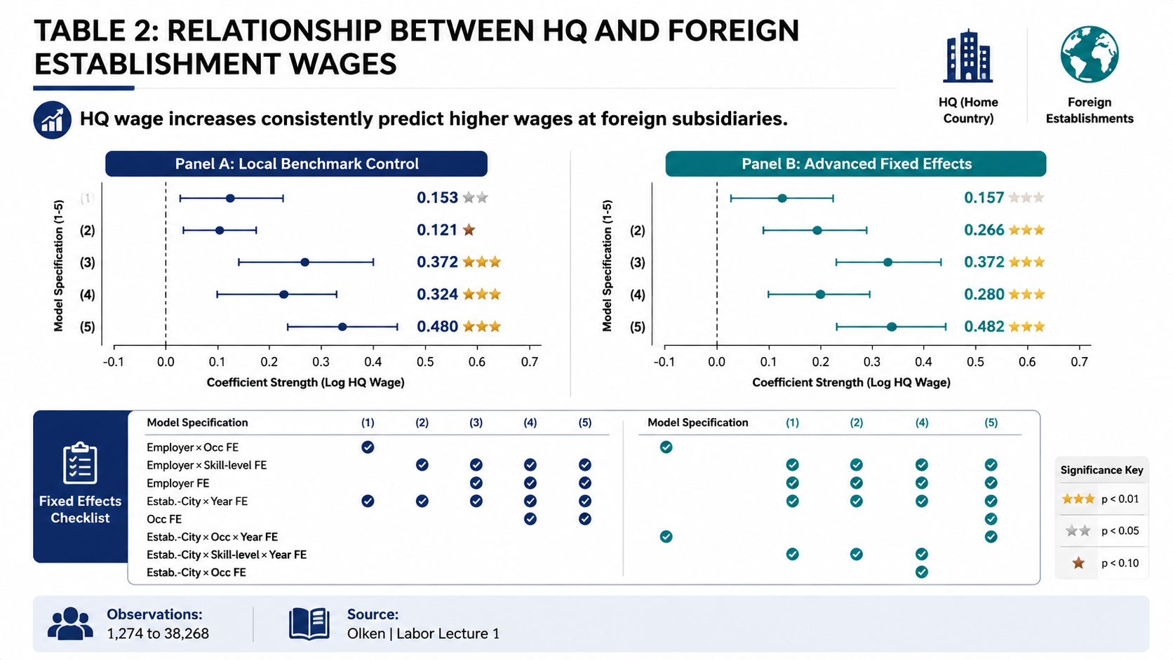
After: Redesigned slide 20 with dual forest plot
Dual forest plot with fixed effects checklist
21

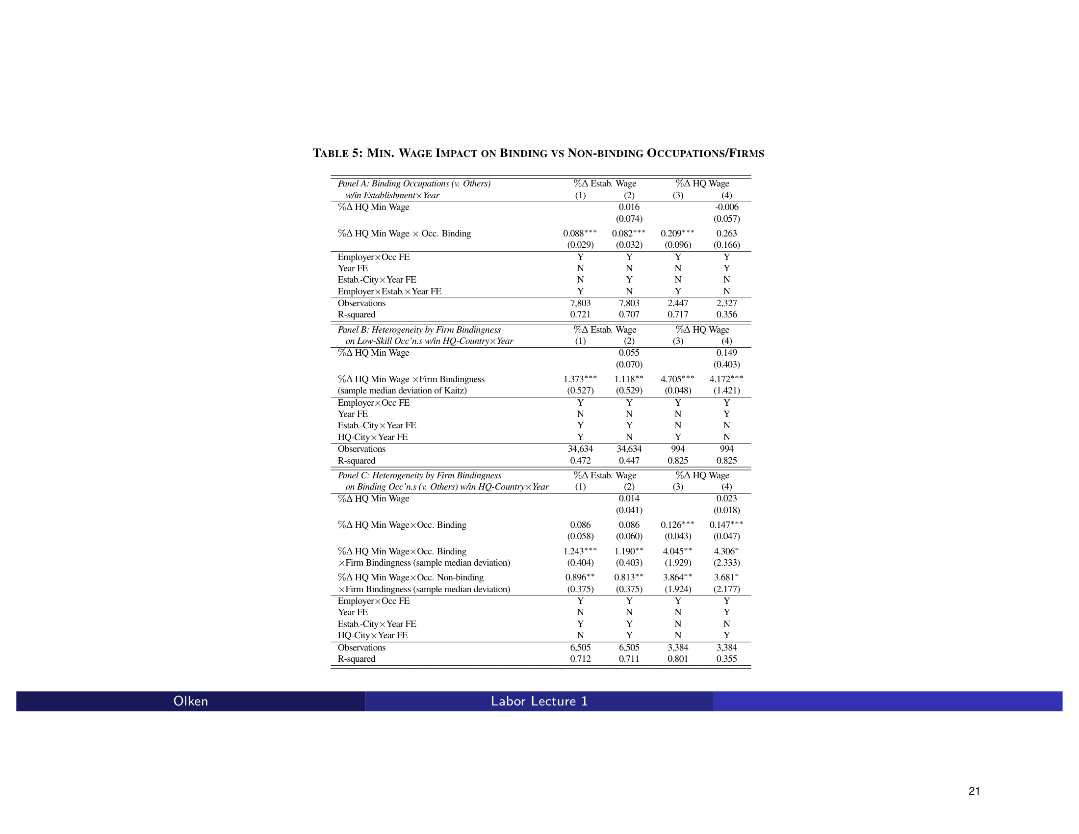
Table 5 → Chart: Minimum Wage Impact

Extremely dense 3-panel regression table on minimum wage impact. The redesign transforms it into a visual coefficient display that makes the cross-panel comparison intuitive.

Before
Before: Original slide 21 — dense 3-panel regression table
Extremely dense 3-panel table, coefficients buried in numeric grid
After
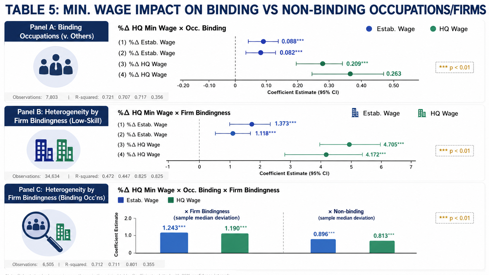
After: Redesigned slide 21 with visual coefficient display
Visual coefficient display with intuitive cross-panel comparison
22

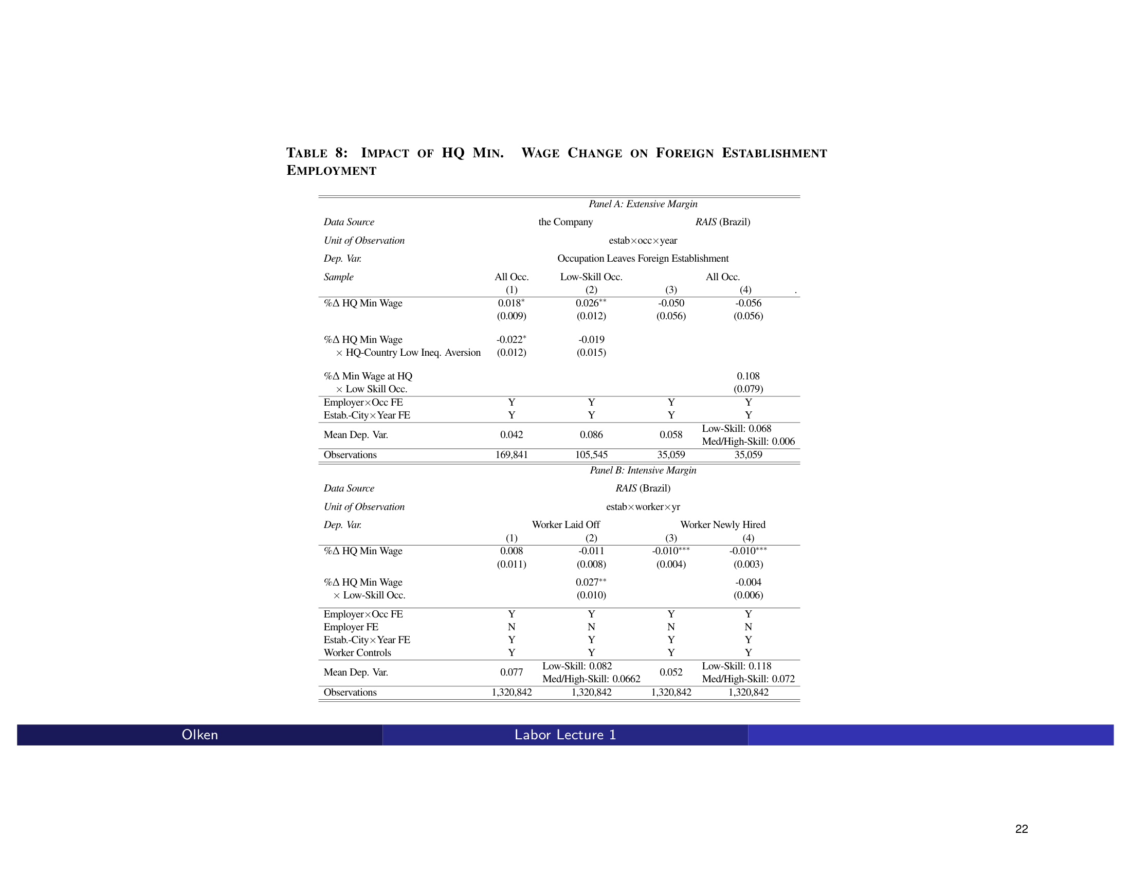
Table 8 → Chart: Impact of HQ Min. Wage Change

Another dense 2-panel regression table on the impact of HQ minimum wage changes. The redesign converts it into a chart-based visualization with clear effect direction and significance.

Before
Before: Original slide 22 — dense 2-panel regression table
Dense 2-panel table, raw coefficients and standard errors
After
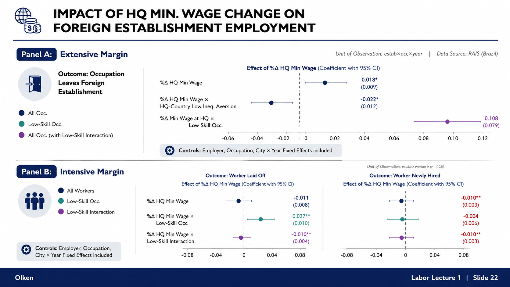
After: Redesigned slide 22 with chart-based visualization
Chart-based visualization with clear effect direction and significance
23

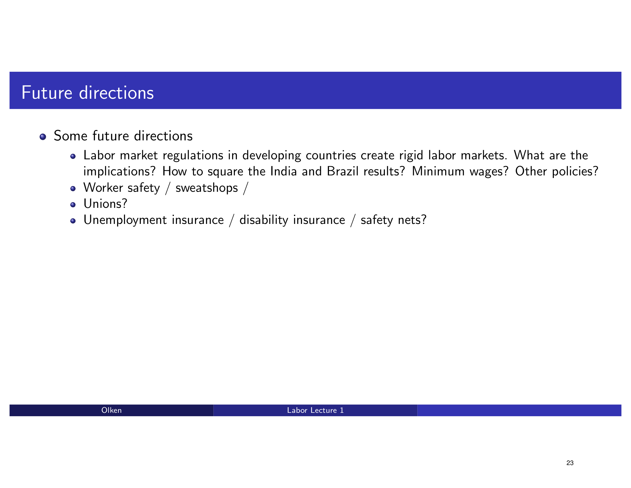
Future Directions — Research Topics

A bullet point list of future research topics with no visual structure. The redesign presents a clean future directions layout with categorized research areas.

Before
Before: Original slide 23 — flat bullet list of research topics
Flat bullet list, no categorization or visual anchors
After
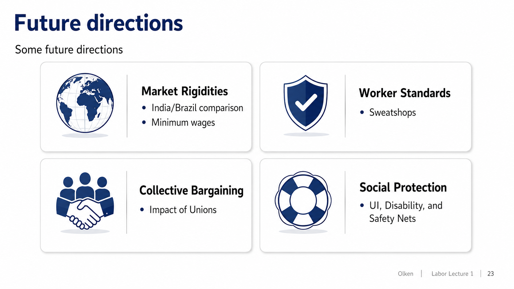
After: Redesigned slide 23 with categorized future directions
Clean future directions layout with categorized research areas
24

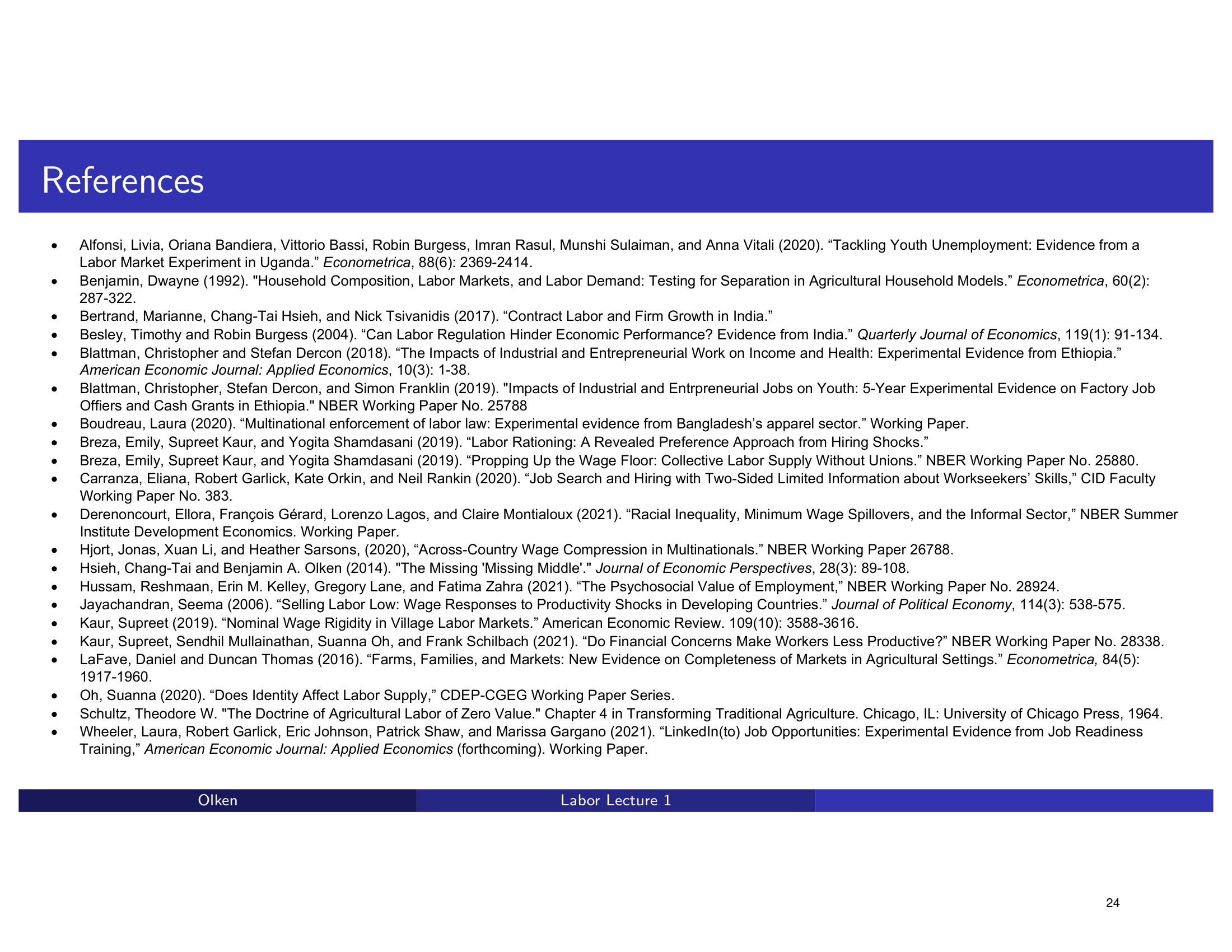
References — Bibliography

A long bibliography list in standard LaTeX formatting with small text. The redesign presents a clean, scannable reference list with improved typography.

Before
Before: Original slide 24 — dense bibliography in small LaTeX text
Dense bibliography list, small LaTeX text, hard to scan
After
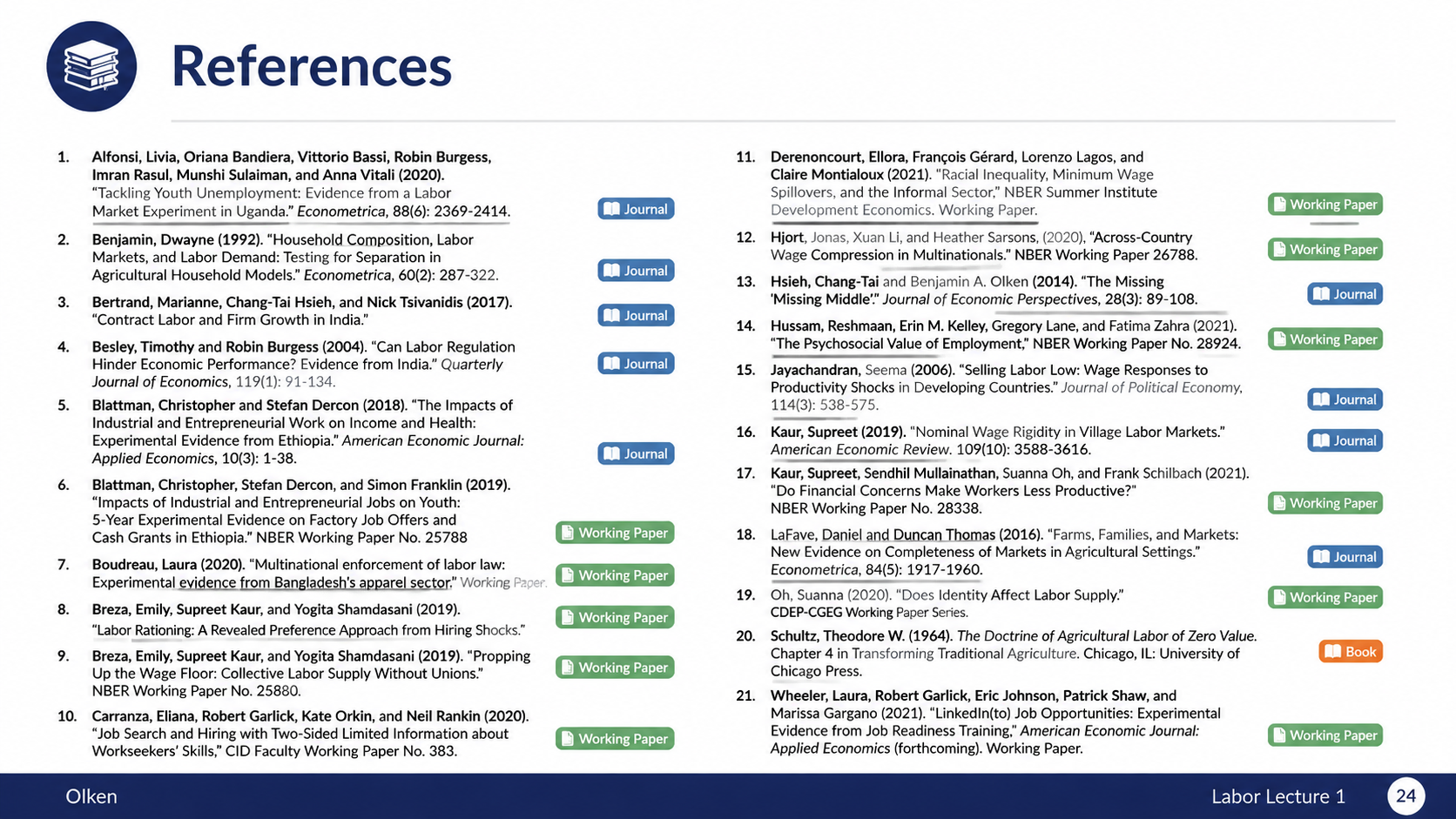
After: Redesigned slide 24 with clean reference list
Clean, scannable reference list with improved typography
25

MIT OpenCourseWare License

Standard MIT OCW license and attribution page. The redesign presents a clean attribution page with proper styling and layout.

Before
Before: Original slide 25 — standard MIT OCW license page
Standard MIT OCW license page, plain text layout
After

After: Redesigned slide 25 with clean attribution page
Clean attribution page with proper styling and layout

Transform Your Lecture Slides in Minutes

Upload your deck, pick a style, and let Arty handle the rest. Your words stay — the design levels up.

Try Deckly.art Free